In this documentation, we will discuss the customization of the WooExpand slider, brought to you by the Prime Slider addon for Elementor.
Enable The WooExpand Slider

To use the WooExpand Slider widget from Prime Slider, first, you have to enable the widget.
Go to WordPress dashboard > Prime Slider Plugin dashboard.
Then, Click the 3rd Party Widgets Tab.
Search the WooExpand Slider Name.
Enable the WooExpand Slider.
Hit the Save Settings Button.
Work With The Content Tab
Layout Section
Go to Content > Layout
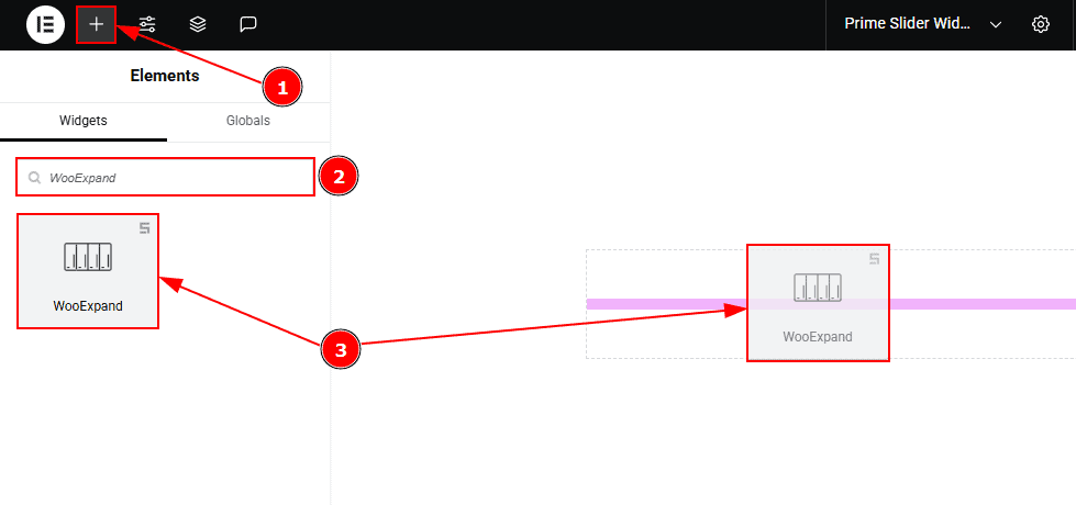
Go to the Elementor Editor Page and Hit the “+” icon Button.
Search the WooExpand slider.
Drag the widget and drop it on the editor page.
Work With The Content Tab
Layout Section
Go to Content > Layout
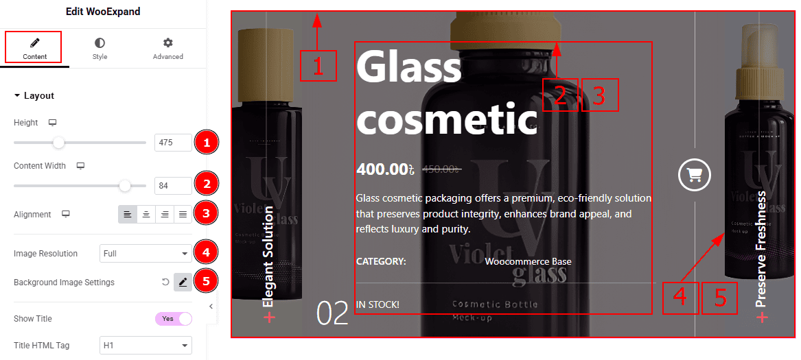
Height: You can adjust the slider height with this option.
Content Width: You can adjust the content width with this option.
Alignment: You can adjust the content alignment to left, center, right or justified with this option.
Image Resolution: You can adjust the image resolution with this option.
Background Image Setting: You can make changes to the image settings with this option.
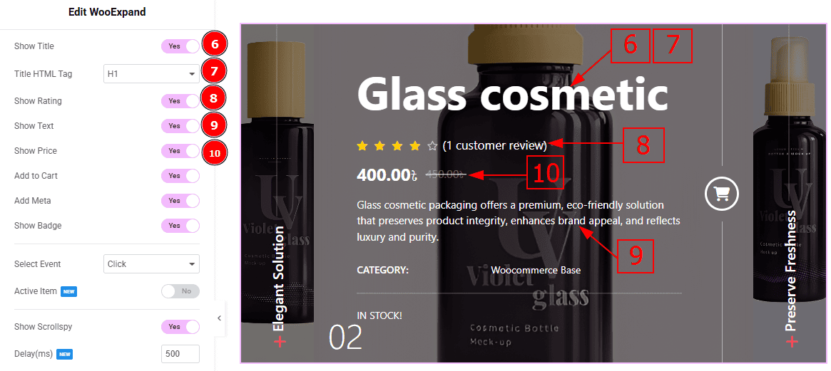
Show Title: Enable the switcher to show the title to the audience.
Title HTML Tag: This option lets you select the heading for the title.
Show Rating: Enable the switcher to show the ratings to the audience.
Show Text: Enable the switcher to show the text/description to the audience.
Show Price: Enable the switcher to show the price to the audience.
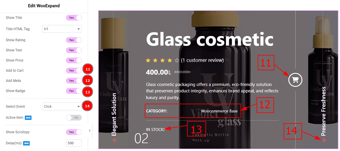
Add to Cart: Enable the switcher to show the add to cart button to the audience.
Add Meta: Enable the switcher to show the meta text (category) to the audience.
Show Badge: Enable the switcher to show the product status to the audience.
Select Event: You can select the event type to click or hover to view the product details with this option.
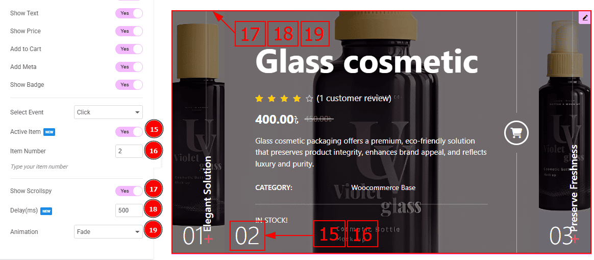
Active Items: Enable the switcher to show the active items to the audience.
Item Number: You can adjust the product number to view the product as active to the audience.
Show Scrollspy: Enable the switcher to activate the scroll-triggered animation effect.
Delay(ms): Sets the time (in milliseconds) before the animation begins after the element enters the viewport.
Animation: You can select the slider animation to fade, slide top or slide bottom with this option.
Query Section
Go to Content > Query
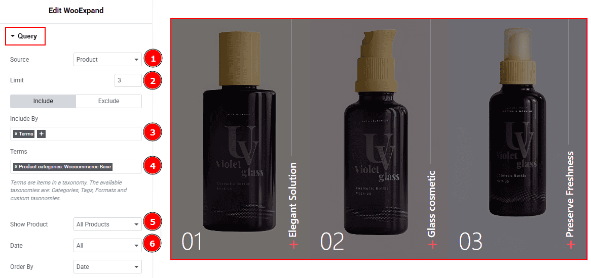
Source: Select the source for the slider from here. The types of sources are - Products, Manual Selection, Current Query, and Related. Here we selected the type as products.
Limit: You can adjust the limit here of how many posts you want to show in the slider.
Include/Exclude Selection: Select the Include / Exclude filter to show/hide specific posts by Terms (Tags/Categories) or Authors. Here, we selected the include field as Author.
Author: This option lets you select the author's name whose post you want to add to the slider.
Show Product: You can choose the option to show products (All products, On Sale & Featured) to the audience with this option.
Date: You can select the post as per the date of creation with this option.
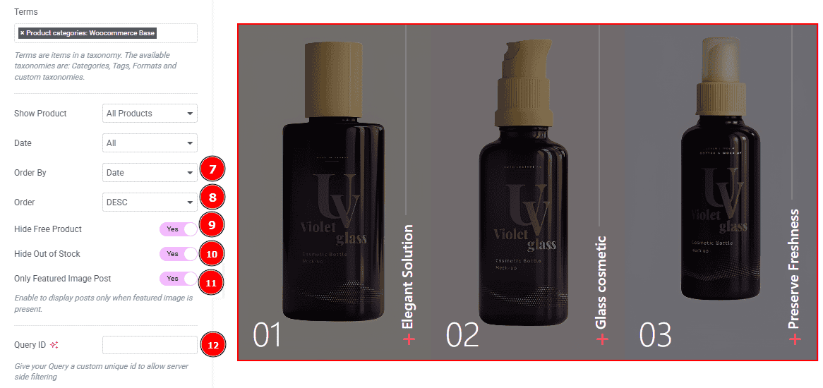
Order By: It controls the data you want to display through title, id, date, author, comment count, menu order & random. Here we selected the order as date.
Order: This option controls the order by which data is arranged. There are two types of order. Ascending Order (Starts from the smallest or lowest value and goes to the largest or highest.) & Descending Order (Starts from the largest or highest value and goes to the smallest or lowest.)
Hide Free Products: Enable the switcher to hide free products from the slide.
Hide Out of Stock: Enable the switcher to hide out-of-stock products from the slide.
Only Featured Image Post: Enable or disable the switcher to show or hide the featured image post.
Query ID: Give your query a custom, unique ID to allow server-side filtering. Learn more about the Query.
Work with The Style Tab
Wrapper Section
Go to Style > Wrapper
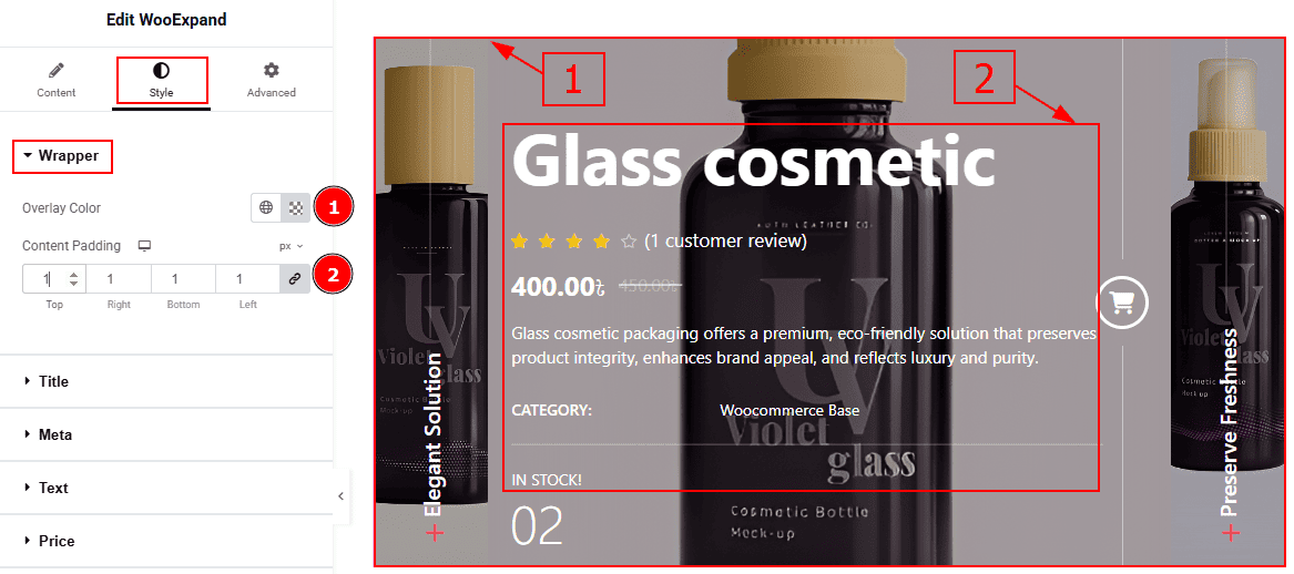
Overlay Color: You can change the overlay color with this option.
Content Padding: You can adjust the space and gaps of the content with this option.
Title Section
Go to Style > Title
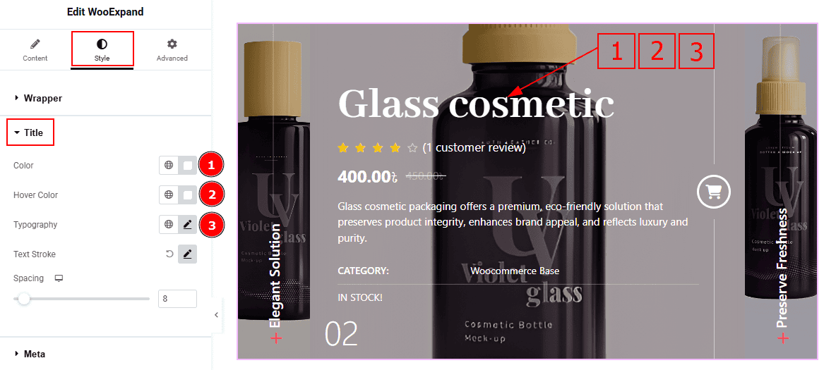
Color: You can change the title text color with this option.
Hover Color: You can change the title hover color with this option.
Typography: Change the font family, size, weight, transform, style, decoration, line height, letter spacing, and word spacing from here.
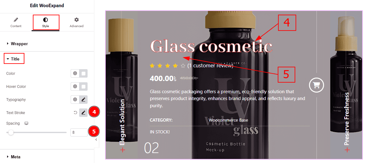
Text Stroke: This option allows you to add an outline or border around text, creating a visually distinct effect.
Spacing: You can adjust the space between the title and the ratings with this option.
Meta Section
Go to Style > Meta
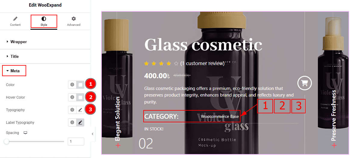
Color: You can change the meta text color with this option.
Hover Color: You can change the meta text hover color with this option.
Typography: Change the font family, size, weight, transform, style, decoration, line height, letter spacing, and word spacing from here.
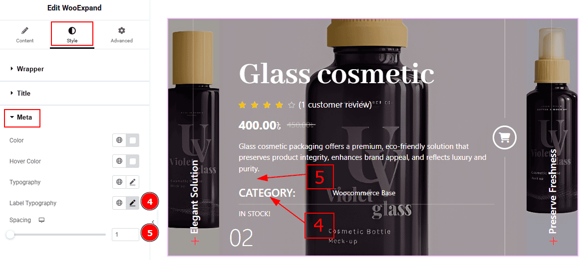
Label Typography: You can make changes to the label’s font family, size, weight, transform, style, decoration, line height, letter spacing, and word spacing from here.
Spacing: You can adjust the space and gaps between the meta and the text with this option.
Text Section
Go to Style > Text
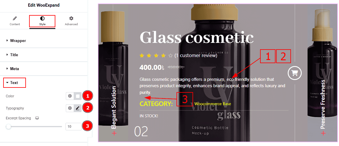
Color: You can change the text color with this option.
Typography: Change the font family, size, weight, transform, style, decoration, line height, letter spacing, and word spacing from here.
Excerpt Spacing: You can adjust the space and gaps between the text and the meta with this option.
Price Tab
Go to Style > Price
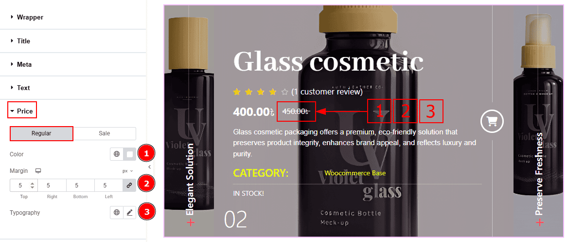
In this section, we have two more tabs. These are Regular & Sale. Let’s start with the Regular Tab -
Color: You can change the regular price color with this option.
Margin: This option allows you to adjust the space & create gaps between elements.
Typography: Change the font family, size, weight, transform, style, decoration, line height, letter spacing, and word spacing from here.
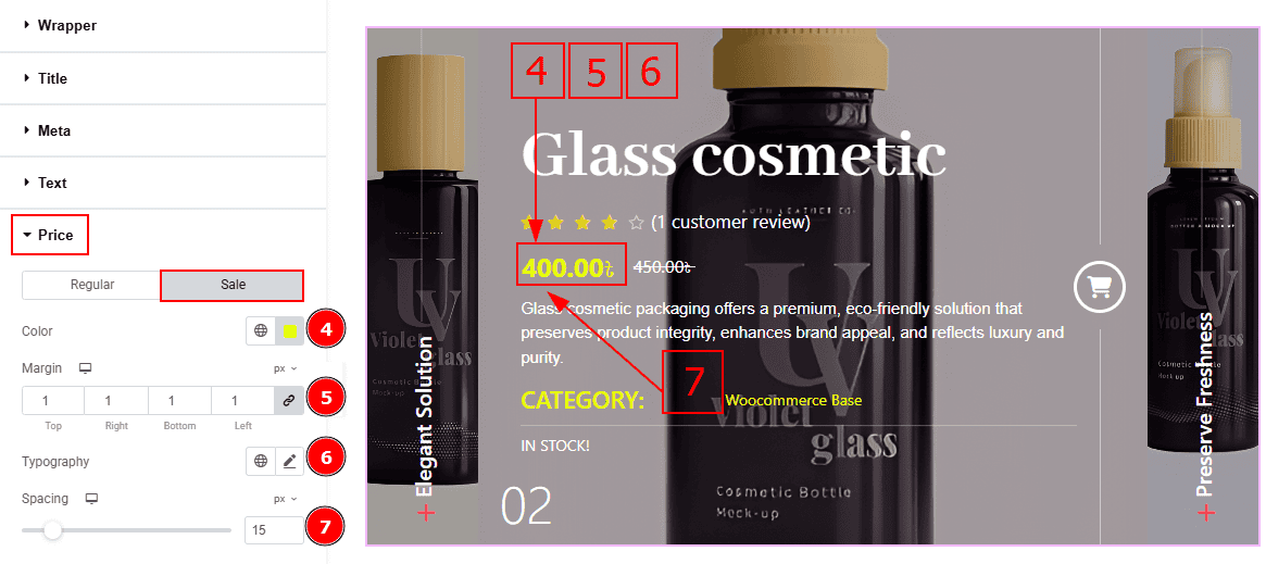
Now let’s proceed to the Sale Tab -
Color: You can change the sale price color with this option.
Margin: This option allows you to adjust the space & create gaps between elements.
Typography: Change the font family, size, weight, transform, style, decoration, line height, letter spacing, and word spacing from here.
Spacing: You can adjust the space between the price and the text with this option.
Badge Section
Go to Style > Badge
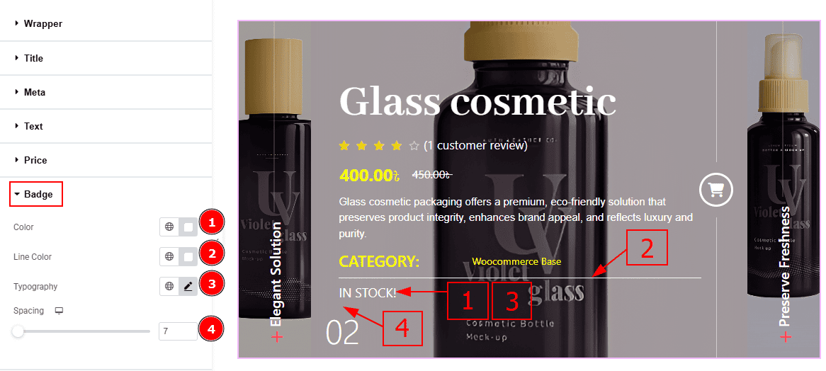
Color: You can change the badge text color with this option.
Line Color: You can change the line color with this option.
Typography: Change the font family, size, weight, transform, style, decoration, line height, letter spacing, and word spacing from here.
Spacing: You can adjust the space and gaps between the badge and the counter number with this option.
Rating Section
Go to Style > Rating
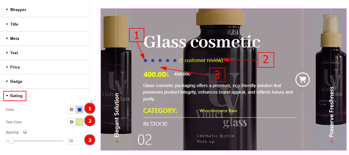
Color: You can change the ratings star color with this option.
Text Color: You can change the rating text color with this option.
Spacing: You can adjust the space between the rating & the price with this option.
Add to Cart Button Section
Go to Style > Add to Cart Button
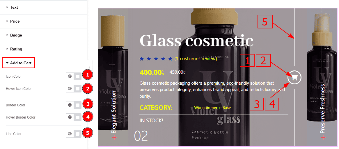
Icon Color: You can change the add to cart icon color with this option.
Hover Icon Color: You can change the add to cart icon hover color with this option.
Border Color: You can change the add to cart border color with this option.
Hover Border Color: You can change the add to cart border hover color with this option.
Line Color: You can change the add to cart line color with this option.
Counter/Plus Section
Go to Style > Counter/Plus Title
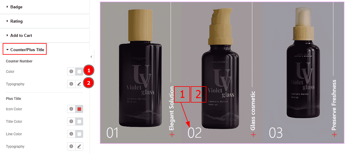
Color: You can change the counter number color with this option.
Typography: Change the font family, size, weight, transform, style, decoration, line height, letter spacing, and word spacing from here.
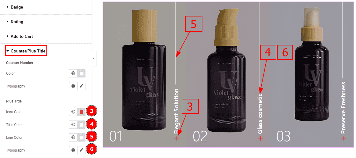
Icon Color: You can change the plus icon color with this option.
Title Color: You can change the plus title color with this option.
Line Color: You can change the line color with this option.
Typography: Change the font family, size, weight, transform, style, decoration, line height, letter spacing, and word spacing from here.
All done! You have successfully customized the WooExpand Slider on your website.
Video Assist
You can also watch the video tutorial to learn more about the WooExpand Slider. Please visit the demo page for examples.
Thanks for being with us.
