
In this documentation, we will discuss the customization of the Monster Slider, brought to you by the Prime Slider addon for Elementor.
Enable The Monster Slider
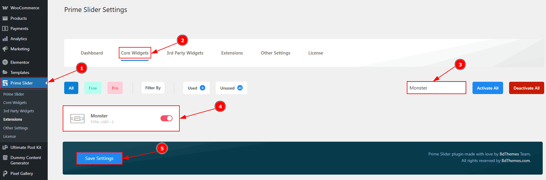
To use the Monster Slider from Prime Slider, first, you have to enable the widget.
Go to WordPress dashboard > Prime Slider Plugin dashboard.
Then, Click the Core Widgets Tab.
Search the Monster Slider Name.
Enable the Monster Slider Widget.
Hit the Save Settings Button.
Inserting The Monster Slider
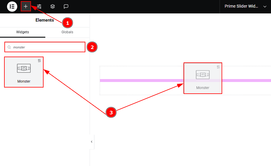
Go to the Elementor Editor Page and Hit the “+” icon Button.
Search the Monster Slider.
Drag the widget and Drop it on the editor page.
Work With The Content Tab
Layout Section
Go to Content > Layout
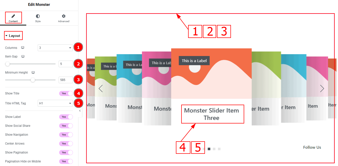
Column: You can select the quantity of the column with this option.
Item Gap: This option allows you to adjust the space and gaps between the items.
Minimum Height: You can adjust the slider height with this option.
Show Title: Enable the switcher to show the title to the audience.
Title HTML Tag: This option lets you select the heading for the title.
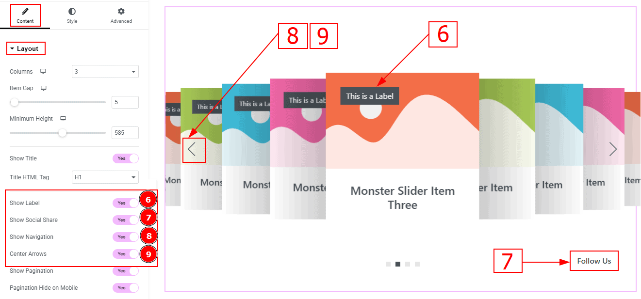
Show Label: Enable the switcher to show the label to the audience.
Show Social Share: You can show the social icon to the audience by enabling this option.
Show Navigation: Enable the switcher to show the navigation to the audience.
Center Arrows: Enable the switcher to keep the arrows in center alignment.
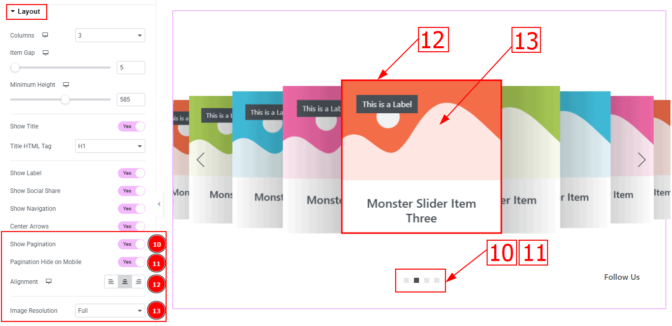
Show Pagination: Enable the switcher to show the pagination to the audience.
Pagination Hide on Mobile: Enable the switcher to hide the pagination on mobile devices.
Alignment: You can set the content position to left, center or right with this position. Here, we selected the alignment position as center.
Image Resolution: You can change the image resolution with this option.
Sliders Section
Go to Content > Sliders
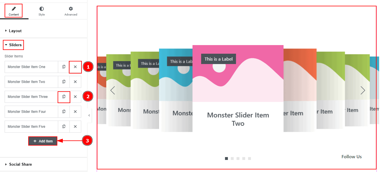
Close Item: You can delete the Slider item by clicking the Close icon button.
Copy Item: This option lets you copy the same item.
Add Item: You can add a new item by clicking the “+”Add Item button.
Now, let’s proceed to the inner options of the slider items.
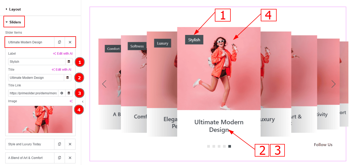
Label: You can change the label text with this option.
Title: You can make changes to the title text with this option.
Title Link: This option allows you to add a link to the title.
Image: You can add or change the image with this option.
Social Share Section
Go to Content > Social Share
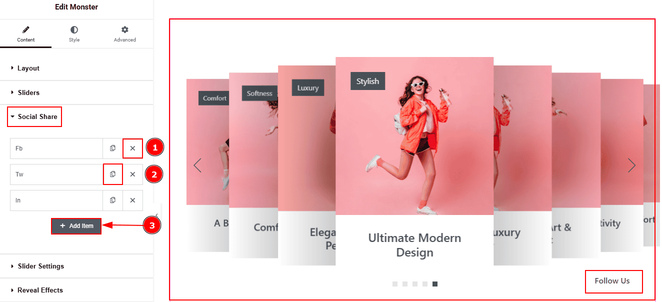
Close Item: You can delete the Slider item by clicking the Close icon button.
Copy Item: This option lets you copy the same item.
Add Item: You can add a new item by clicking the “+”Add Item butto
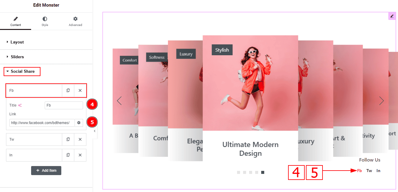
Now, let’s proceed to the inner options of the social icon -
Title: You can add a title to your social icon with this option.
Link: This option allows you to add a link to the social icon.
Slider Settings Section
Go to Content > Slider Settings
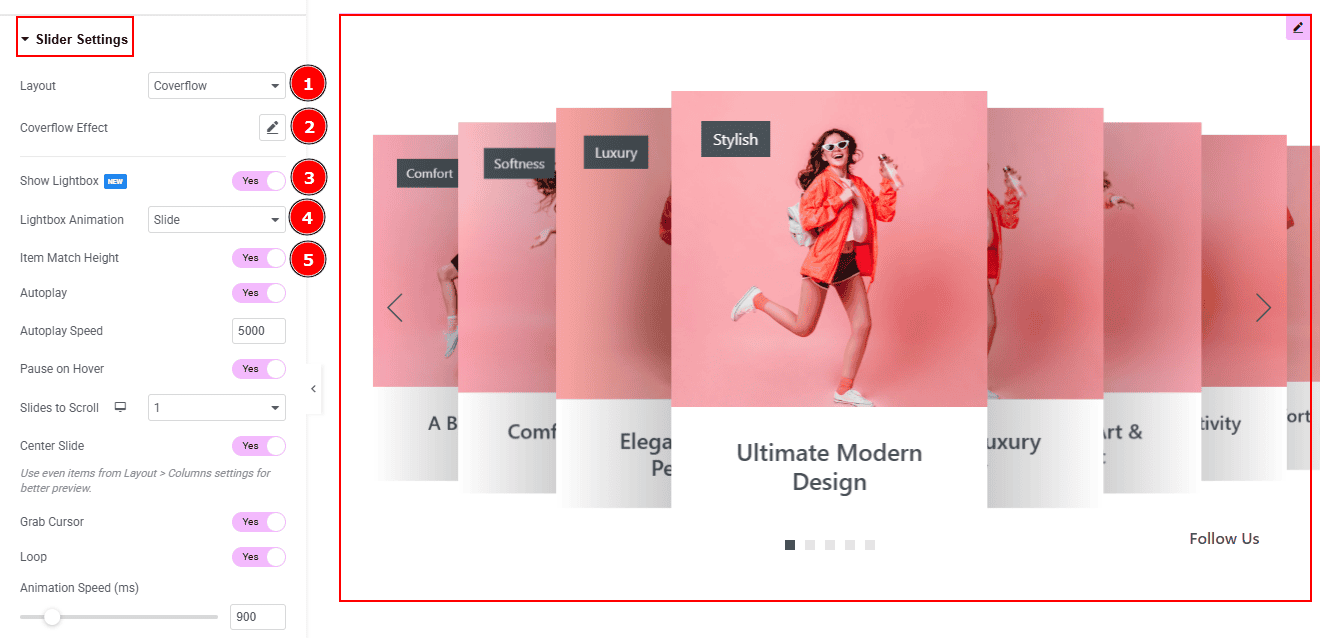
Layout: This option allows you to set the visual style of the slider to Carousel or Coverflow. Here, we selected the layout as Coverflow.
Coverflow Effect: You can customize the coverflow effect by editing rotate, stretch, modifier, depth & slide shadows with this option.
Show Lightbox: Enable the switcher to open the image in a lightbox when an item is clicked in the slider.
Lightbox Animation: You can set the lightbox animation to slide, fade or scale with this option.
Item Match Height: Enable the switcher to make all the items of the slider to same height.
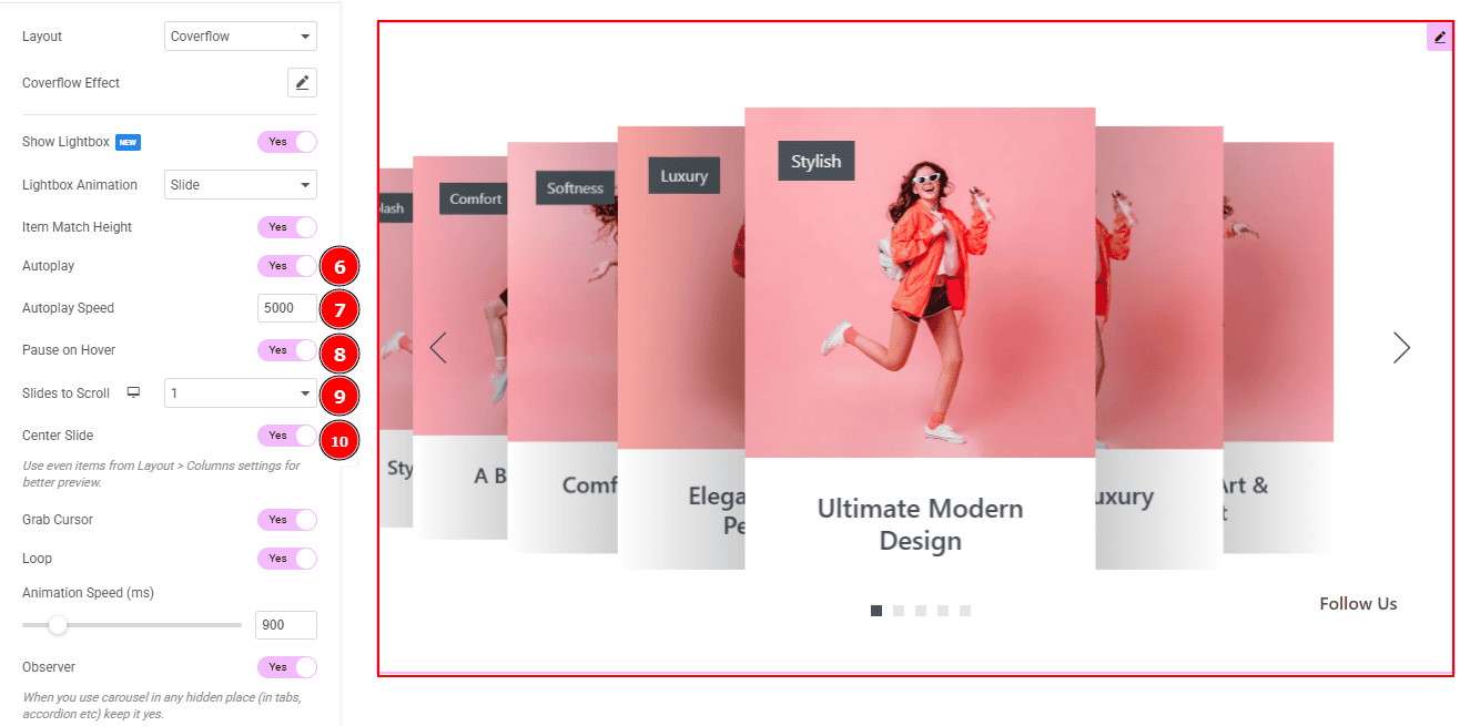
Autoplay: By enabling this option, you can automatically play the slides one after another.
Autoplay Interval (ms): This option lets you set the time delay between each slide transition.
Pause on Hover: Enable the switcher to pause autoplay when the user hovers over the slider.
Slides to Scroll: This option controls the number of slides that will move at a time when the user navigates.
Center Slide: Enable the switcher to activate the center slide in the view.
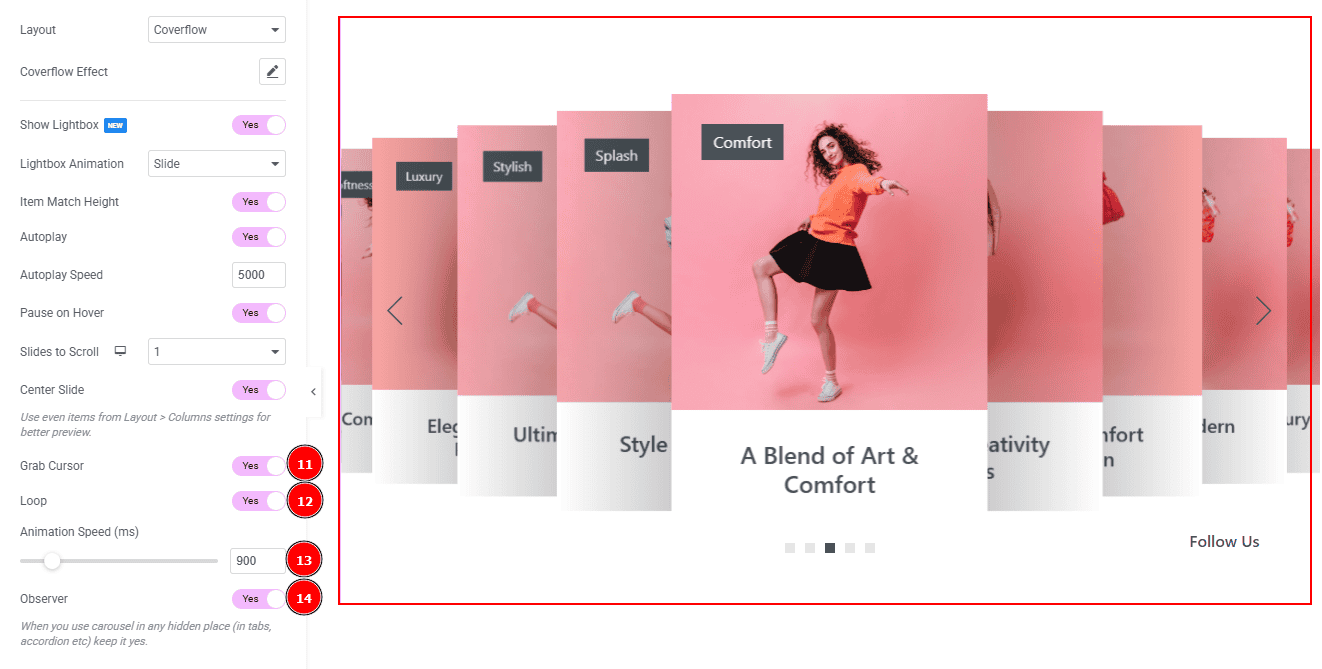
Grab Cursor: Enable the switcher to change the mouse cursor to a grab icon when hovering over the slider.
Loop: Enable the switcher to go back to the first automatically after the last slide.
Animation Speed: You can adjust the slider animation speed with this option.
Observer: Enable the switcher to use carousel (in tabs, accordion etc) in any hidden place.
Work with The Style Tab
Sliders Section
Go to Style > Sliders
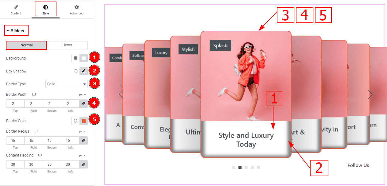
In this section, we have two tabs. These are Normal & Hover. Let’s start with the Normal Tab -
Background: You can change the background color with this option.
Box Shadow: While working with this option, you will get three more options (Blur, Horizontal & Vertical). Blur Controls how sharp or soft the shadow will appear. By using the horizontal option, you can move the shadow left or right and by using the vertical option, you can move the shadow up or down.
Border Type: This option allows you to add borders to your items. You can select various border types from this option. Such as Solid, Double, Dotted, Dashed, Groove.
Border Width: Set the thickness of the border with this option.
Border Color: You can change the border color with this option.
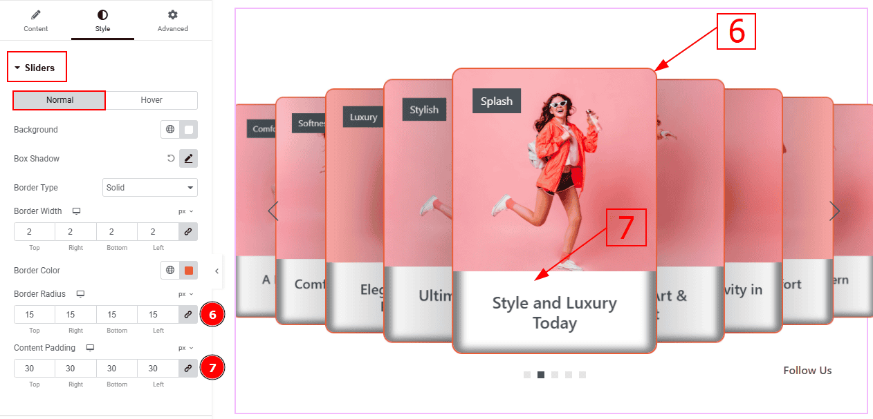
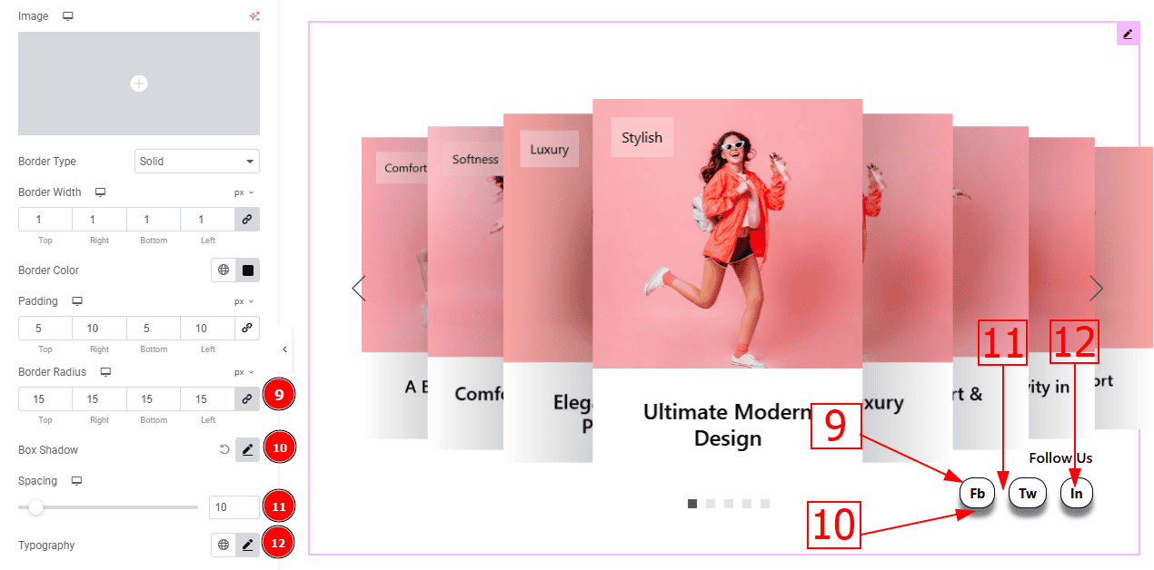
Border Radius: This option controls the roundness of the border with this option.
Content Padding: This option allows you to adjust the space & create gaps inside the content field.
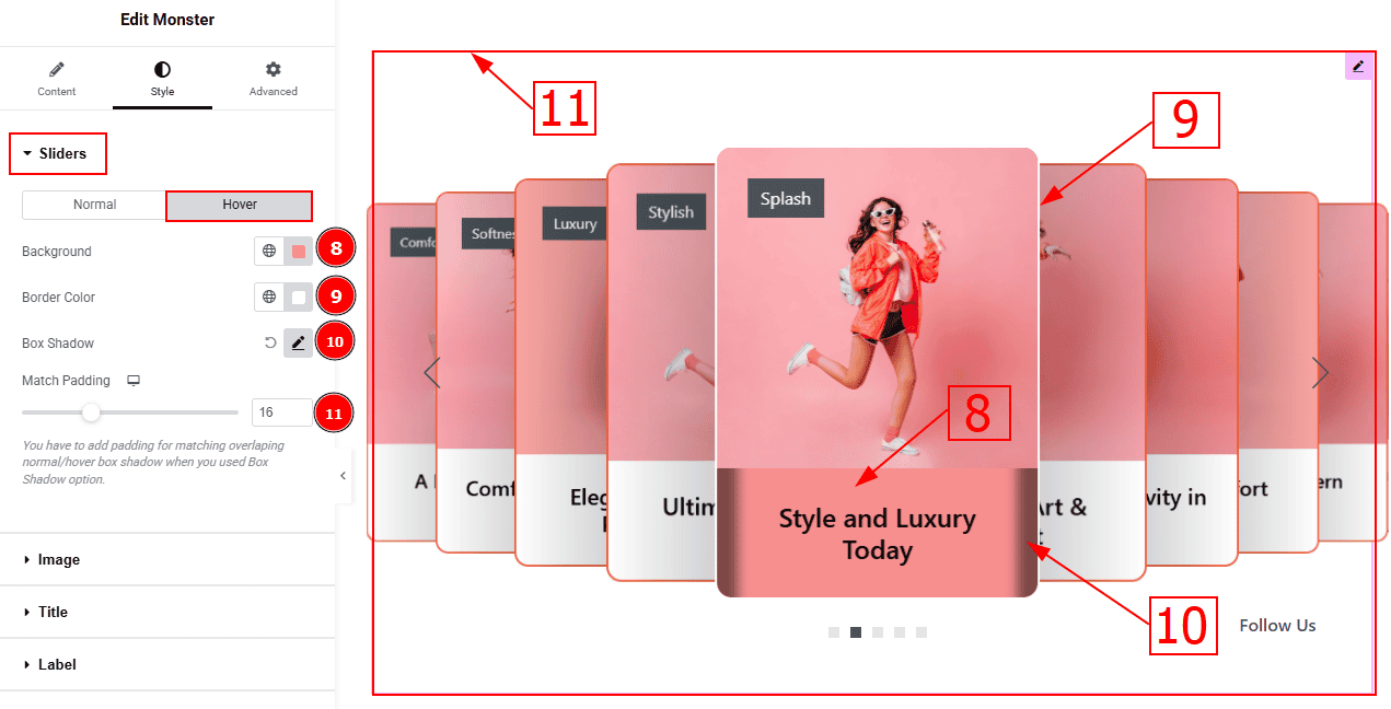
Now, let’s proceed to the Hover Tab -
Background: You can change the background hover color with this option.
Border Color: You can change the border hover color with this option.
Box Shadow: You can add a shadow effect to the content field with this option.
Match Padding: You have to add padding for matching overlapping normal/hover box shadow when you use the box shadow option.
Image Section
Go to Style > Image
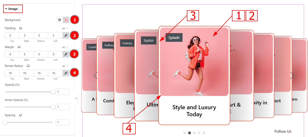
Background: You can change the background color with this option. (This option will only work for the png image)
Padding: This option allows you to adjust the inner space and gaps of the image.
Margin: This option allows you to adjust the space and gaps around the image.
Border Radius: This option controls the roundness of the border with this option.
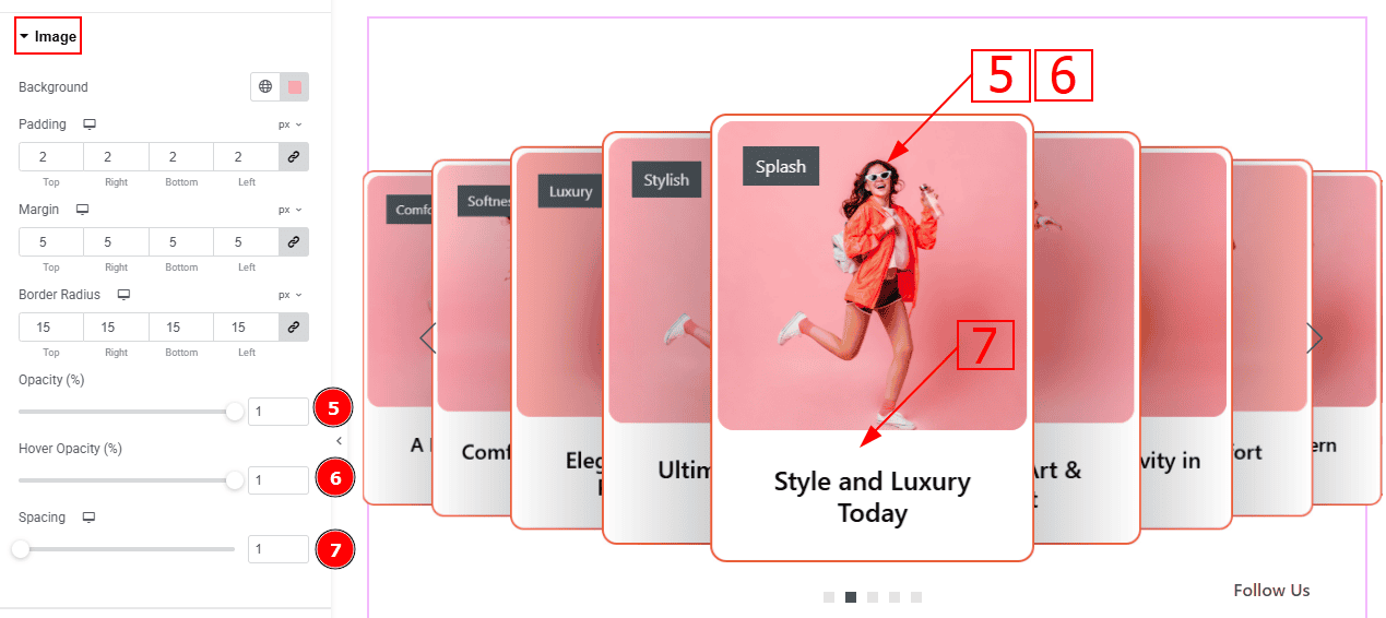
Opacity: This option controls the blur effect on the image:
Hover Opacity: This option controls the blur effect on the image while hovering the mouse on the slide.
Spacing: You can adjust the space and gaps between the image and the title with this option.
Title Section
Go to Style > Title
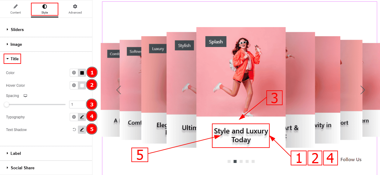
Color: You can change the title color with this option.
Hover Color: You can change the hover color with this option.
Spacing: You can adjust the space between the title and the image with this option.
Typography: Change the font family, size, weight, transform, style, decoration, line height, letter spacing, and word spacing from here.
Text Shadow: This option allows you to add a shadow effect to the text.
Label Section
Go to Style > Label
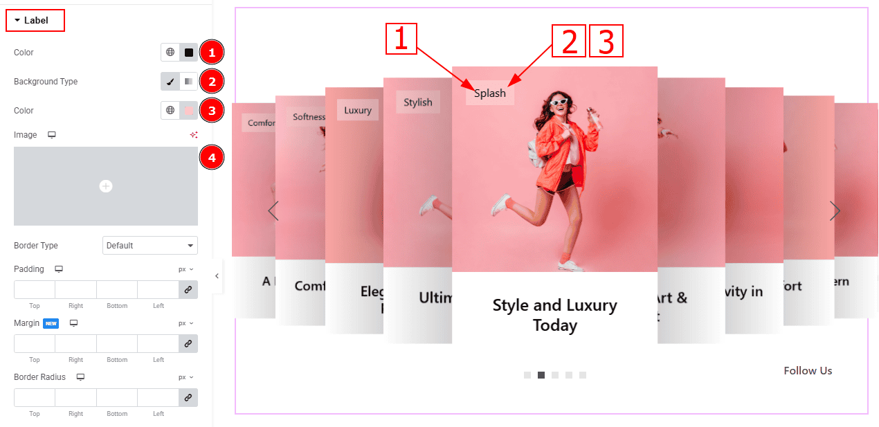
Color: You can change the label color with this option.
Background Type: You can select the background type to classic or gradient with this option.
Color: You can change the background color with this option.
Image: You can change the background image with this option.
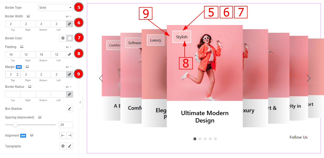
Border Type: You can add and select the border type with this option.
Border Width: Set the thickness of the border with this option.
Border Color: You can change the border color with this option.
Padding: You can adjust the inner space of the label with this option.
Margin: You can adjust the space around the label with this option.
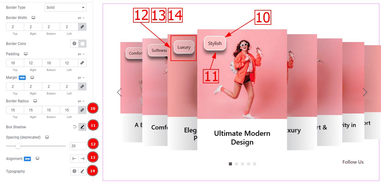
Border Radius: This option controls the roundness of the border.
Box Shadow: You can add a shadow effect to the label with this option.
Spacing (Deprecated): You can adjust the space of the label with this option.
Alignment: You can move the label to left or right with this option.
Typography: Change the font family, size, weight, transform, style, decoration, line height, letter spacing, and word spacing from here.
Social Share Section
Go to Style > Social Share
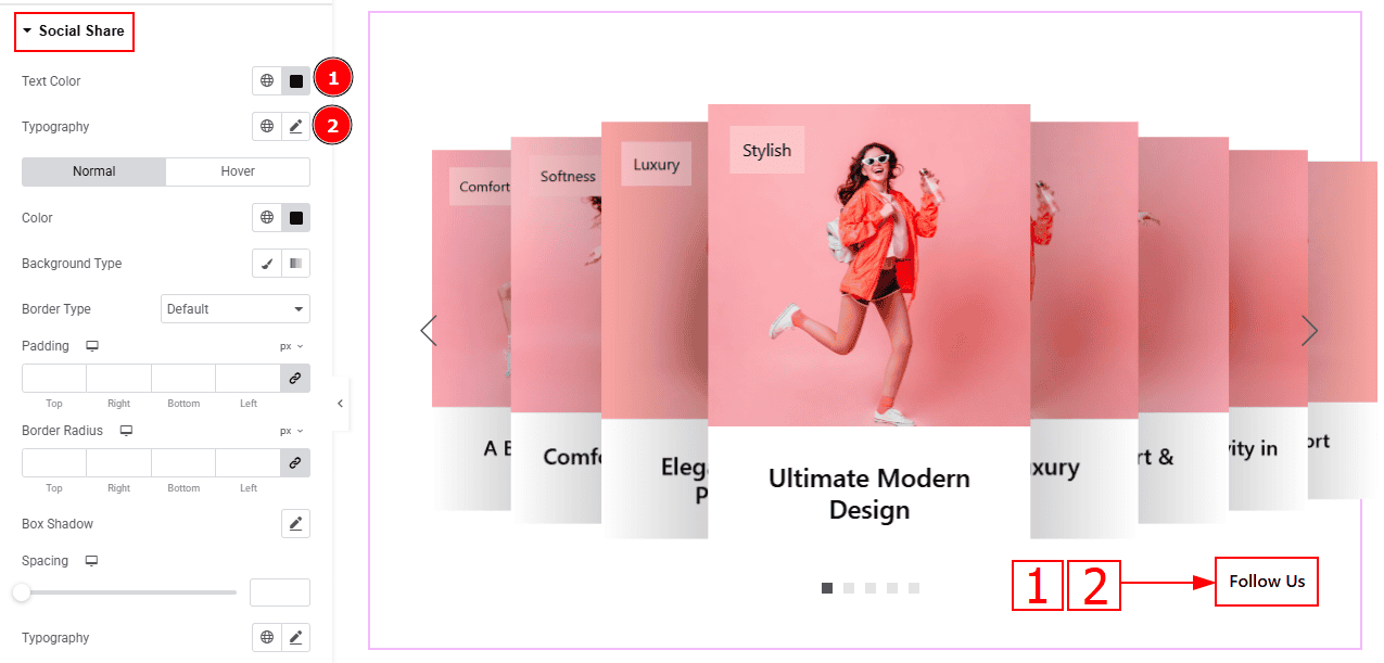
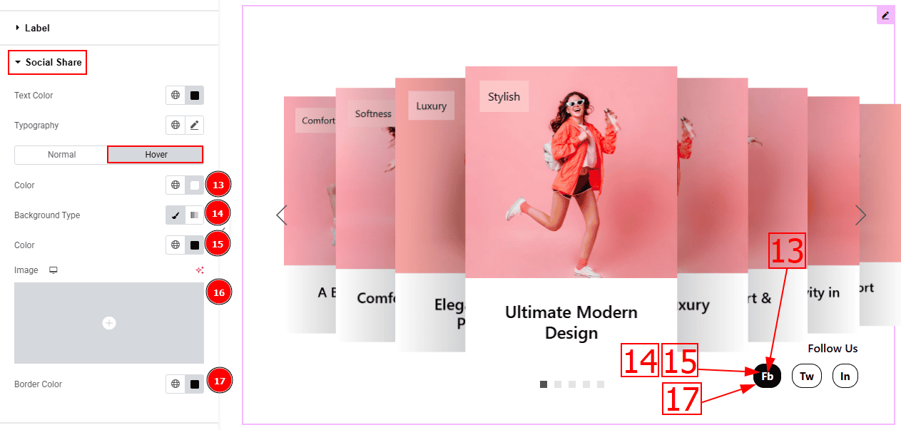
Text Color: You can change the text color with this option.
Typography: Change the font family, size, weight, transform, style, decoration, line height, letter spacing, and word spacing from here.
In this tab, we have two more tabs. One is Normal and the other is Hover. Let’s start with the Normal Tab -
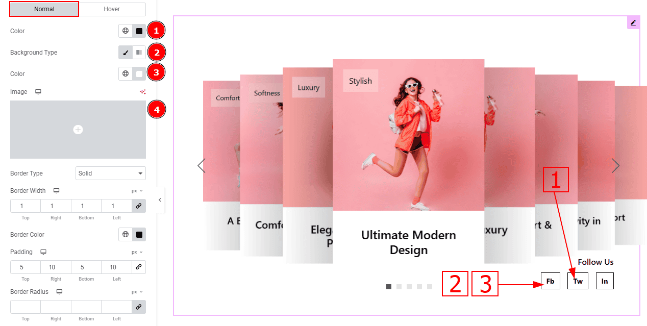
Color: You can change the social share text color with this option.
Background Type: You can select the background type to classic or gradient with this option.
Color: You can change the background color with this option.
Image: You can change the background image with this option.
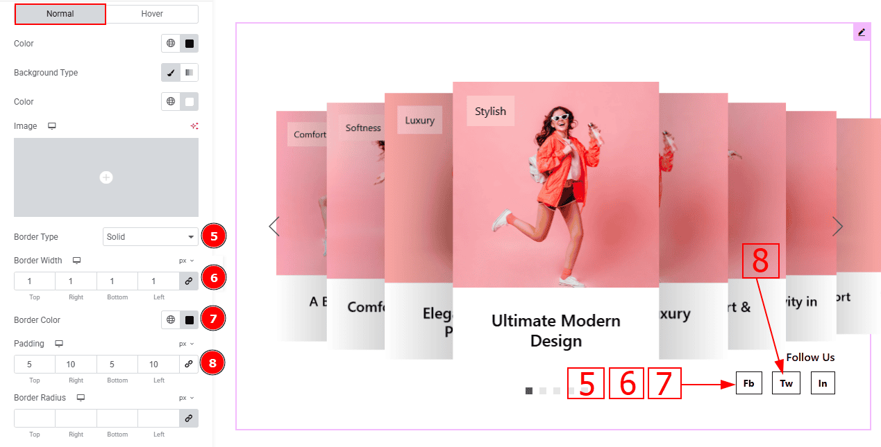
Border Type: This option allows you to add borders to your items. You can select various border types from this option. Such as Solid, Double, Dotted, Dashed, Groove.
Border Width: Set the thickness of the border with this option.
Border Color: You can change the border color with this option.
Border Radius: This option controls the roundness of the border.
Padding: Add spaces around an object to increase the inner area. Padding allows you to control the internal space within an element.
Box Shadow: You can add the shadow effect to the button with this option.
Spacing: You can adjust the space between the social share text with this option.
Typography: Change the button text font family, size, weight, transform, style, decoration, line height, letter spacing, and word spacing from here.
Now, Let’s Proceed to the Hover Tab -
Color: You can change the social share text hover color with this option.
Background Type: You can change the background type with this option.
Color: You can change the background hover color with this option.
Image: You can change the background image with this option.
Border Color: You can change the border hover color with this option.
Navigation Section
Go to Style > Navigation
In this section, we have two sub-sections. These are Arrows & Pagination. Let's explore those one by one.
Arrows Sub Section
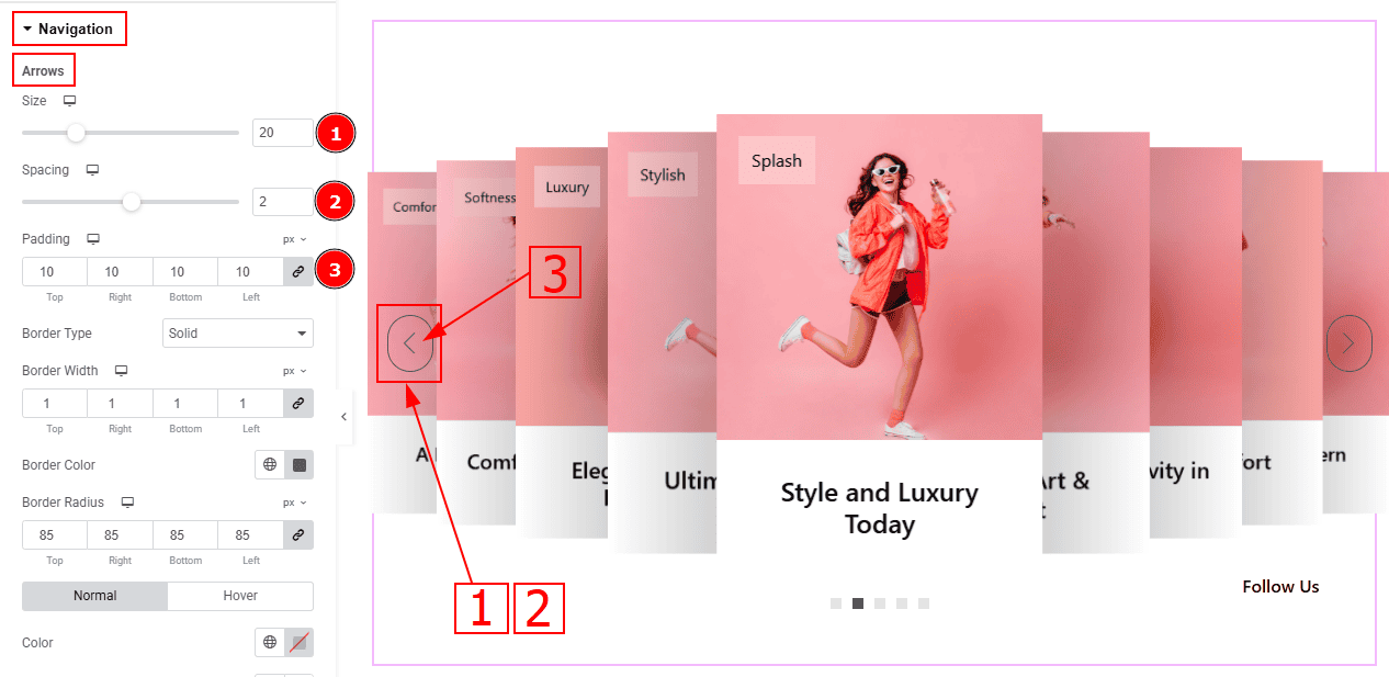
Size: You can make changes to the arrow's size with this option.
Spacing: You can adjust the space between the arrows with this option.
Padding: You can adjust the inner space of the arrow's field with this option.
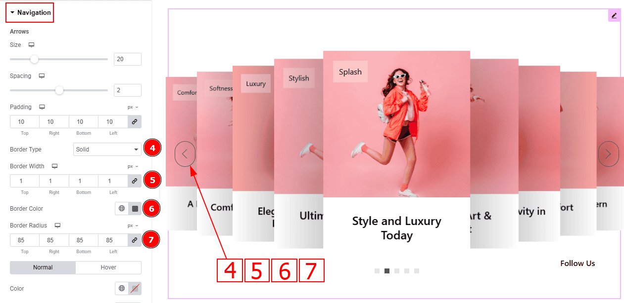
Border Type: You can add and select the border type with this option.
Border Width: Set the thickness of the border with this option.
Border Color: You can change the border color with this option.
Border Radius: This option controls the roundness of the border.
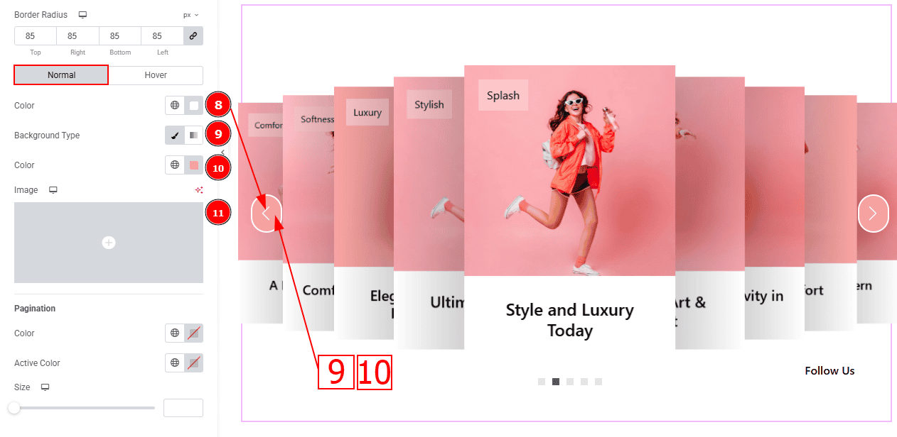
In this Section, we have two tabs. These are Normal & Hover. Let’s start with the Normal Tab -
Color: This option allows you to change the arrows' color.
Background Type: You can select the background type to Classic or Gradient from here. Here we selected the Classic.
Color: You can change the background hover color with this option.
Image: You can change the background image with this option.
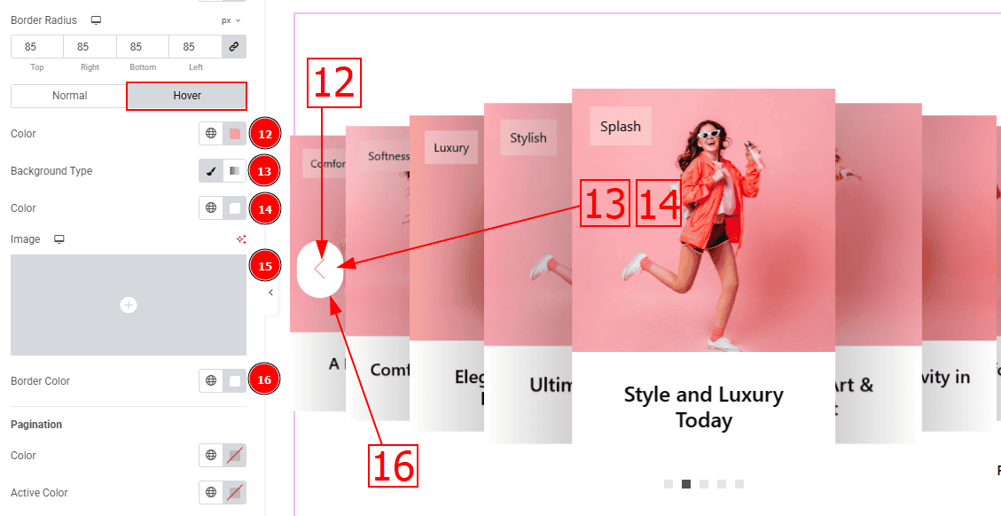
Now, let’s proceed to the Hover Tab -
Color: You can change the arrow’s hover color with this option.
Background Type: You can select the background type to Classic or Gradient from here. Here we selected the Classic.
Color: You can change the background hover color with this option.
Image: You can change the background image with this option.
Border Color: You can change the border hover color with this option.
Pagination Sub Section
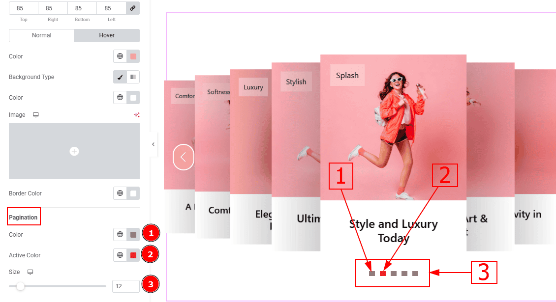
Color: You can change the pagination color with this option.
Active Color: You can change the pagination active color with this option.
Size: You can make changes to the pagination size with this option.
All done! You have successfully customized the Monster Silder on your website.
Video Assist
You can also watch the video tutorial to learn more about the Monster Slider. Please visit the demo page for examples.
Thanks for being with us.