
In this documentation, we will discuss the customization of the Sequester slider, brought to you by the Prime Slider addon for Elementor.
Enable The Sequester Slider
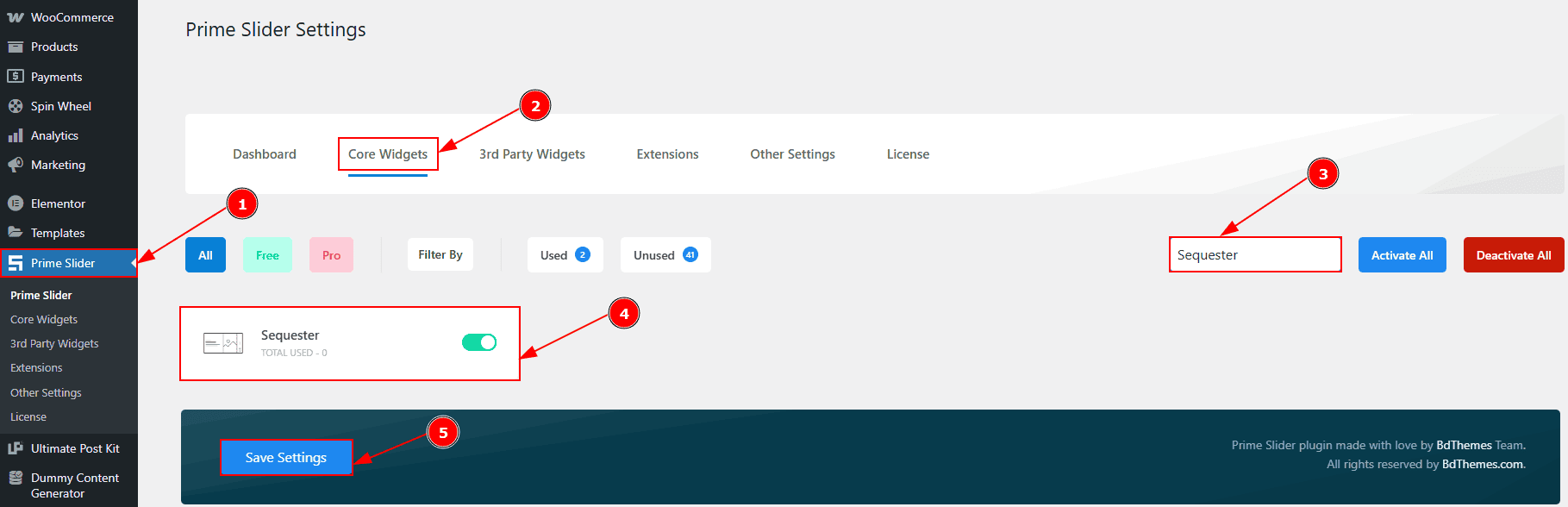
To use the Sequester Slider widget from Prime Slider, first, you have to enable the widget.
Go to WordPress dashboard > Prime Slider Plugin dashboard.
Then, Click the Core Widgets Tab.
Search the Sequester Slider Name.
Enable the Sequester Slider.
Hit the Save Settings Button.
Inserting The Sequester Slider
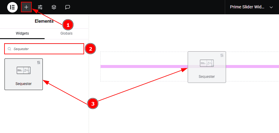
Go to the Elementor Editor Page and hit the “+” icon Button.
Search the Sequester slider.
Drag the widget and drop it on the editor page.
Work With The Content Tab
Sliders Section
Go to Content > Sliders
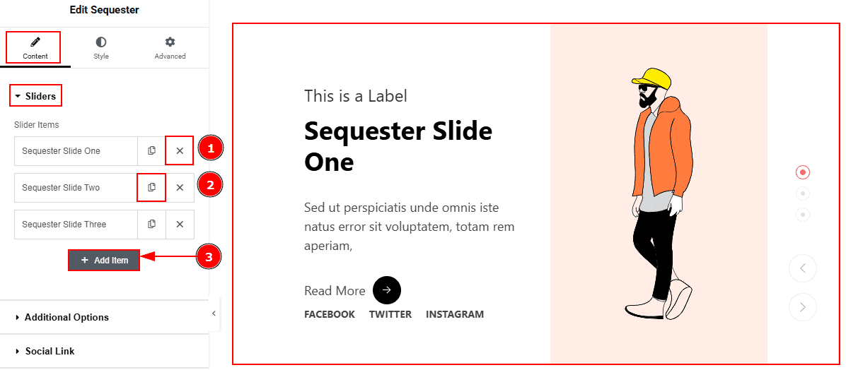
Close Item: You can delete the Slider item by clicking the Close icon button.
Copy Item: This option lets you copy the same item.
Add Item: You can add a new item by clicking the “+”Add Item button.
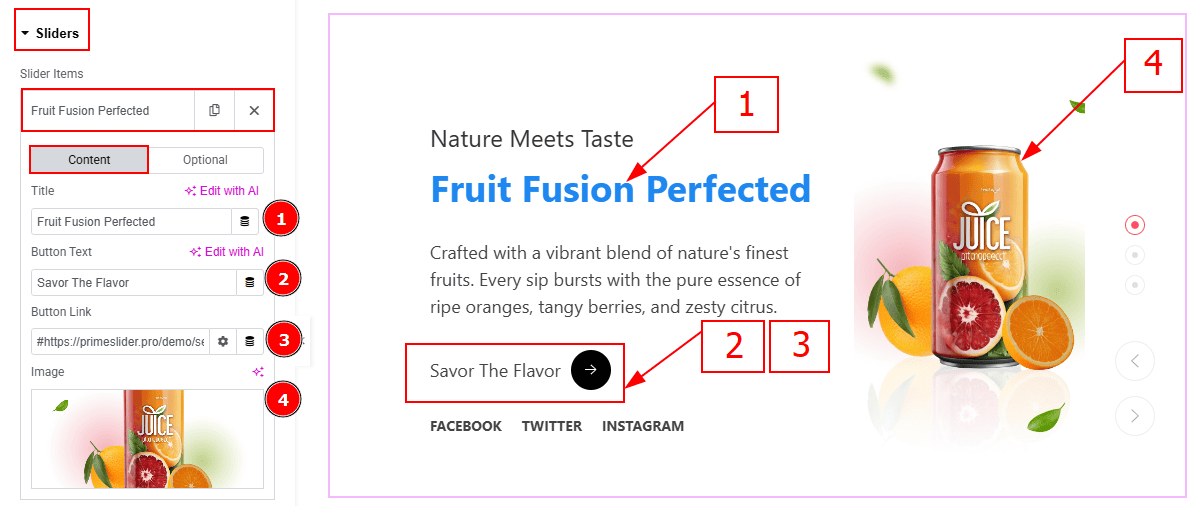
In the Slider Items, each item contains more options. There are two tabs that present those options. These are Content & Optional. Let’s start with the Content Tab -
Title: You can add the title text with this option.
Button Text: You can add the button text with this option.
Button Link: You can add a link to the button with this option.
Image: You can add or change the background image with this option.
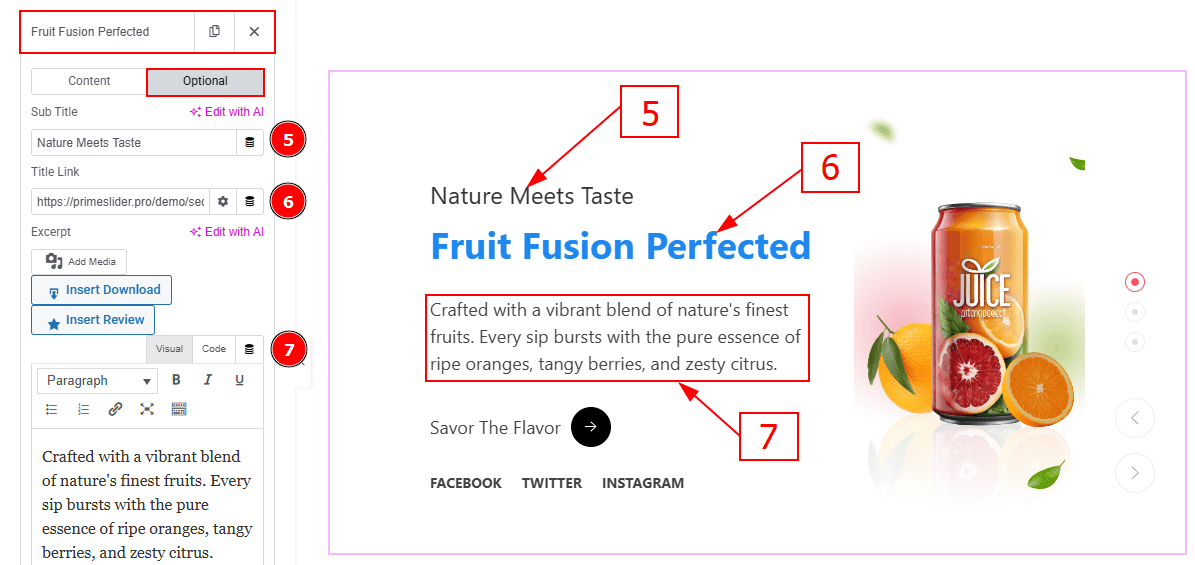
Now let’s proceed with the Optional Tab -
Sub Title: You can add the subtitle text in this option.
Title Link: This option allows you to add a link to the title.
Text: This option allows you to add and customize the description.
Additional Options Section
Go to Content > Additional Options
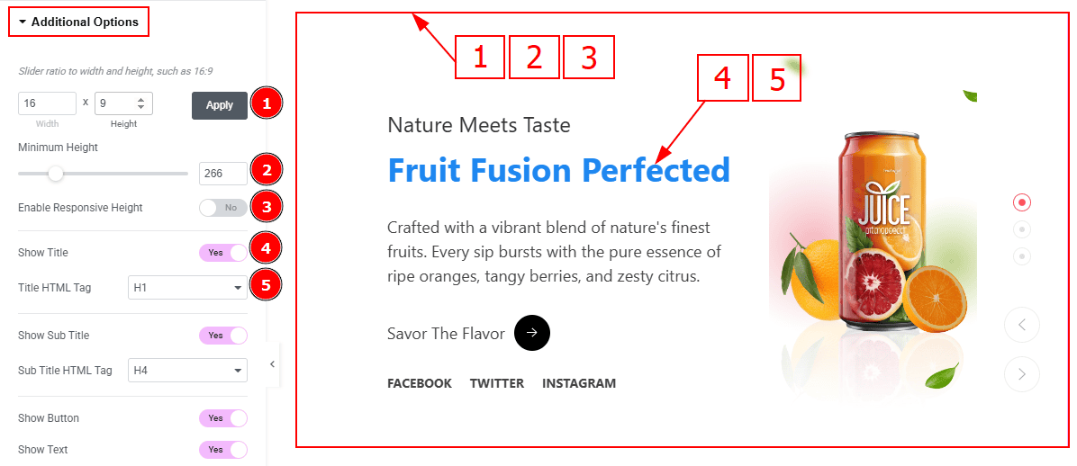
Slider Ratio: You can adjust the slider ratio to width & height with this option.
Minimum Height: You can adjust the slider height with this option.
Enable Response Height: Enable the switcher to set the slider height as responsive for all device.
Show Title: Enable the switcher to show the title to the audience.
Title HTML Tag: This option lets you select the heading for the title.
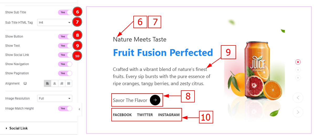
Show Sub Title: Enable the switcher to show the sub title to the audience.
Sub Title HTML Tag: This option lets you select the heading for the sub title.
Show Button: Enable the switcher to show the button to the audience.
Show Text: Enable the switcher to show the description to the audience.
Show Social Icon: You can show the social link to the audience by enabling this option.
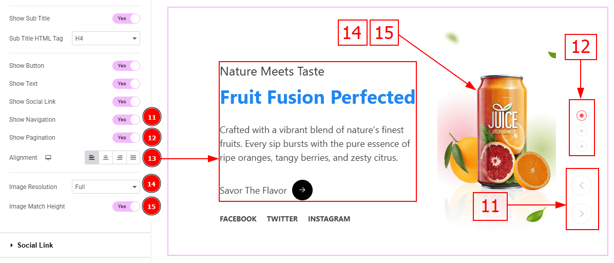
Show Navigation: Enable the switcher to show the navigation bar to the audience.
Show Pagination: Enable the switcher to show the page number to the audience.
Alignment: You can set the content position to left, center, right or justified with this option.
Image Resolution: You can change the image resolution with this option.
Image Match Height: Enable the switcher to match the image height with this option.
Social Link Section
Go to Content > Social Link
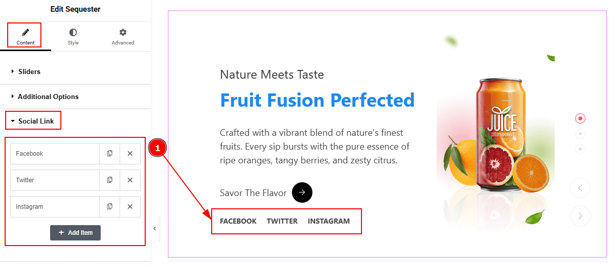
The settings in this section are the same as those in the Sliders section described above. For a detailed explanation, please refer to the Sliders section to understand how these options work.
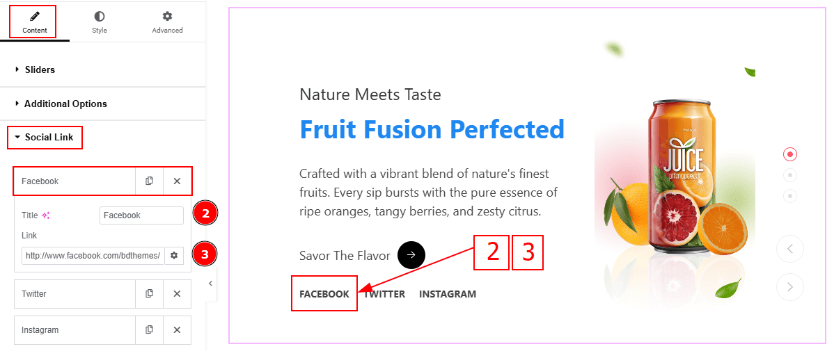
Now, let’s proceed to the inner options of the social icon -
Title: You can add a title to your social icon with this option.
Link: This option allows you to add a link to the social icon.
Slider Settings Section
Go to Content > Slider Settings
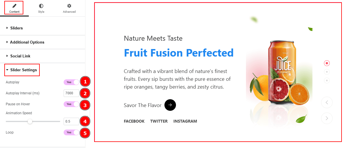
Autoplay: By enable this option you can automatically play the slides one after another.
Autoplay Interval (ms): This option let you set the time delay between each slide transition.
Pause on Hover: Enable the switcher to pause autoplay when the user hovers over the slider.
Animation Speed: This option controls how fast the transition animation occurs between slides.
Loop: Enable the switcher to go back to the first automatically after the last slide.
Advanced Animation Section
Go to Content > Advanced Animation
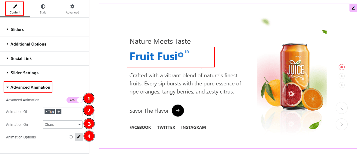
Advanced Animation: Enable or disable the switcher to show or hide the advanced animation feature.
Animation Of: You choose which text element(s) (e.g., Title, Subtitle) will be animated with this option.
Animation On: This option allows you to choose how the animation will apply: by Characters, Words, or Lines.
Animation Options: You can customize the animation feature with this option.
Work with The Style Tab
Sliders Section
Go to Style > Sliders
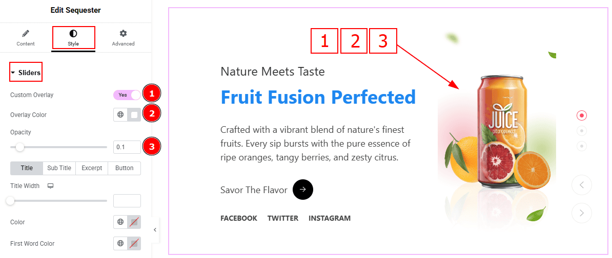
Custom Overlay: Enable the switcher to get more option to customize the overlay.
Overlay Color: You can change the overlay color with this option.
Opacity: You can adjust the blur effect of the overlay with this option.
In this section, we have four tabs. These are Title, Sub Title, Excerpt & Button. Let’s explore those tabs one by one.
Title Tab
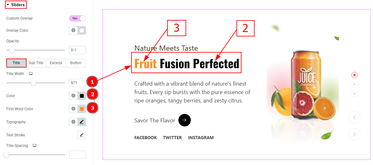
Title Width: You can set the title width with this option.
Color: You can change the title color with this option.
First Word Color: You can change the title first word color with this option.
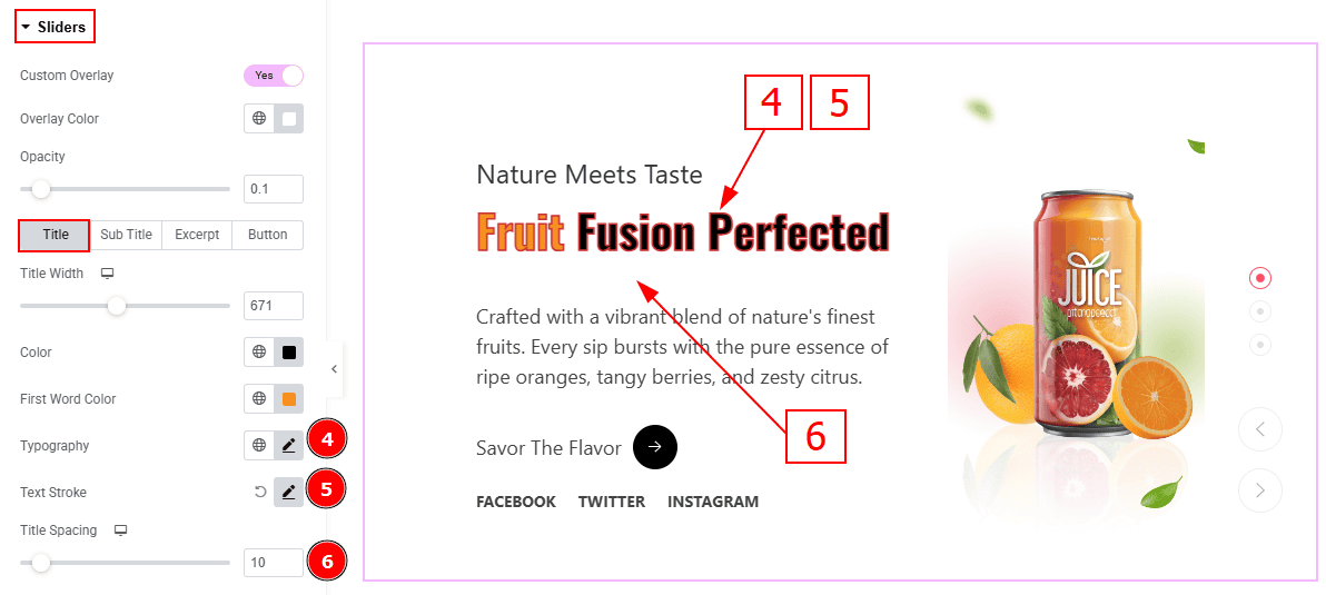
Typography: Change the font family, size, weight, transform, style, decoration, line height, letter spacing, and word spacing from here.
Text Stroke: This option allows you to add an outline or border around text, creating a visually distinct effect.
Title Spacing: You can adjust the space between title and the text with this option.
Sub Title Tab
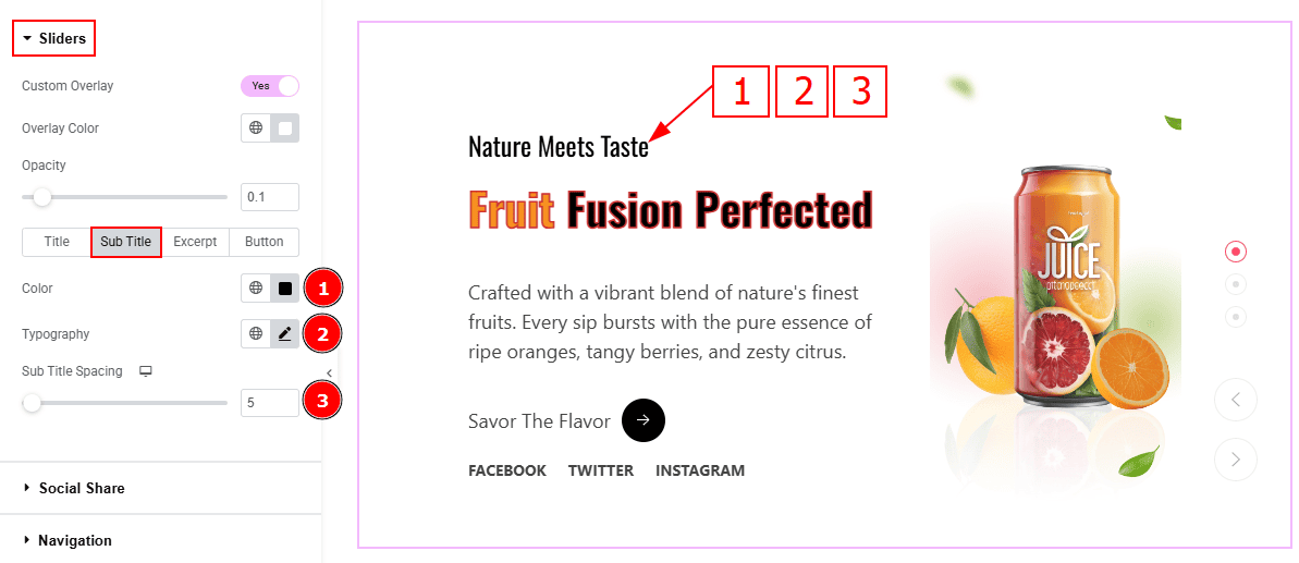
Color: You can change the subtitle color with this option.
Typography: You can change the font family, size, weight, transform, style, decoration, line height, letter spacing, and word spacing from here.
Sub Title Spacing: This option allows you to adjust the space between the title and the subtitle with this option.
Excerpt Tab
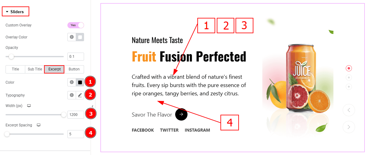
Color: You can change the excerpt text color with this option.
Typography: Change the font family, size, weight, transform, style, decoration, line height, letter spacing, and word spacing from here.
Width: You can adjust the width of the excerpt with this option.
Excerpt Spacing: You can adjust the space between the excerpt and the button with this option.
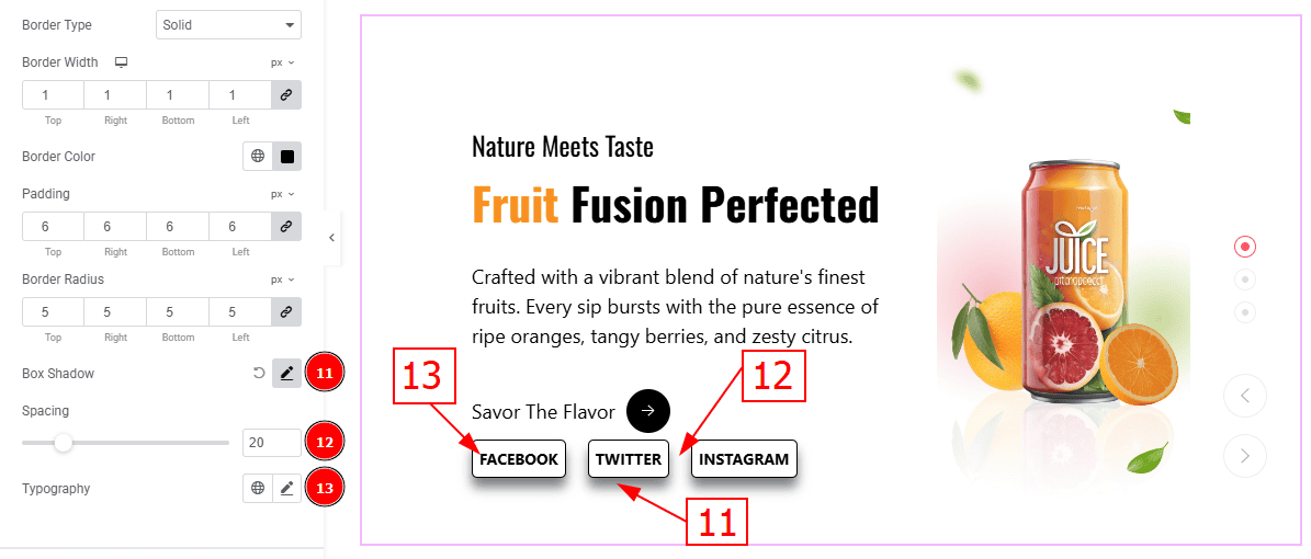
Button Tab
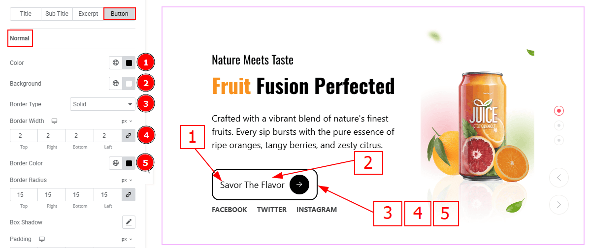
In this tab, we have two more sub section. One is Normal and the other is Hover. Let’s start with the Normal sub section -
Color: You can change the button text color with this option.
Background Color: You can change the background type with this option.
Border Type: You can add border with this option.
Border Width: Set the thickness of the border with this option.
Border Color: You can change the border color with this option.
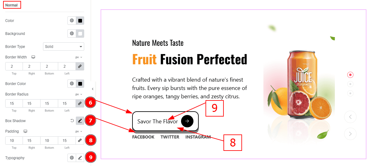
Border Radius: This option controls the roundness of the border.
Box Shadow: You can add the shadow effect to the button with this option.
Padding: Add spaces around an object to increase the inner area. Padding allows you to control the internal space within an element.
Typography: Change the button text font family, size, weight, transform, style, decoration, line height, letter spacing, and word spacing from here.
Icon Style
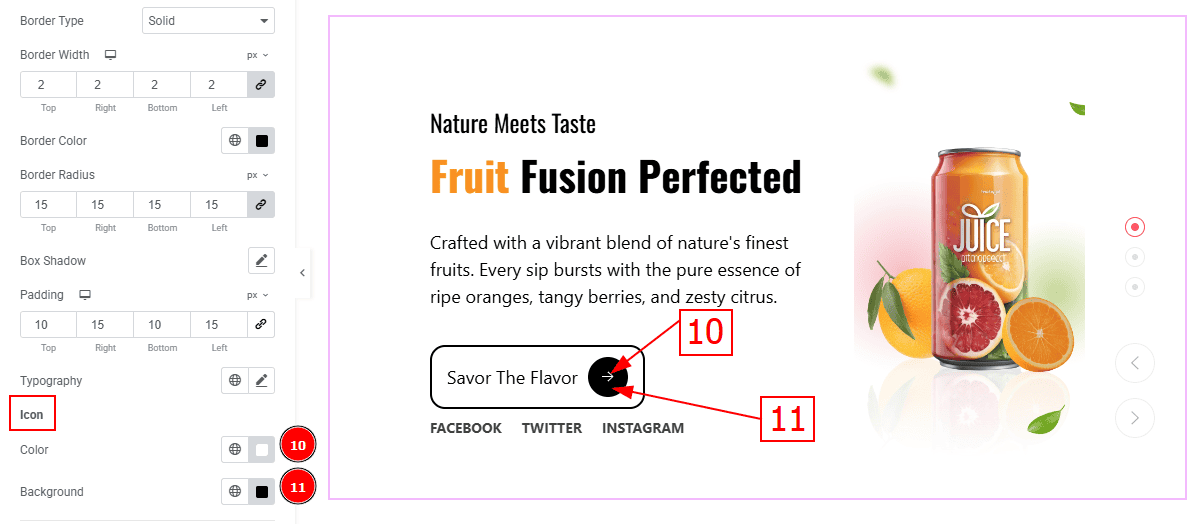
Color: You can change the icon color with this option.
Background: You can change the background color with this option.
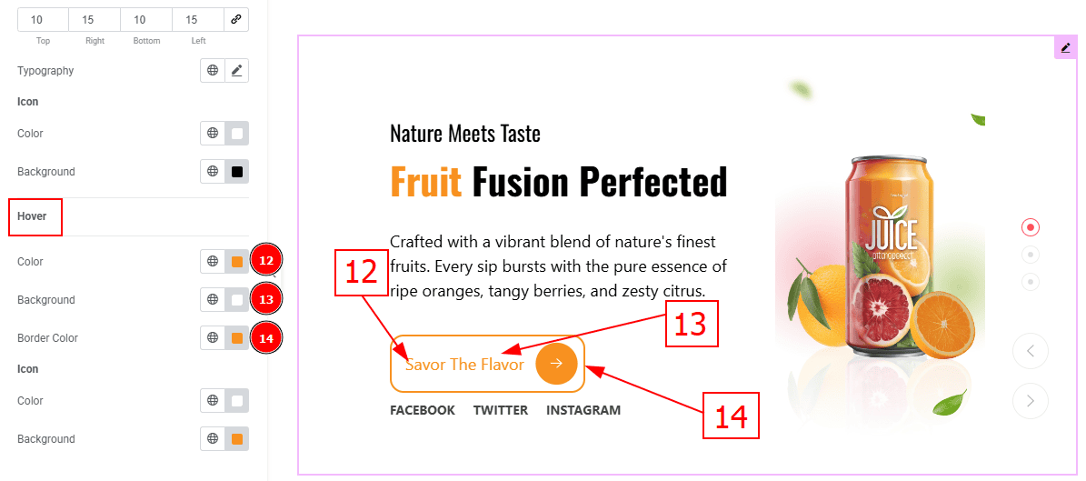
Now, Let’s Proceed to the Hover Tab -
Color: You can change the button text hover color with this option.
Background: You can change the background hover color with this option.
Border Color: You can change the border color with this option.
Icon
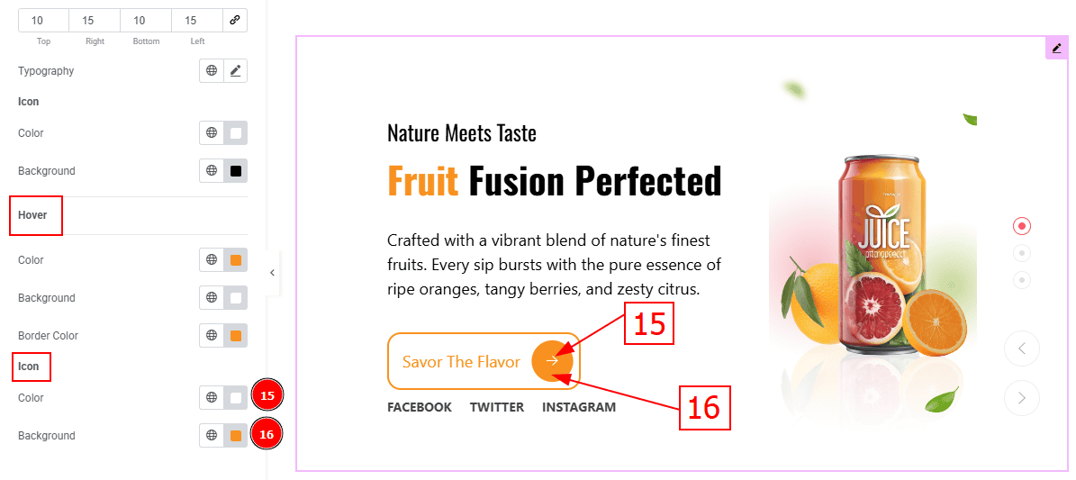
Color: You can change the icon hover color with this option.
Background: You can change the background hover color with this option.
Social Share Section
Go to Style > Social Share
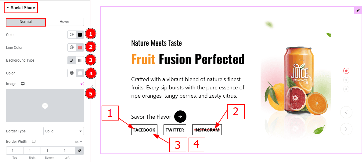
In this Section, we have two tabs. These are Normal & Hover. Let’s start with the Normal Tab -
Color: You can change the social icon text color with this option.
Line Color: You can change the line color with this option.
Background Type: You can select the background type to Classic or Gradient from here. Here we selected Classic.
Color: You can change the background hover color with this option.
Image: You can change the background image with this option.v
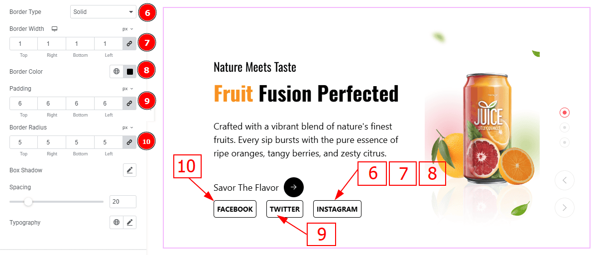
Border Type: You can add a border to the social icon with this option.
Border Width: Set the thickness of the border with this option.
Border Color: You can change the border color with this option.
Padding: You can adjust the inner space of the social icon with this option.
Border Radius: This option controls the roundness of the border.
Box Shadow: You can add a shadow effect with this option.
Spacing: This option allows you to adjust the space between the social share.
Typography: Change the font family, size, weight, transform, style, decoration, line height, letter spacing, and word spacing from here.
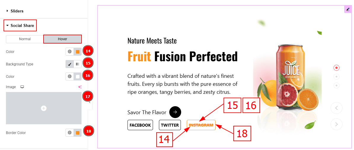
Now, let’s proceed to the Hover Tab -
Color: You can change the social share text hover color with this option.
Background Type: You can select the background type to Classic or Gradient from here. Here we selected the Classic.
Color: You can change the background hover color with this option.
Image: You can change the background image with this option.
Border Color: You can change the border hover color with this option.
Navigation Section
Go to Style > Navigation
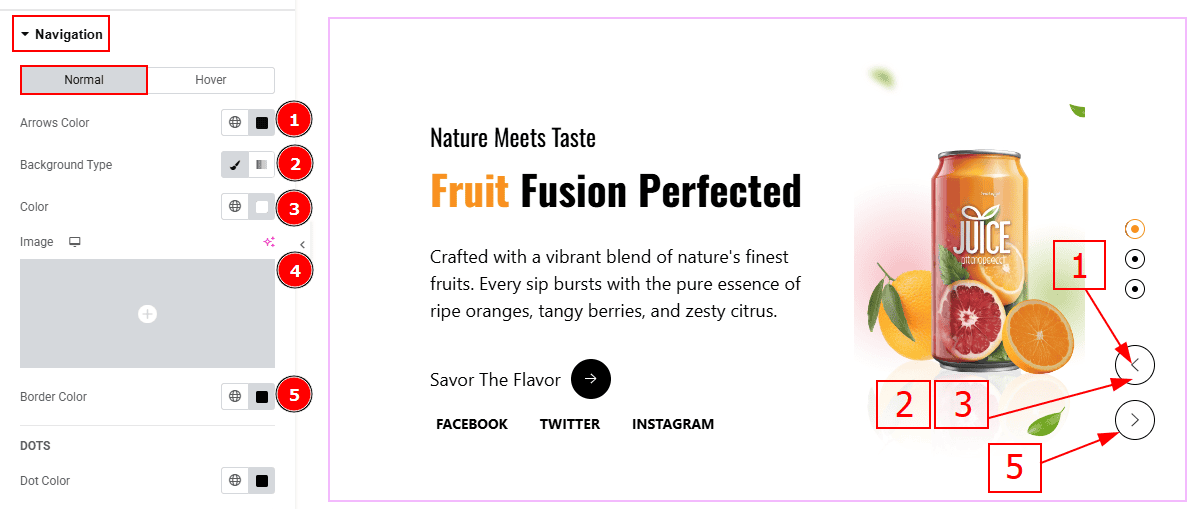
In this Section, we have two tabs. These are Normal & Hover. Let’s start with the Normal Tab -
Arrows Color: This option allows you to change the arrows' color.
Background Type: You can select the background type to Classic or Gradient from here. Here we selected the Classic.
Color: You can change the background hover color with this option.
Image: You can change the background image with this option.
Border Type: This option allows you to add a border.
DOTS
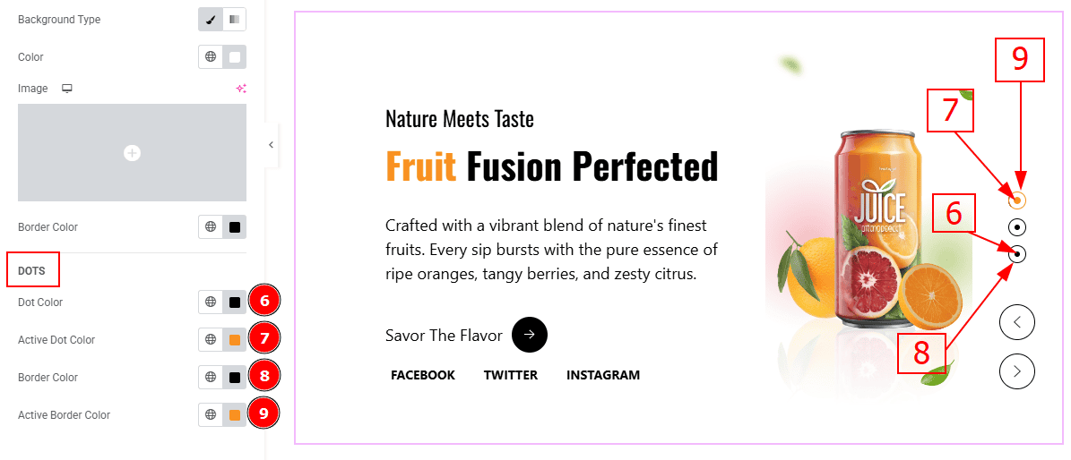
Dot Color: You can change the dot color with this option.
Active Dot Color: You can change the active dot color with this option.
Border Color: You can change the border color with this option.
Active Border Color: You can change the active border color with this option.
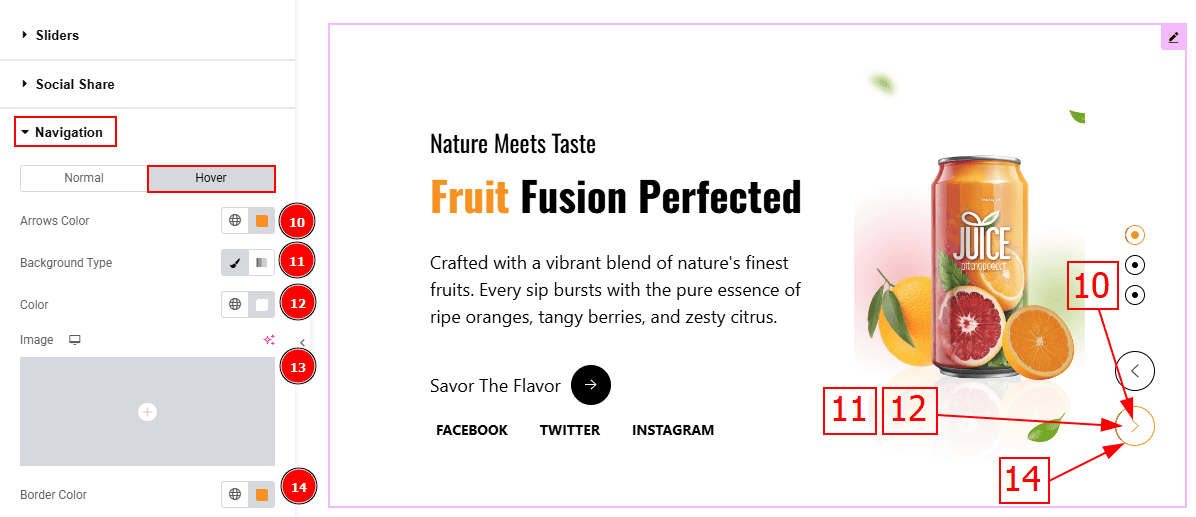
Now, let’s proceed to the Hover Tab -
Arrows Color: You can change the arrows' hover color with this option.
Background Type: You can select the background type to Classic or Gradient from here. Here we selected the Classic.
Color: You can change the background hover color with this option.
Image: You can change the background image with this option.
Border Color: You can change the border hover color with this option.
All done! You have successfully customized the Sequester Slider on your website.
Video Assist
You can also watch the video tutorial to learn more about the Sequester Slider. Please visit the demo page for examples.
Thanks for being with us.