
In this documentation, we will discuss the customization of the Crossroad Slider, brought to you by the Prime Slider addon for Elementor.
Enable The Crossroad Slider
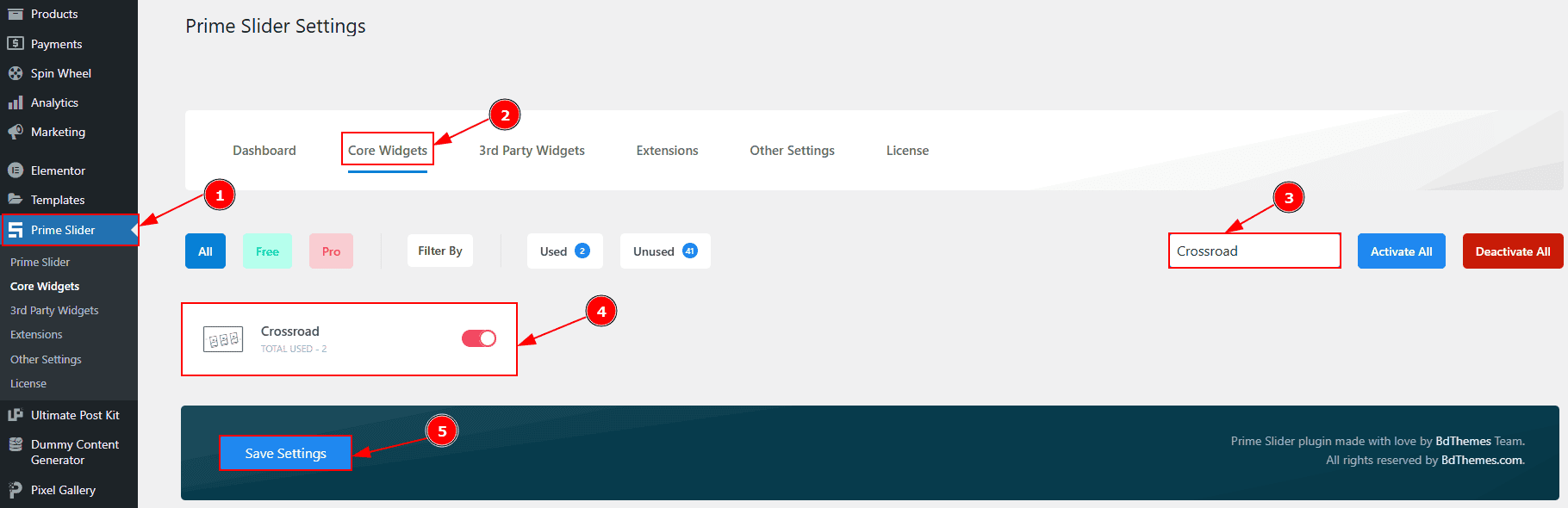
To use the Crossroad Slider from Prime Slider, first, you have to enable the widget.
Go to WordPress dashboard > Prime Slider Plugin dashboard.
Then, Click the Core Widgets Tab.
Search the Crossroad Slider Name.
Enable the Crossroad Slider.
Hit the Save Settings Button.
Inserting The Crossroad Slider
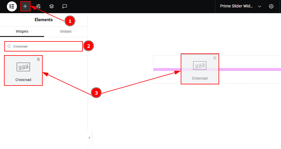
Go to the Elementor Editor Page and hit the “+” icon Button.
Search the Crossroad Slider widget.
Drag the widget and drop it on the editor page.
Work With The Content Tab
Slider Items Section
Go to Content > Slider Items
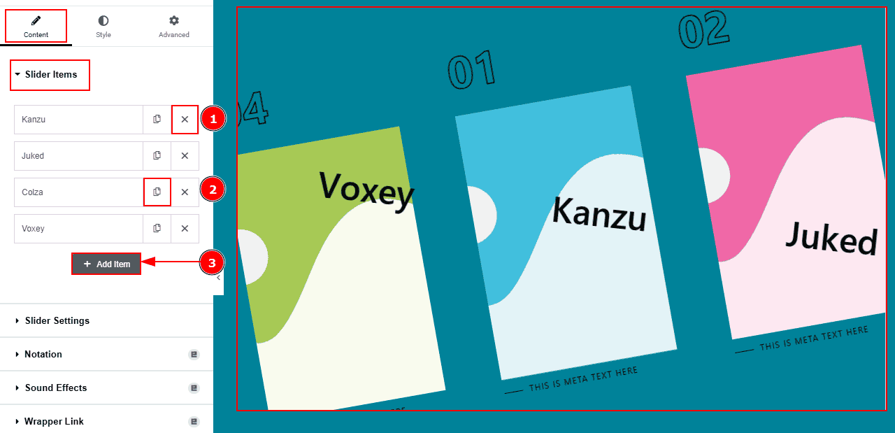
Close Item: You can delete the Slider item by clicking the Close icon button.
Copy Item: This option lets you copy the same item.
Add Item: You can add a new item by clicking the “+” Add Item button.
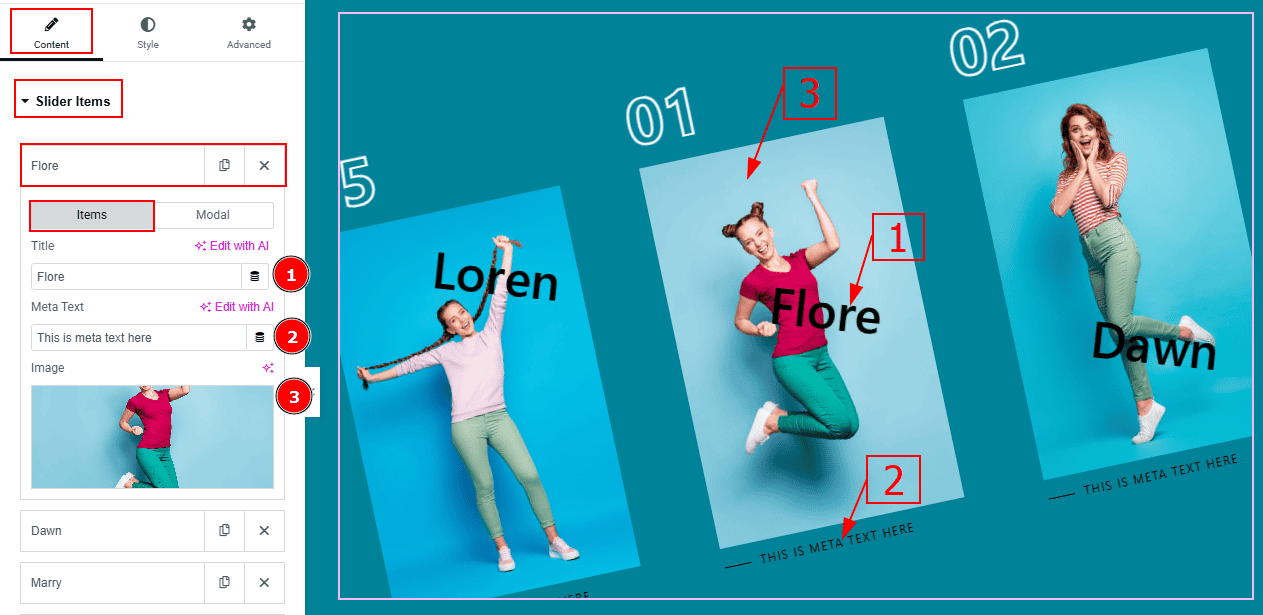
In the Slider Items, each item contains more options. There are two tabs that present those options. These are Items & Modal. Let’s start with the Items Tab -
Title: You can add the title text with this option.
Meta Text: You can add the meta text with this option.
Image: You can add or change image with this option.
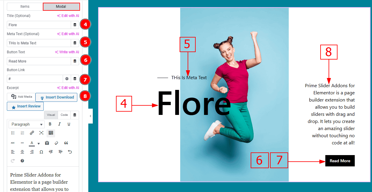
Now let’s proceed with the Modal Tab -
Title (optional): You can change the title text with this option.
Meta Text (Optional): You can change the meta text with this option.
Button Text: You can change the button text with this option.
Button Link: You can add a link to the button with this option.
Excerpt: This option allows to to add a short summary and customize the description.
Slider Settings Section
Go to Content > Slider Settings
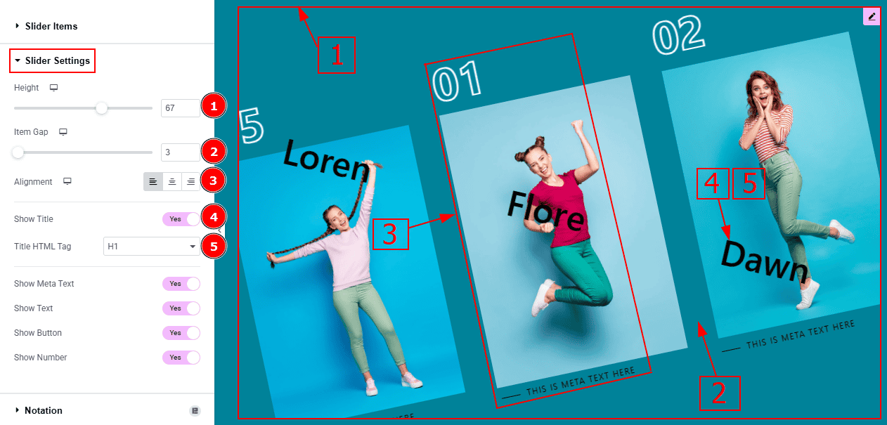
Height: You can adjust the slider height with this option.
Item Gap: You can adjust the space and gaps between the items with this option.
Alignment: You can set the content position to left, center or right with this option.
Show Title: Enable the switcher to show the title to the audience.
Title HTML Tag: This option lets you select the heading for the title.
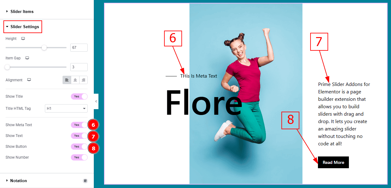
Show Meta Text: Enable the switcher to show the meta text to the audience.
Show Text: Enable the switcher to show the description to the audience.
Show Button: Enable the switcher to show the button to the audience.
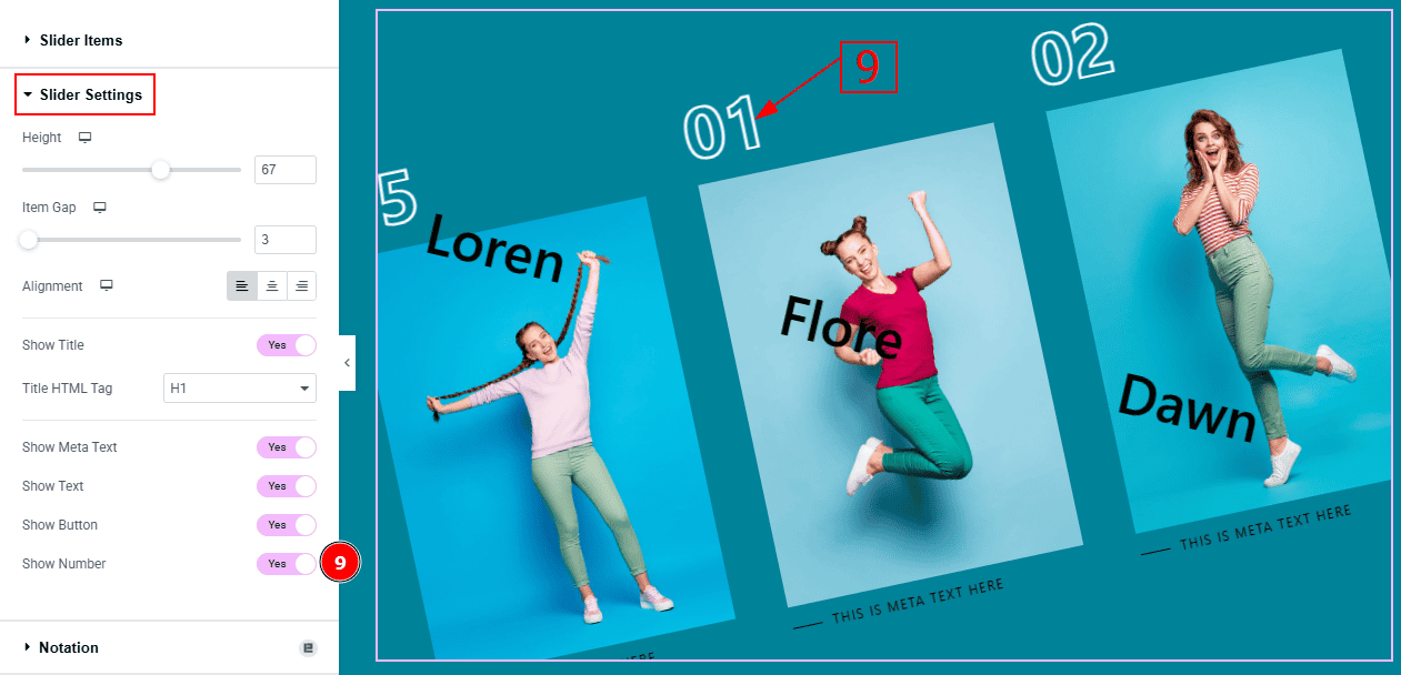
9. Show Number: Enable the switcher to show the number to the audience.
Work with The Style Tab
Items Section
Go to Style > Items
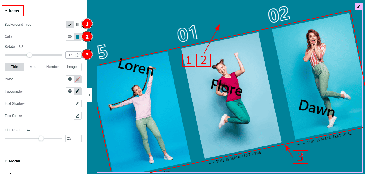
Background Type: You can change the background type to classic or gradient with this option.
Color: You can change the background color with this option.
Rotate: You can rotate the items with this option.
In this section, we have four tabs. These are Title, Meta, Number & Image. Let’s explore those tabs one by one.
Title Tab
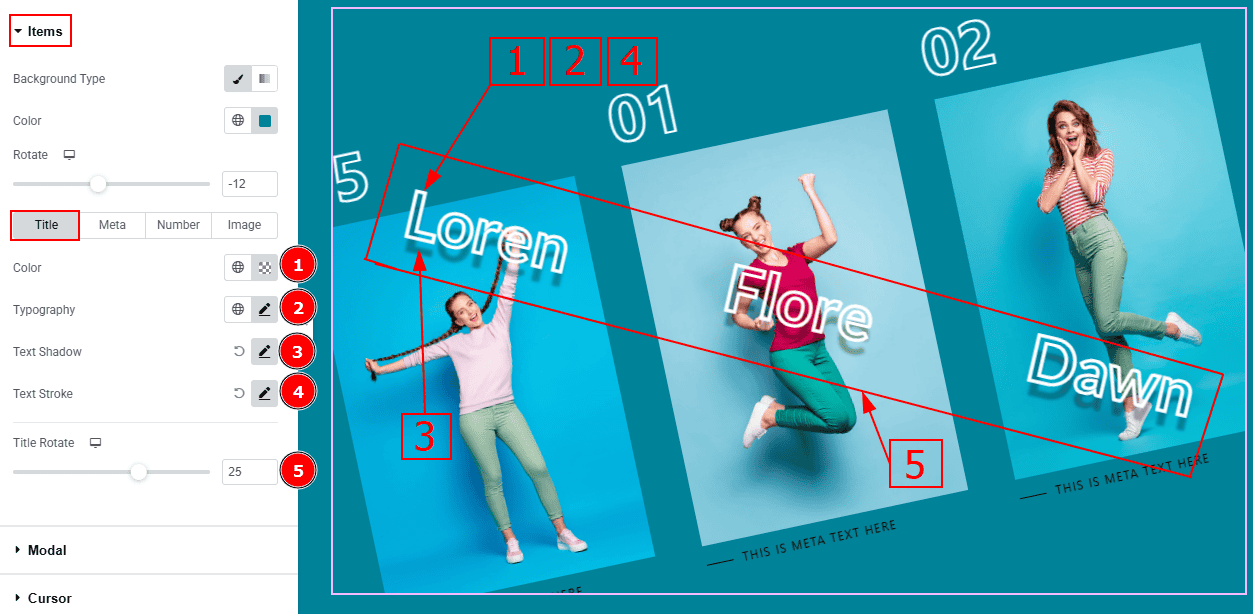
Color: You can change the title color with this option.
Typography: Change the font family, size, weight, transform, style, decoration, line height, letter spacing, and word spacing from here.
Text Shadow: This option allows you to add a shadow effect to the text.
Text Stroke: This option allows you to add an outline or border around text, creating a visually distinct effect.
Title Rotate: You can rotate the title with this option.
Meta Tab
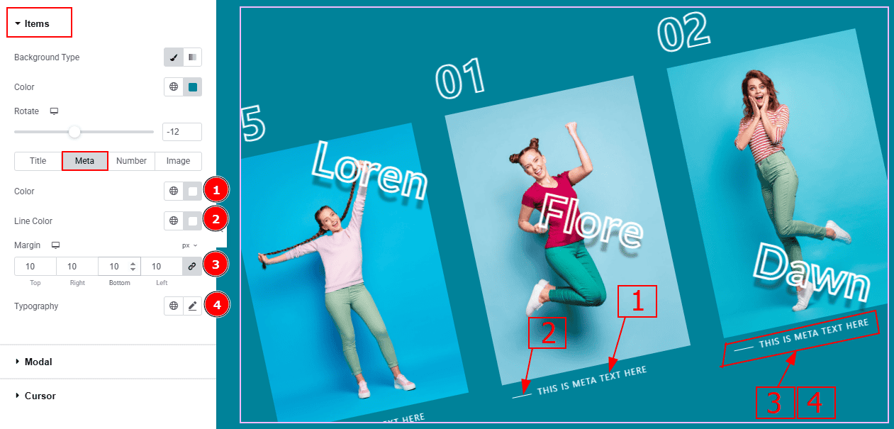
Color: You can change the title color with this option.
Line Color: You can change the line color with this option.
Margin: This option allows you to adjust the space & create gaps between elements.
Typography: You can change the font family, size, weight, transform, style, decoration, line height, letter spacing, and word spacing from here.
Number Tab
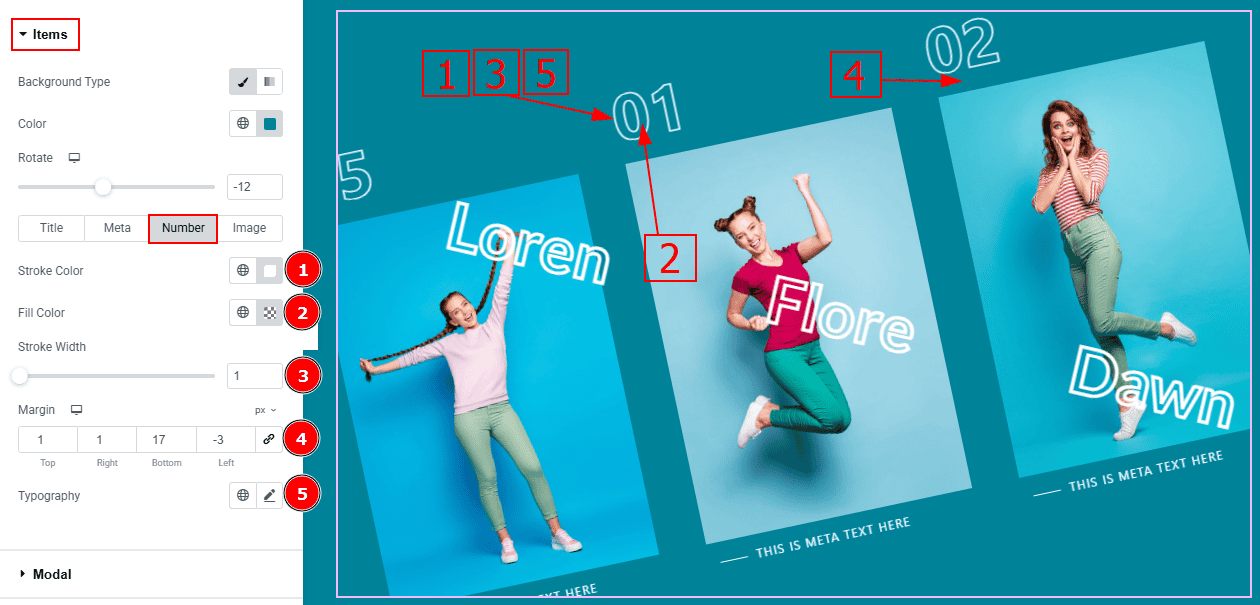
Color: You can change the excerpt text color with this option.
Fill Color: You can change the number’s fill color with this option.
Stroke Width: You can make changes to the number’s stroke width with this option.
Margin: This option allows you to adjust the space & create gaps between elements.
Typography: Change the font family, size, weight, transform, style, decoration, line height, letter spacing, and word spacing from here.
Image Tab
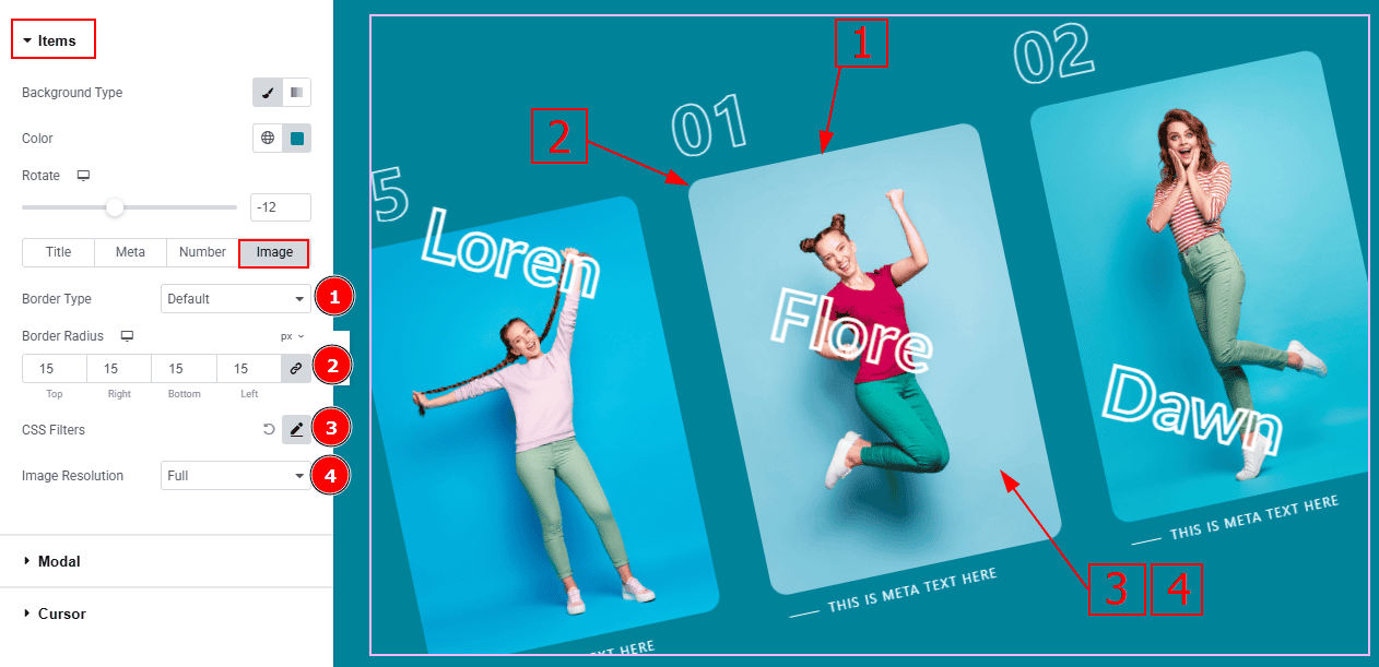
Border Type: You can add and change the border type with this option.
Border Radius: This option controls the roundness of the border.
CSS Filters: This setting lets you apply visual changes to the image. In this setting, you can modify properties like Blur, Brightness, Contrast, Saturation, and Hue.
Blur: Softens the image, reducing sharpness.
Brightness: Adjusts the overall lightness or darkness.
Contrast: Modifies the difference between light and dark areas.
Saturation: Controls the intensity of the colors.
Hue: Shifts the overall color spectrum.
Image Resolution: You can make changes to the image resolution with this option.
Modal Section
Go to Style > Modal
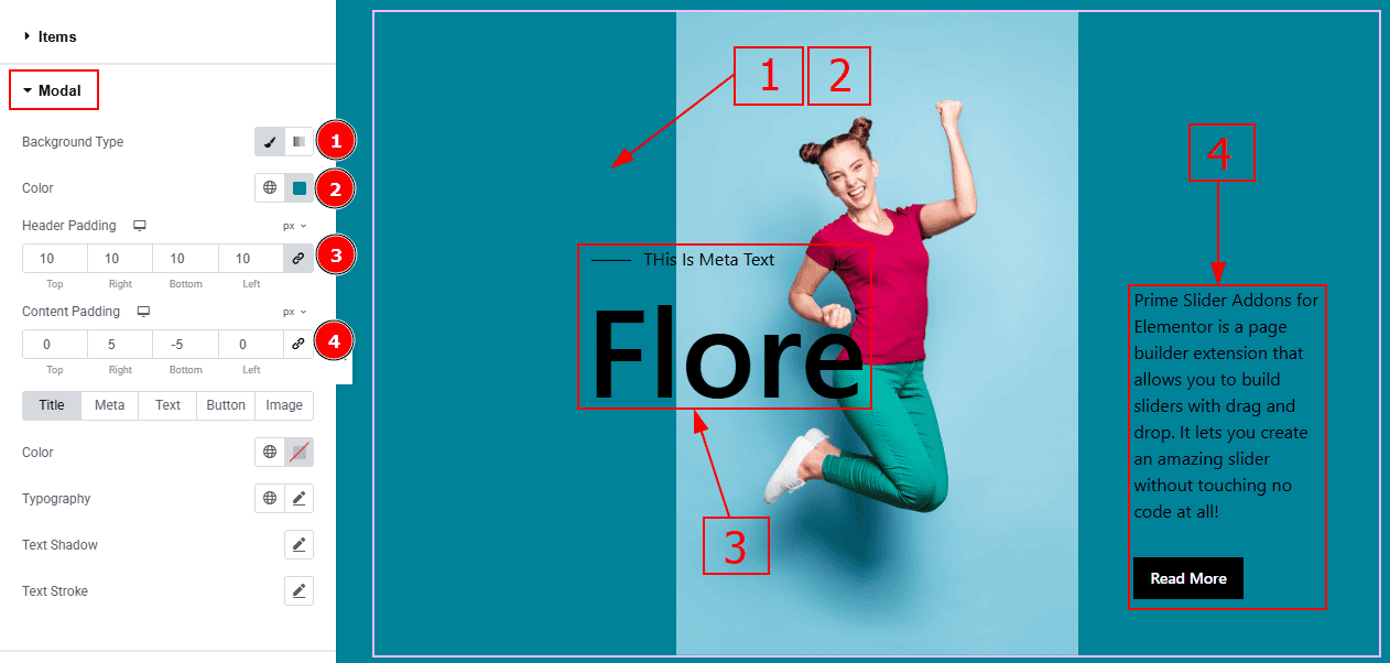
Background Type: You can change the background type with this option.
Color: You can change the background color with this option.
Header Padding: This option allows you to adjust the inner space of the heading field.
Content Padding: This option allows you to adjust the inner space of the content field.
In this section, we have five tabs. These are Title, Meta, Text, Button & Image. Let’s explore those tabs one by one.
Title Tab
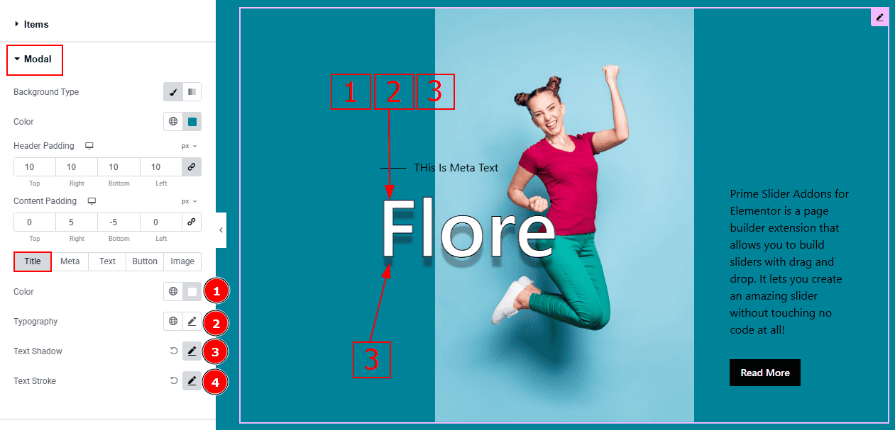
Color: You can change the title text color with this option.
Typography: Change the font family, size, weight, transform, style, decoration, line height, letter spacing, and word spacing from here.
Text Shadow: You can add a shadow effect to the title with this option.
Text Stroke: You can add an outline border to the text with this option.
Meta Tab
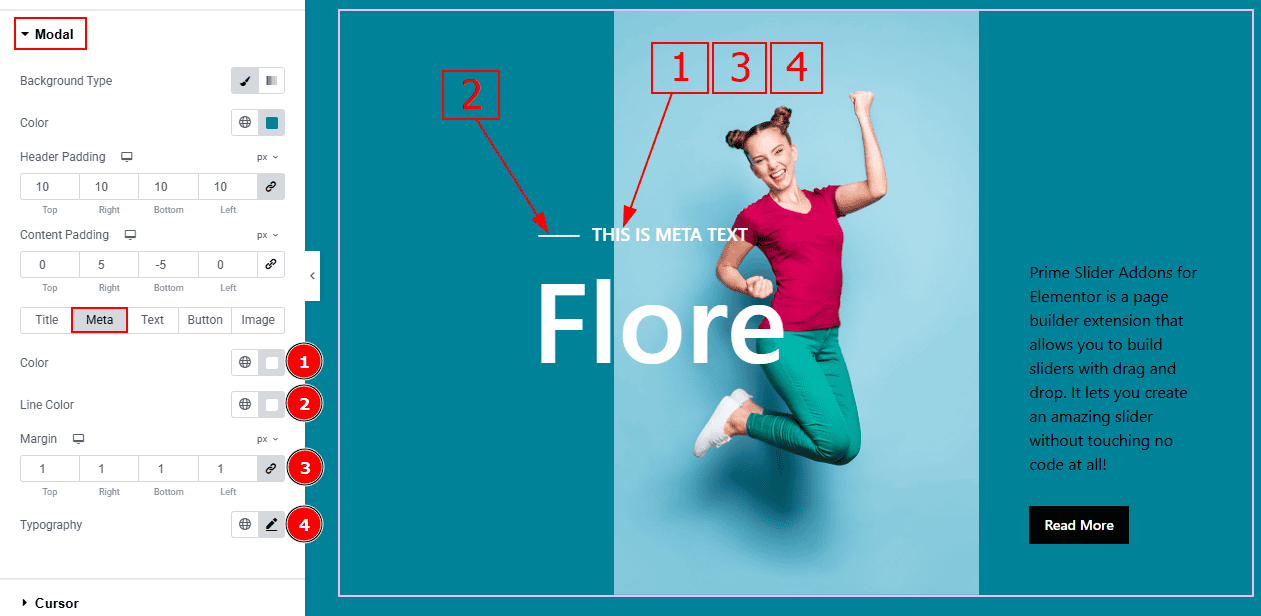
Color: You can change the meta text color with this option.
Line Color: You can change the line color with this option.
Margin: This option allows you to adjust the space & create gaps between elements.
Typography: Change the font family, size, weight, transform, style, decoration, line height, letter spacing, and word spacing from here.
Text Tab
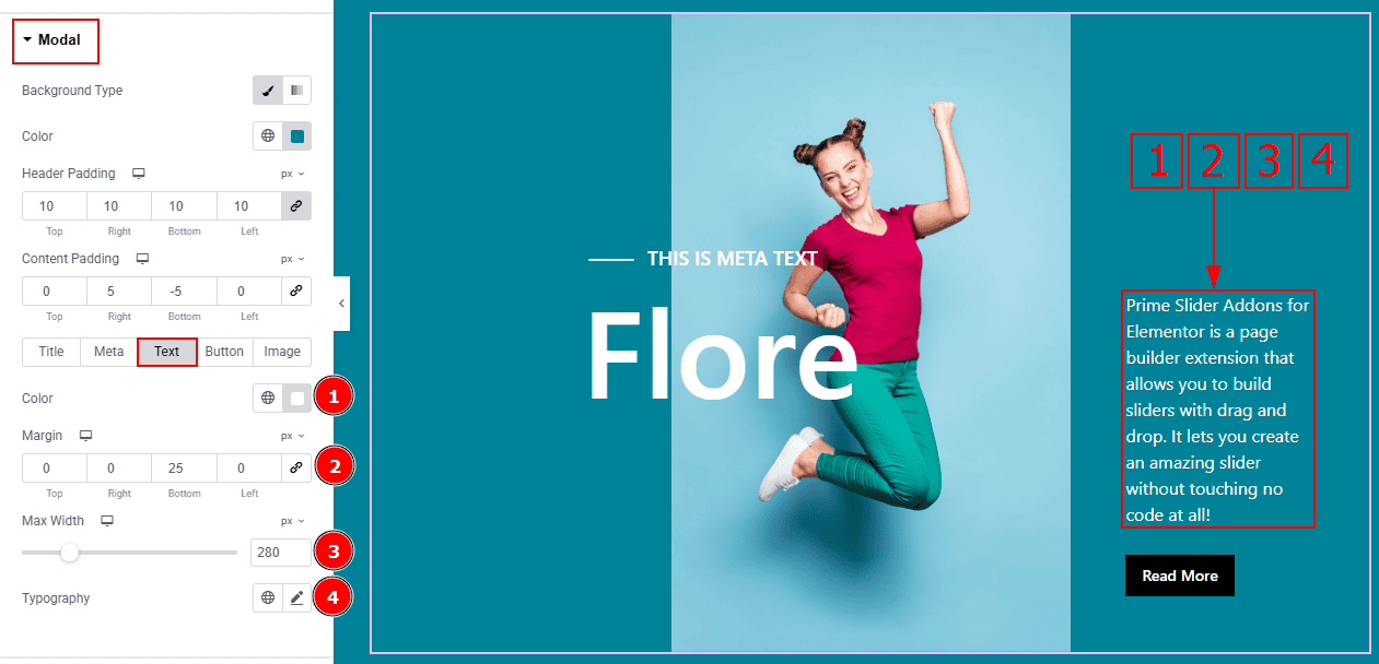
Color: You can change the text color with this option.
Margin: This option allows you to adjust the space & create gaps between elements.
Max Width: You can make changes to the text width with this option.
Typography: Change the font family, size, weight, transform, style, decoration, line height, letter spacing, and word spacing from here.
Button Tab
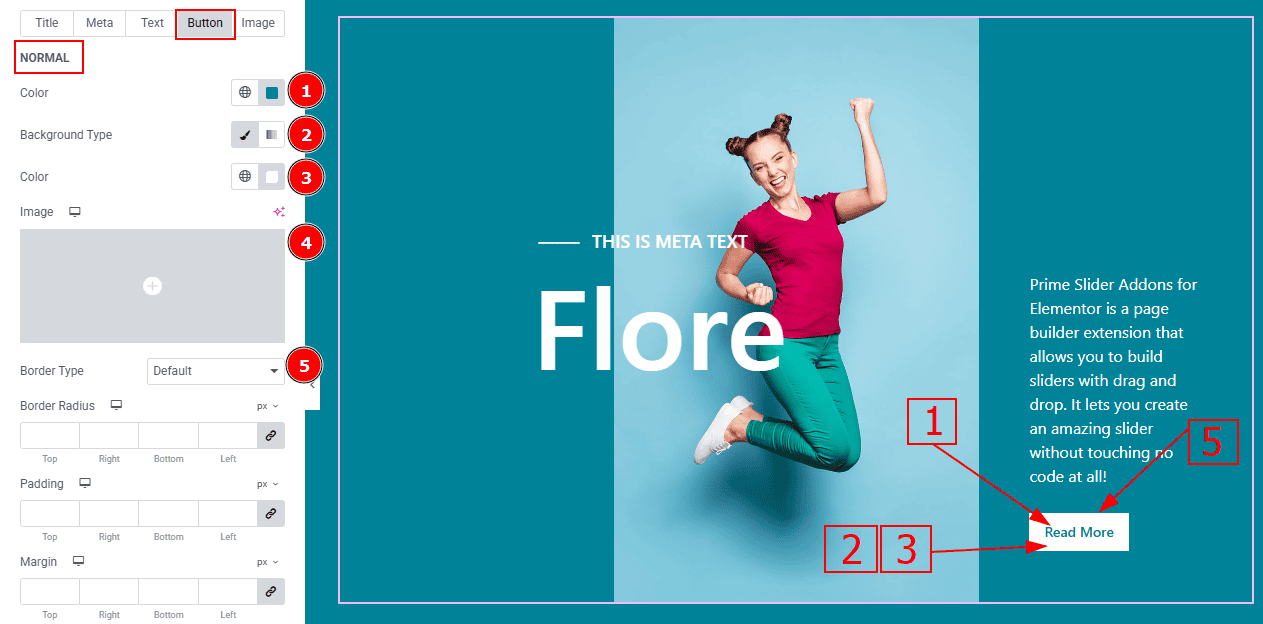
In this tab, we have two more sub-sections. One is Normal and the other is Hover. Let’s start with the Normal sub-section -
Color: You can change the button text color with this option.
Background Type: You can select the background type to classic or gradient with this option. Here we selected the classic background.
Color: You can change the background type with this option.
Image: You can change the background image with this option.
Border Type: You can add and change the border with this option.
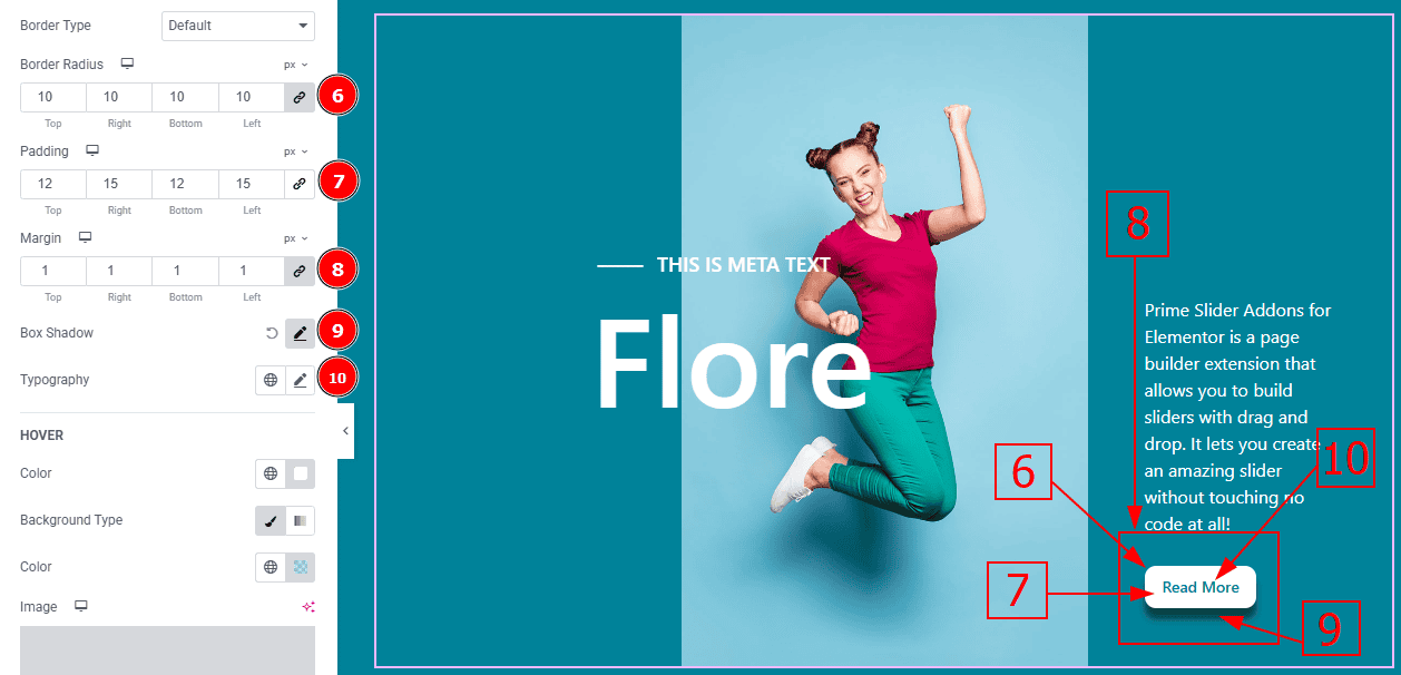
Border Radius: This option controls the roundness of the border.
Padding: Add spaces around an object to increase the inner area. Padding allows you to control the internal space within an element.
Margin: This option allows you to adjust the space & create gaps between elements.
Box Shadow: You can add the shadow effect to the button with this option.
Typography: Change the button text font family, size, weight, transform, style, decoration, line height, letter spacing, and word spacing from here.
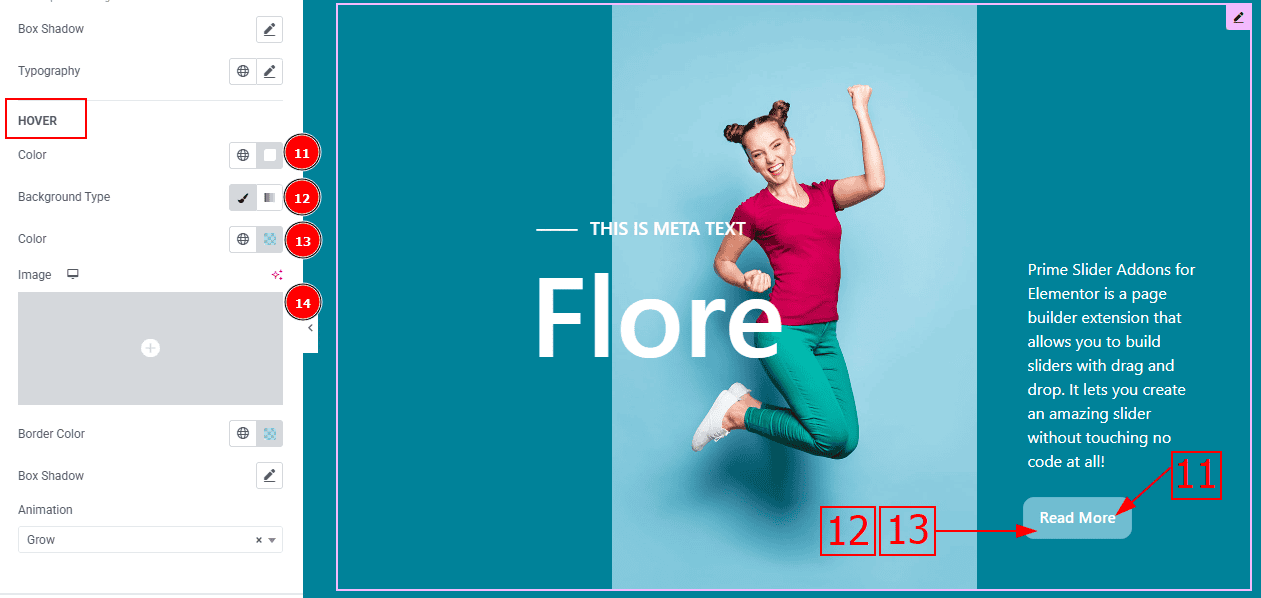
Now, Let’s Proceed to the Hover Tab -
Color: You can change the button text hover color with this option.
Background Type: You can select the background type to Classic or Gradient from here. Here we selected the Classic.
Color: You can change the background hover color with this option.
Image: You can change the background image with this option.
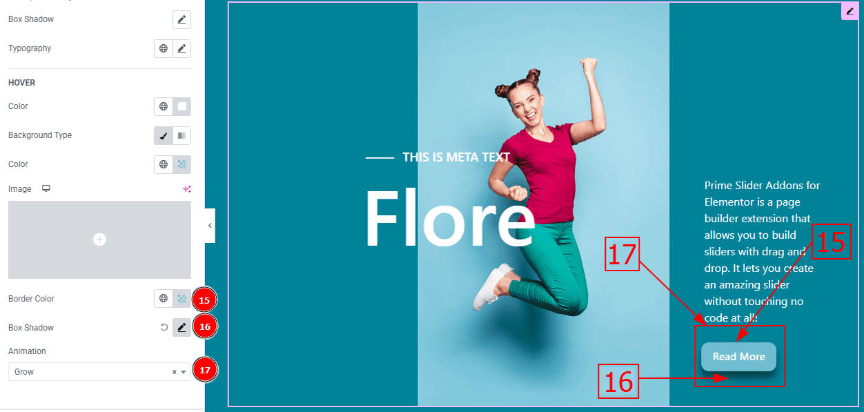
Border Color: You can change the border color with this option.
Box Shadow: You can add a shadow effect to the button with this option.
Animation: You can select the animation type that you want to add to the button with this option.
Image Tab
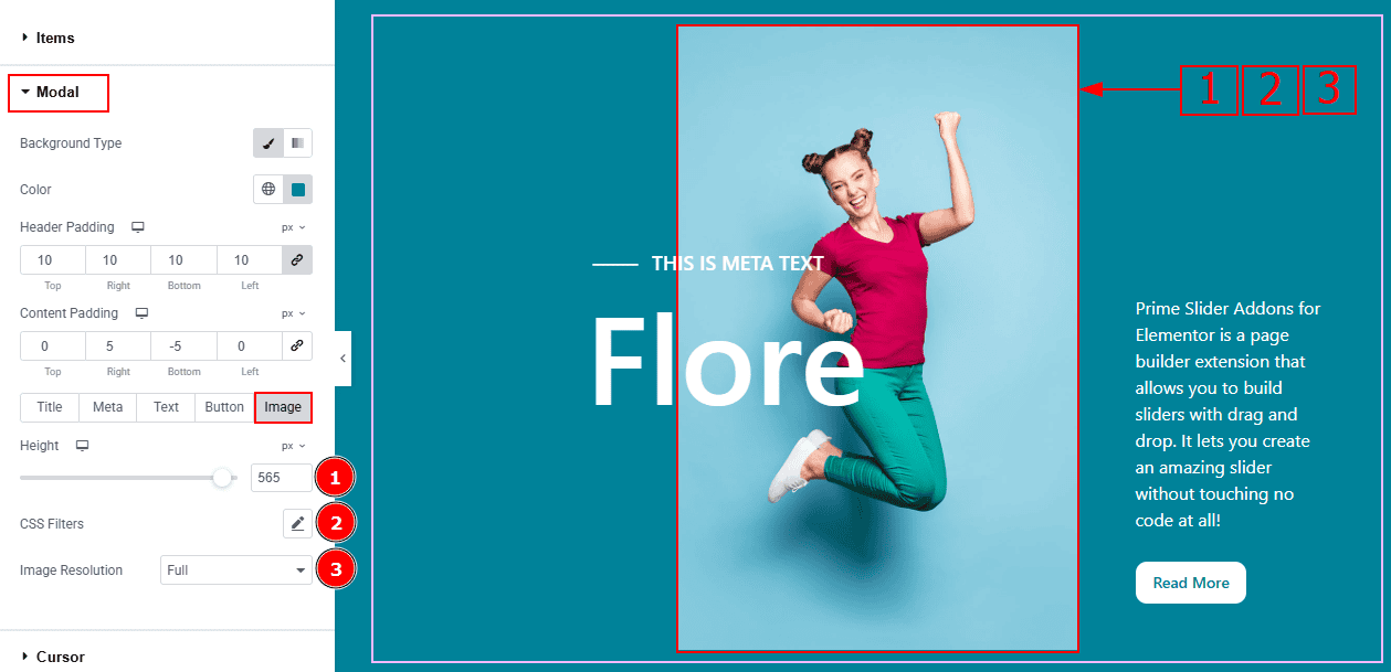
Height: You can adjust the image height with this option.
CSS Filters: This setting lets you apply visual changes to the image. In this setting, you can modify properties like Blur, Brightness, Contrast, Saturation, and Hue.
Image Resolution: You can adjust the image resolution with this option.
Cursor Section
Go to Style > Cursor
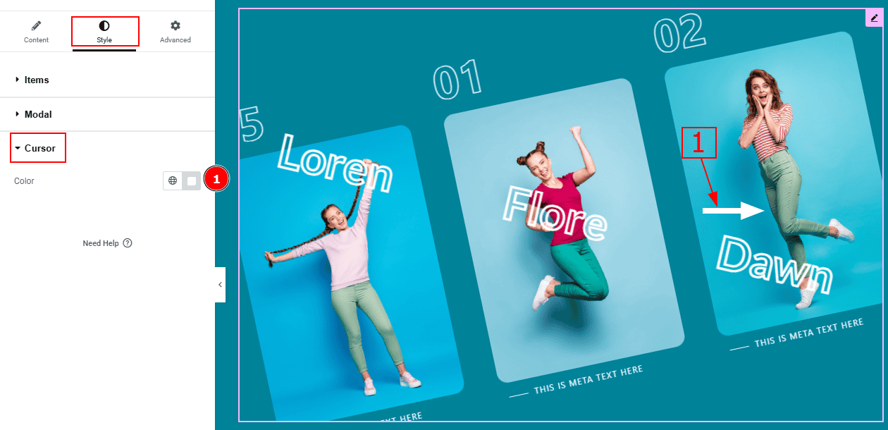
1. Color: You can change the cursor color with this option.
All done! You have successfully customized the Crossroad Slider on your website.
Video Assist
You can also watch the video tutorial to learn more about the Crossroad Slider. Please visit the demo page for examples.
Thanks for being with us.