
In this documentation, we will discuss the customization of the Event Calendar Slider, brought to you by the Prime Slider addon for Elementor.
Enable The Event Calendar Slider
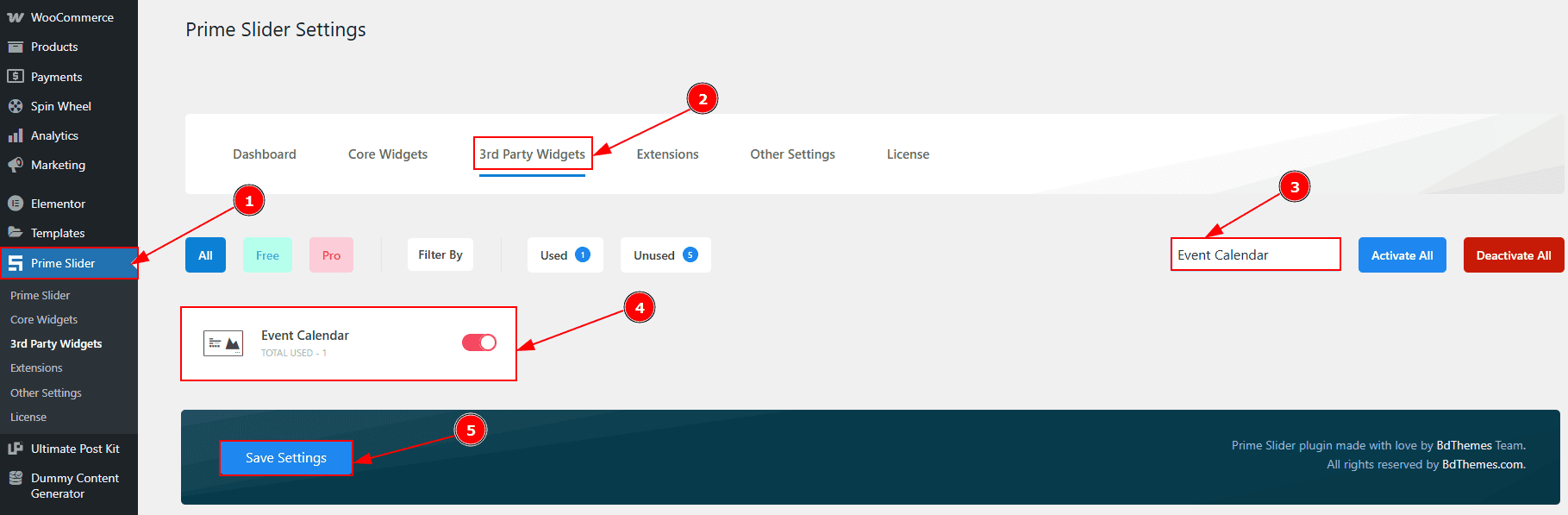
To use the Event Calendar Slider from Prime Slider, first, you have to enable the slider.
Go to WordPress dashboard > Prime Slider Plugin dashboard.
Then, Click the 3rd Party Widgets Tab.
Search the Event Calendar slider Name.
Enable the Event Calendar slider.
Hit the Save Settings Button.
Inserting The Event Calendar Slider
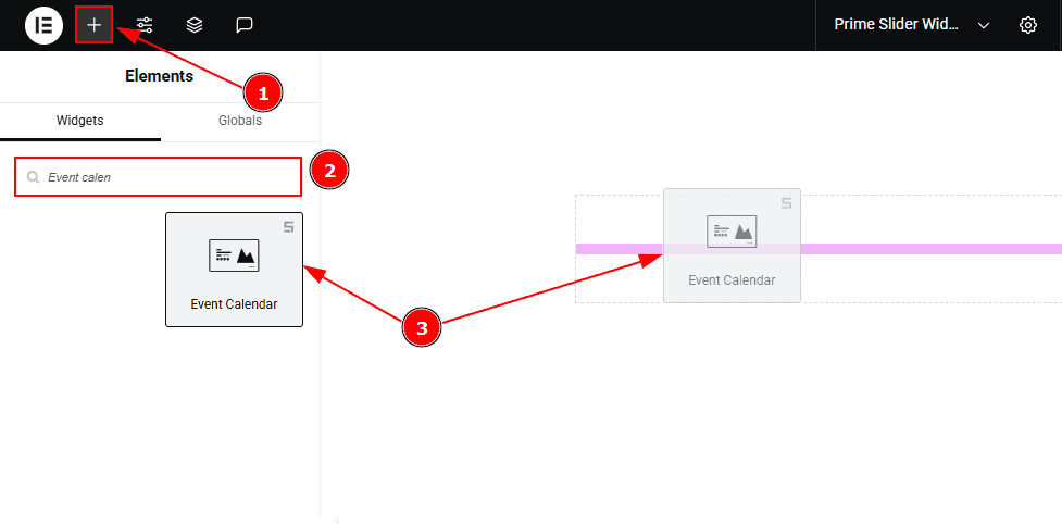
Go to the Elementor Editor Page and hit the “+” icon Button.
Search the Event Calendar slider name.
Drag the widget and drop it on the editor page.
(Note: Since this is a third-party widget, you’ll need to install the required plugin and create the events you want to display. Otherwise, the slider will appear blank.)
Work With The Content Tab
Layout Section
Go to Content > Layout
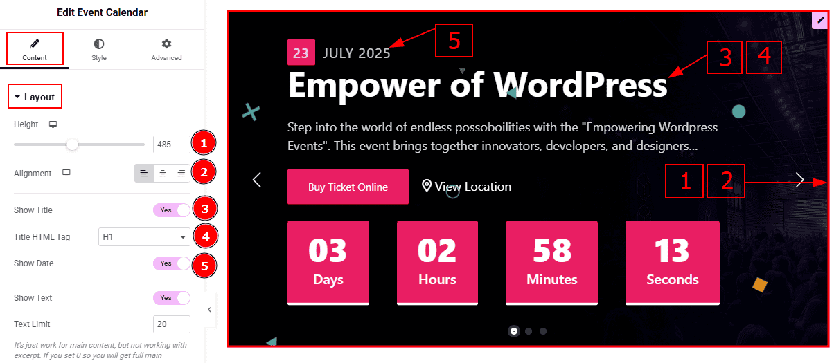
Height: You can adjust the slider height with this option.
Alignment: You can adjust the content’s alignment to left, center or right with this option.
Show Title: Enable the switcher to show the title to the audience.
Title HTML Tag: This option lets you select the heading for the title.
Show Date: Enable the switcher to show the event date on the slider.
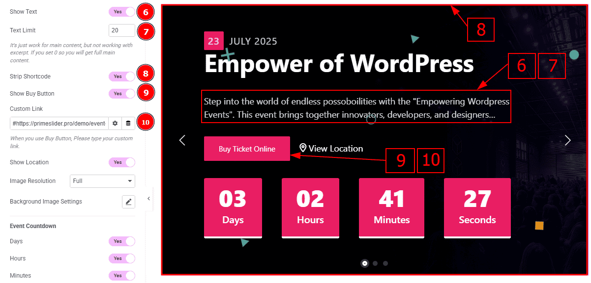
Show text: Enable the switcher to show the text/description to the audience. 7 Text Limit: This option allows you to adjust the text’s word limit.
Strip Shortcode: This option removes any shortcodes from the blog's main content.
Show Buy Button: Enable the switcher to show the buy button to the audience.
Custom Link: You can set a link to the buy button with this option.
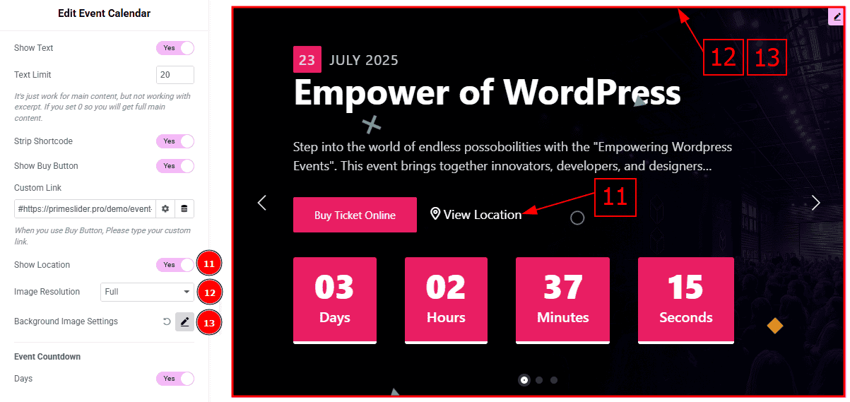
Show Location: Enable the switcher to show the location to the audience.
Image Resolution: You can change the image resolution with this option.
Background Image Setting: You can make changes to the setting of the image with this option.
In this section, we have another sub-seciton named Event Countdown. Let’s explore this sub-section -
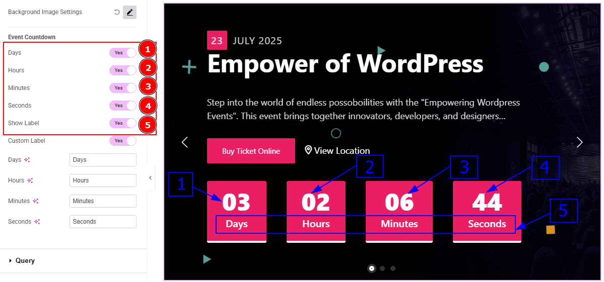
Days: Enable the switcher to show the countdown days number on the slider.
Hours: Enable the switcher to show the hours on the slider.
Minutes: Enable the switcher to show the minutes on the slider.
Seconds: Enable the switcher to show seconds on the slider.
Show Label: Enable the switcher to show the label below the numbers on the slider.
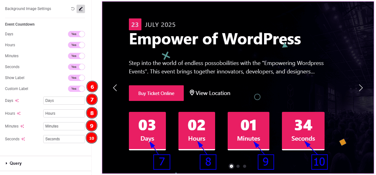
Custom Label: Enable the switcher to get options to customize the labels on the slider.
Days: You can change the days label text with this option.
Hours: You can change the hours label text with this option.
Minutes: You can change the minutes label text with this option.
Seconds: You can change the seconds label text with this option.
Query Section
Go to Content > Query
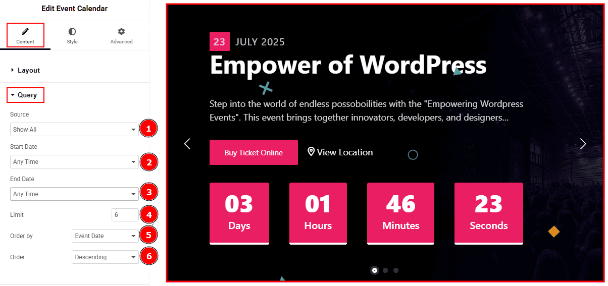
Source: Select the source type for the slider from this section. You can choose between "Show All" and "Manual Selection". Show All displays all available events in the slider. Manual Selection allows you to filter and display events based on specific categories.
Start Date: You can select the start date of events to appear on the slider with this option.
End Date: You can select the end date of events to appear on the slider with this option.
Limit: You can adjust the limit here of how many events you want to show in the slider.
Order By: It controls the data you want to display through event date, title, category & random. Here we selected the order by event date.
Order: This option controls the order in which data is arranged. There are two types of order. Ascending Order (Starts from the smallest or lowest value and goes to the largest or highest.) & Descending Order (Starts from the largest or highest value and goes to the smallest or lowest.)
Navigation Section
Go to Content > Navigation
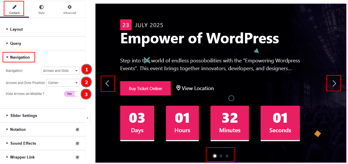
Navigation: You can select the navigation type to arrows & Dots, arrows, dots or none with this option. Here, we selected the navigation type as arrows and dots.
Arrows and Dots Position: You can adjust the arrows and dots position with this option.
Hide Arrows on Mobile: Enable the switcher to hide arrows on mobile device.
Slider Settings Section
Go to Content > Slider Settings
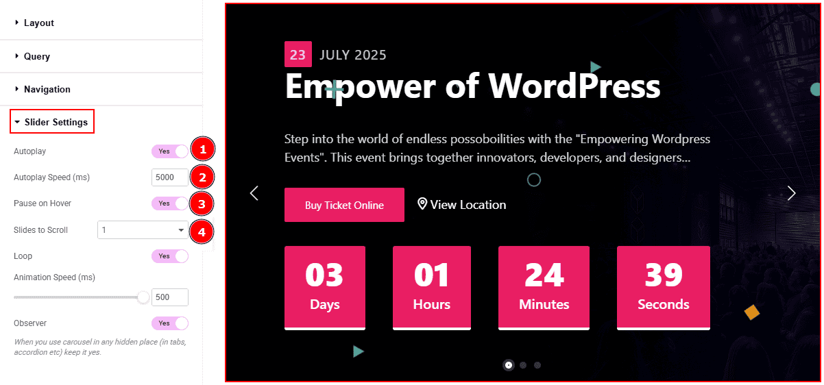
Autoplay: By enabling this option, you can automatically play the slides one after another.
Autoplay Interval (ms): This option lets you set the time delay between each slide transition.
Pause on Hover: Enable the switcher to pause autoplay when the user hovers over the slider.
Sliders to Scroll: You can adjust the number of slides that you want to slide in transition.
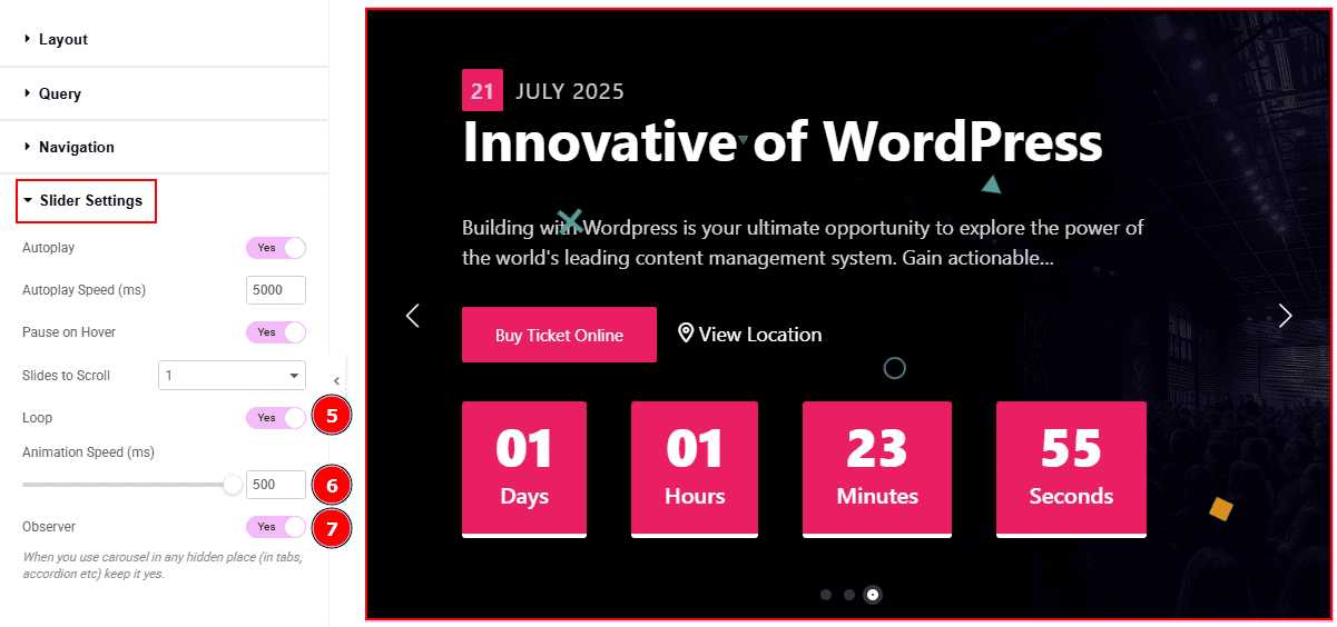
Loop: Enable the switcher to go back to the first automatically after the last slide.
Animation Speed (ms): This option controls how fast the transition animation occurs between slides.
Observer: Enabling this option helps the slider function correctly when it’s initially hidden.
Work with The Style Tab
Wrapper Section
Go to Style > Wrapper
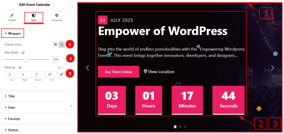
Overlay Color: You can change the overlay color with this option.
Max Width: You can adjust the content width with this option.
Padding: This option allows you to adjust the inner space and create gaps in the content.
Title Section
Go to Style > Title
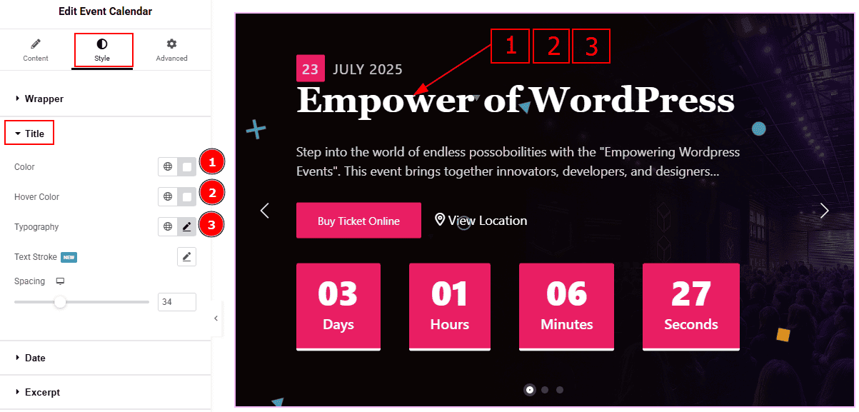
Color: You can change the title color with this option.
Hover Color: You can change the title hover color with this option.
Typography: Change the font family, size, weight, transform, style, decoration, line height, letter spacing, and word spacing from here.
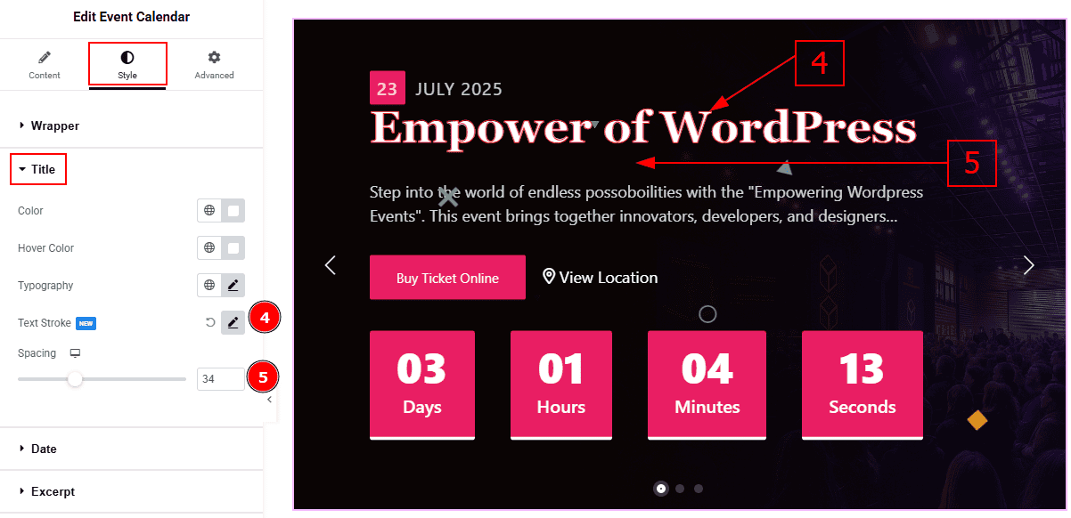
Text Stroke: This options refers to the outline effect applied to text, allowing you to add a border around the letters.
Spacing: You can adjust the space between the title and the text with this option.
Date Section
Go to Style > Date
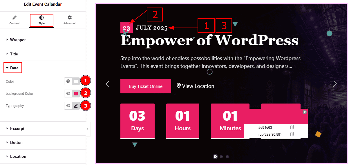
Color: You can change the date text color with this option.
Background Color: You can change the date background color with this option.
Typography: Change the font family, size, weight, transform, style, decoration, line height, letter spacing, and word spacing from here.
Excerpt Section
Go to Style > Excerpt
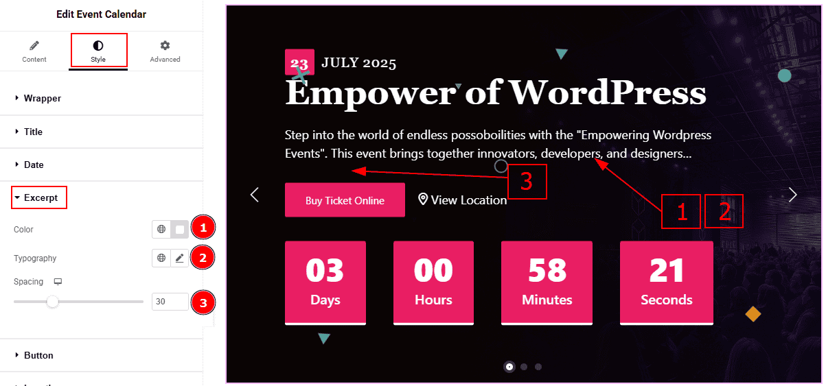
Color: You can change the excerpt text color with this option.
Typography: Change the font family, size, weight, transform, style, decoration, line height, letter spacing, and word spacing from here.
Spacing: You can adjust the space between the text and the button with this option.
Button Section
Go to Style > Button
In this section, we have two more tabs. These are Normal & Hover. Let’s start with the Normal Tab -
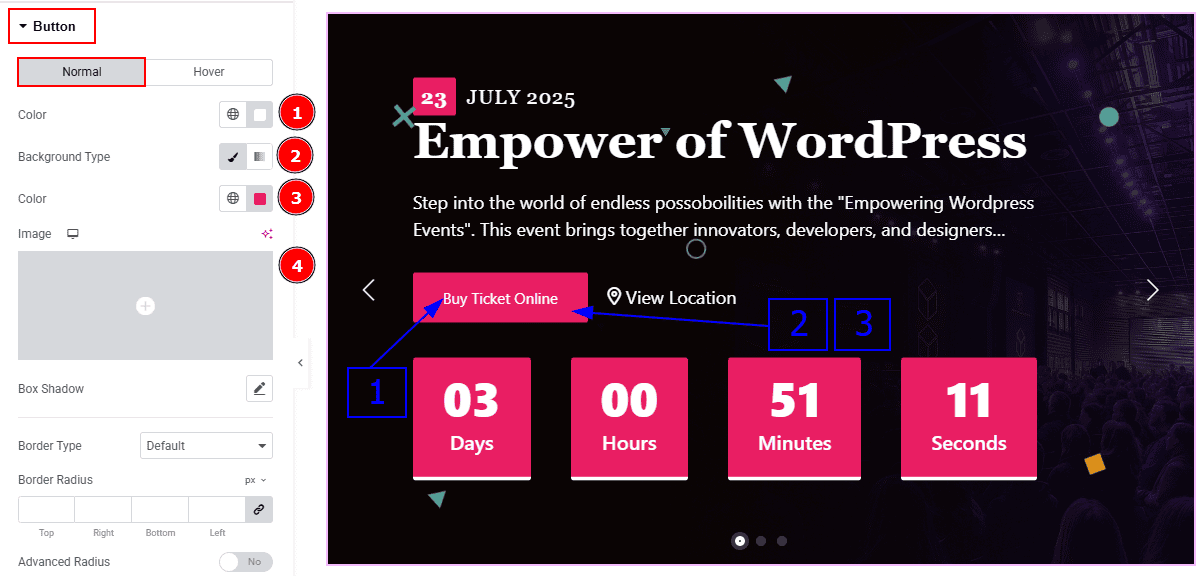
Color: You can change the button text color with this option.
Background Type: You can select the background type to classic or gradient with this option.
Color: You can change the background color with this option.
Image: You can change the background image with this option.
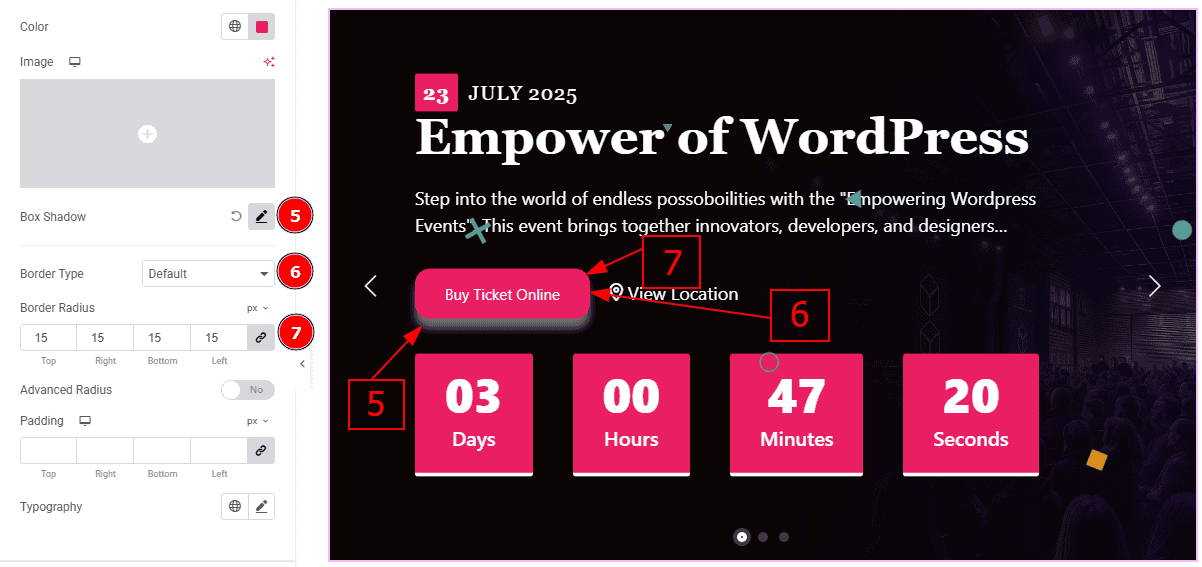
Box Shadow: While working with this option, you will get three more options (Blur, Horizontal & Vertical). Blur Controls how sharp or soft the shadow will appear. By using the horizontal option you can move the shadow left or right and by using the vertical option you can move the shadow up or down.
Border Type: You can set the border to the button with this option.
Border Radius: This option controls the roundness of the border.
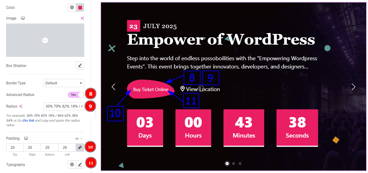
Advanced Radius: Enable the switcher to get more attractive visual of the border radius.
Radius: You can customize the border radius with this option.
Padding: You can adjust the inner space of the button with this option.
Typography: Change the font family, size, weight, transform, style, decoration, line height, letter spacing, and word spacing from here.
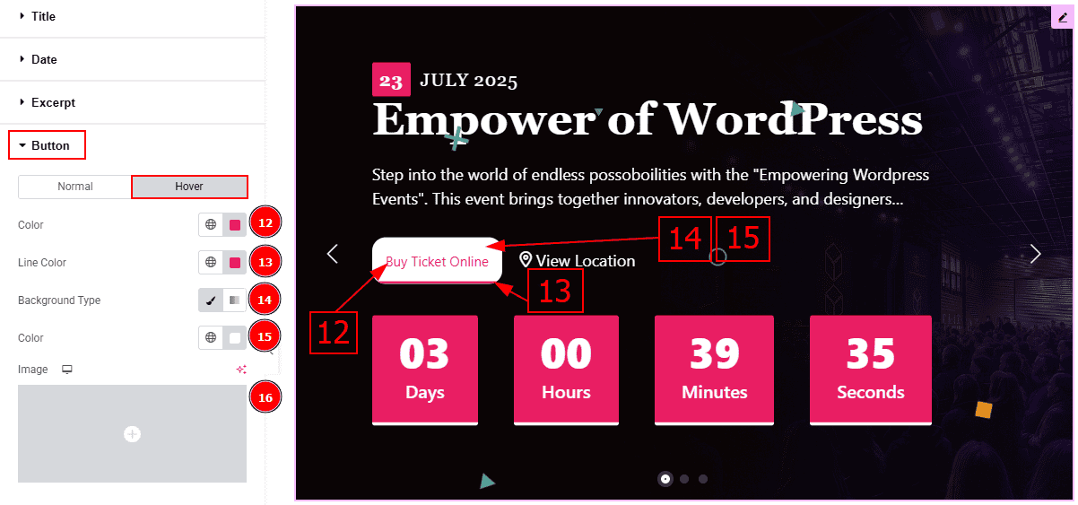
Now, let’s proceed to the Hover tab -
Color: You can change the button text hover color with this option.
Line Color: You can change the line hover color with this option.
Background Type: You can select the background type to classic or gradient with this option.
Color: You can change the background hover color with this option.
Image: You can change the background image with this option.
Location Section
Go to Style > Location
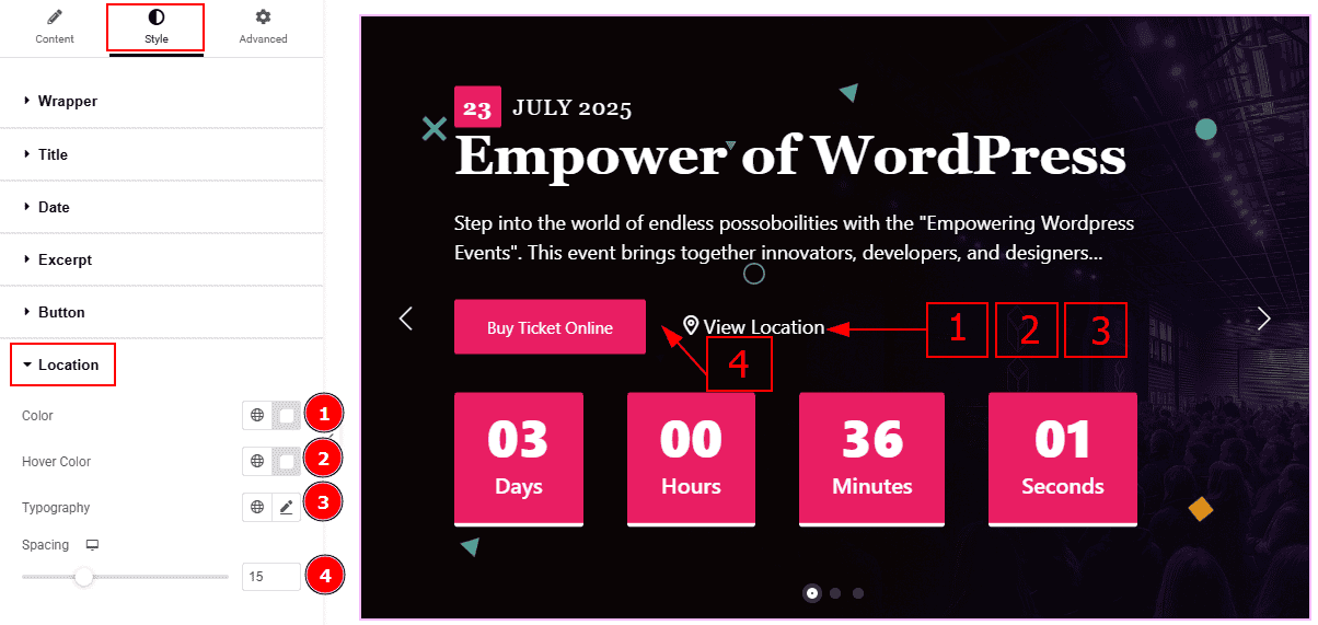
Color: You can change the location text color with this option.
Hover Color: You can change the location text hover color with this option.
Typography: Change the font family, size, weight, transform, style, decoration, line height, letter spacing, and word spacing from here.
Spacing: You can adjust the space between the location and the button with this option.
Countdown Section
Go to Style > Countdown
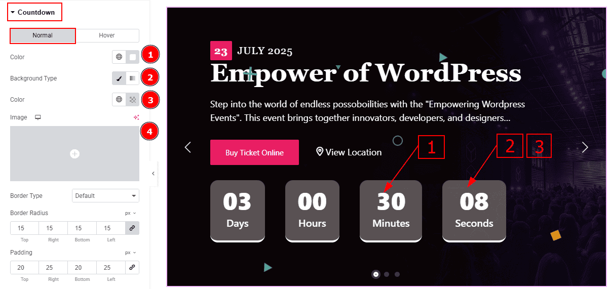
In this Section, we have two tabs. These are Normal & Hover. Let’s start with the Normal Tab -
Color: You can change the countdown number color with this option.
Background Type: You can select the background type to Classic or Gradient from here. Here we selected Classic.
Color: You can change the background color with this option.
Image: You can change the background image with this option.
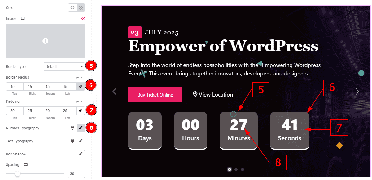
Border Type: You can add a border to the countdown field with this option.
Border Radius: This option controls the roundness of the border with this option.
Padding: You can adjust the inner space of the social icon with this option.
Number Typography: Change the font family, size, weight, transform, style, decoration, line height, letter spacing, and word spacing from here.
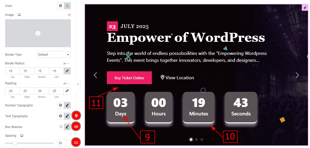
Text Typography: Change the font family, size, weight, transform, style, decoration, line height, letter spacing, and word spacing from here.
Box Shadow: You can add a shadow effect with this option.
Spacing: You can adjust the space between the button and the countdown field with this option.
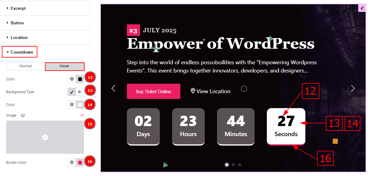
Now, let’s proceed to the Hover Tab -
Color: You can change the countdown number hover color with this option.
Background Type: You can select the background type to Classic or Gradient from here. Here we selected the Classic.
Color: You can change the background hover color with this option.
Image: You can change the background image with this option.
Border Color: You can change the border hover color with option.
Navigation Section
Go to Style > Navigation
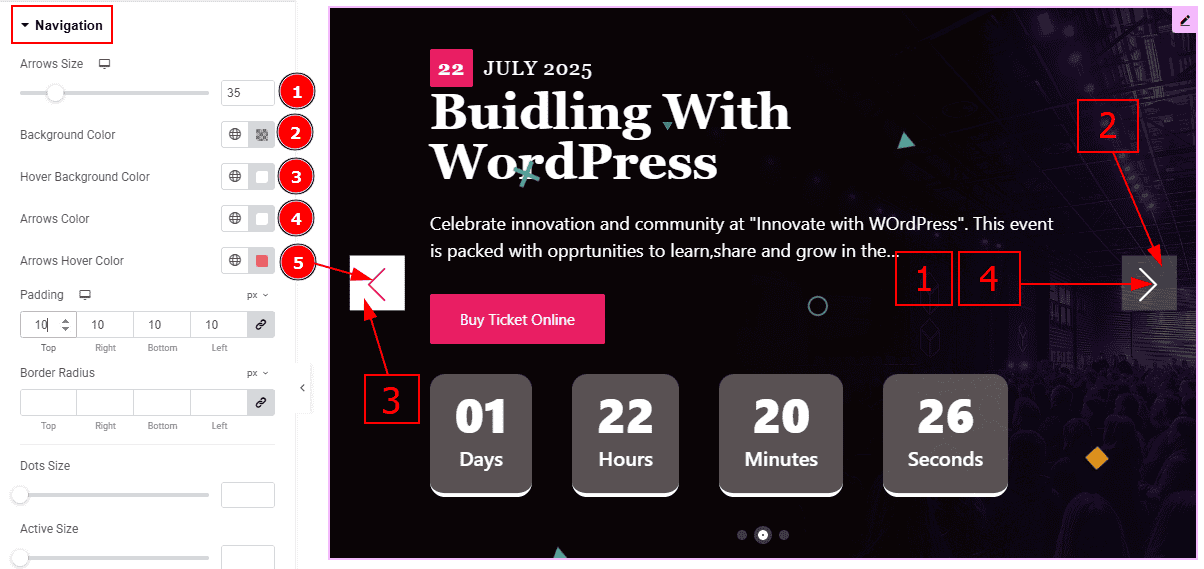
Arrows Size: You can make changes to the arrows size with this option.
Background Color: You can change the background color with this option.
Hover Background Color: You can change the background hover color with this option.
Arrows Color: This option allows you to change the arrows' color.
Arrows Hover Color: You can change the arrow's hover color with this option.
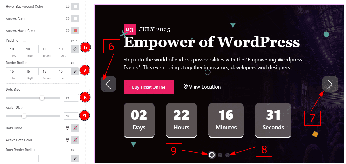
Padding: You can adjust the inner space and gaps of the arrow field with this option.
Border Radius: This option control the roundness of the border.
Dots Size: You can make changes to the dots size with this option.
Active Size: You can make changes to the active dot size with this option.
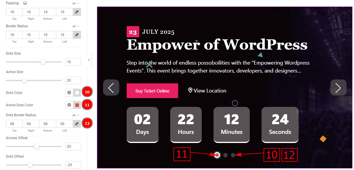
Dots Color: You can make changes to the dots size with this option.
Active Dots Color: You can make changes to the active dot size with this option.
Dots Border Radius: This option controls the roundness of the dots border with this option.
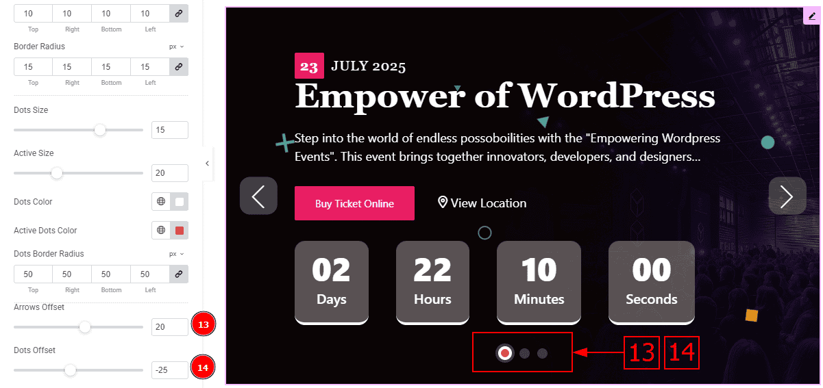
Arrows Offset: You can move the arrows position with this option.
Dots Offset: You can move the dots position with this option.
All done! You have successfully customized the Event Calendar Slider on your website.
Video Assist
You can also watch the video tutorial to learn more about the Event Calendar Slider. Please visit the demo page for examples.
Thanks for being with us.