
In this documentation, we will discuss the customization of the Dragon Slider widget, brought to you by the Prime Slider addon for Elementor.
Enable The Dragon Slider Widget
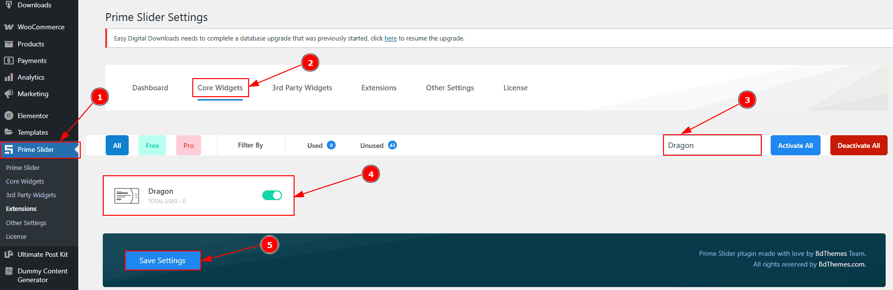
To use the Elementor Dragon Slider widget from Prime Slider, first, you have to enable the widget.
Go to WordPress dashboard > Prime Slider Plugin dashboard.
Then, Click the Core Widgets Tab.
Search the Dragon Slider Widget Name.
Enable the Dragon Slider Widget.
Hit the Save Settings Button.
Inserting The Dragon Slider widget

Go to the Elementor Editor Page and Hit the “+” icon Button.
Search the Dragon Slider widget.
Drag the widget and Drop it on the editor page.
Work With The Content Tab
Sliders Section
Go to Content > Sliders

Close Item: You can delete the Slider item by clicking the Close icon button.
Copy Item: This option lets you copy the same item.
Add Item: You can add a new item by clicking the “+”Add Item button.

In the Slider Items, each item contains more options. There are two tabs that present those options. These are Content & Optional. Let’s start with the Content Tab -
Sub Title: You can add the sub-title text in this option.
Title: You can add the title text with this option.
Button Text: You can add the button text with this option.
Button Link: You can add a link to the button with this option.
Image: You can add, change or remove an image with this option.

Now let’s proceed with the Optional Tab -
Title Link: This option allows you to add a link to the title.
Excerpt: This option allows to add a short summary and customize the description.
Additional Options Section
Go to Content > Additional Options
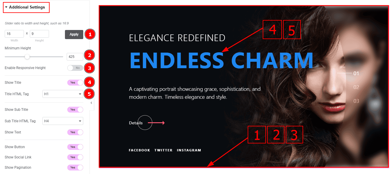
Slider Ratio: You can adjust the slider ratio to width & height with this option.
Minimum Height: You can adjust the slider height with this option.
Enable Response Height: Enable the switcher to set the slider height as responsive for all devices.
Show Title: Enable the switcher to show the title to the audience.
Title HTML Tag: This option lets you select the heading for the title.

Show Sub Title: Enable the switcher to show the subtitle to the audience.
Sub Title HTML Tag: This option lets you select the heading for the sub title.
Show Text: Enable the switcher to show the excerpt (short summary) to the audience.
Show Button: Enable the switcher to show the button to the audience.
Show Social Link: You can show the social link to the audience by enabling this option.

Show Pagination: Enable the switcher to show the page number to the audience.
Show Blur Effect: Enable or disable the switcher to show or hide the blur effect.
Image Resolution: You can change the image resolution with this option.
Background Image Setting: You can make changes to the background image with this option. Here you will get position, repeat & size option to set up the background image.
Social Link Section
Go to Content > Social Link

The settings in this section are the same as those in the Slider section described above. For a detailed explanation, please refer to the Slider section to understand how these options work.
Now, let’s proceed to the inner options of the social icon -
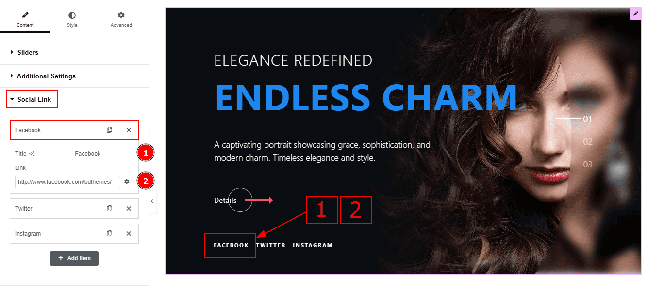
Title: You can add a title to your social icon with this option.
Link: This option allows you to add a link to the social icon.
Slider Settings Section
Go to Content > Slider Settings
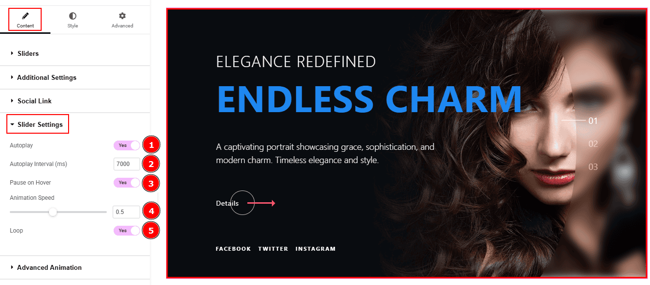
Autoplay: By enable this option you can automatically play the slides one after another.
Autoplay Interval (ms): This option let you set the time delay between each slide transition.
Pause on Hover: Enable the switcher to pause autoplay when the user hovers over the slider.
Animation Speed: This option controls how fast the transition animation occurs between slides.
Loop: Enable the switcher to go back to the first automatically after the last slide.
Work with The Style Tab
Sliders Section
Go to Style > Sliders
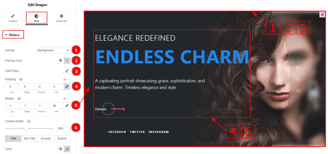
Overlay: You can select the overlay with this option.
Overlay Color: You can change the overlay color with this option.
CSS Filters: You can edit the image with this option.
Padding: You can adjust the inner space of the content with this option.
Margin: This option allows you to adjust the space & create gaps around the content.
Content Width: You can adjust the content width with this option.
In this section, we have four tabs. These are Title, Sub Title, Excerpt & Button. Let’s explore those tabs one by one.
Title Tab

Color: You can change the title color with this option.
First Word Color: You can change the title's first word color with this option.
Typography: Change the font family, size, weight, transform, style, decoration, line height, letter spacing, and word spacing from here.

Text Stroke: This option allows you to add an outline or border around text, creating a visually distinct effect.
Title Spacing: You can adjust the space between the title and the excerpt with this option.
Sub Title Tab

Color: You can change the subtitle color with this option.
Typography: You can change the font family, size, weight, transform, style, decoration, line height, letter spacing, and word spacing from here.
Sub Title Spacing: This option allows you to adjust the space between the title and the subtitle with this option.
Excerpt Tab
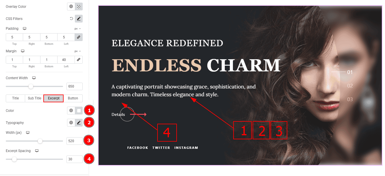
Color: You can change the excerpt text color with this option.
Typography: Change the font family, size, weight, transform, style, decoration, line height, letter spacing, and word spacing from here.
Width: You can adjust the width of the excerpt with this option.
Excerpt Spacing: You can adjust the space between the excerpt and the button with this option.
Button Tab
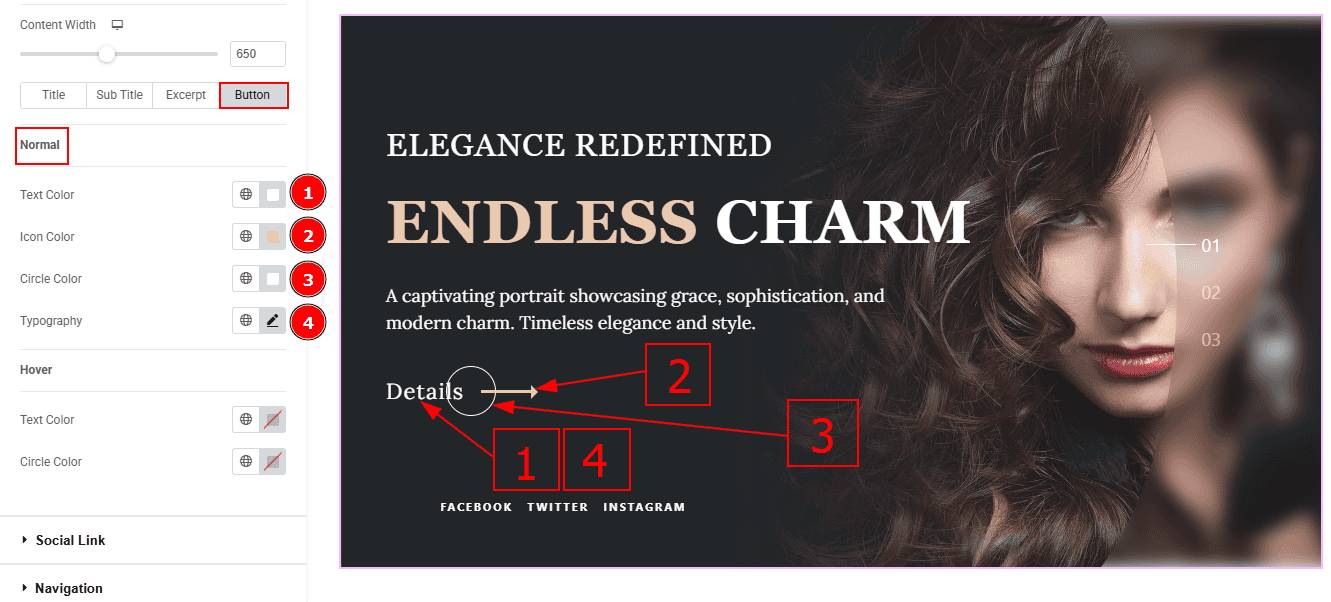
In this tab, we have two more sub-sections. One is Normal and the other is Hover. Let’s start with the Normal sub-section -
Text Color: You can change the button text color with this option.
Icon Color: You can change the icon color with this option.
Circle Color: You can change the circle color with this option.
Typography: Change the font family, size, weight, transform, style, decoration, line height, letter spacing, and word spacing from here.
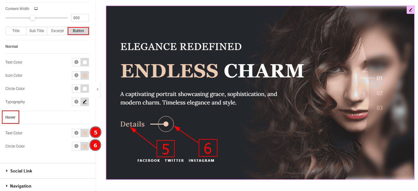
Text Color: You can change the text hover color with this option.
Circle Color: You can change the circle hover color with this option.
Social Link Section
Go to Style > Social Link
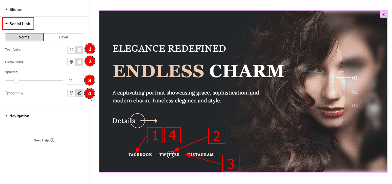
In this Section, we have two tabs. These are Normal & Hover. Let’s start with the Normal Tab -
Text Color: You can change the text color with this option.
Circle Color: You can change the circle color with this option.
Spacing: You can adjust the space between the social links with this option.
Typography: Change the font family, size, weight, transform, style, decoration, line height, letter spacing, and word spacing from here.

Now, let’s proceed to the Hover Tab -
5. Text Color: You can change the text hover color with this option.
Navigation Section
Go to Style > Navigation

Color: You can change the navigation color with this option.
Hover Color: You can change the navigation hover color with this option.
Active Color: You can change navigation hover color with this option.
Size: You can make changes to the navigation size with this option.
Line Width: You can make changes to the line width with this option.
All done! You have successfully customized the Dragon Slider Widget on your website.
Video Assist
You can also watch the video tutorial to learn more about the Dragon Slider Widget. Please visit the demo page for examples.
Thanks for being with us.