
In this documentation, we will discuss the customization of the Isolate Slider Slice Skin, brought to you by the Prime Slider addon for Elementor.
Enable The Isolate Slider Widget
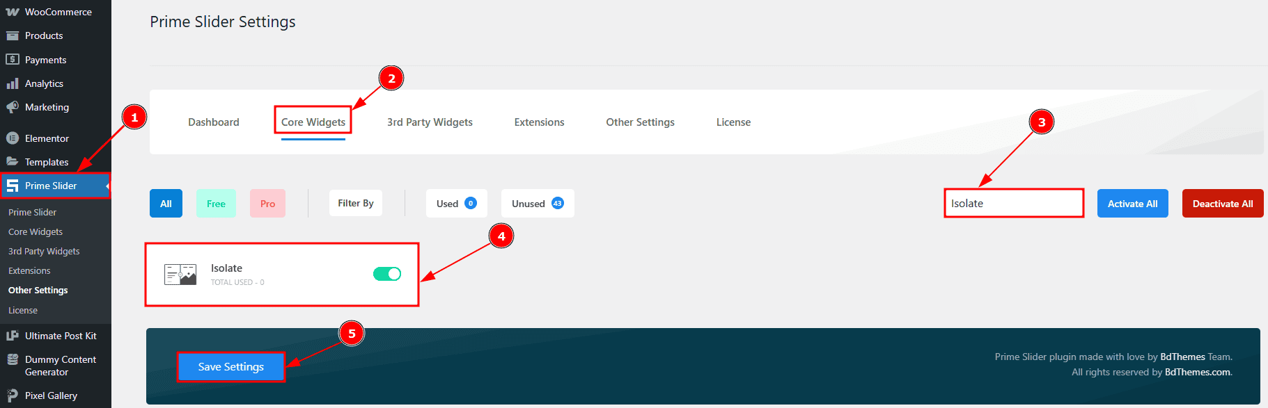
To use the Isolate Slider widget from Prime Slider, first, you have to enable the widget.
Go to WordPress dashboard > Prime Slider Plugin dashboard.
Then, Click the Core Widgets Tab.
Search for the Isolate Slider Widget Name.
Enable the Isolate Slider Widget.
Hit the Save Settings Button.
Inserting the Isolate Slider widget
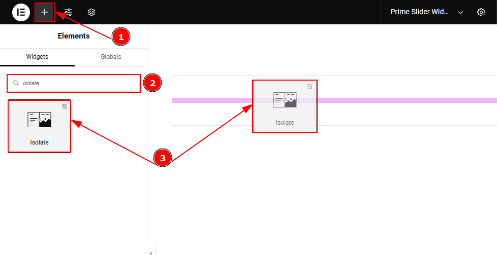
Go to the Elementor Editor Page and hit the “+” icon Button.
Search the Isolate Slider widget.
Drag the widget and drop it on the editor page.
Work With The Content Tab Of Isolate Slider Slice Skin
Sliders Section
Go to Content > Sliders
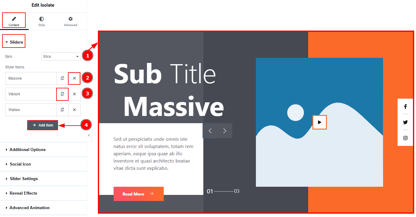
Skin: This option allows you to change the slider skin to Default, Locate & Slice. Here we selected the Slice Skin.
Close Item: You can delete the Slider item by clicking the Close icon button.
Copy Item: This option lets you copy the same item.
Add Item: You can add a new item by clicking the “+”Add Item button.
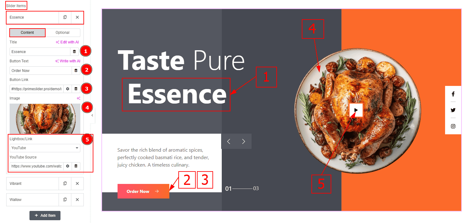
In the Slider Items, each item contains more options. There are two tabs that present those options. These are Content & Optional. Let’s start with the Content Tab –
Title: You can add the title text with this option.
Button Text: You can add the button text with this option.3. Button Link: You can add a link to the button with this option.
Image: You can add or change the image with this option.
Lightbox/Link: This option allows you to choose the type of content that will appear when the play button (on the slider image) is clicked. The types are selected image, website, video, youtube, vimeo & google map. Here we selected YouTube & below got YouTube Source option Here, you can add the YouTube video link.
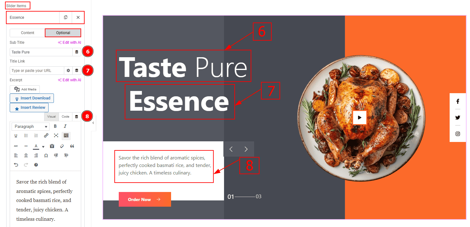
Now let’s proceed with the Optional Tab –
Sub Title: You can change the subtitle text with this option.
Title Link: This option allows you to add a link to the title.
Excerpt: This option allows to to add a short summary and customize the description.
Additional Options Section
Go to Content > Additional Options
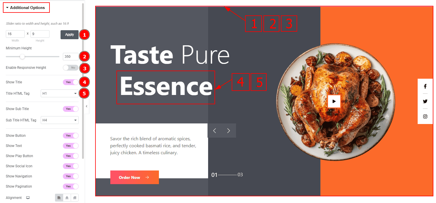
Slider Ratio: You can adjust the slider ratio to width & height with this option.
Minimum Height: You can adjust the slider height with this option.
Enable Response Height: Enable the switcher to set the slider height as responsive for all device.
Show Title: Enable the switcher to show the title to the audience.
Title HTML Tag: This option lets you select the heading for the title.
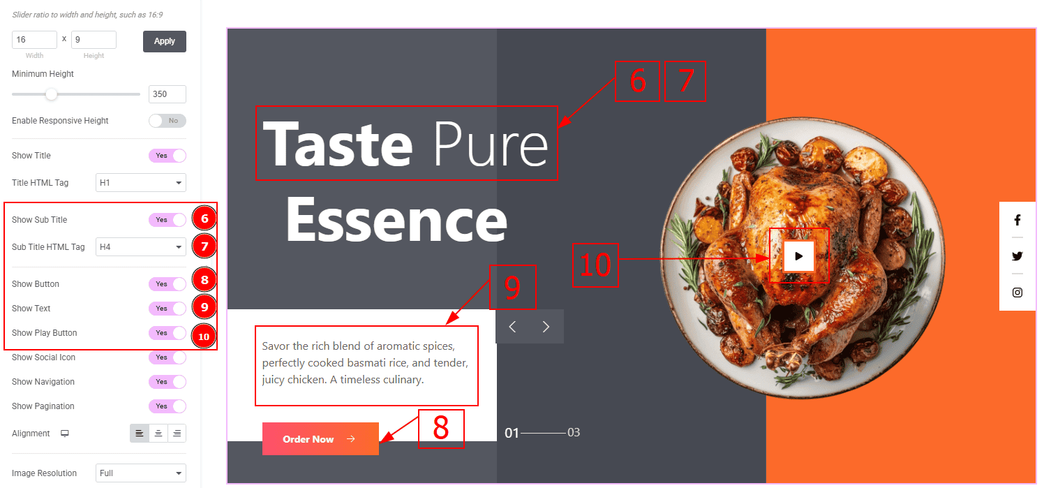
Show Sub Title: Enable the switcher to show the sub title to the audience.
Sub Title HTML Tag: This option lets you select the heading for the sub title.
Show Button: Enable the switcher to show the button to the audience.
Show Text: Enable the switcher to show the description to the audience.
Show Play Button: Enable the switcher to show the play button to the audience.
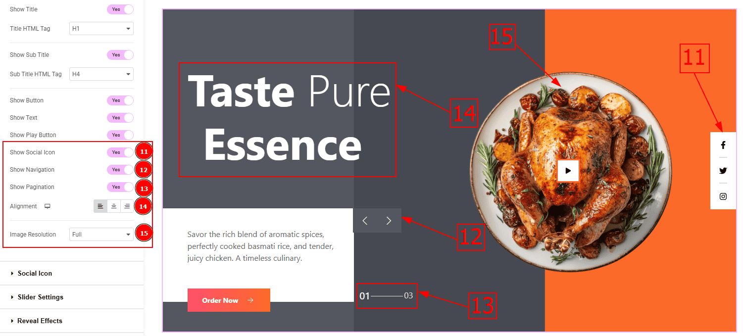
Show Social Icon: By enabling this switch, you can make the social icons visible.
Show Navigation: Enable the switcher to show the navigation bar to the audience.
Show Pagination: Enable the switcher to show the page number to the audience.
Alignment: You can set the content position to left, center or right with this option.
Image Resolution: You can change the image resolution with this option.
Social Icon Section
Go to Content > Social Icon
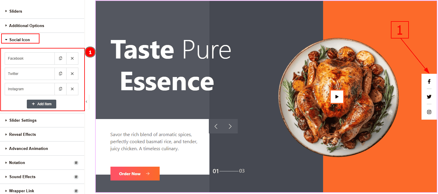
The settings in this section are the same as those in the Sliders section described above. For a detailed explanation, please refer to the Sliders section to understand how these options work.
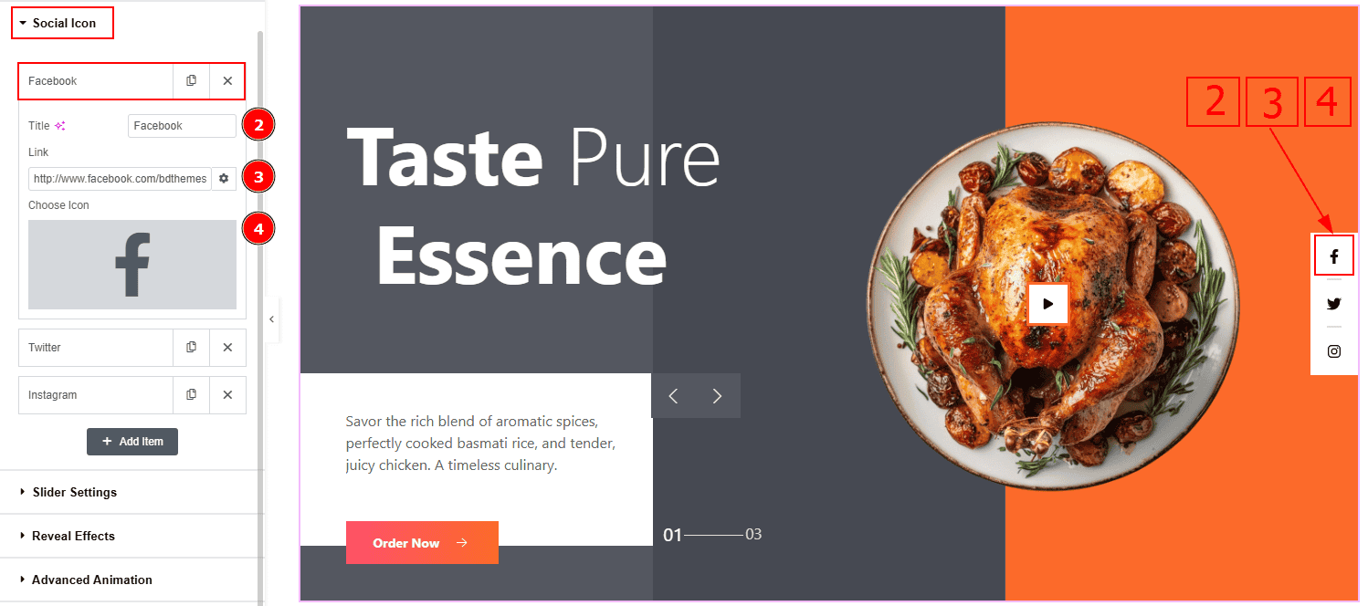
Now, let’s proceed to the inner options of the social icon –
Title: You can add a title to your social icon with this option.
Link: This option allows you to add a link to the social icon.
Choose Icon: You can choose an icon with this option.
Slider Settings Section
Go to Content > Slider Settings
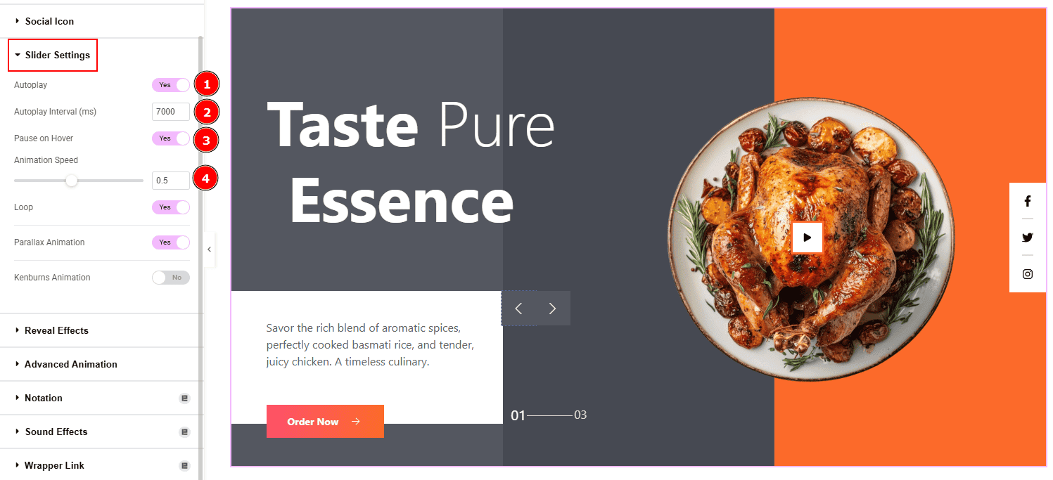
Autoplay: By enabling this option you can automatically play the slides one after another.
Autoplay Interval (ms): This option lets you set the time delay between each slide transition.
Pause on Hover: Enable the switcher to pause autoplay when the user hovers over the slider.
Animation Speed: This option controls how fast the transition animation occurs between slides.
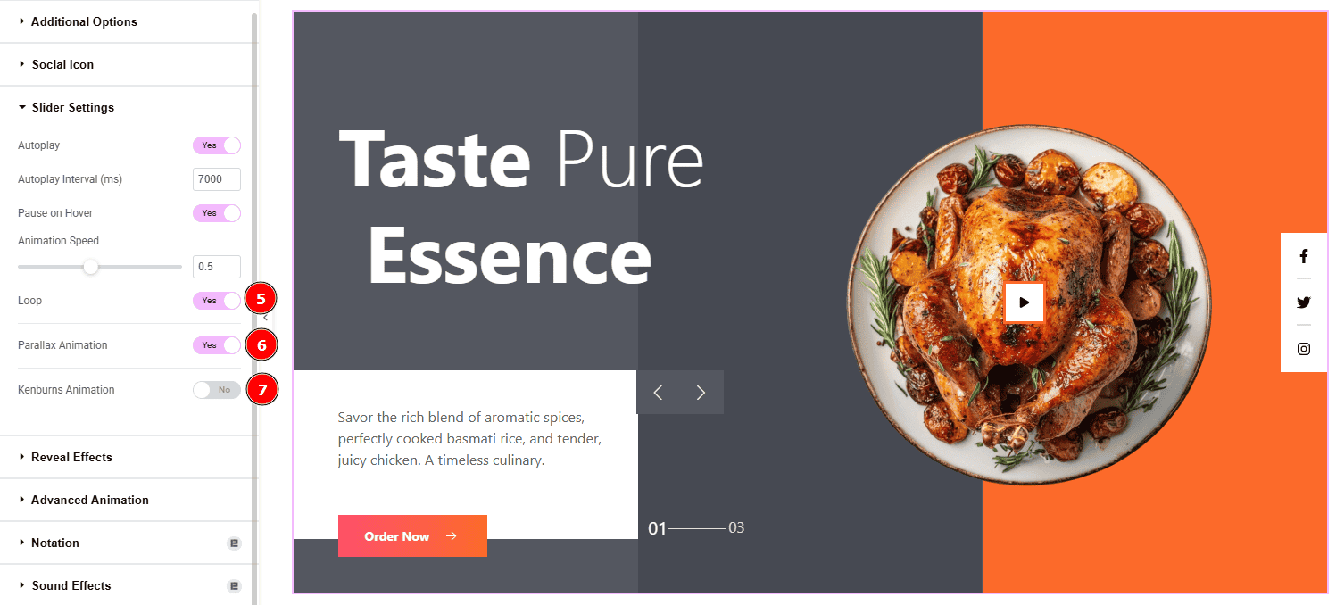
Loop: Enable the switcher to go back to the first automatically after the last slide.
Parallax Animation: Enable the switcher to add a layered scrolling effect to slider elements.
Kenburns Animation: Enable the switcher to add a smooth zoom-in/out and pan effect on background images. Also you will get the Kenburn Reverse option which will allow you to reverse the Kenburns animation direction (zoom-out instead of in, or pan the other way).
Work with The Style Tab Of Isolate Slider Slice Skin
Wrapper Section
Go to Style > Wrapper
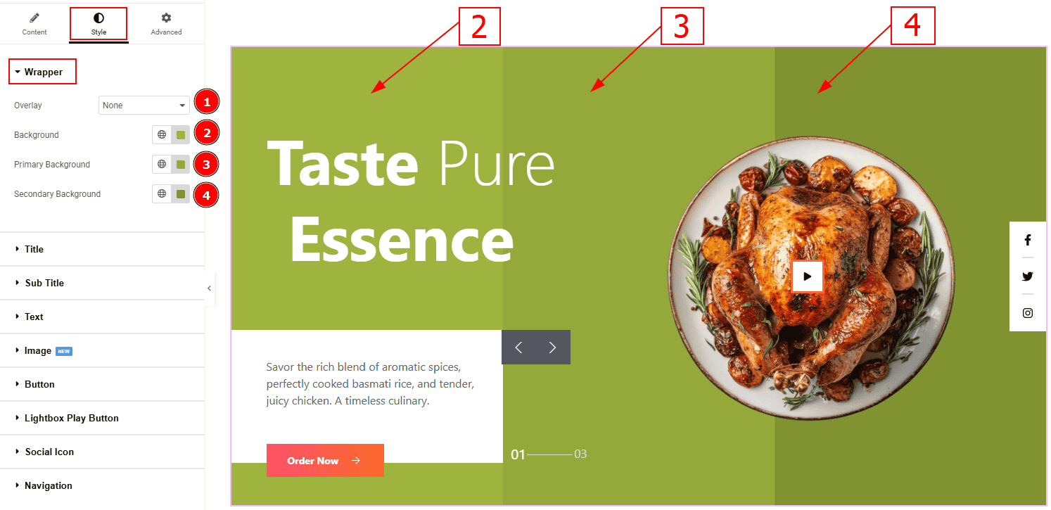
Overlay: You can set an overlay color to the image with this option.
Background: You can change the background color with this option.
Primary Background: You can change the primary background color with this option.
Secondary Background Color: You can change the secondary background color with this option.
Title Section
Go to Style > Title
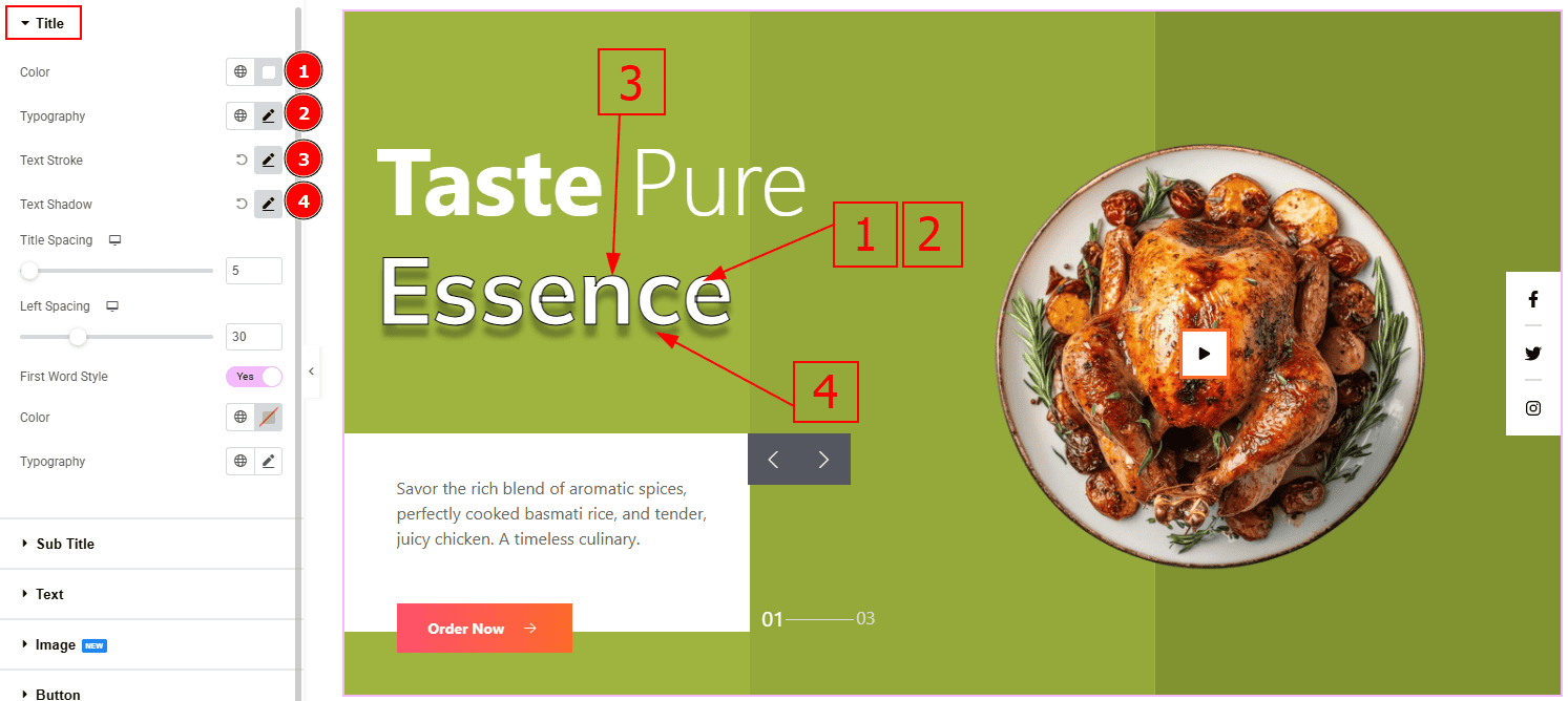
Color: You can change the title color with this option.
Typography: Change the font family, size, weight, transform, style, decoration, line height, letter spacing, and word spacing from here.
Text Stroke: This option allows you to add an outline or border around text, creating a visually distinct effect.
Text Shadow: This option allows you to add a shadow effect to the text.
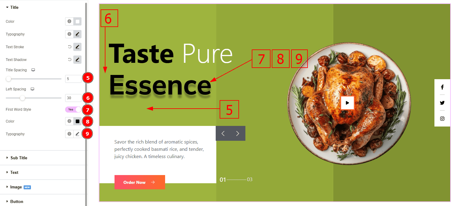
Title Spacing: You can adjust the space between the title and the description with this option.
Left Spacing: This option allows you to control the left space adjustment.
First Word Style: Enable this switcher to customize the title’s first word.
Color: You can change the title’s first word color with this option.
Typography: Change the font family, size, weight, transform, style, decoration, line height, letter spacing, and word spacing from here.
Sub Title Section
Go to Style > Sub Title
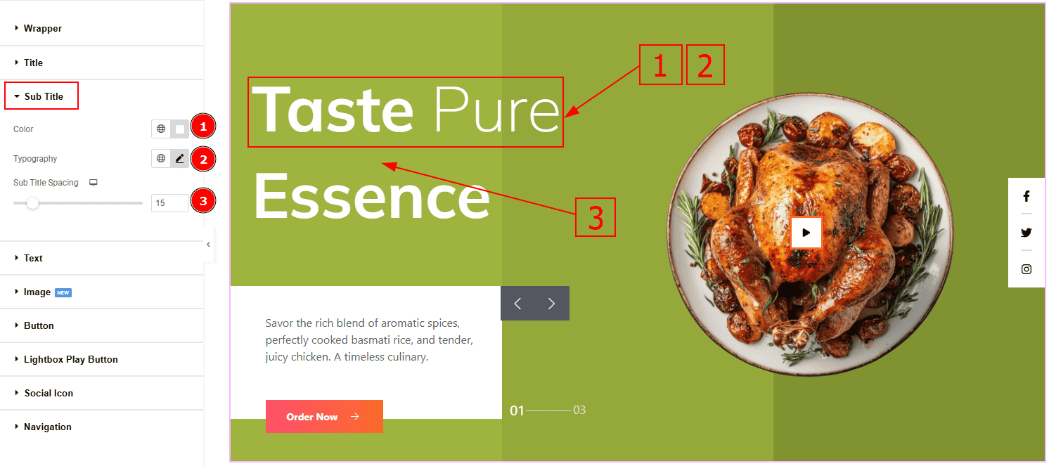
Color: You can change the subtitle’s text color with this option.
Typography: Change the font family, size, weight, transform, style, decoration, line height, letter spacing, and word spacing from here.
Sub Title Spacing: This option allows you to adjust the space between the subtitle and the title.
Text Section
Go to Style > Text
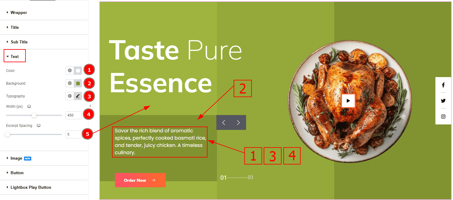
Color: You can change the text color with this option.
Background: You can change the background color with this option.
Typography: Change the font family, size, weight, transform, style, decoration, line height, letter spacing, and word spacing from here.
Width: You can adjust the width of the text with this option.
Excerpt Spacing: You can adjust the space between the excerpt and the title with this option.
Image Section
Go to Style > Image
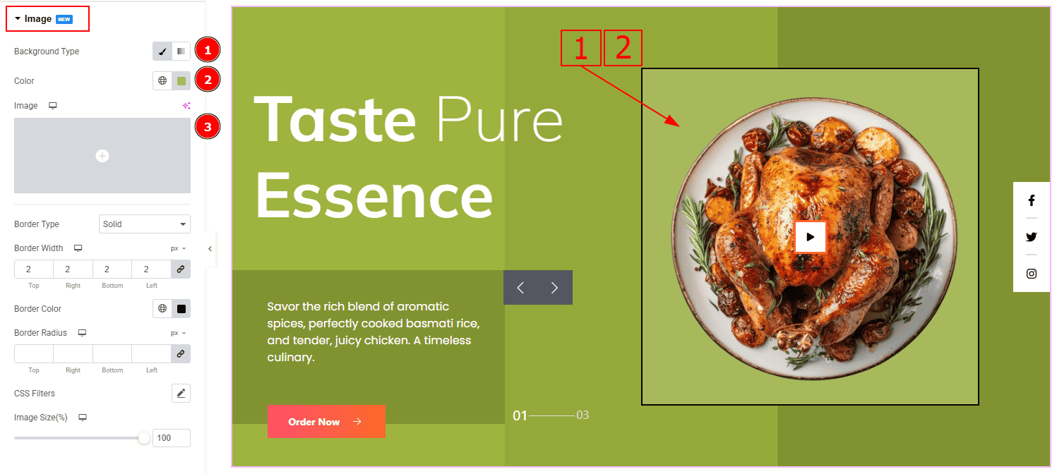
Background Type: You can change the background type here. There are two options in background type. These are Classic & Gradient. In Classic, you can change the background color and also set an image as the background. In the gradient option, you can also set background color along with locations and angle for each breakpoint to ensure the gradient adapts to different screen sizes. Also, you can change the gradient type (Radial & Linear) and positions.
Color: You can change the background color with this option. (Note: To change the background color of the image, you need to use a PNG image with a transparent background.)
Image: You can add or change the background image with this option.
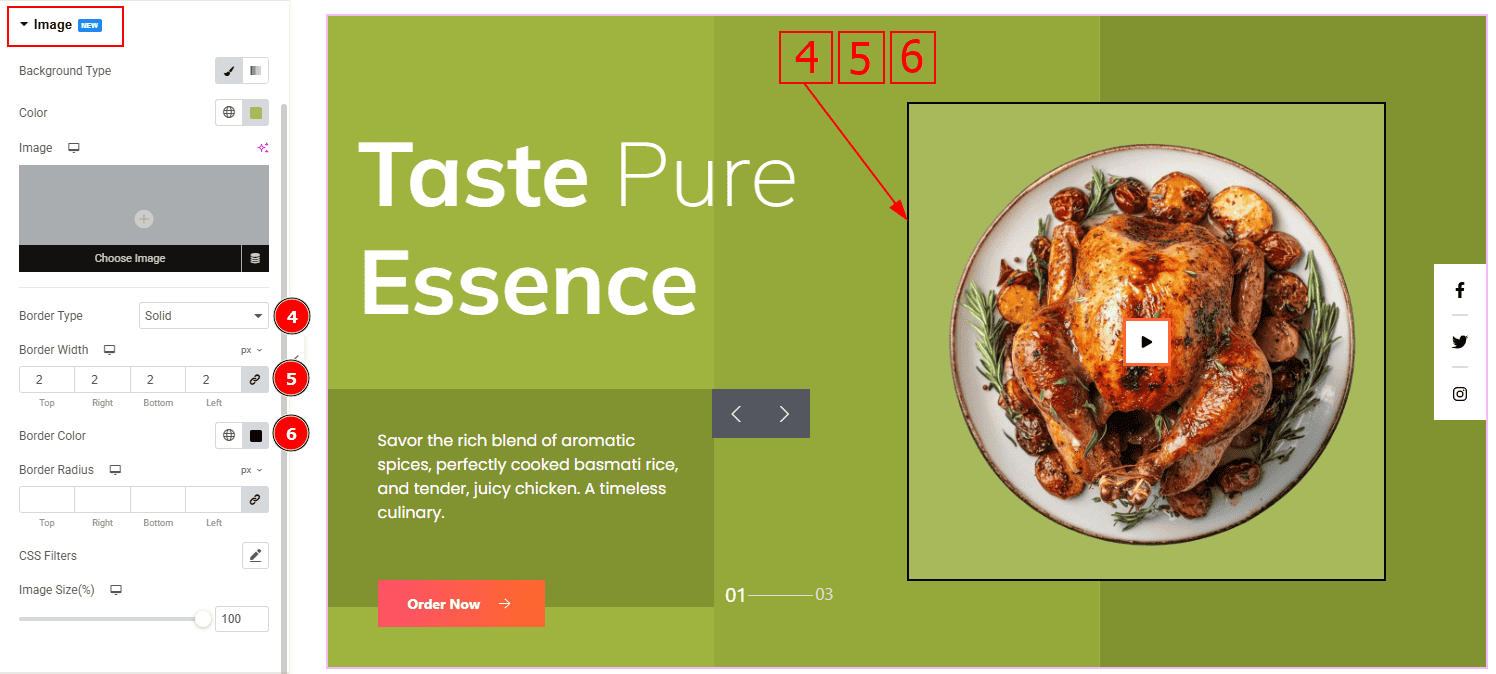
Border Type: This option allows you to set a border to the element and the types are default, none, solid, double, grooved, dashed, dotted. Here we selected solid.
Border Width: Set the thickness of the border with this option.
Border Color: You can change the image border with this option.
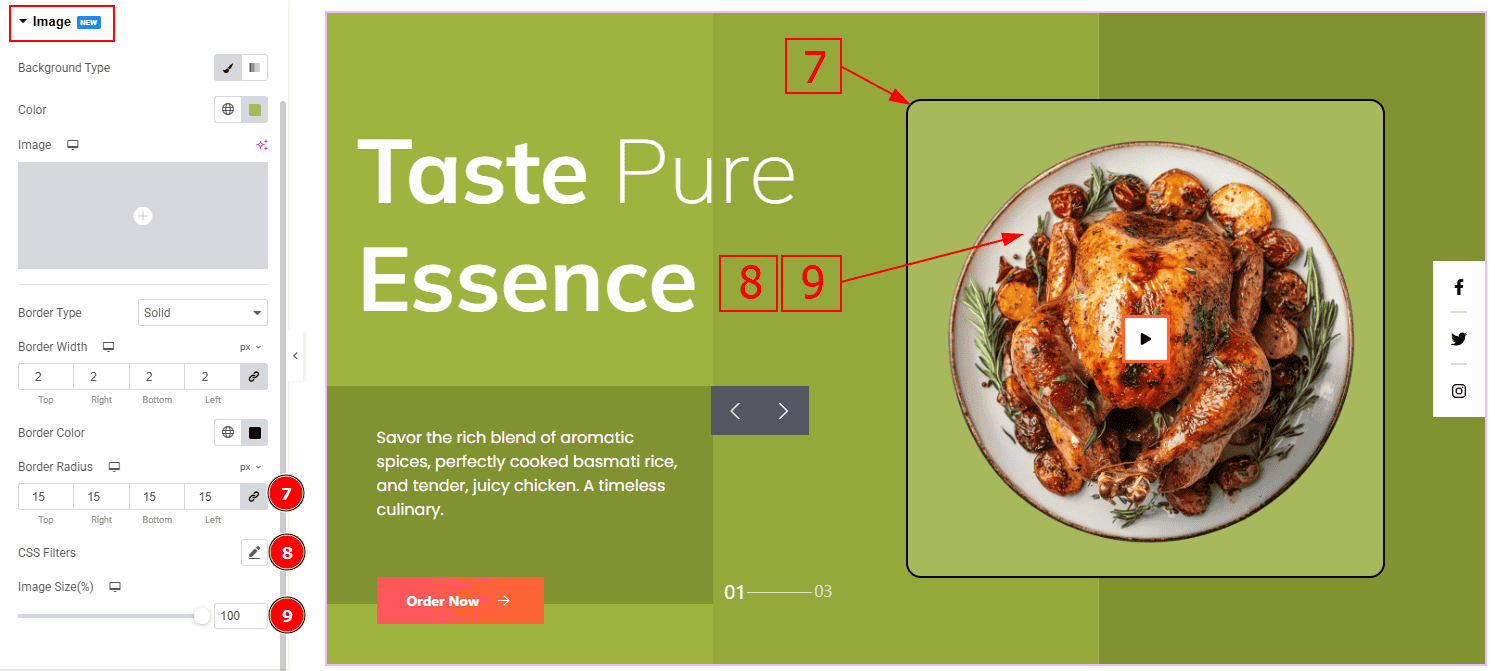
Border Radius: This option controls the roundness of the border.
CSS Filters: This setting lets you apply visual changes to the image. In this setting you can modify properties like Blur, Brightness, Contrast, Saturation, and Hue.
Blur: Softens the image, reducing sharpness.
Brightness: Adjusts the overall lightness or darkness.
Contrast: Modifies the difference between light and dark areas.
Saturation: Controls the intensity of the colors.
Hue: Shifts the overall color spectrum.
Image Size: This option allows you to make changes to the image size.
Button Section
Go to Style > Button
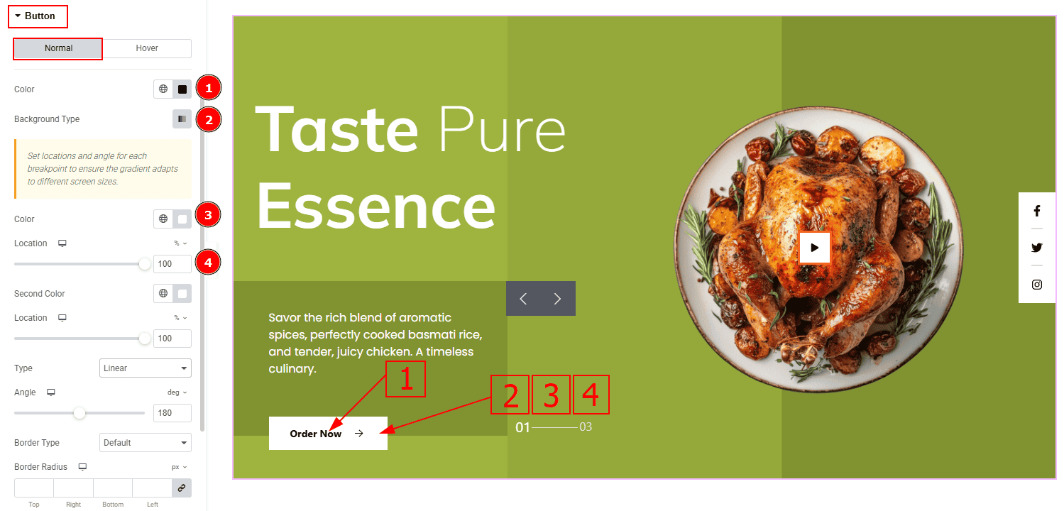
In this tab, we have two tabs. One is Normal and the other is Hover. Let’s start with the Normal Tab –
Color: You can change the button text color with this option.
Background Type: This option allows you to change the background type and customize the background.
Color: You can change the background color with this option.
Location: This option allows you to adjust the position to fill the first color.
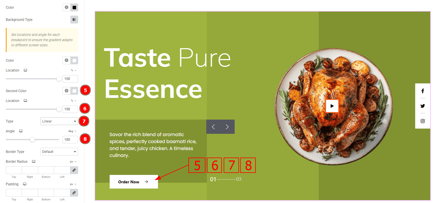
Second Color: You can change the second color with this option.
Location: This option allows you to adjust the position to fill the second color.
Type: This option allows you to set the background color type to Linear or Radial. Here we selected Linear.
Angle: This option controls the first and second color angle visual to the audience.
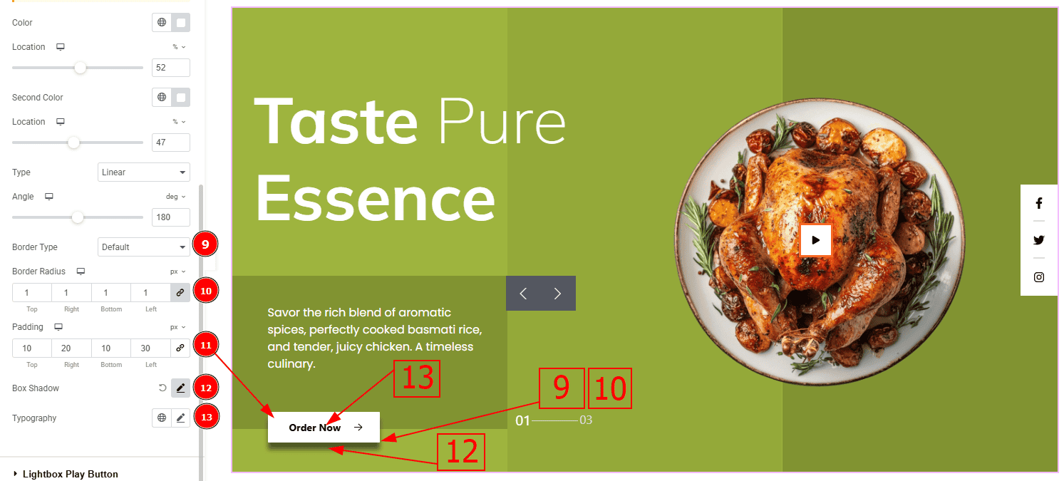
Border Type: You can add a border with this option.
Border Radius: This option controls the roundness of the border.
Padding: This option controls the inner space and gaps of the button.
Box Shadow: You can add a shadow effect to the button with this option.
Typography: Change the font family, size, weight, transform, style, decoration, line height, letter spacing, and word spacing from here.
Now, Let’s Proceed to the Hover Tab –
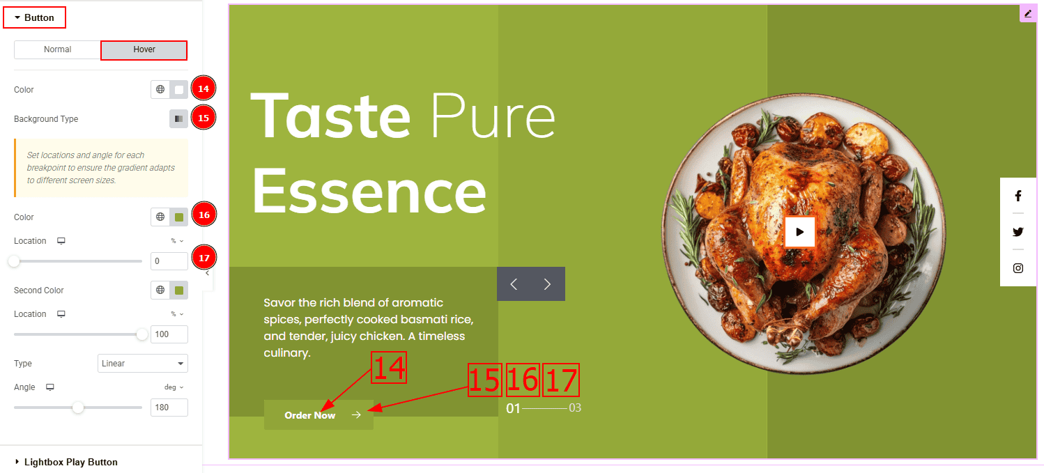
Color: You can change the button text hover color with this option.
Background Type: This option allows you to change the background type and customize the background.
Color: You can change the background hover color with this option.
Location: This option allows you to adjust the position to fill the first hover color.
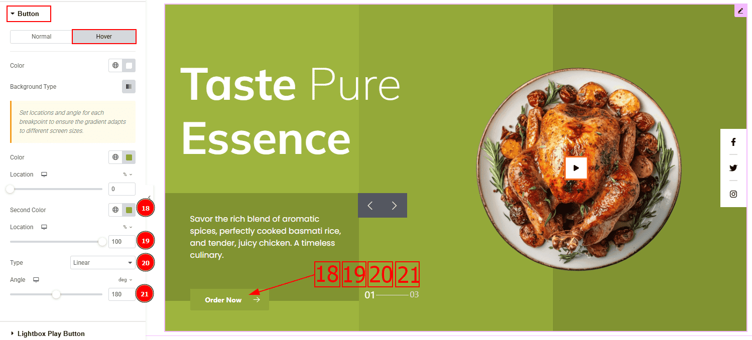
Second Color: You can change the second hover color with this option.
Location: This option allows you to adjust the position to fill the second hover color.
Type: This option allows you to set the background color type to Linear or Radial. Here we selected Linear.
Angle: This option controls the first and second color angle hover visual to the audience.
Lightbox Play Button Section
Go to Style > Lightbox Play Button
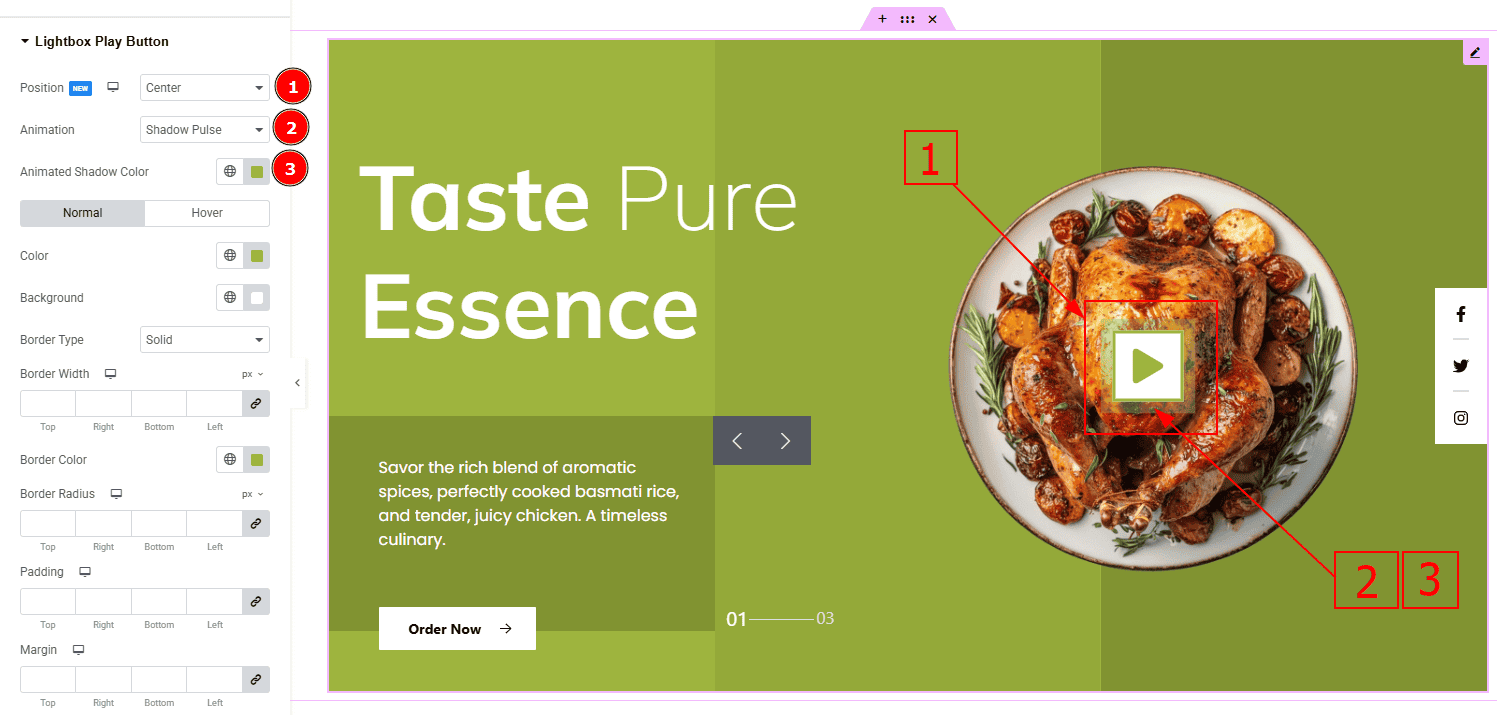
Position: You can adjust the lightbox play button position to Top Left, Top Right, Center, Bottom Left & Bottom Right. Here we selected the ceneter position.
Animation: This option allows you to select the animation style to Shadow Pulse, Multi Shadow & Line Bounce. Here we selected the Shadow Pulse animation.
Animated Shadow Color: This option allows you to change the animated shadow shadow color.
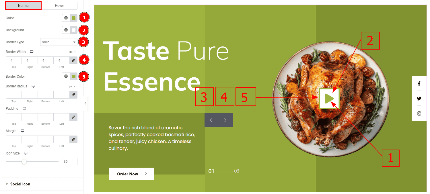
In this section, we have two more tabs. These are Normal & Hover. Let’s start with the Normal Tab –
Color: You can change the play button icon color with this option.
Background: You can change the background color with this option.
Border Type: This option allows you to add various types of borders to the lightbox play button.
Border Width: You can set the thickness of the border with this option.
Border Color: You can change the border color with this option.
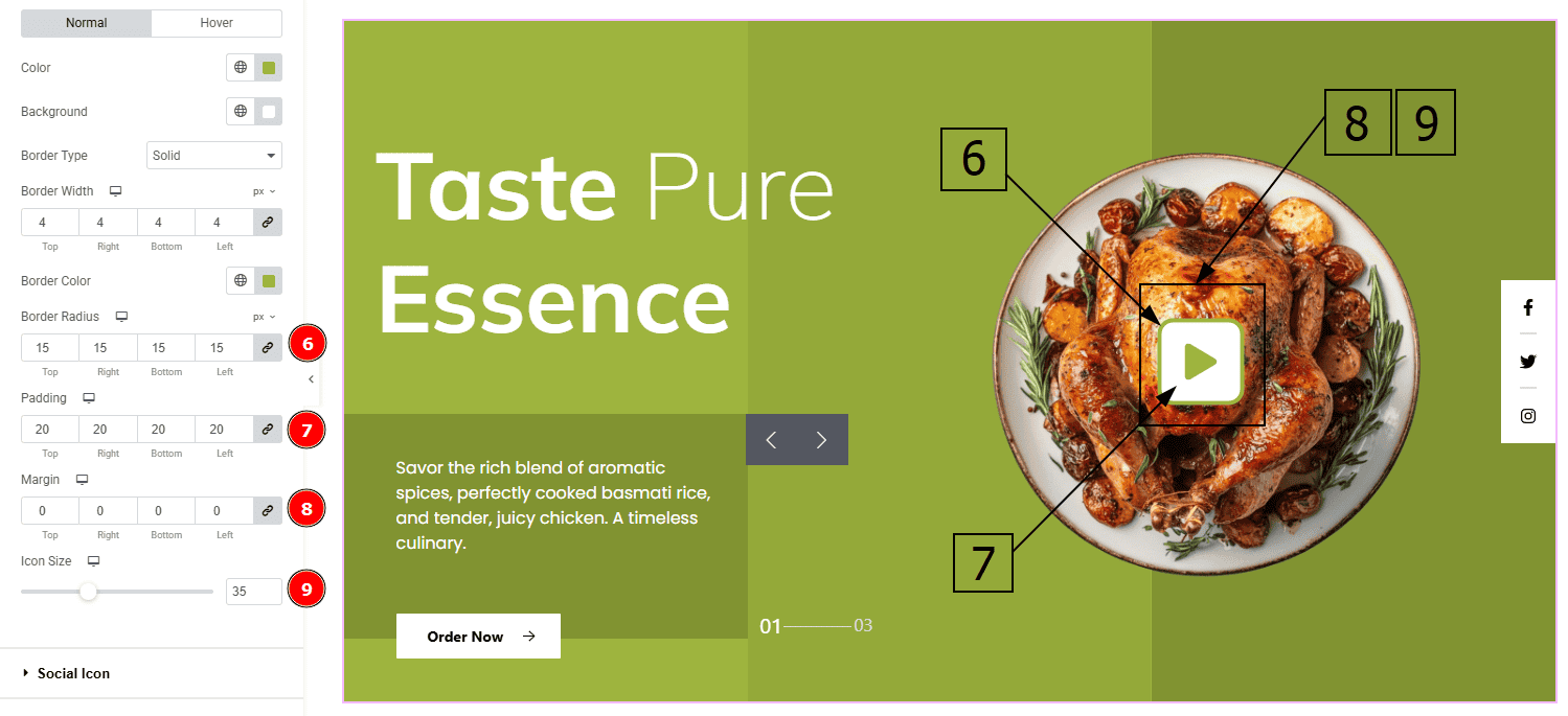
Border Radius: This option controls the roundness of the border.
Padding: This option allows you to adjust the inner space of the lightbox play button.
Margin: This option controls the outer space and gaps of the lightbox play button.
Icon Size: You can make changes to the lightbox play button icon size with this option.
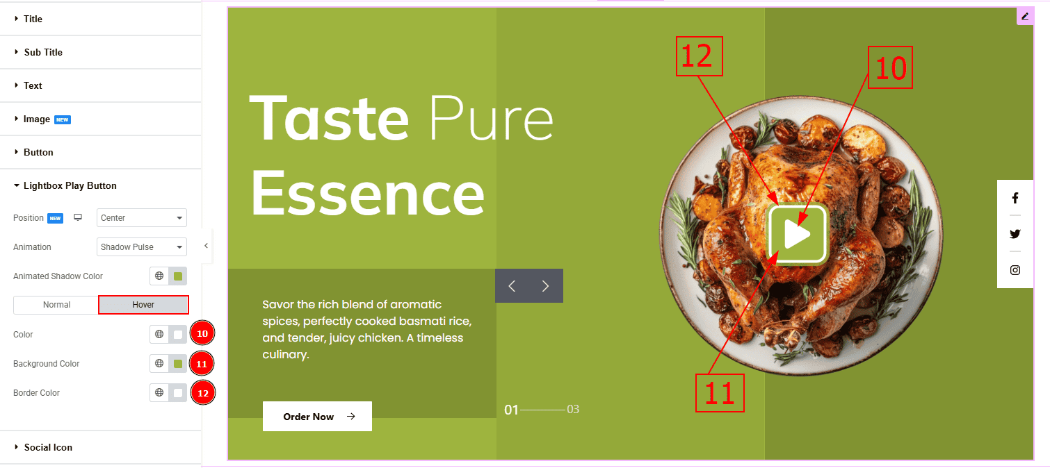
Now lets proceed to the Hover Tab –
Color: You can change the play button icon hover color with this option.
Background Color: You can change the background hover color with this option.
Border Color: You can change the border hover color with this option.
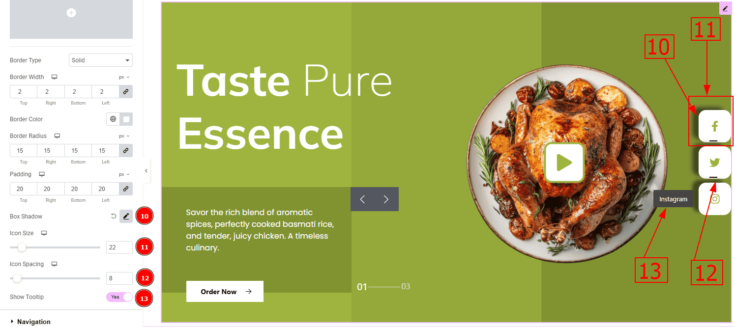
Social Icon Section
Go to Style > Social Icon
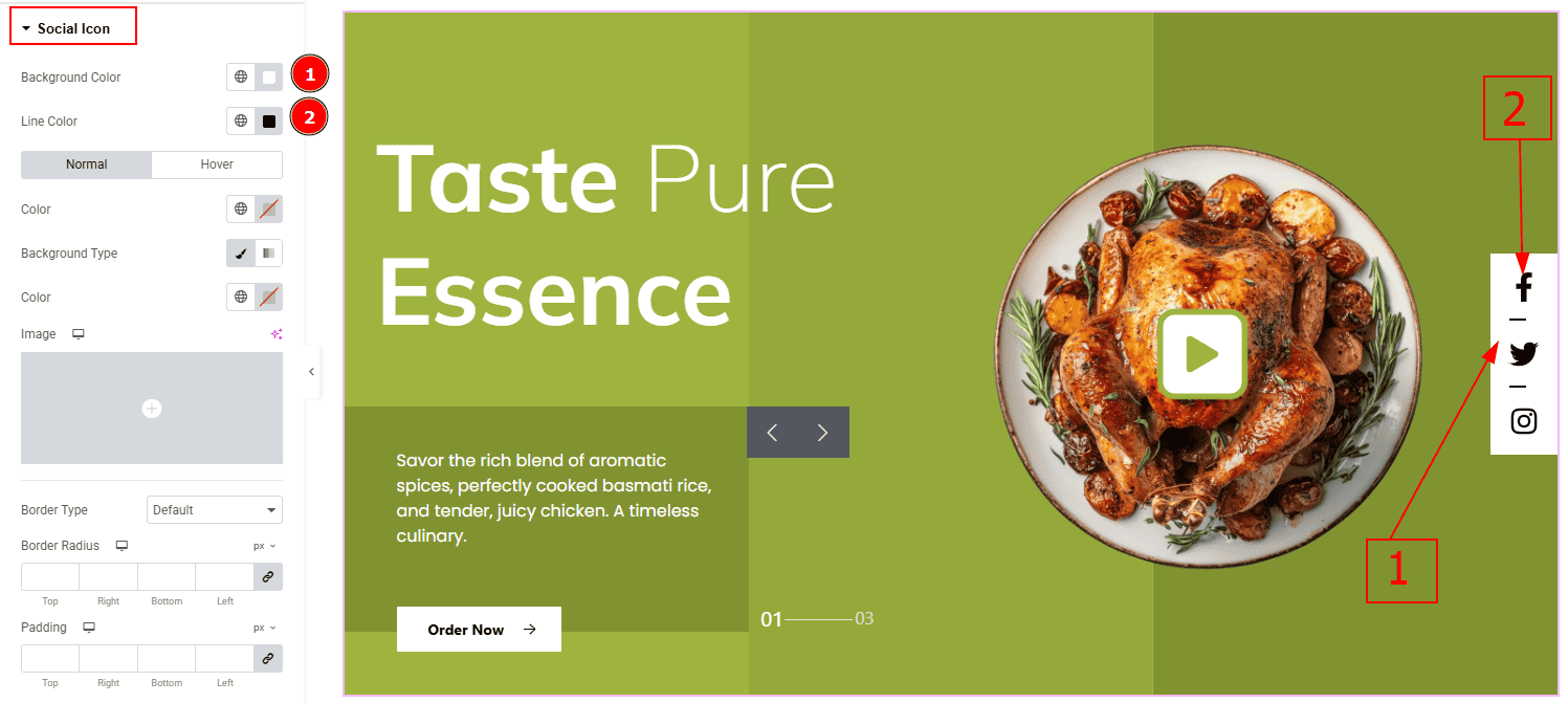
Background Color: You can change the background color with this option.
Line Color: You can change the line color with this option
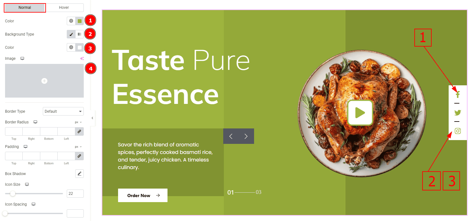
In this Section, we have two tabs. These are Normal & Hover. Let’s start with the Normal Tab –
Color: You can change the social icon color with this option.
Background Type: You can select the background type to Classic or Gradient from here. Here we selected Classic.
Color: You can change the background hover color with this option.
Image: You can change the background image with this option.
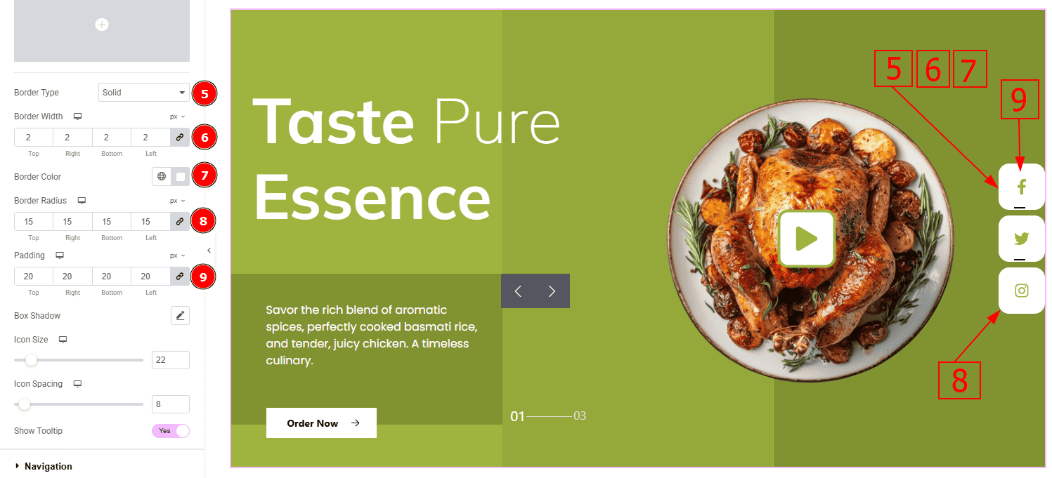
Border Type: You can add a border to the social icon with this option.
Border Width: Set the thickness of the border with this option.
Border Color: You can change the border color with this option.
Border Radius: This option controls the roundness of the border with this option.
Padding: You can adjust the inner space of the social icon with this option.
Box Shadow: You can add a shadow effect with this option.
Icon Size: You can make changes to the social icon size with this option.
Icon Space Between: This option allows you to adjust the space between the social icons.
Show Tooltip: Enable the switcher to show the icon name when the mouse hovers over the icon.
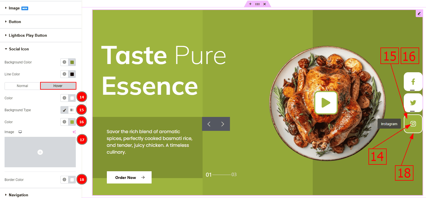
Now, let’s proceed to the Hover Tab –
Color: You can change the button text hover color with this option.
Background Type: You can select the background type to Classic or Gradient from here. Here we selected the Classic.
Color: You can change the background hover color with this option.
Image: You can change the background image with this option.
Border Color: You can change the border color with this option.
Navigation Section
Go to Style > Navigation
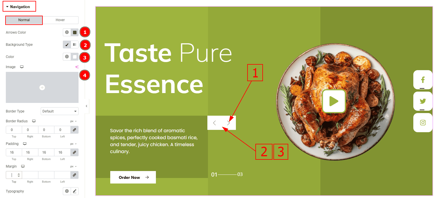
In this Section, we have two tabs. These are Normal & Hover. Let’s start with the Normal Tab –
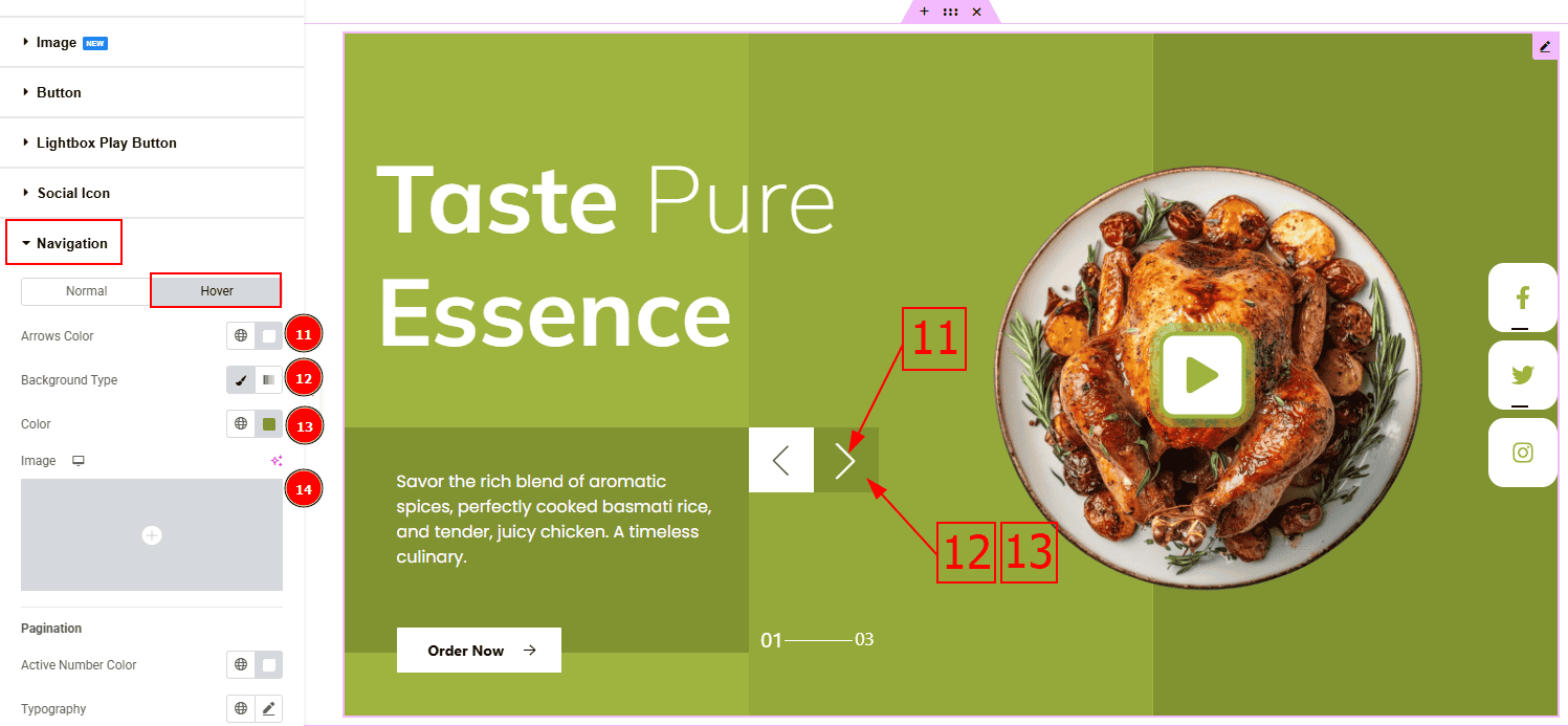
Arrows Color: This option allows you to change the arrows’ color.
Background Type: You can select the background type to Classic or Gradient from here. Here we selected the Classic.
Color: You can change the background hover color with this option.
Image: You can change the background image with this option.
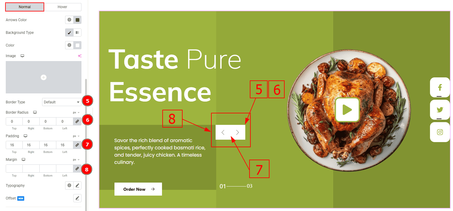
Border Type: This option allows you to add a border.
Border Radius: This option controls the roundness of the border with this option.
Padding: Add spaces around an object to increase the inner area. Padding allows you to control the internal space within an element.
Margin: This option allows you to adjust the space & create gaps between elements.
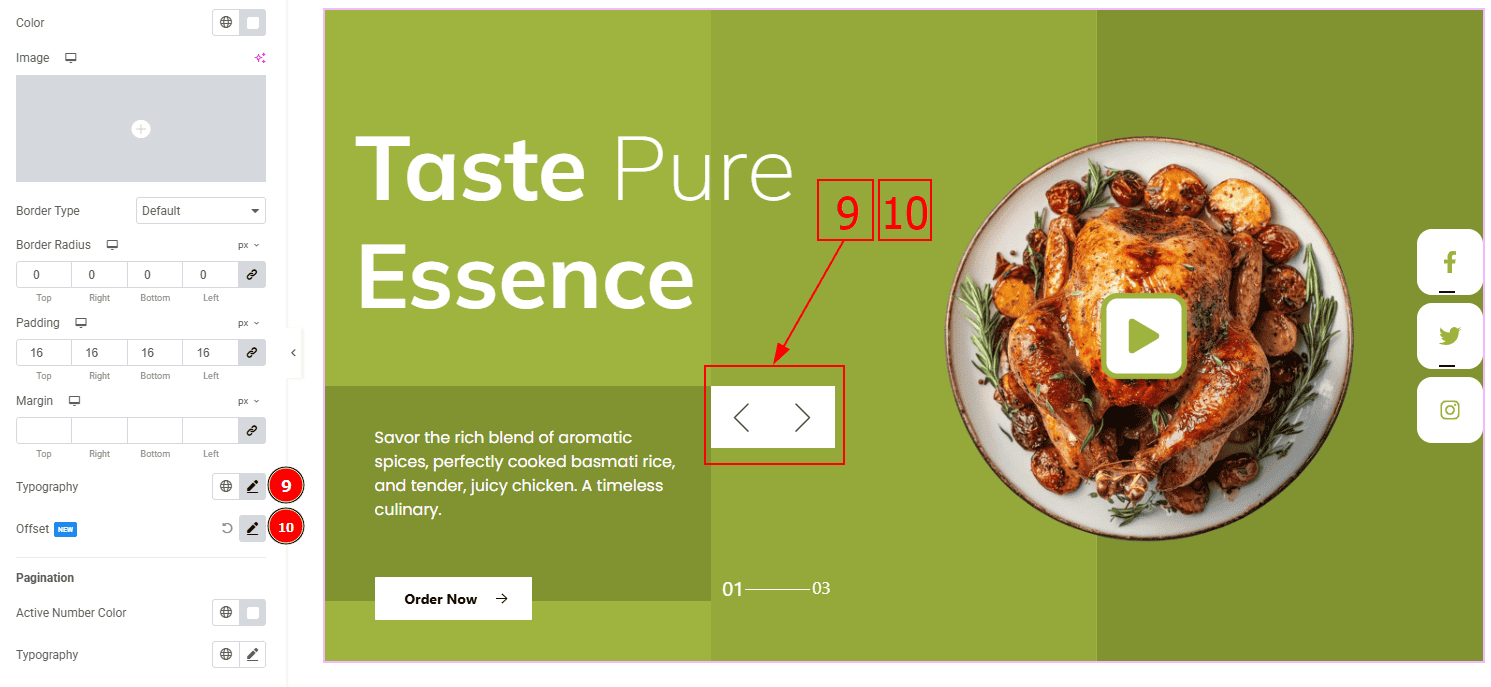
Typography: Change the font family, size, weight, transform, style, decoration, line height, letter spacing, and word spacing from here.
Offset: This option allows you to move the arrow’s position vertically or horizontally.
Now, let’s proceed to the Hover Tab –
Arrows Color: You can change the button text hover color with this option.
Background Type: You can select the background type to Classic or Gradient from here. Here we selected the Classic.
Color: You can change the background hover color with this option.
Image: You can change the background image with this option.
Pagination
In this section, we have one sub-section named Pagination. Let’s explore this –
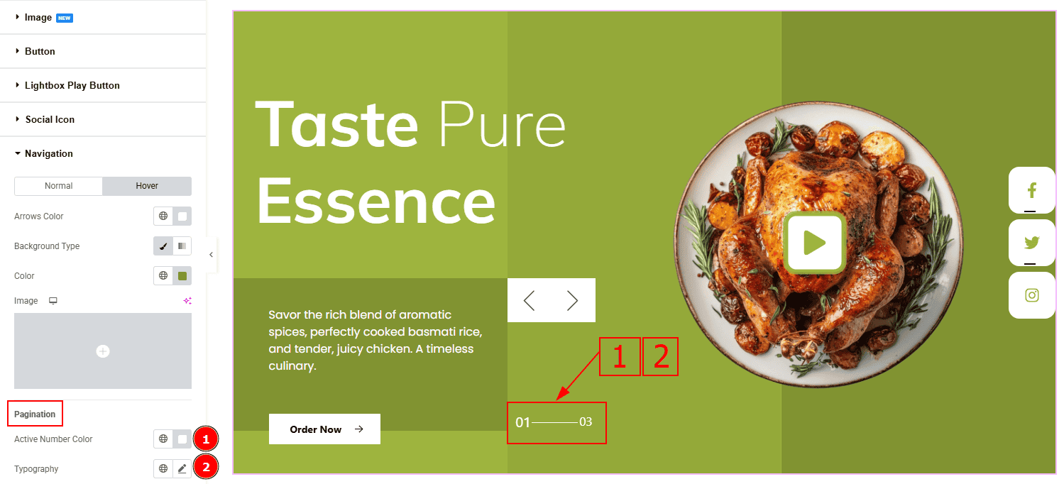
Active Number Color: You can change the active number color with this option.
Typography: Change the font family, size, weight, transform, style, decoration, line height, letter spacing, and word spacing from here.
All done! You have successfully customized the Isolate Slider Slice Skin on your website.
Video Assist
You can also watch the video tutorial to learn more about the Isolate Slider Slice Skin. Please visit the demo page for examples.
Thanks for staying with us.