
In this documentation, we will discuss the customization of the Coddle widget, brought to you by the Prime Slider addon for Elementor.
Enable The Coddle Widget
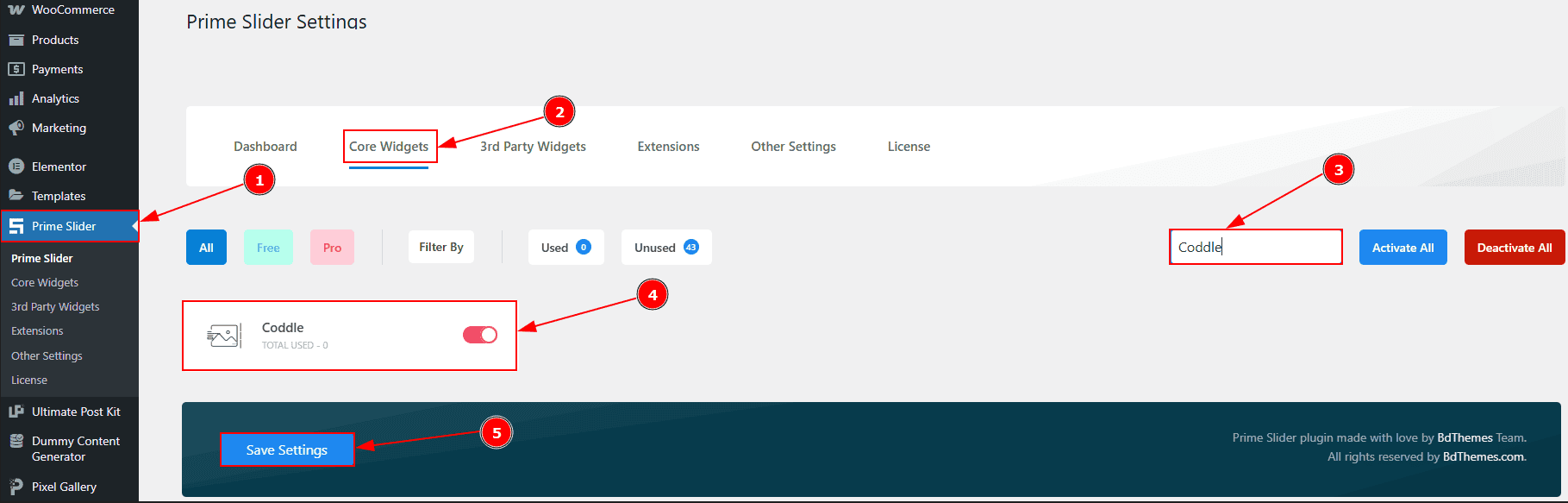
To use the Coddle widget from Prime Slider, first, you have to enable the widget.
Go to WordPress dashboard > Prime Slider Plugin dashboard.
Then, Click the Core Widgets Tab.
Search the Coddle Widget Name.
Enable the Coddle Widget.
Hit the Save Settings Button.
Inserting The Coddle widget

Go to the Elementor Editor Page and Hit the “+” icon Button.
Search the Coddle widget.
Drag the widget and drop it on the editor page.
Work With The Content Tab
Layout Section
Go to Content > Layout
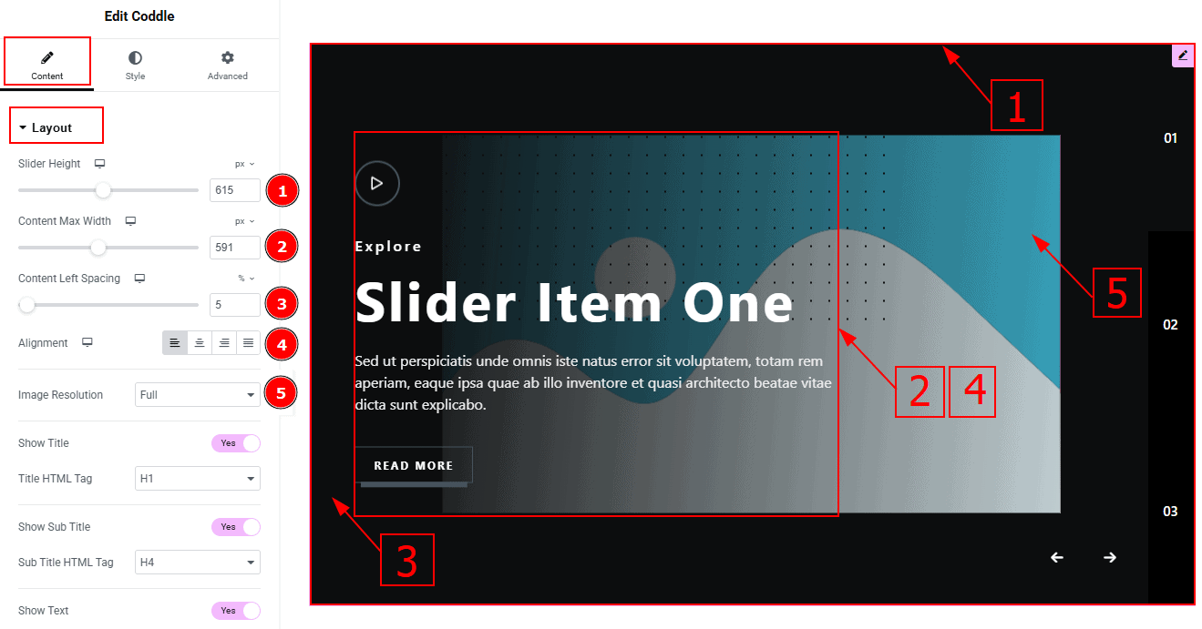
Slider Height: You can make changes to the slider height with this option.
Content Max Width: This option allows you to adjust the content width.
Content Left Spacing: This option allows you to adjust the left space of the content.
Alignment: This option allows you to move the content position to left, center, right or justify.
Image Resolution: You can set the image resolution with this option.
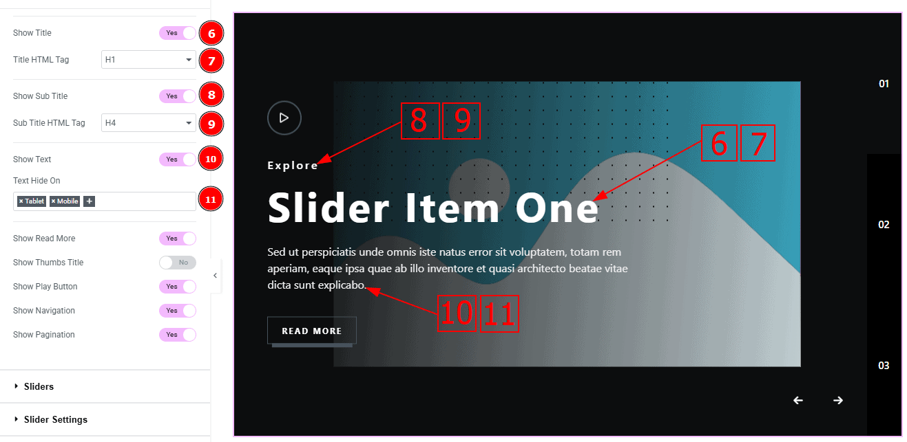
Show Title: Enable or disable the switcher to show or hide the title to the audience.
Title HTML Tag: You can change the HTML tag of the title with this option.
Show Sub title: Enable or disable the switcher to show or hide the sub title to the audience.
Title HTML Tag: You can change the HTML tag of the title with this option.
Show Text: Enable or disable the switcher to show or hide the text to the audience.
Text Hide On: This option allows you to add the names of the devices where you want to hide text.
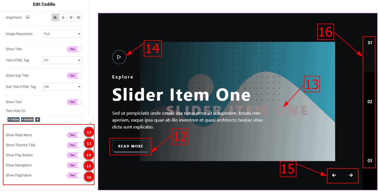
Show Read More: Enable or disable the switcher to show or hide the Read More Button to the audience.
Show Thumbs Title: Enable or disable the switcher to show or hide the Thumbs Title to the audience.
Show Play Icon: Enable or disable the switcher to show or hide the play icon to the audience.
Show Pagination: Enable or disable the switcher to show or hide pagination to the audience.
Sliders Section
Go to Content > Sliders
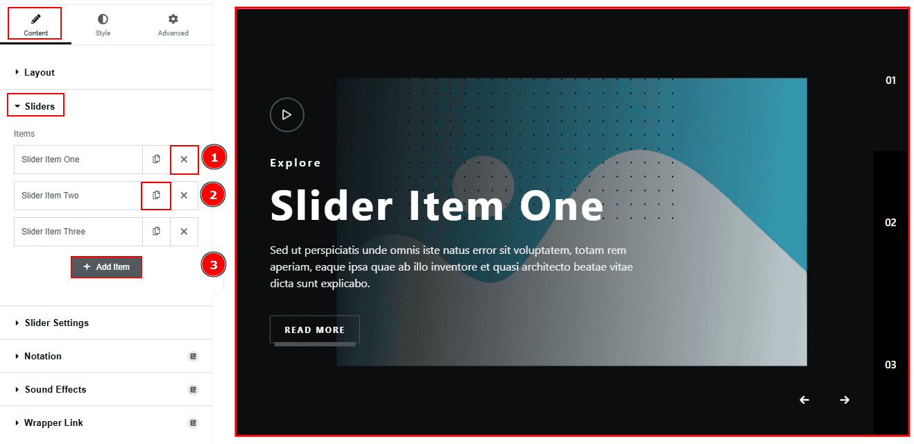
Close Item: You can delete the Slider item by clicking the Close icon button.
Copy Item: This option lets you copy the same item.
Add Item: You can add a new item by clicking the “+”Add Item button.
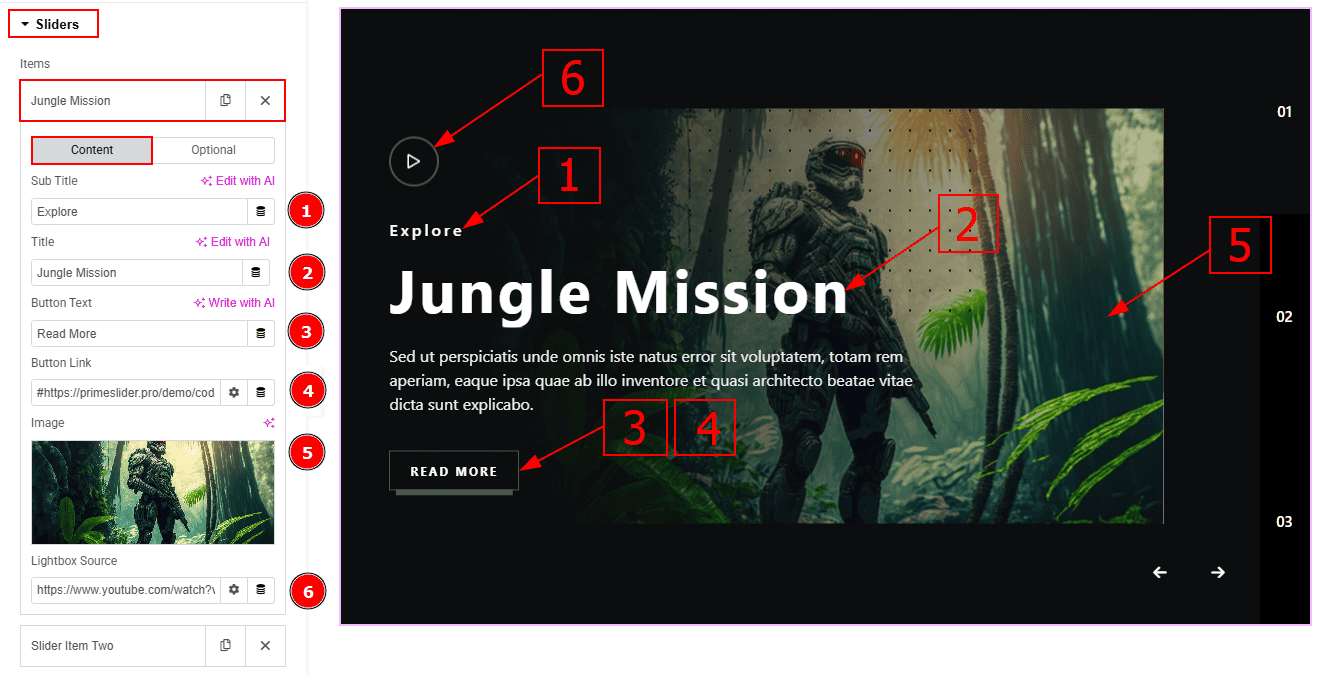
In the Slider Items, each item contains more options. There are two tabs that present those options. These are Content & Optional. Let’s start with the Content Tab -
Sub Title: You can add the sub-title text in this option.
Title: You can add the title text with this option.
Button Text: You can add the button text with this option.
Button Link: You can add a link to the button with this option.
Image: You can add, change or remove an image with this option.
Lightbox Source: You can a link to the play button with this option.
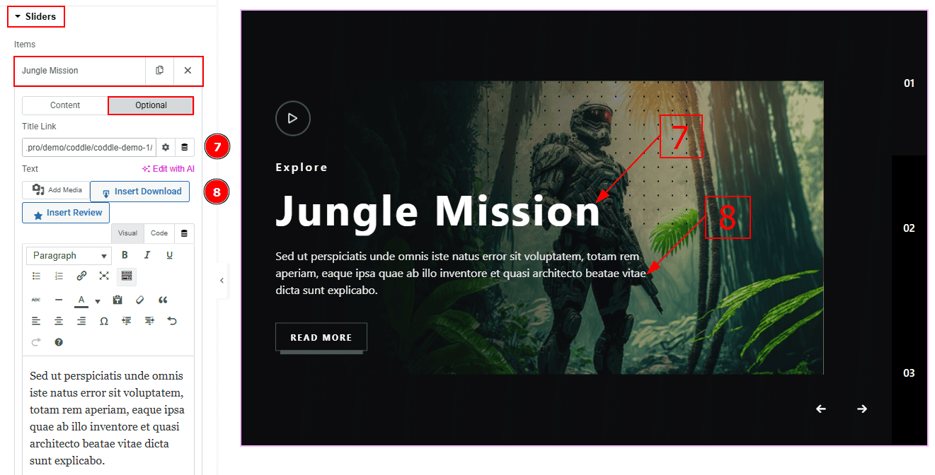
Now let’s proceed with the Optional Tab -
Title Link: This option allows you to add a link to the title.
Text: This option allows you to add and customize the description.
Slider Settings Section
Go to Content > Slider Settings
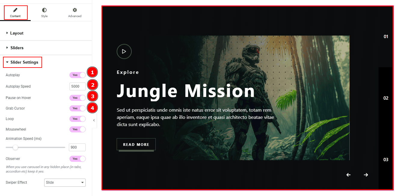
Autoplay: By enable this option you can automatically play the slides one after another.
Autoplay Interval (ms): This option let you set the time delay between each slide transition.
Pause on Hover: Enable the switcher to pause autoplay when the user hovers over the slider.
Grab Cursor: Enable/ Disable the switcher to show/hide the grab icon while hovering on the slider with this option.
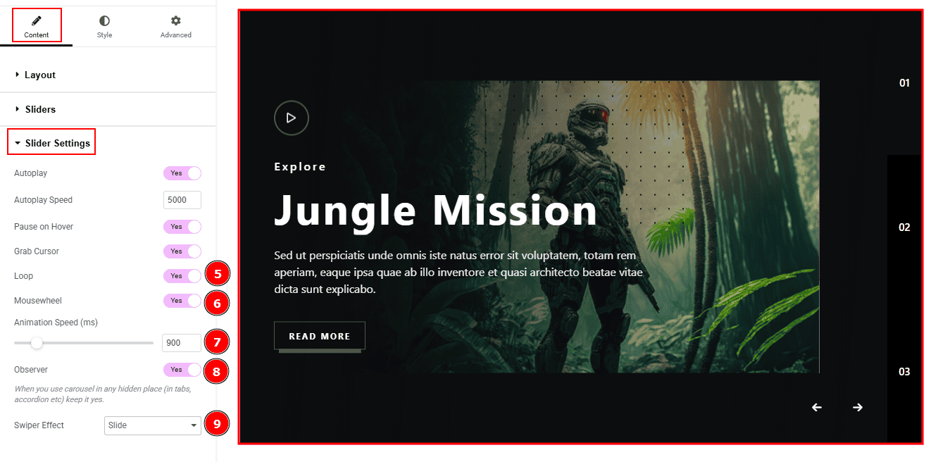
Loop: Enable the switcher to go back to the first automatically after the last slide.
Mousewheel: You can navigate through the slider’s slides by scrolling your mouse wheel while your cursor is over the slider.
Animation Speed: This option controls how fast the transition animation occurs between slides.
Observer: Enabling this option helps the slider function correctly when it’s initially hidden.
Swiper Effect: This option allows you to select the swiper effect from Slide, Fade, Cube, Coverflow, Flip, Shutters, Tinder, GL, & Creative. Here we selected the slide swiper effect.
Work with The Style Tab
Image Section
Go to Style > Image
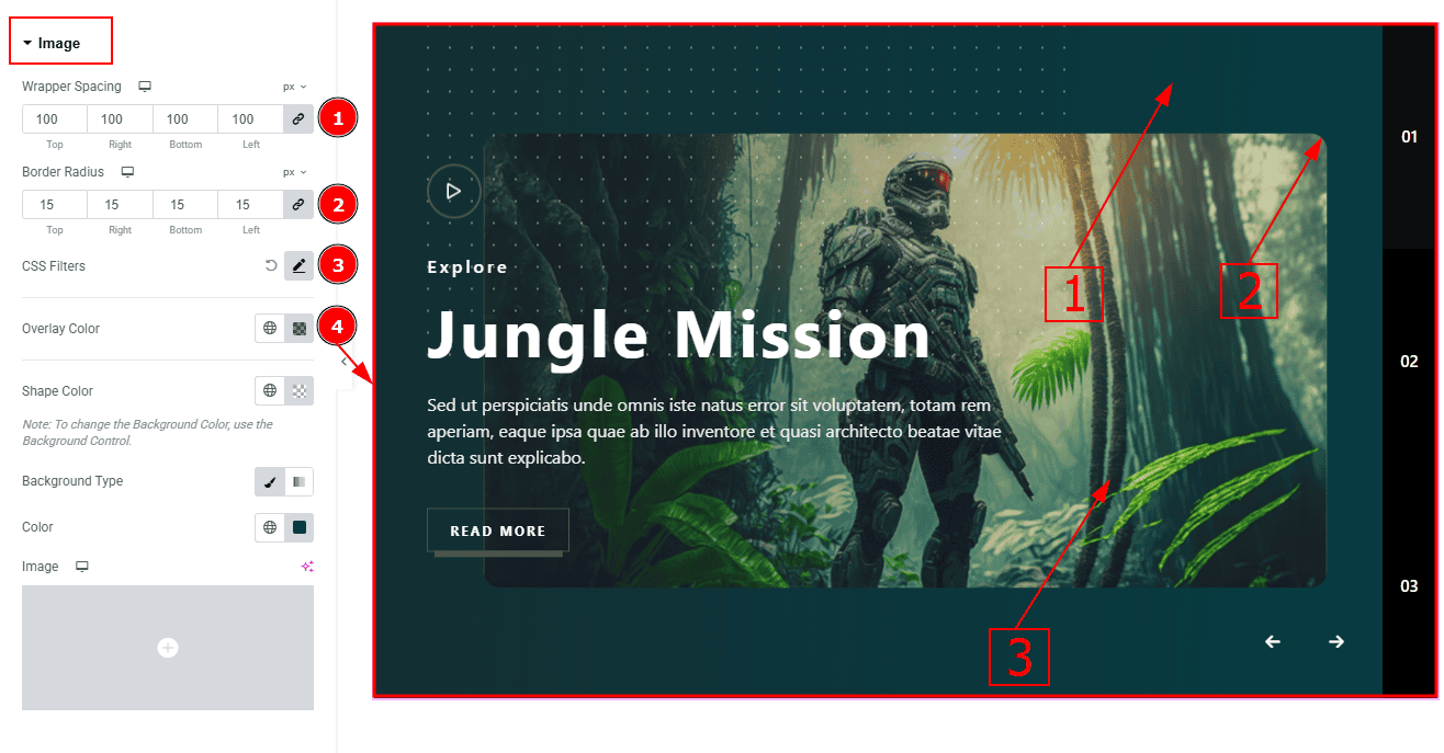
Wrapper Spacing: This option allows you to adjust the space around the image.
Border Radius: This option controls the roundness of the image.
CSS Filters: This setting lets you apply visual changes to the image. In this setting you can modify properties like Blur, Brightness, Contrast, Saturation, and Hue.
Blur: Softens the image, reducing sharpness.
Brightness: Adjusts the overall lightness or darkness.
Contrast: Modifies the difference between light and dark areas.
Saturation: Controls the intensity of the colors.
Hue: Shifts the overall color spectrum.
Overlay Color: You can change the overlay color with this option.
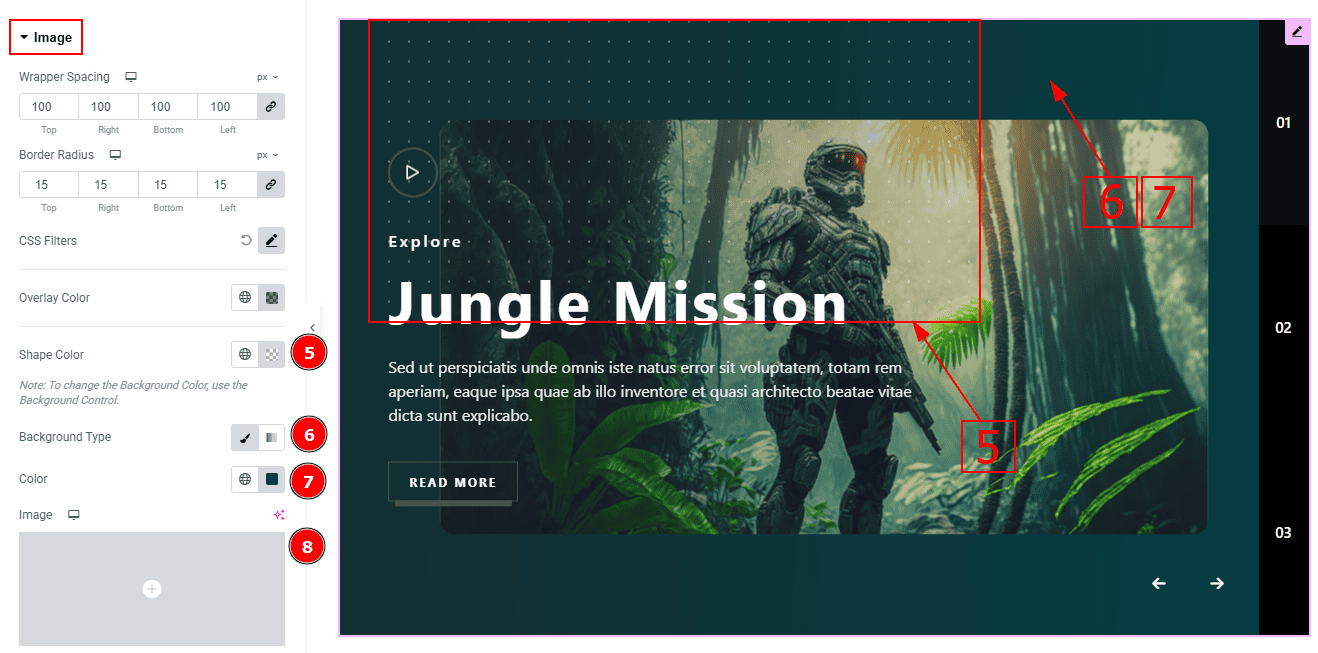
Shape Color: You can change the shape color with this option.
Background Type: You can change the background type here. There are two options in background type. These are Classic & Gradient. In Classic, you can change the background color and also set an image as the background. In the gradient option, you can also set background color along with locations and angle for each breakpoint to ensure the gradient adapts to different screen sizes. Also, you can change the gradient type (Radial & Linear) and positions.
Color: You can change the background color with this option.
Image: You can change the background image with this option.
Title Section
Go to Style > Title
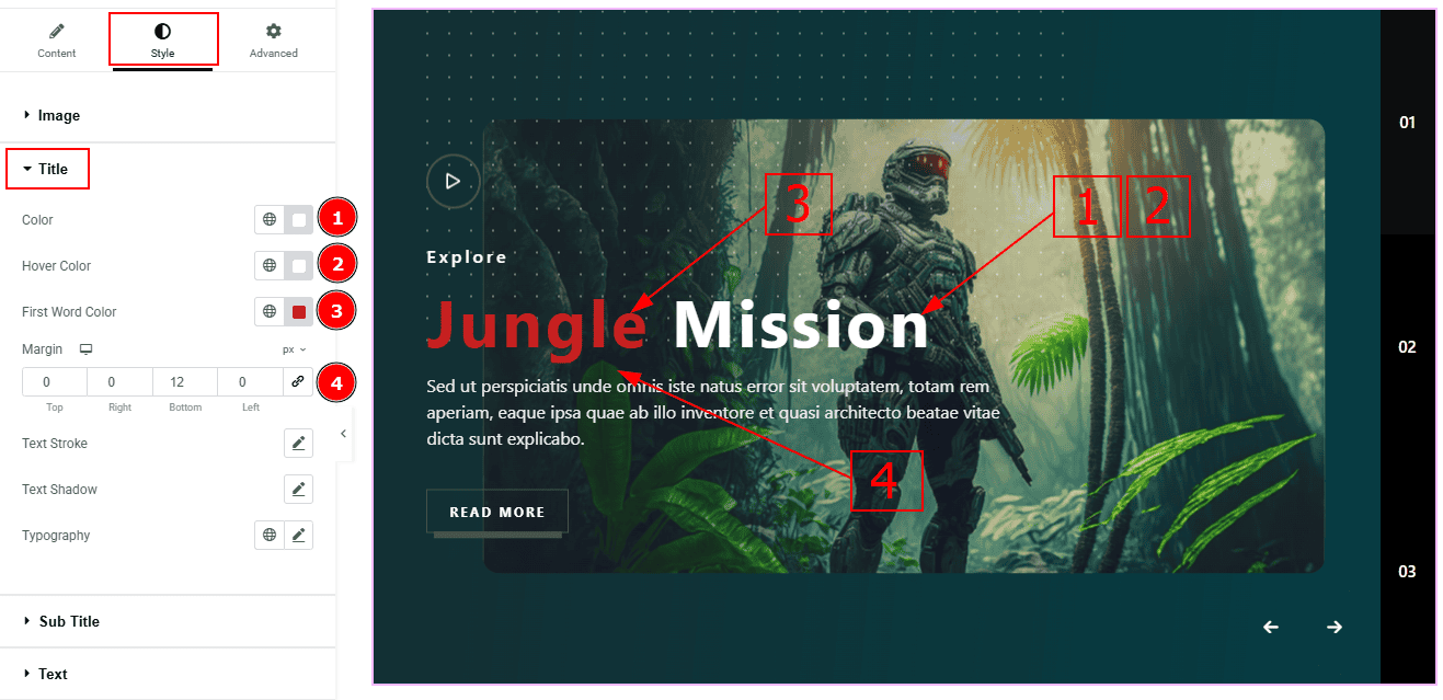
Color: You can change the title color with this option.
Hover Color: You can change the title hover color with this option.
First Word Color: You can change the title's first word color with this option.
Margin: This option allows you to adjust the space & create gaps between elements.
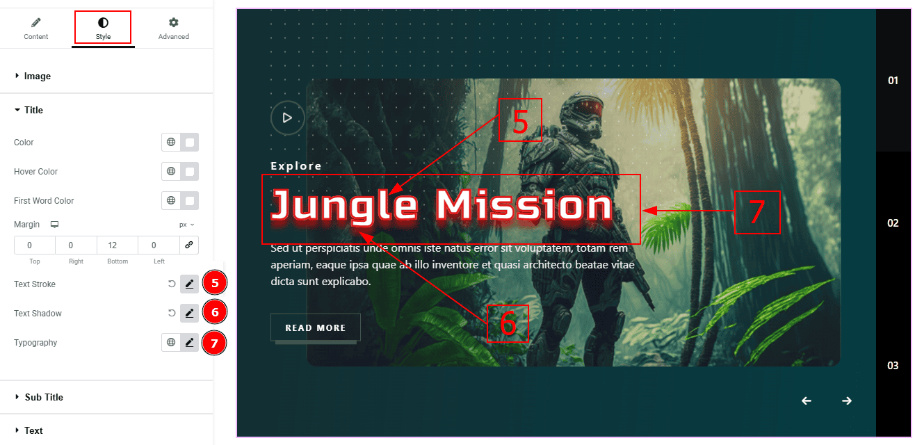
Text Stroke: This option allows you to add an outline or border around text, creating a visually distinct effect.
Text Shadow: You can create a shadow around the text and customize it with this option.
Typography: Change the font family, size, weight, transform, style, decoration, line height, letter spacing, and word spacing from here.
Sub Title Section
Go to Style > Sub Title
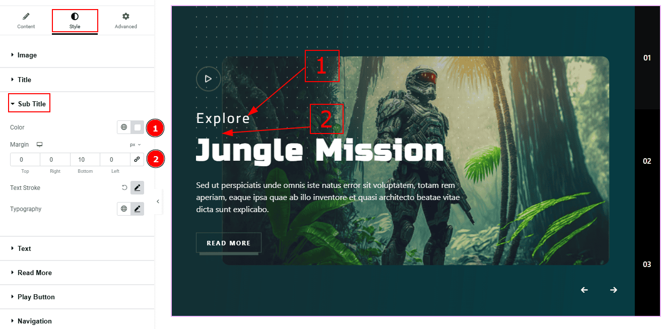
Color: You can change the subtitle color with this option.
Margin: This option allows you to adjust the space & create gaps between elements.
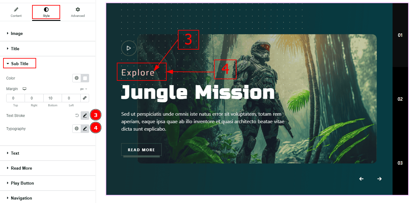
Text Stroke: This option allows you to add an outline or border around text, creating a visually distinct effect.
Typography: You can change the font family, size, weight, transform, style, decoration, line height, letter spacing, and word spacing from here.
Text Section
Go to Style > Text
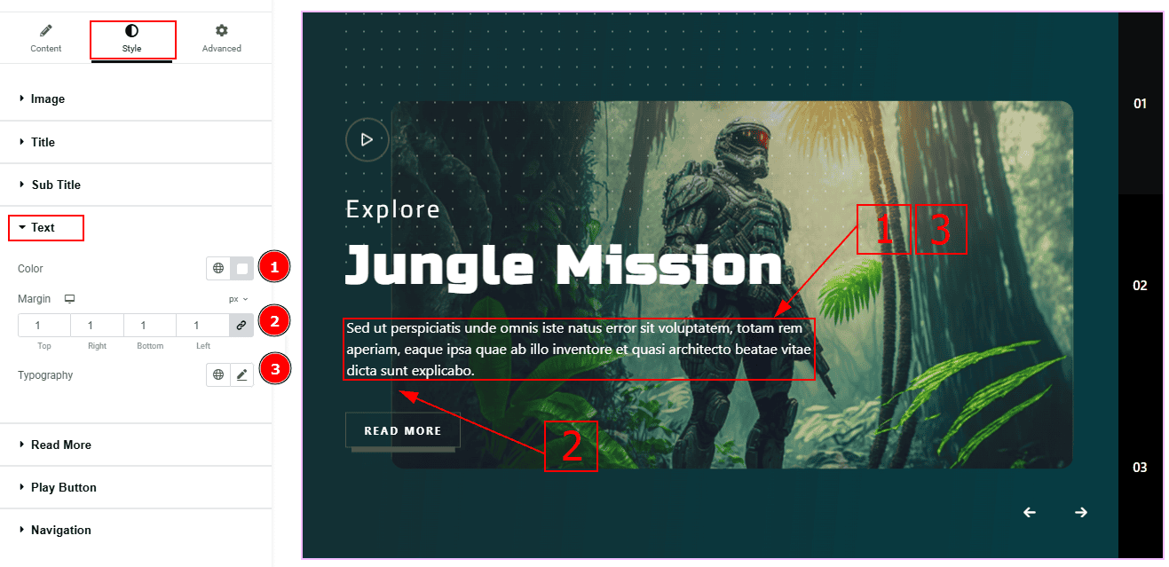
Color: You can change the excerpt text color with this option.
Margin: This option allows you to adjust the space & create gaps between elements.
Typography: Change the font family, size, weight, transform, style, decoration, line height, letter spacing, and word spacing from here.
Read More Section
Go to Style > Read More
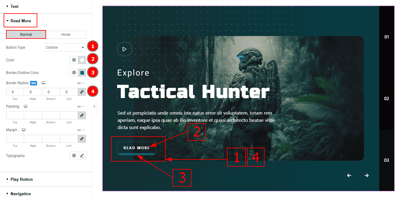
In this tab, we have two more sub-sections. One is Normal and the other is Hover. Let’s start with the Normal sub-section -
Button Type: This option allows you to change the button design to fill or outline. Here, we selected the outline option.
Color: You can change the button text color with this option.
Border/Outline Color: You can change the button’s border/outline color with this option.
Border Radius: This option controls the roundness of the border with this option.
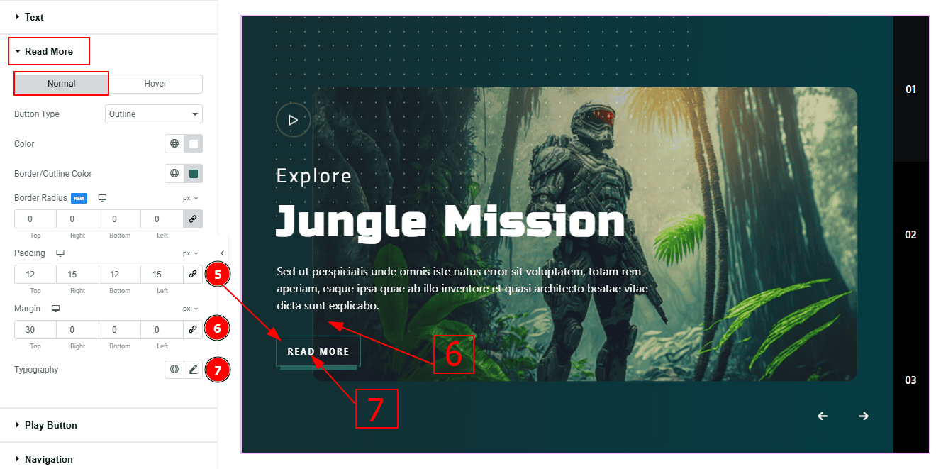
Padding: This option controls the inner gaps and space of the button.
Margin: This option controls the outer space and gaps around the button.
Typography: Change the font family, size, weight, transform, style, decoration, line height, letter spacing, and word spacing from here.
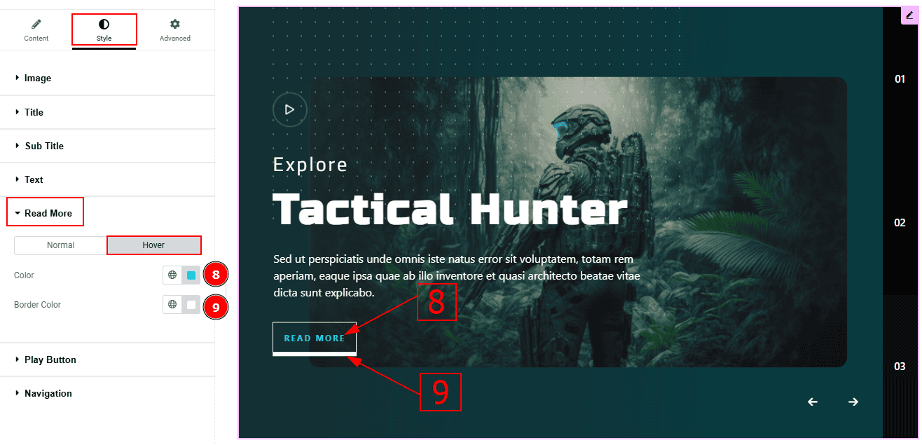
Now, let’s proceed to the Hover sub-section -
Color: You can change the text hover color with this option.
Border Color: You can change the border hover color with this option.
Play Button Section
Go to Style > Play Button
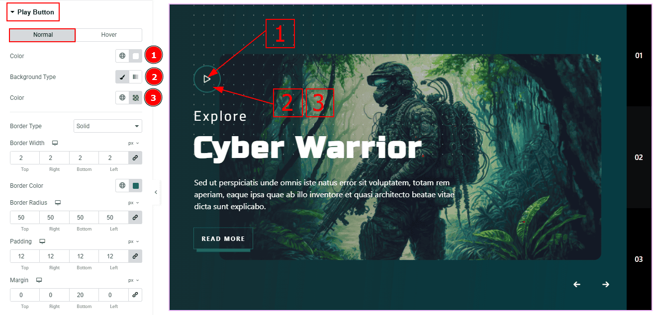
In this Section, we have two tabs. These are Normal & Hover. Let’s start with the Normal Tab -
Color: You can change the icon color with this option.
Background Type: This option allows you to change the background type to classic or gradient. Here, we selected the background type as classic.
Color: You can change the background color with this option.
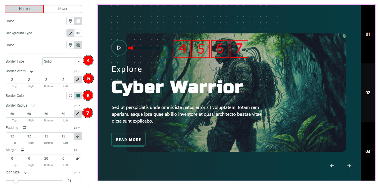
Border Type: This option allows you to add borders to your items. You can select various border types from this option. Such as Solid, Double, Dotted, Dashed, Groove.
Border Width: Set the thickness of the border with this option.
Border Color: You can change the border color with this option.
Border Radius: This option controls the roundness of the border.
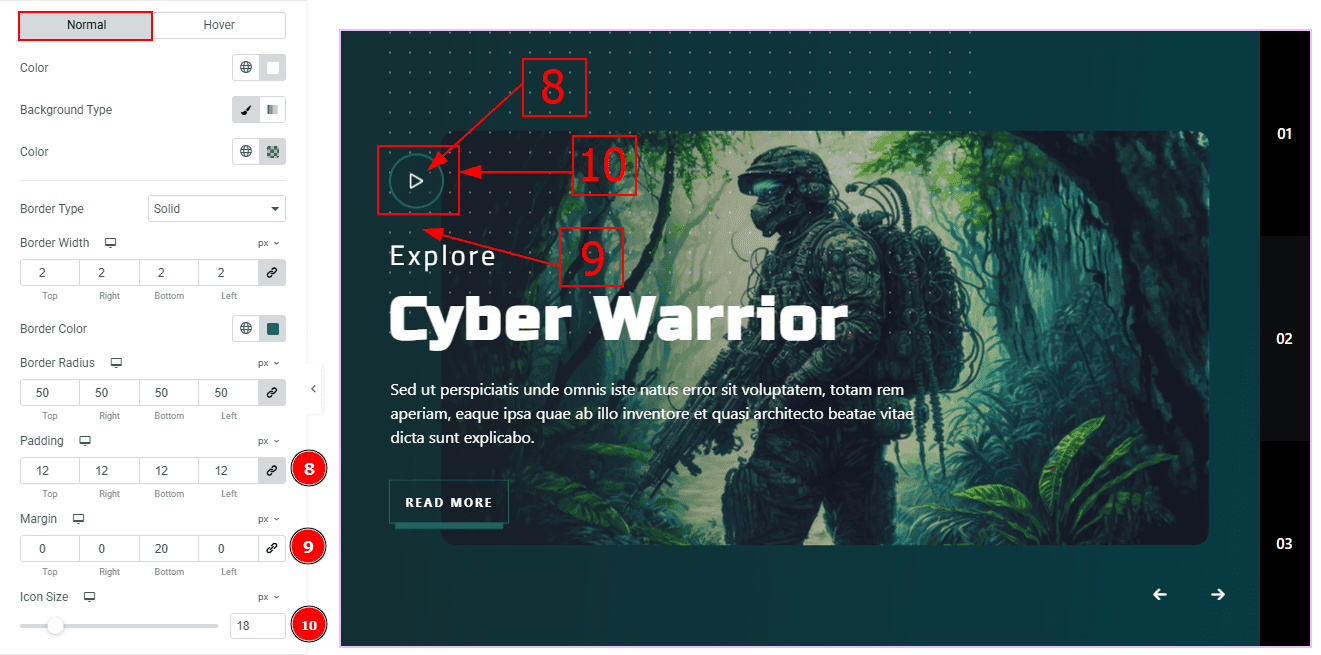
Padding: This option allows you to adjust the inner space and gaps of the play button.
Margin: This option allows you to adjust the outer space and gaps of the play button.
Icon Size: You can change the play button icon size with this option.
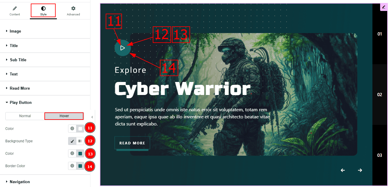
Now, let’s proceed to the Hover Tab -
Color: You can change the play button icon color with this option.
Background Type: This option allows you to change the background type to classic or gradient. Here, we selected the background type as classic.
Color: You can change the background hover color with this option.
Border Color: You can change the border hover color with this option.
Navigation Section
Go to Style > Navigation
Arrows Sub Section
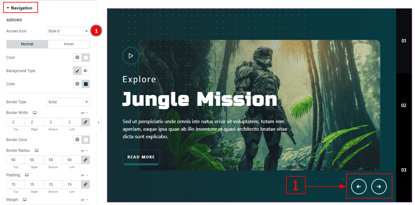
In this section we have two more sub section. These are Arrows & Pagination. Let’s proceed to the arrows sub section first -
1. Arrows Icon: This option allows you to select the arrows design. Here we selected the arrows style 8.
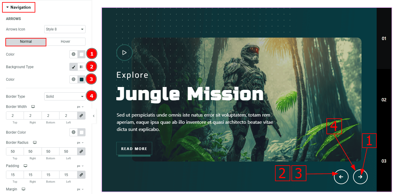
In the arrows sub section, we have two more tabs. These are Normal & Hover. Let’s start with the Normal Tab -
Color: You can change the arrows' color with this option.
Background Type: You can select the background type to classic or gradient here.
Color: You can change the background color with this option.
Border Type: You can select the border type with this option.
Border Width: Set the thickness of the border with this option.
Border Color: You can change the border color with this option.
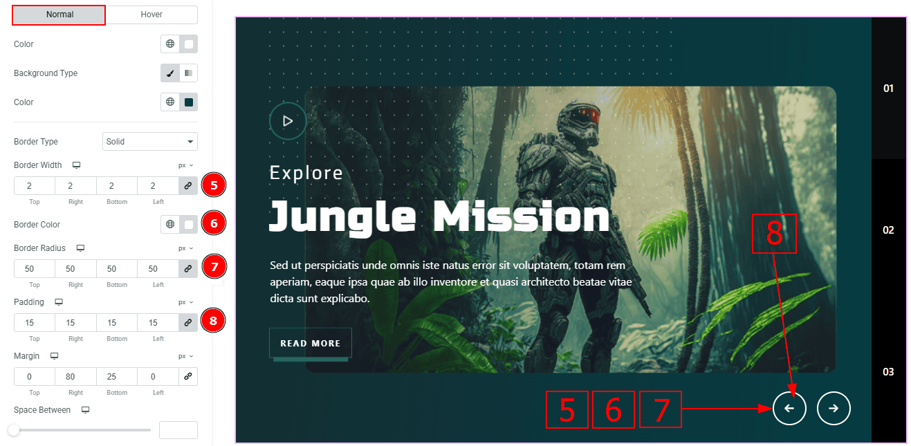
Border Radius: This option controls the roundness of the border.
Padding: You can adjust the inner space of the arrow's field with this option.
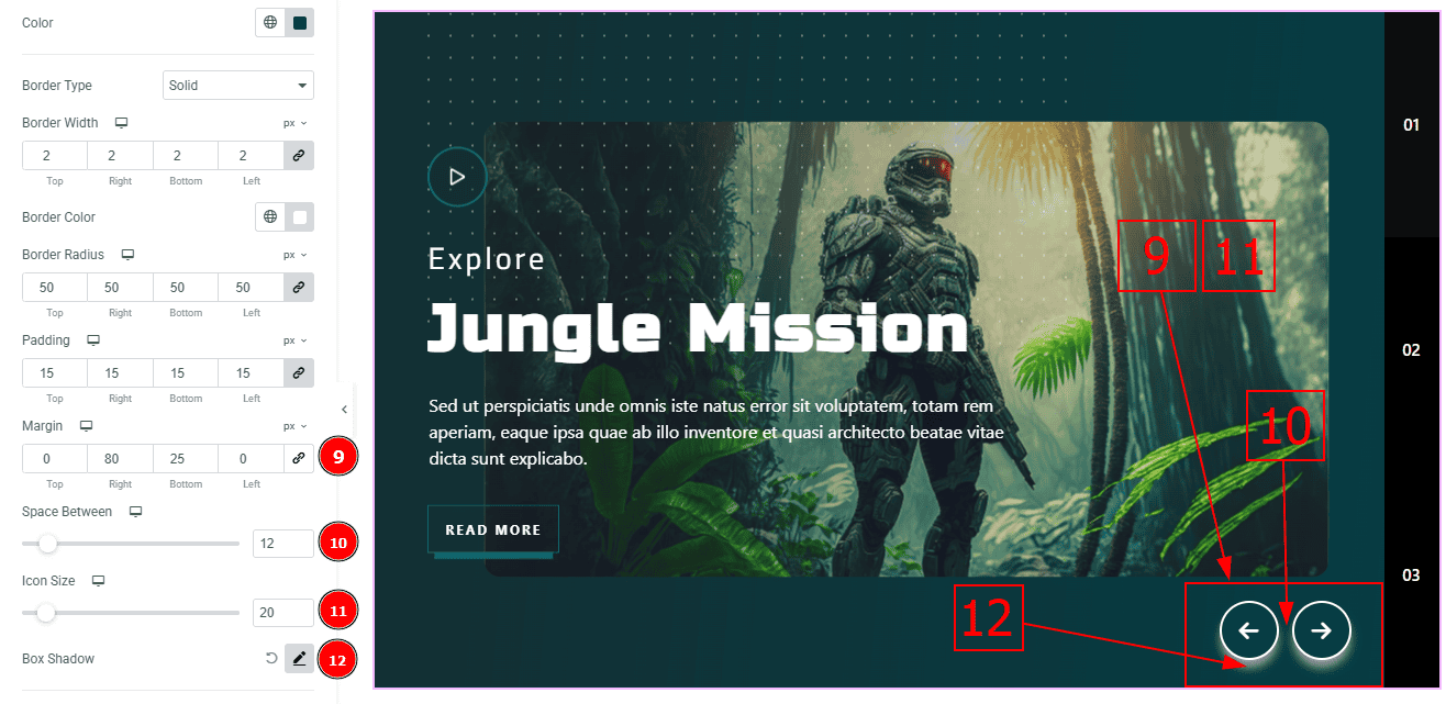
Margin: You can adjust the outer space of the arrow’s field with this option.
Space Between: You can adjust the space between arrow’s with this option.
Icon Size: You can make changes to the icon size with this option.
Box Shadow: While working with this option, you will get three more options (Blur, Horizontal & Vertical). Blur Controls how sharp or soft the shadow will appear. By using the horizontal option you can move the shadow left or right and by using the vertical option you can move the shadow up or down.
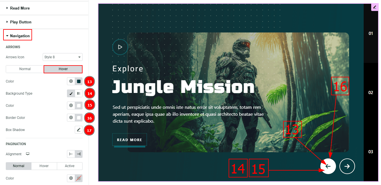
Now, let’s proceed to the Hover Tab -
Color: You can change the arrow's icon hover color with this option.
Background Type: You can select the background type to classic or gradient here.
Color: You can change the background hover color with this option.
Border Color: You can change the border hover color with this option.
Box Shadow: You can add a shadow effect to the arrow’s icon with this option.
Pagination Sub Section
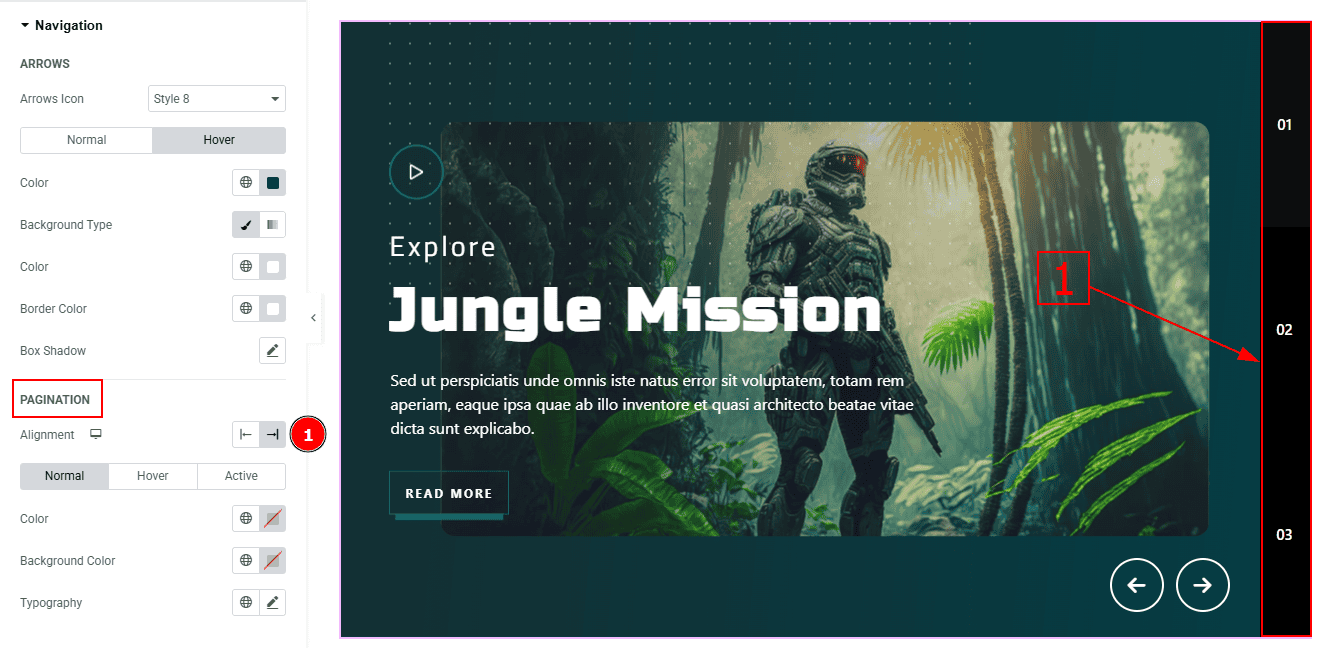
1. Alignment: You can set the pagination alignment to left or right with this option.
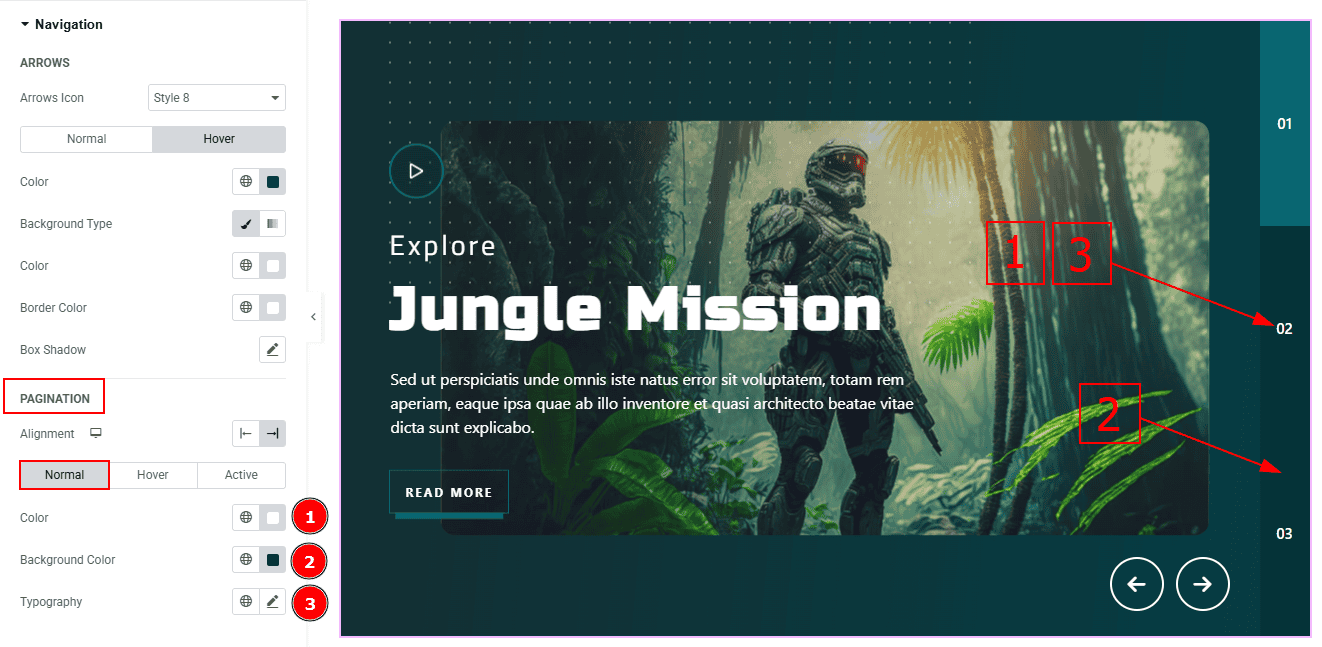
In this sub-section, we have three more tabs. These are Normal, Hover & Active. Let’s start with the Normal Tab first -
Color: You can change the pagination number color with this option.
Background Color: You can change the background color with this option.
Typography: Change the font family, size, weight, transform, style, decoration, line height, letter spacing, and word spacing from here.

Now, let’s proceed to the Hover Tab -
Color: You can change the pagination hover color with this option.
Background Color: You can change the background hover color with this option.
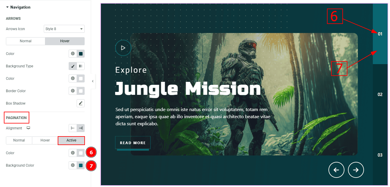
Now, let’s proceed to the Active Tab -
Color: You can change the pagination active color with this option.
Background Color: You can change the background active color with this option.
All done! You have successfully customized the Coddle Widget on your website.
Video Assist
You can also watch the video tutorial to learn more about the Coddle Widget. Please visit the demo page for examples.
Thanks for being with us.