
In this documentation, we will discuss the customization of the Astoria Slider, brought to you by the Prime Slider addon for Elementor.
Enable The Astoria Slider
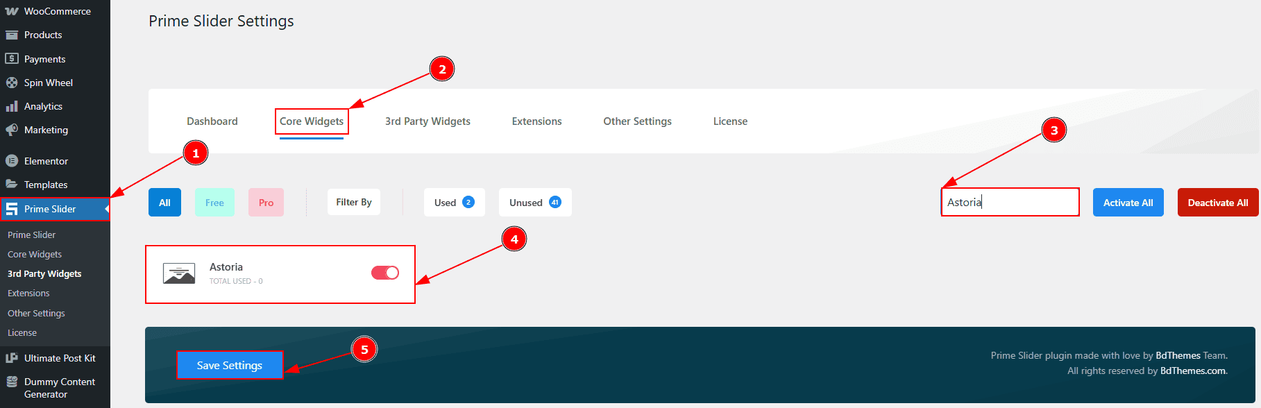
To use the Astoria Slider from Prime Slider, first, you have to enable the slider.
Go to WordPress dashboard > Prime Slider Plugin dashboard.
Then, Click the Core Widgets Tab.
Search the Astoria Slider Name.
Enable the Astoria Slider.
Hit the Save Settings Button.
Inserting The Astoria Slider
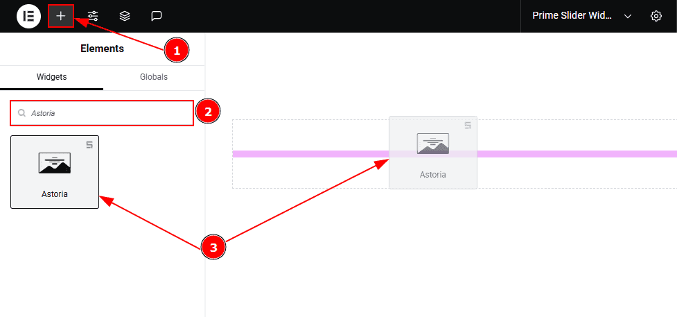
Go to the Elementor Editor Page and hit the “+” icon Button.
Search the Astoria Slider.
Drag the widget and drop it on the editor page.
Work With The Content Tab
Sliders Section
Go to Content > Sliders
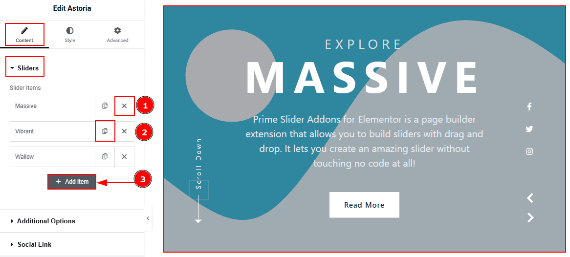
Close Item: You can delete the Slider item by clicking the Close icon button.
Copy Item: This option lets you copy the same item.
Add Item: You can add a new item by clicking the “+” Add Item button.
In the Slider Items, each item contains more options. There are two tabs that present those options. These are Content & Optional. Let’s start with the Content Tab -
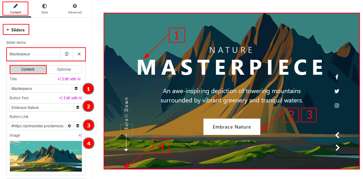
Title: You can add the title text with this option.
Button Text: You can add the button text with this option.
Button Link: You can add a link to the button with this option.
Image: You can add or change the background image with this option.
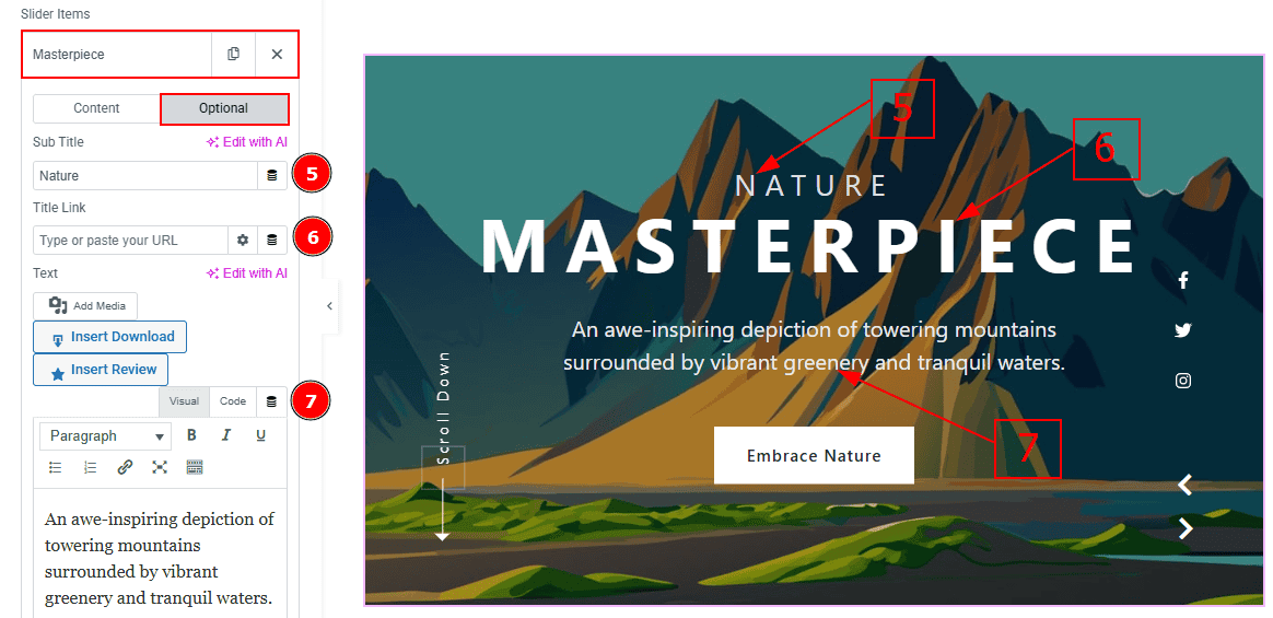
Now let’s proceed with the Optional Tab -
Sub Title: You can add the subtitle text in this option.
Title Link: This option allows you to add a link to the title.
Text: This option allows you to add and customize the description.
Additional Options Section
Go to Content > Additional Options
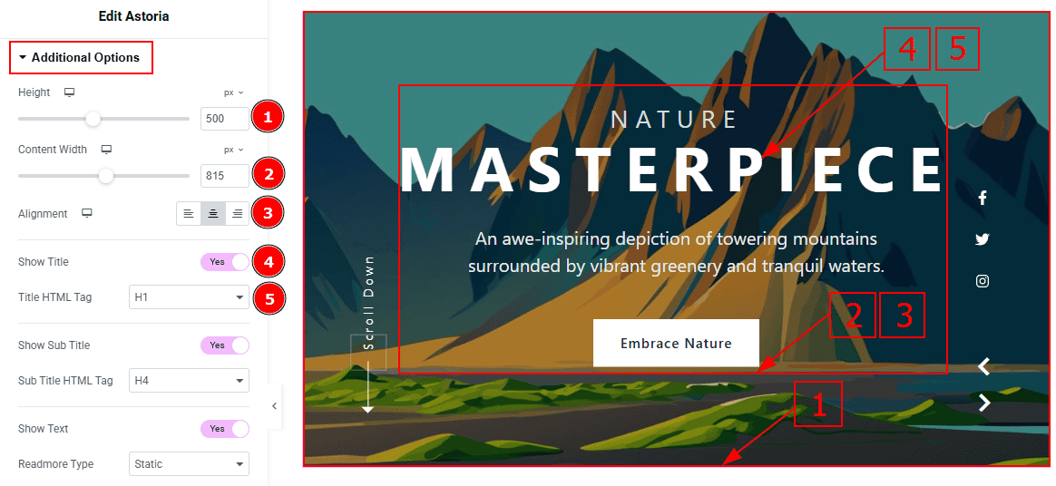
Minimum Height: You can adjust the slider height with this option.
Content Width: You can change the width of the content with this option.
Alignment: You can set the content position to left, center or right with this option.
Show Title: Enable the switcher to show the title to the audience.
Title HTML Tag: This option lets you select the heading for the title.
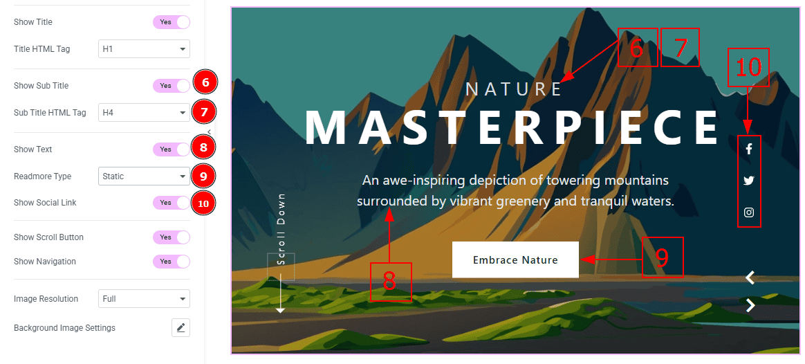
Show Sub Title: Enable the switcher to show the subtitle to the audience.
Sub Title HTML Tag: This option lets you select the heading for the subtitle.
Show Excerpt: Enable the switcher to show the text (description) to the audience.
Readmore Type: You can select the readmore type as static to show the button to the audience.
Show Social Link: You can show the social link to the audience by enabling this option.
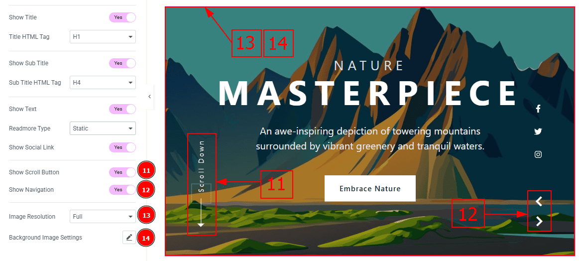
Show Scroll Button: You can show the scroll button to the audience by enabling this option.
Show Navigation: Enable the switcher to show the navigation bar to the audience.
Image Resolution: You can change the image resolution with this option.
Background Image Setting: You can make changes to the background image with this option. Here you will get position, repeat & size options to set up the background image.
Social Link Section
Go to Content > Social Link
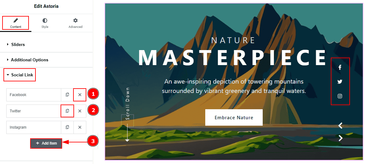
The settings in this section are the same as those in the Sliders section described above. For a detailed explanation, please refer to the Sliders section to understand how these options work.
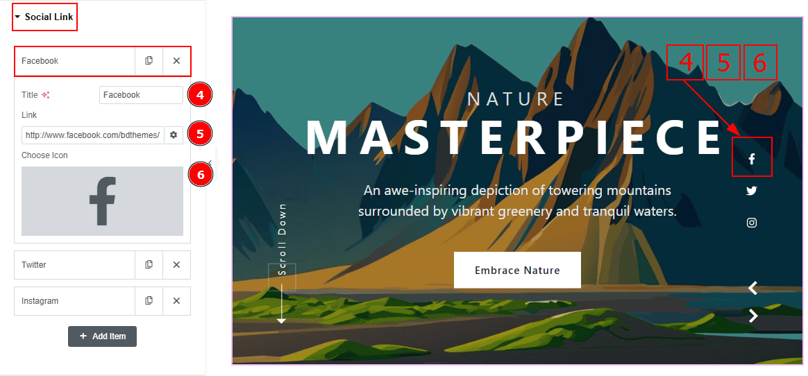
Now, let’s proceed to the inner options of the social icon -
Title: You can add a title to your social icon with this option.
Link: This option allows you to add a link to the social icon.
Choose Icon: You can choose an icon with this option.
Scroll Down Section
Go to Content > Scroll Down
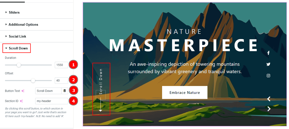
Duration: This option controls the timing of how long the scroll animation will take.
Offset: This option adjusts the final scroll position by a number of pixels (positive or negative).
Button Text: You can add the button text with this option.
Section ID: You can add the section ID here to go to the section where you want to go by clicking on the scroll down button.
Work with The Style Tab
Sliders Section
Go to Style > Sliders
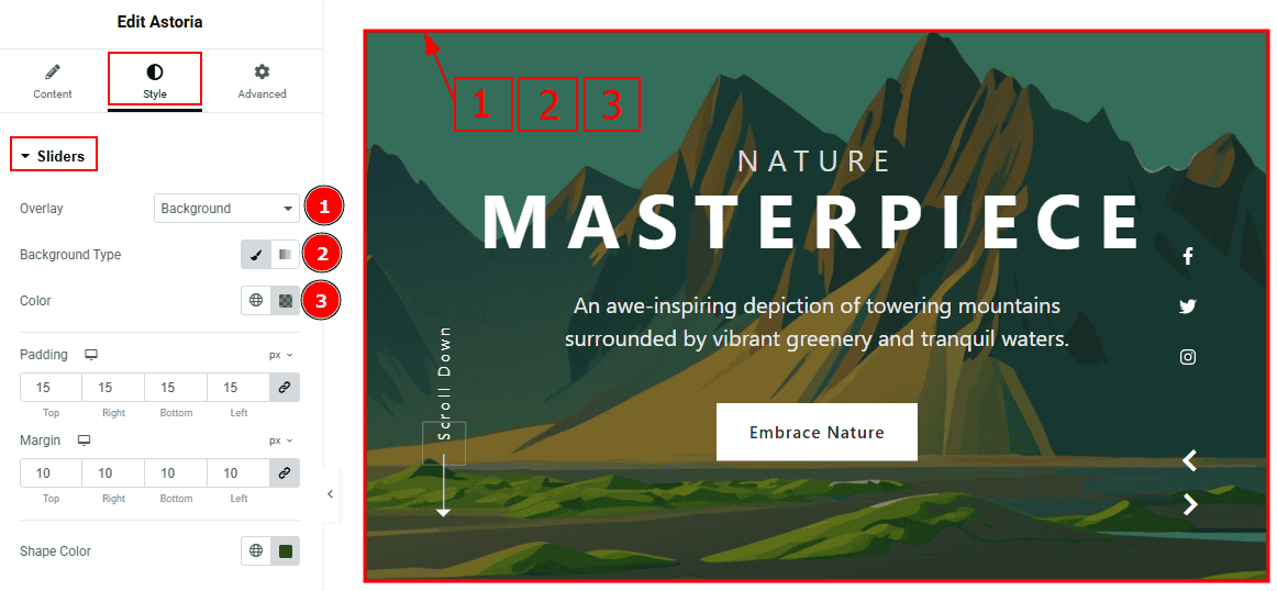
Overlay: You can select the overlay with this option.
Background Type: You can select the background type to classic or gradient with this option. Here, we selected the background type as Classic.
Color: You can change the background color with this option.
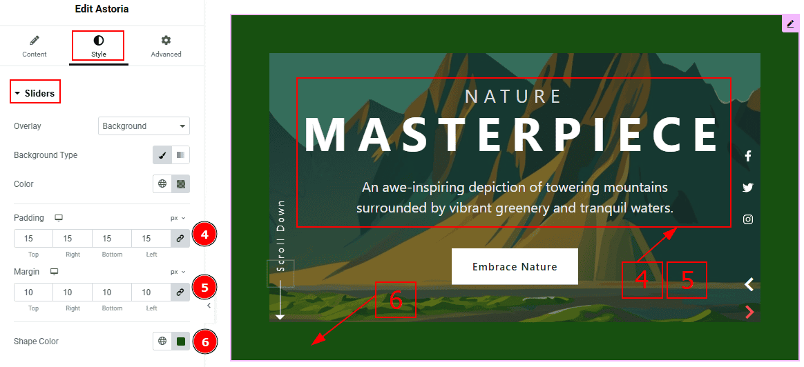
Padding: This option allows you to adjust the inner space of the content.
Margin: This option allows you to adjust the space & create gaps around the content.
Shape Color: You can change the shape color with this option.
Title Section
Go to Style > Title
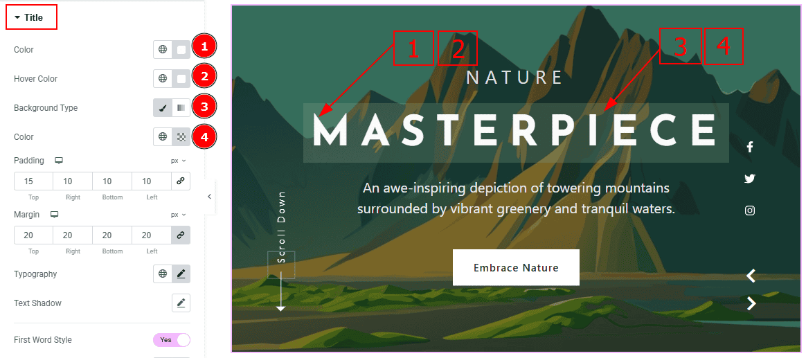
Color: You can change the title color with this option.
Hover Color: You can change the hover color with this option.
Background Type: You can select the background type to classic or gradient with this option. Here, we selected the background type as classic.
Color: You can change the background color with this option.
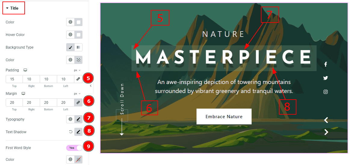
Padding: You can adjust the inner space of the title field with this option.
Margin: You can adjust the space around the title field with this option.
Typography: Change the font family, size, weight, transform, style, decoration, line height, letter spacing, and word spacing from here.
Text Shadow: This option allows you to add a shadow effect on the text.
First Word Style: Enable the switcher to get more options below to style the title.
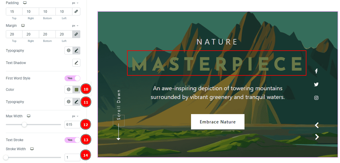
Color: You can change the first word's color with this option.
Typography: Change the font family, size, weight, transform, style, decoration, line height, letter spacing, and word spacing from here.
Max Width: You can set the title width with this option.
Text Stroke: This option allows you to add an outline or border around text, creating a visually distinct effect.
Stroke Width: You can adjust the stroke width with this option.
Sub Title Tab
Go to Style > Sub Title
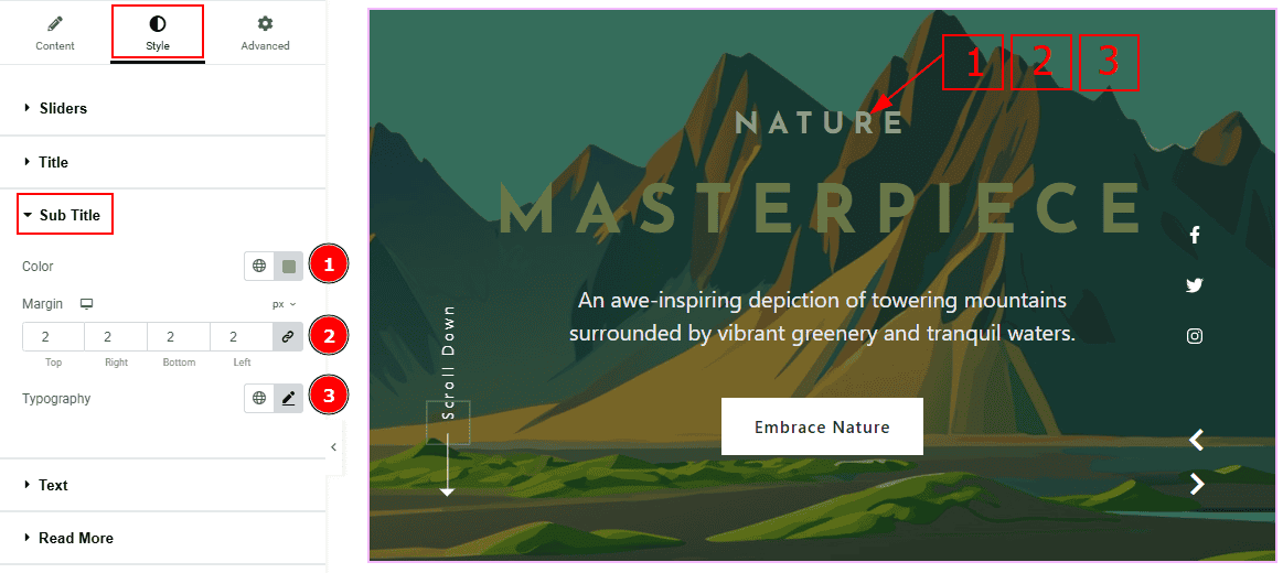
Color: You can change the subtitle color with this option.
Margin: This option allows you to adjust the space & create gaps between elements.
Typography: You can change the font family, size, weight, transform, style, decoration, line height, letter spacing, and word spacing from here.
Text Section
Go to Style > Text
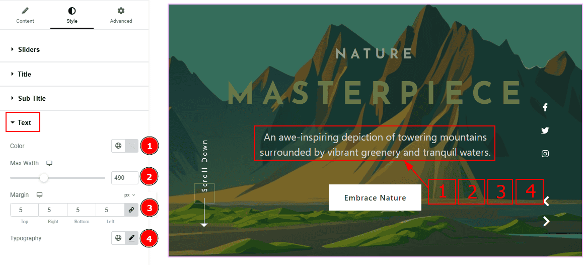
Color: You can change the text color with this option.
Max Width: You can adjust the width of the text with this option.
Margin: You can adjust the space around the text with this option.
Typography: Change the font family, size, weight, transform, style, decoration, line height, letter spacing, and word spacing from here.
Read More Section
Go to Style > Read More
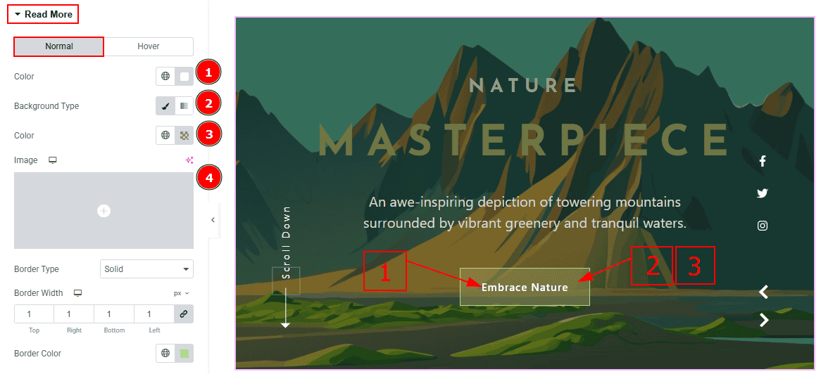
In this tab, we have two more tabs. One is Normal and the other is Hover. Let’s start with the Normal Tab -
Color: You can change the button text color with this option.
Background Type: You can select the background type to classic or gradient with this option. Here we selected the classic background.
Color: You can change the background color with this option.
Image: You can change the background image with this option.
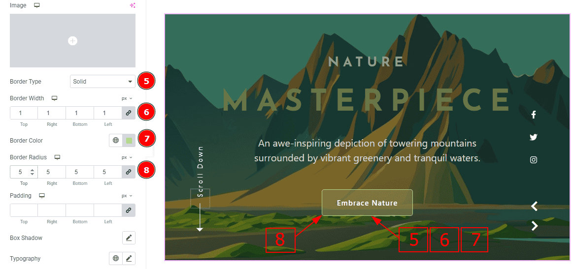
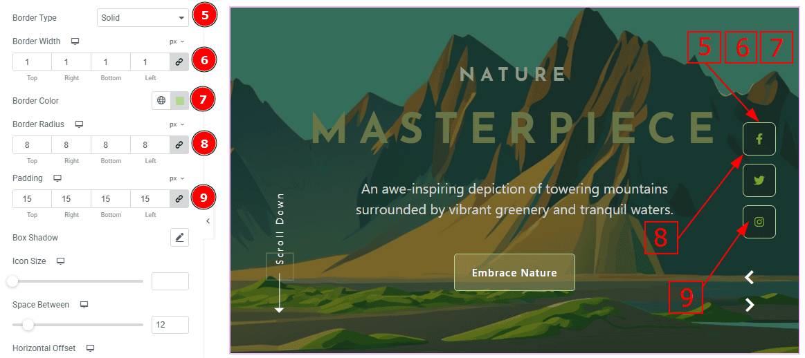
Border Type: You can add a border with this option.
Border Width: Set the thickness of the border with this option.
Border Color: You can change the border color with this option.
Border Radius: This option controls the roundness of the border.
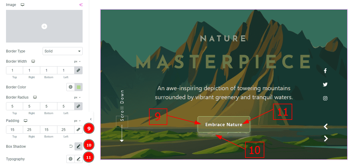
Padding: Add spaces around an object to increase the inner area. Padding allows you to control the internal space within an element.
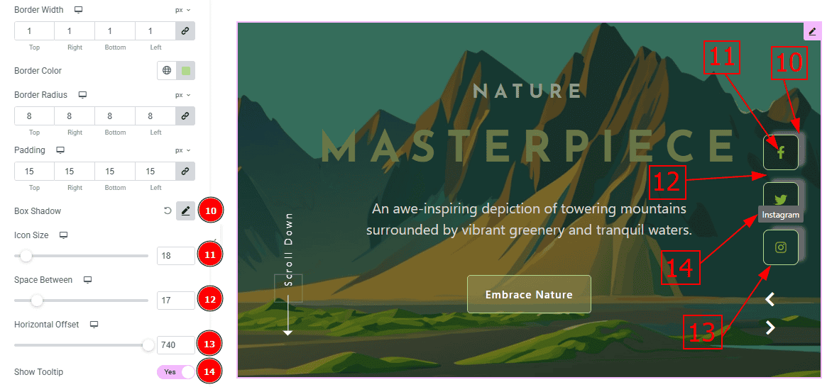
Box Shadow: You can add the shadow effect to the button with this option.
Typography: Change the button text font family, size, weight, transform, style, decoration, line height, letter spacing, and word spacing from here.
Now, Let’s Proceed to the Hover Tab -
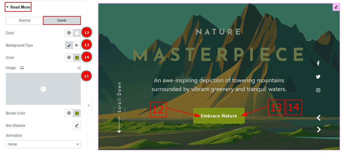
Color: You can change the button text hover color with this option.
Background Type: You can select the background type to Classic or Gradient from here. Here we selected the Classic.
Color: You can change the background hover color with this option.
Image: You can change the background image with this option.
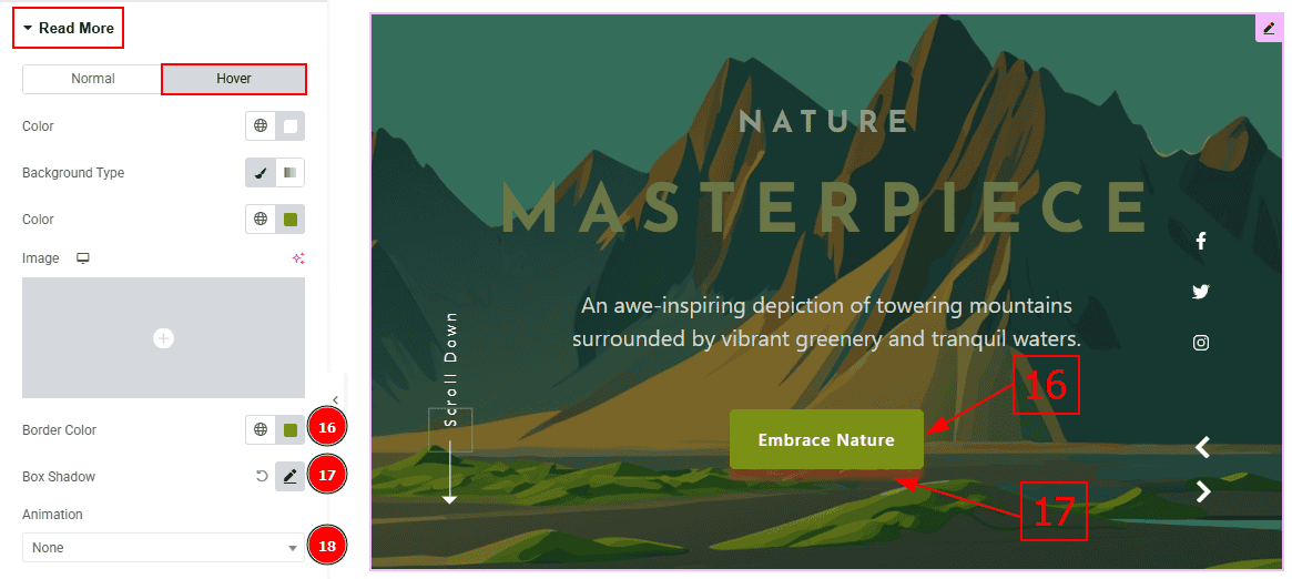
Border Color: You can change the border hover color with this option.
Box Shadow: You can add a hover shadow effect to the button with this option.
Animation: You can add an animation to the button with this option.
Social Link Section
Go to Style > Social Link
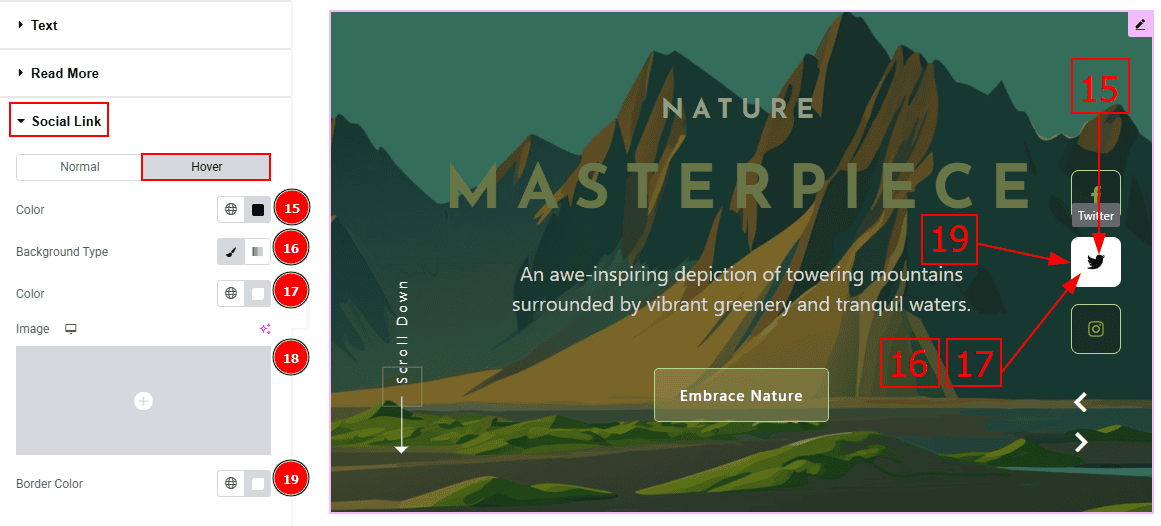
In this Section, we have two tabs. These are Normal & Hover. Let’s start with the Normal Tab -
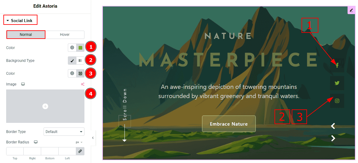
Color: You can change the social link color with this option.
Background Type: You can select the background type to Classic or Gradient from here. Here we selected Classic.
Color: You can change the background color with this option.
Image: You can change the background image with this option.
Border Type: You can add border to the social link with this option.
Border Width: Set the thickness of the border with this option.
Border Color: You can change the border color with this option.
Border Radius: This option controls the roundness of the border with this option.
Padding: You can adjust the inner space of the social icon with this option.
Box Shadow: You can add a shadow effect with this option.
Icon Size: You can make changes to the social icon size with this option.
Space Between: This option allows you to adjust the space between the social icons.
Horizontal Spacing: You can move the icon position horizontally with this option.
Show Tooltip: Enable the switcher to show the icon name when the mouse hovers over the icon.
Now, let’s proceed to the Hover Tab -
Color: You can change the social link hover color with this option.
Background Type: You can select the background type to Classic or Gradient from here. Here we selected the Classic.
Color: You can change the background hover color with this option.
Image: You can change the background image with this option.
Border Color: You can change the border hover color with this option.
Scroll Down Section
Go to Style > Scroll Down
In this Section, we have two tabs. These are Normal & Hover. Let’s start with the Normal Tab -
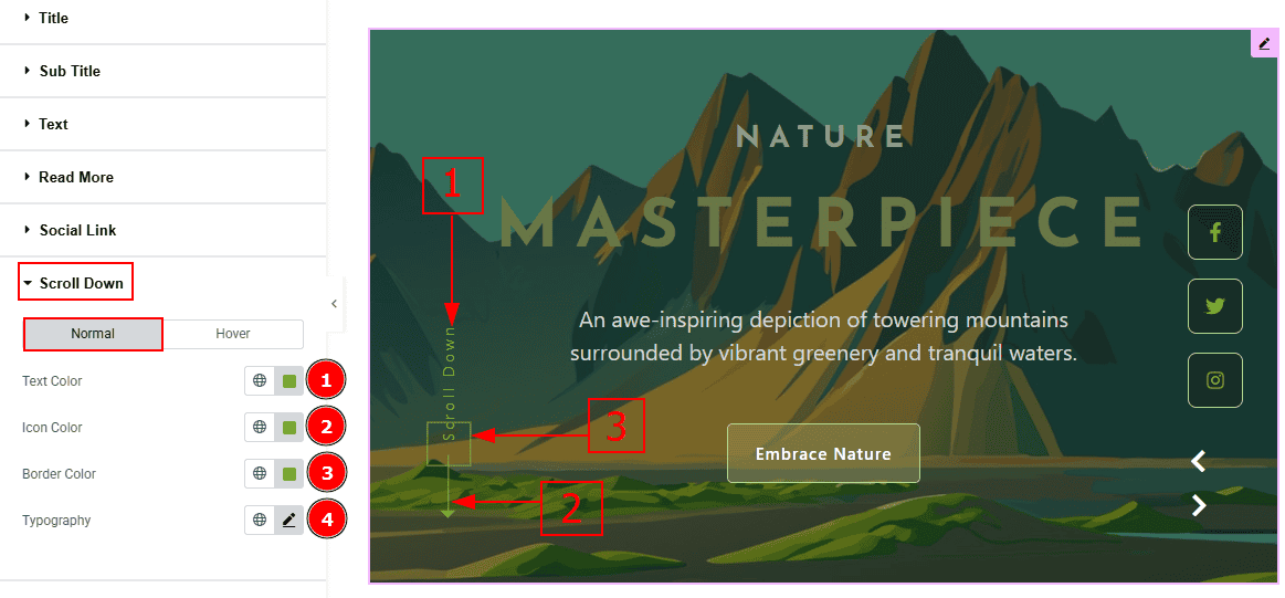
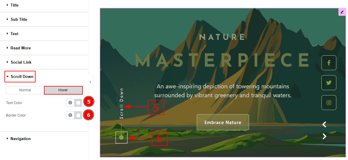
Text Color: You can change the scroll down text color with this option.
Icon Color: You can change the scroll down icon color with this option.
Border Color: You can change the scroll down border color with this option.
Typography: Change the font family, size, weight, transform, style, decoration, line height, letter spacing, and word spacing from here.
Now let’s proceed to the Hover Tab -
Text Color: You can change the scroll down text hover color with this option.
Border Color: You can change the scroll down border hover color with this option
Navigation Section
Go to Style > Navigation
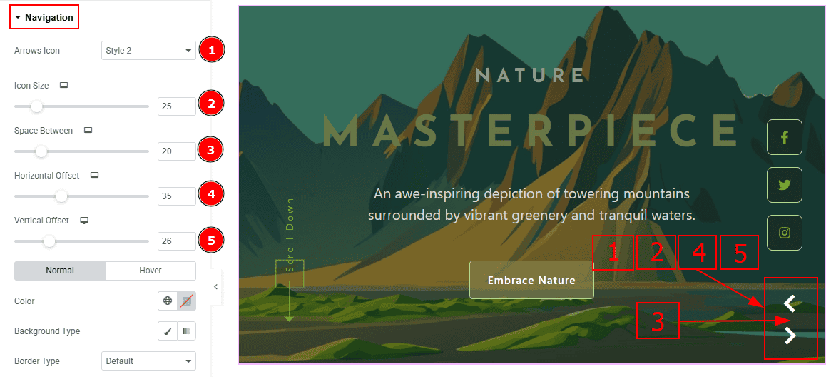
Arrows Icon: You can make changes to the arrows icon style with this option.
Icon Size: You can make changes to the arrows icon size with this option.
Space Between: You can adjust the space between to arrows with this option.
Horizontal Offset: You can move the arrows horizontally with this option.
Vertical Offset: You can move the arrows vertically with this option.
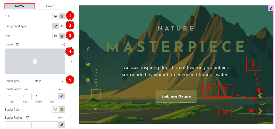
In this Section, we have two tabs. These are Normal & Hover. Let’s start with the Normal Tab -
Arrows Color: This option allows you to change the arrows' color.
Background Type: You can select the background type to Classic or Gradient from here. Here we selected the Classic.
Color: You can change the background hover color with this option.
Image: You can change the background image with this option.
Border Type: This option allows you to add a border.
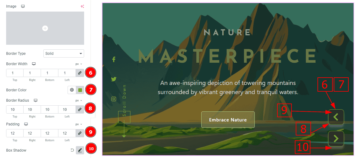
Border Width: Set the thickness of the border with this option.
Border Color: You can change the border color with this option.
Border Radius: This option controls the roundness of the border.
Padding: You can adjust the inner space of the arrows with this option.
Box Shadow: You can add a shadow effect with this option.
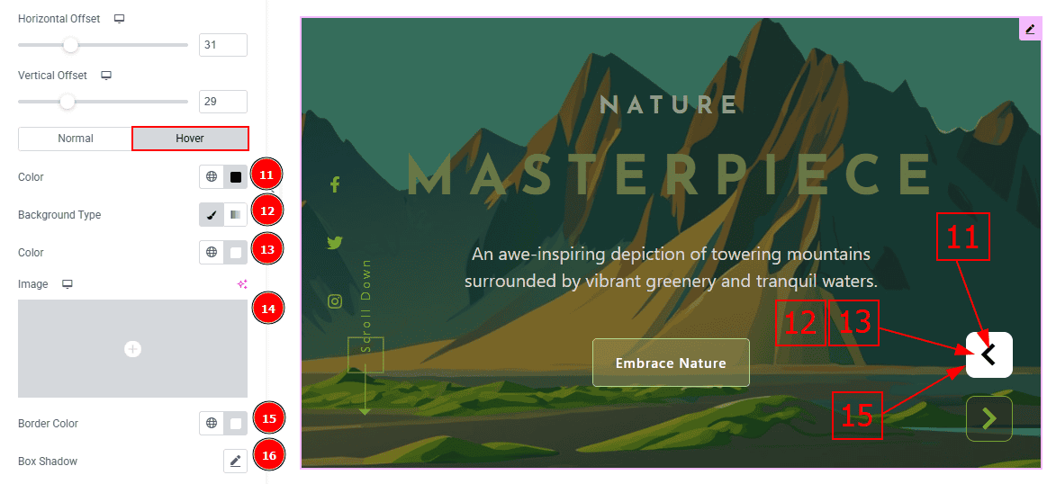
Now, let’s proceed to the Hover Tab -
Color: You can change the arrows icon hover color with this option.
Background Type: You can select the background type to Classic or Gradient from here. Here we selected the Classic.
Color: You can change the background hover color with this option.
Image: You can change the background image with this option.
Border Color: You can change the border hover color with this option.
Box Shadow: You can add a shadow effect with this option.
All done! You have successfully customized the Astoria Slider on your website.
Video Assist
You can also watch the video tutorial to learn more about the Astoria Slider. Please visit the demo page for examples.
Thanks for being with us.