
In this documentation, we will discuss the customization of the Events Calendar Carousel, brought to you by the Element Pack Pro for Elementor.
Enable The Events Calendar Carousel
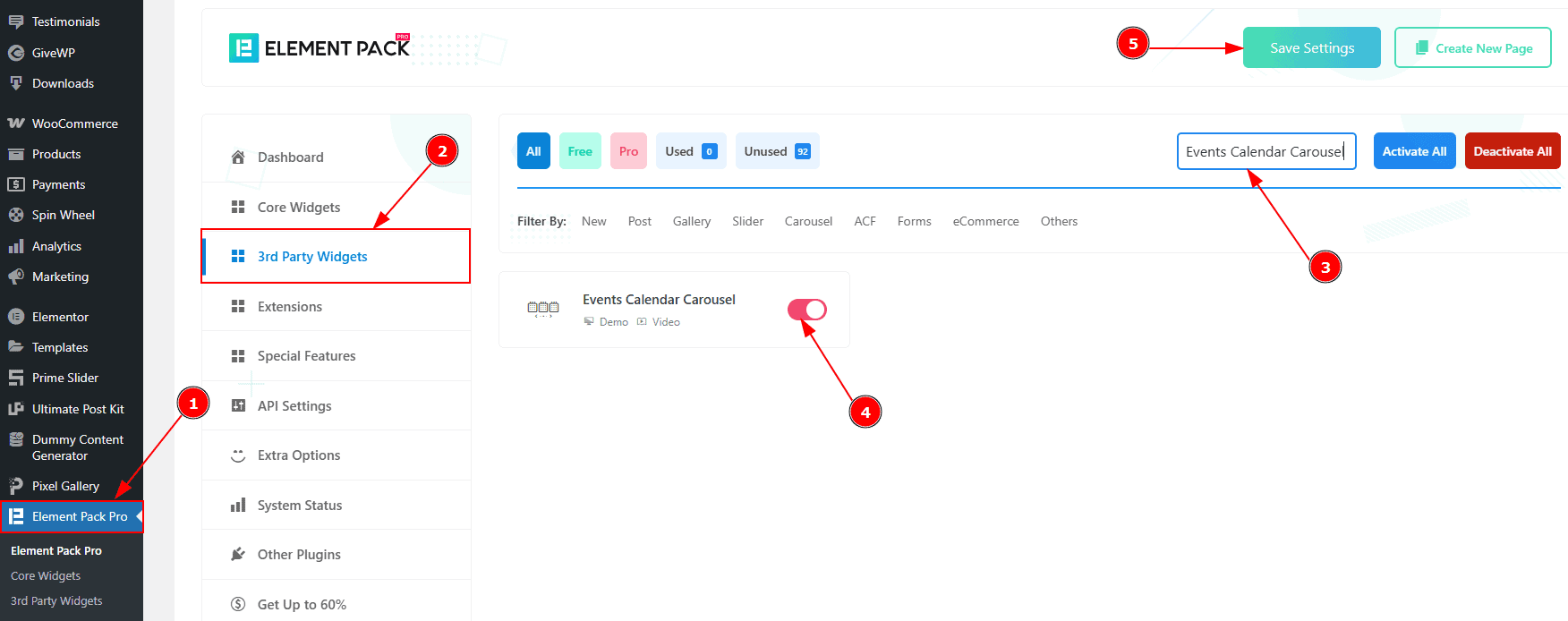
To use the Events Calendar Carousel from Element Pack Pro, first, you have to enable the slider.
Go to WordPress dashboard > Element Pack Pro Plugin dashboard.
Then, Click the 3rd Party Widgets Tab.
Search the Events Calendar Carousel Name.
Enable the Events Calendar Carousel.
Hit the Save Settings Button.
Inserting The Events Calendar Carousel
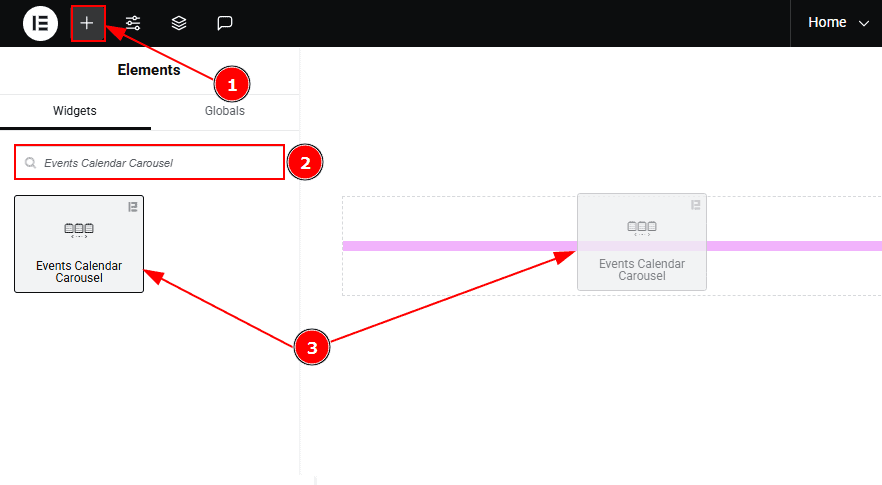
Go to the Elementor Editor Page and hit the “+” icon Button.
Search the Events Calendar Carousel name.
Drag the widget and drop it on the editor page.
(Note: Since this is a third-party widget, you’ll need to install the required plugin and create the events you want to display. Otherwise, the carousel will appear blank.)
Work With The Content Tab
Layout Section
Go to Content > Layout
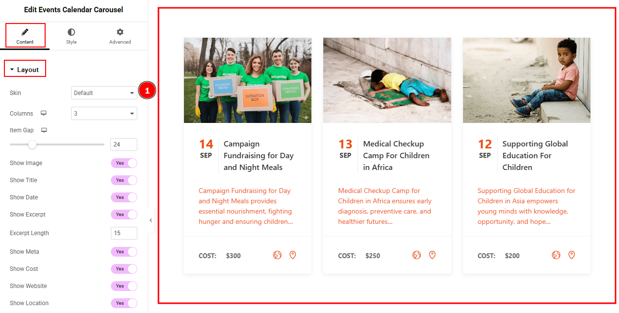
1. Skin: You can select the event calendar carousel skin type from here. We have a total of three skin layouts. If you select the default skin you will get to see this layout.
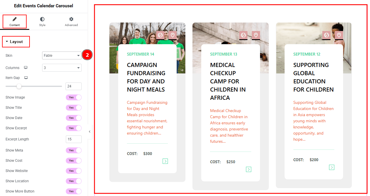
2. Skin: If you select the skin type Fable, you will get to see this layout.
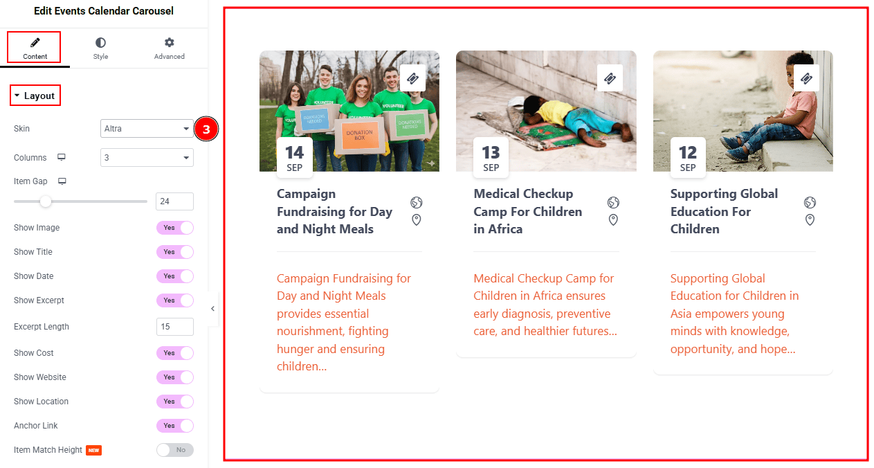
3. Skin: If you select the skin type Altra, you will get to see this layout.
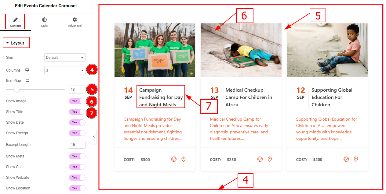
Columns: You can select the number of columns that you want to show with this option.
Item Gap: You can adjust the space between the items with this option.
Show Image: Enable the switcher to show images to the audience.
Show Title: Enable the switcher to show the title to the audience.
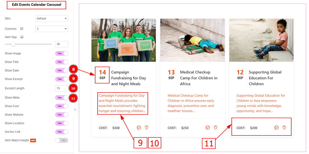
Show Date: Enable the switcher to show the event date to the audience.
Show Excerpt: Enable the switcher to show the text/ short description to the audience.
Excerpt Length: This option allows you to adjust the text’s word limit.
Show Meta: Enable the switcher to show the meta to the audience.
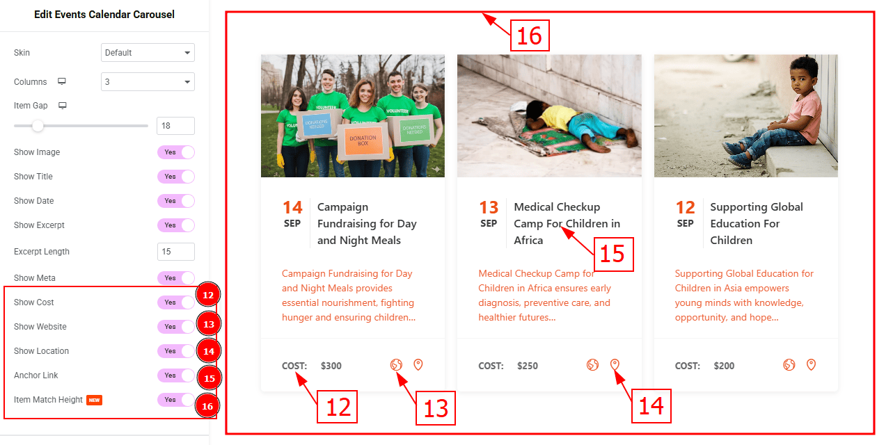
Show Cost: Enable the switcher to show the cost amount to the audience.
Show Website: Enable the switcher to show the website icon to the audience.
Show Location: Enable the switcher to show the location to the audience.
Anchor Link: Enable the switcher to add an anchor link to the title.
Item Match Height: Enable the switcher to make all the items equal height.
Image Section
Go to Content > Image
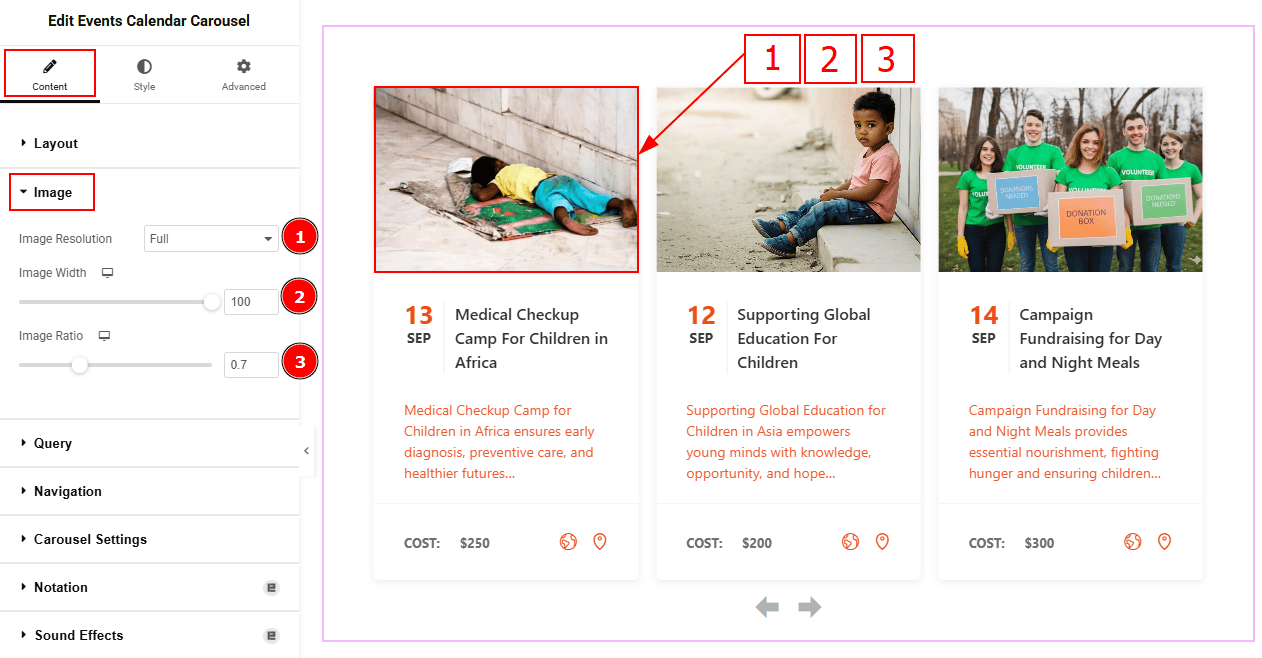
Image Resolution: You can select the image resolution with this option.
Image Width: You can adjust the image width with this option.
Image Ratio: You can select the image ratio with this option.
Query Section
Go to Content > Query
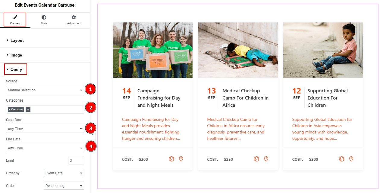
Source: Select the source type for the slider from this section. You can choose between "Show All" and "Manual Selection". Show All displays all available events in the slider. Manual Selection allows you to filter and display events based on specific categories.
Categories: You can select the categories with this option.
Start Date: You can select the start date of events to appear on the slider with this option.
End Date: You can select the end date of events to appear on the slider with this option.
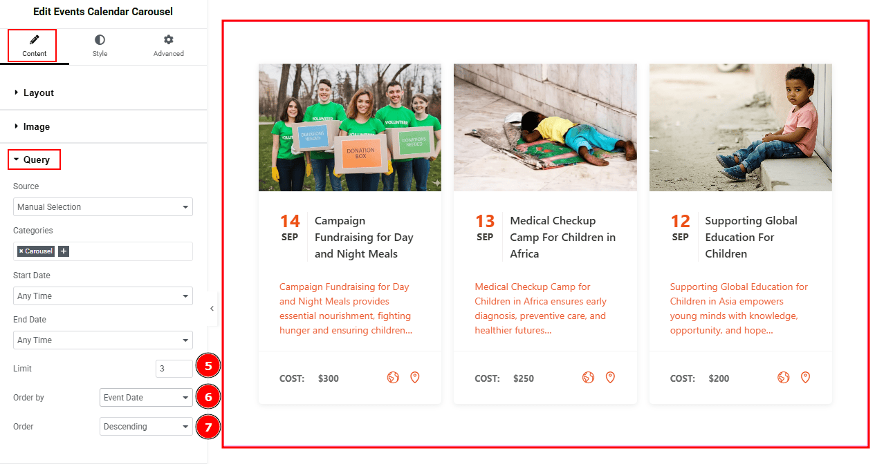
Limit: You can adjust the limit here of how many events you want to show in the slider.
Order By: It controls the data you want to display through event date, title, category & random. Here, we selected the order by event date.
Order: This option controls the order in which data is arranged. There are two types of order. Ascending Order (Starts from the smallest or lowest value and goes to the largest or highest.) & Descending Order (Starts from the largest or highest value and goes to the smallest or lowest.)
Navigation Section
Go to Content > Navigation
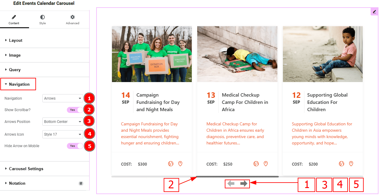
Navigation: You can select the navigation type to arrows & Dots, arrows, dots or none with this option. Here, we selected the navigation type as arrows.
Show Scrollbar: Enable the switcher to show scrollbar to the audience.
Arrows Position: You can adjust the arrows position with this option.
Arrows Icon: You can select the arrows icon type from 22 icon styles with this option.
Hide Arrows on Mobile: Enable the switcher to hide arrows on mobile devices.
Carousel Settings Section
Go to Content > Carousel Settings
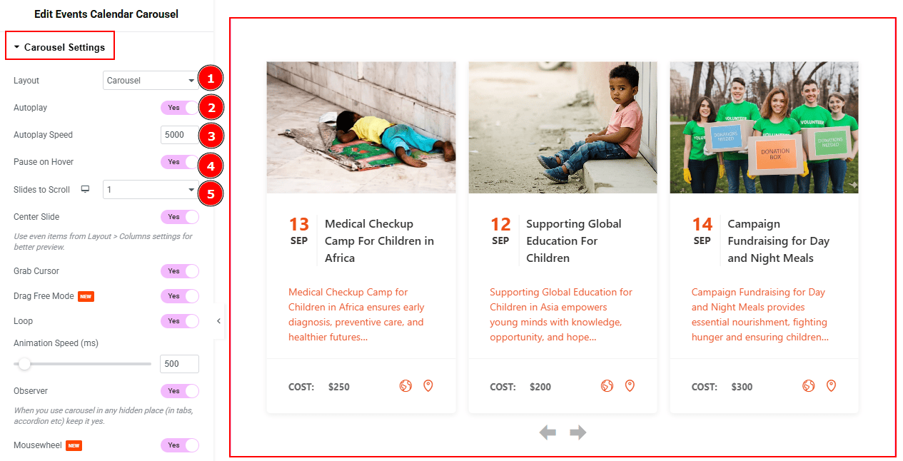
Layout: You can select the Layout type to Carousel & Coverflow. Here we select the layout type as Carousel.
Autoplay: If you enable the Autoplay switcher button, your slider will slide into Autoplay mode.
Autoplay Speed: This option allows you to set the speed for automatically playing the carousel.
Pause on Hover: If you activate the pause on Hover button, when visitors Hover the mouse cursor on the slider, then your slider will Hold, otherwise your slider slide Autoplay.
Slides to Scroll: It represents how many slides will slide at once.
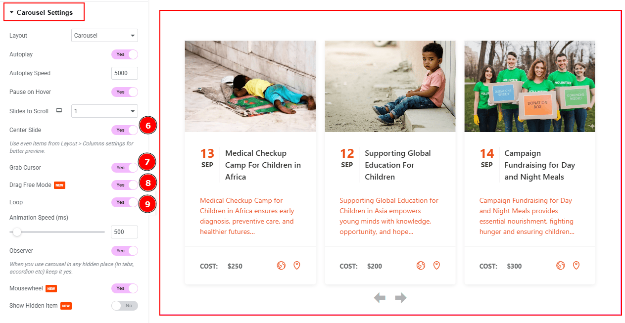
Center Slide: If you enable the Switcher option, then your Active slider will show the center (depending on your widget style).
Grab Cursor: Your mouse pointer icon will be changed into a grab cursor. Visitors can slide the slider manually with their mouse cursor.
Drag Free Mode: Enable the switcher to scroll the carousel smoothly without snapping to a fixed slide, making navigation feel more fluid.
Loop: Enable the switcher to go back to the first automatically after the last slide.
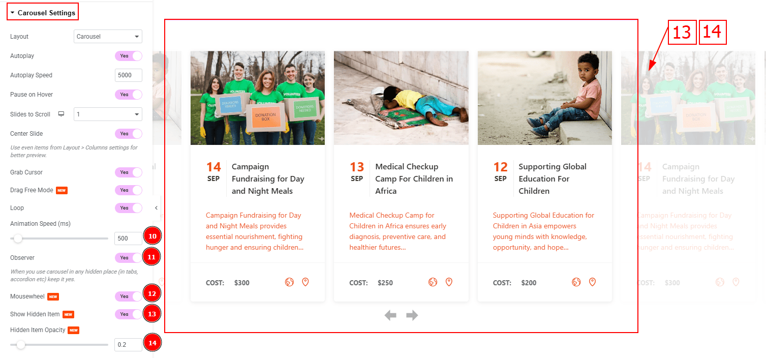
Animation Speed (ms): This option controls how fast the transition animation occurs between slides.
Observer: Enabling this option helps the slider function correctly when it’s initially hidden.
Mousewheel: This option lets visitors scroll through the carousel items using their mouse wheel instead of just clicking arrows or dragging.
Show Hidden Item: Enable the switcher to visible the hidden items.
Hidden Item Opacity: You can adjust the hidden item opacity with this option.
Work with The Style Tab
Items Section
Go to Style > Items
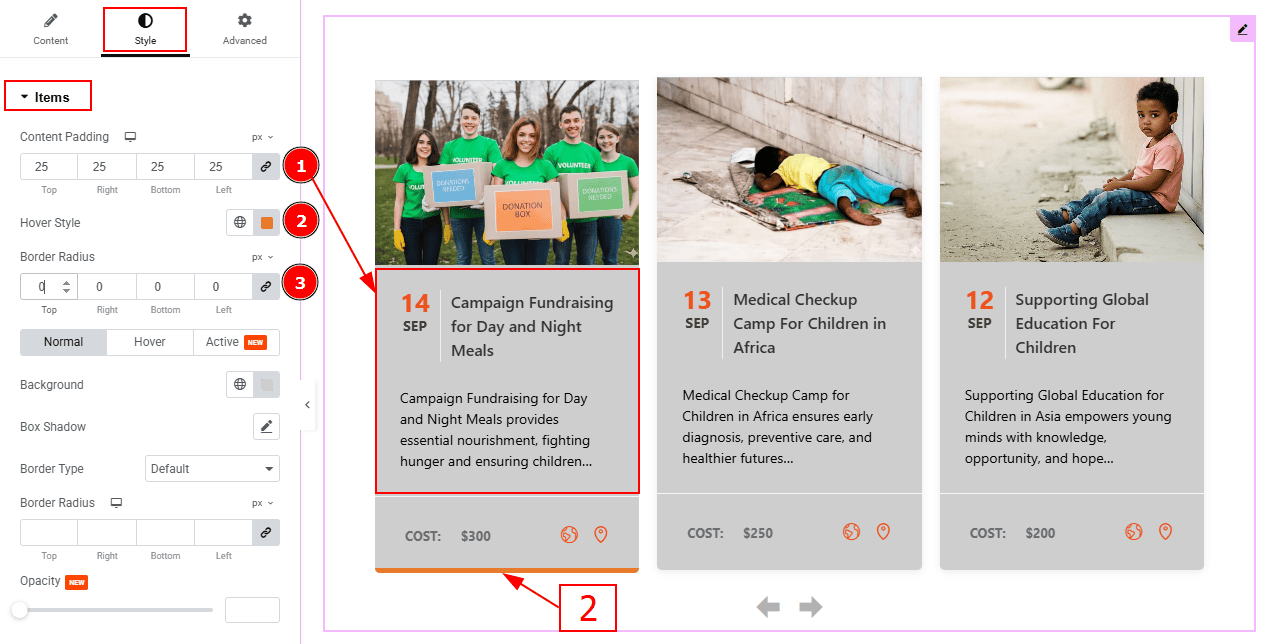
Content Padding: You can adjust the inner space of the content field with this option.
Hover Style: You can change the hover style line color with this option.
Border Radius: This option controls the roundness of the border.
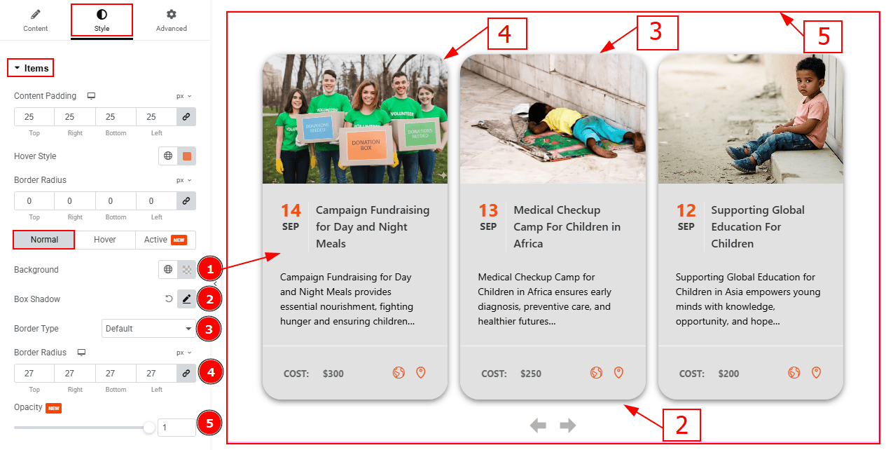
In this section, we have three more tabs. These are Normal, Hover & Active. Let’s start with the Normal Tab -
Background Color: You can change the background color with this option.
Box Shadow: You can add a shadow effect around the items with this option.
Border Type: You can add and change border type with this option.
Border Radius: This option controls the roundness of the border.
Opacity: You can control the transparency of the items with this option.
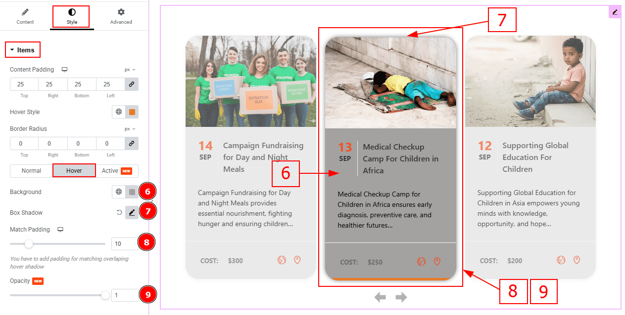
Now, let’s proceed to the Hover Tab -
Background: You can change the background hover color with this option.
Box Shadow: You can add a hover shadow effect to item with this option.
Match Padding: You can adjust padding so hover effects (like shadows) don’t get cut off with this option.
Opacity: You can make changes to the hover item transparency with this option.
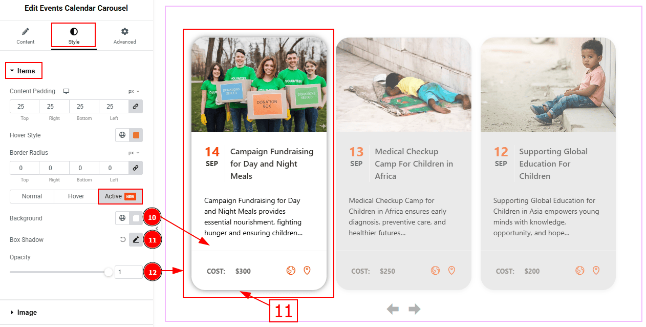
Now. let’s proceed to the Active Tab -
Background: You can change the background active color with this option.
Box Shadow: You can add a shadow effect to the active item with this option.
Opacity: You can make changes to the active item transparency with this option.
Image Section
Go to Style > Image
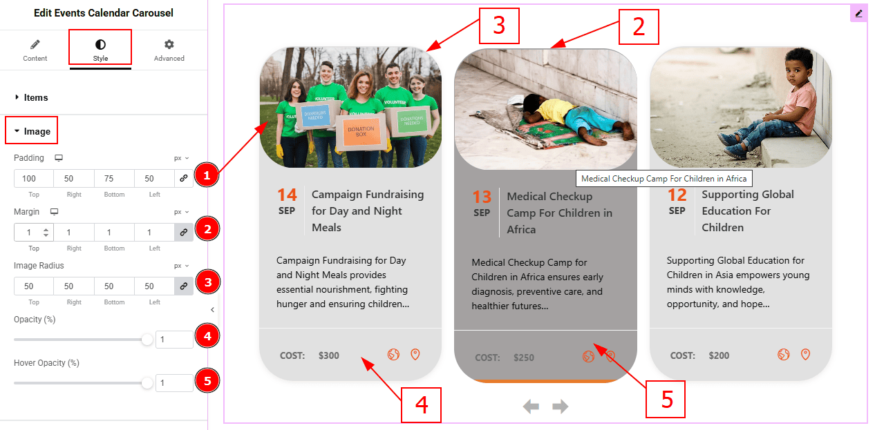
Padding: You can adjust the inner space of the image field with this option.
Margin: You can adjust the outer space of the image field with this option.
Image Radius: You can make changes to the image corners with this option.
Opacity: This option controls the transparency of the image.
Hover Opacity: This option controls the transparency of the image while hovering.
Title Section
Go to Style > Title
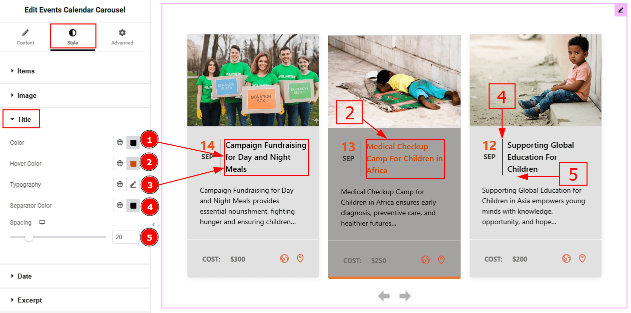
Color: You can change the title color with this option.
Hover Color: You can change the title hover color with this option.
Typography: Change the font family, size, weight, transform, style, decoration, line height, letter spacing, and word spacing from here.
Separator Color: You can change the separator color with this option.
Spacing: You can adjust the space between the title and the text with this option.
Date Section
Go to Style > Date
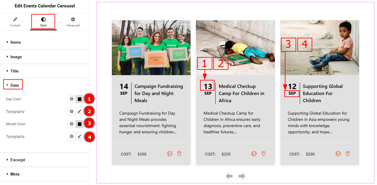
Day Color: You can change the date’s day color with this option.
Typography: Change the font family, size, weight, transform, style, decoration, line height, letter spacing, and word spacing from here.
Month Color: You can change the date’s month color with this option.
Typography: Change the font family, size, weight, transform, style, decoration, line height, letter spacing, and word spacing from here.
Excerpt Section
Go to Style > Excerpt
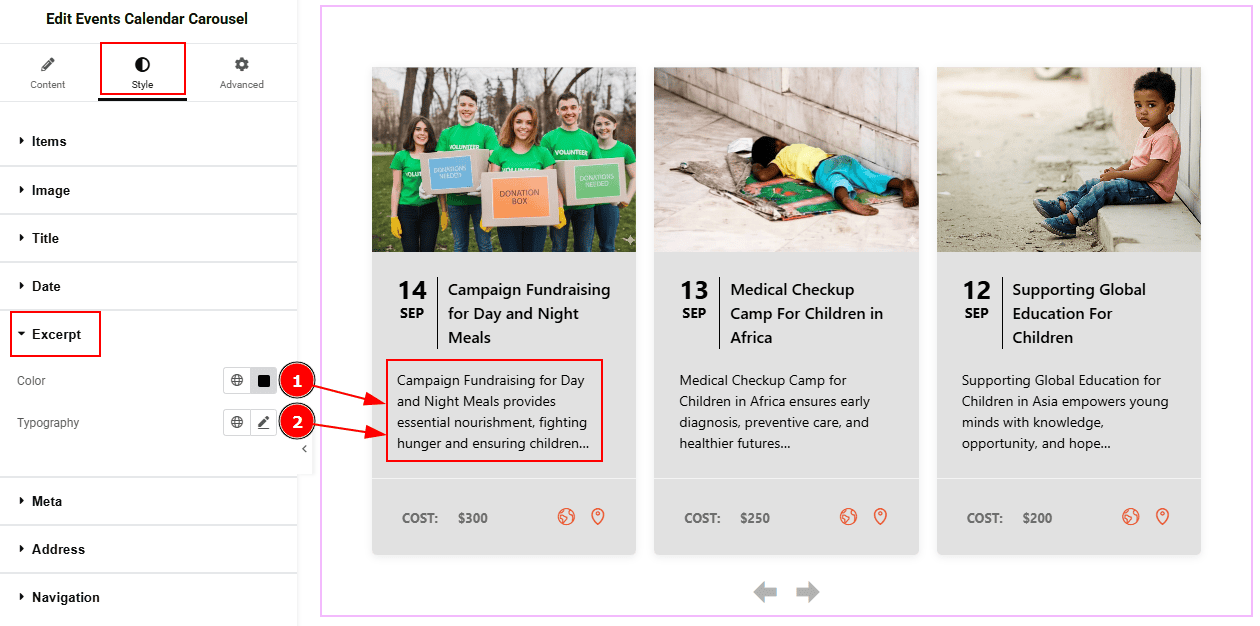
Color: You can change the excerpt text color with this option.
Typography: Change the font family, size, weight, transform, style, decoration, line height, letter spacing, and word spacing from here.
Meta Section
Go to Style > Meta
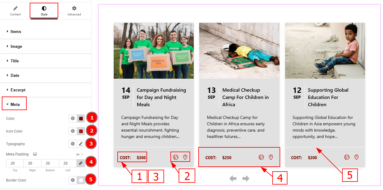
Color: You can change the meta text color with this option.
Icon Color: You can change the meta icon color with this option.
Typography: Change the font family, size, weight, transform, style, decoration, line height, letter spacing, and word spacing from here.
Meta Padding: You can adjust the inner space of the meta field with this option.
Border Color: You can change the border color with this option.
Address Section
Go to Style > Address
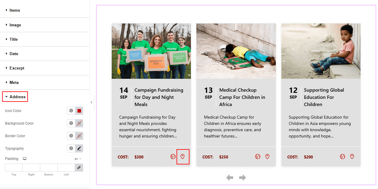
Icon Color: You can change the icon color with this option.
Background Color: You can change the address icon background color with this option.
Border Color: You can change the border color with this option.
Typography: Change the font family, size, weight, transform, style, decoration, line height, letter spacing, and word spacing from here.
Padding: You can adjust the inner space of the address icon with this option.
Navigation Section
Go to Style > Navigation
Arrows Subsection
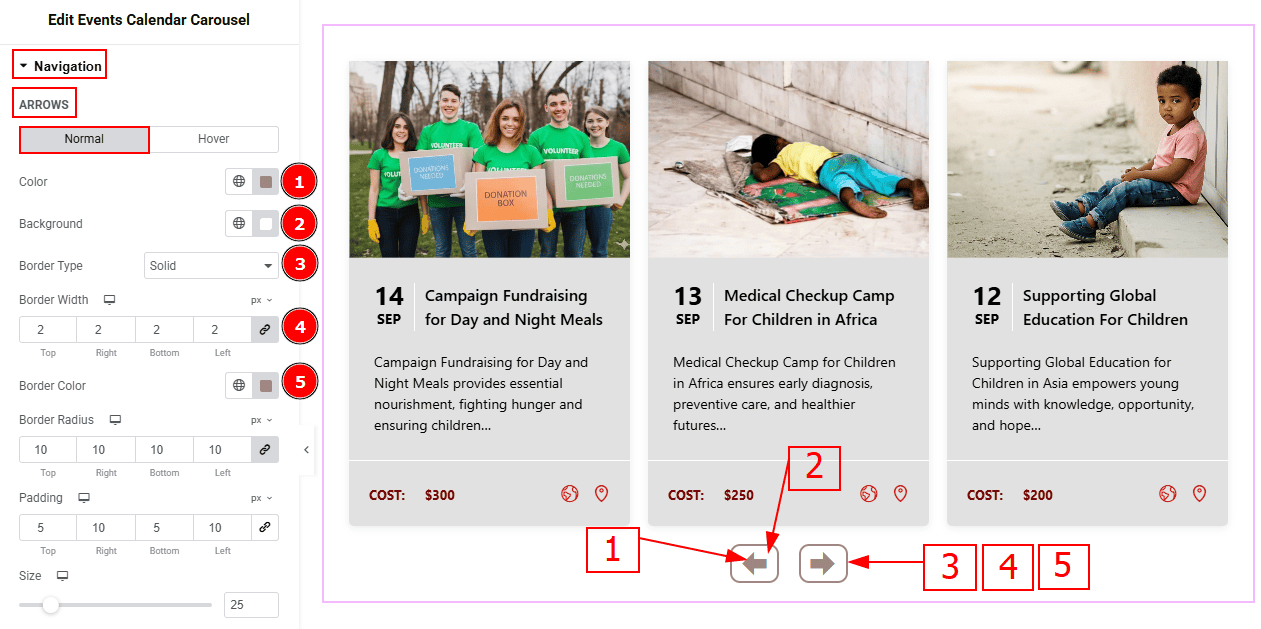
In this sub-section we have two more tabs. These are Normal & Hover. Let’s start with the Normal Tab -
Color: You can change the arrow icon color with this option.
Background Color: You can change the arrow’s background color with this option.
Border Type: This option allows you to add borders to your items. You can select various border types from this option. Such as Solid, Double, Dotted, Dashed, Groove.
Border Width: You can set the thickness of the border with this option.
Border Color: You can change the border color with this option.
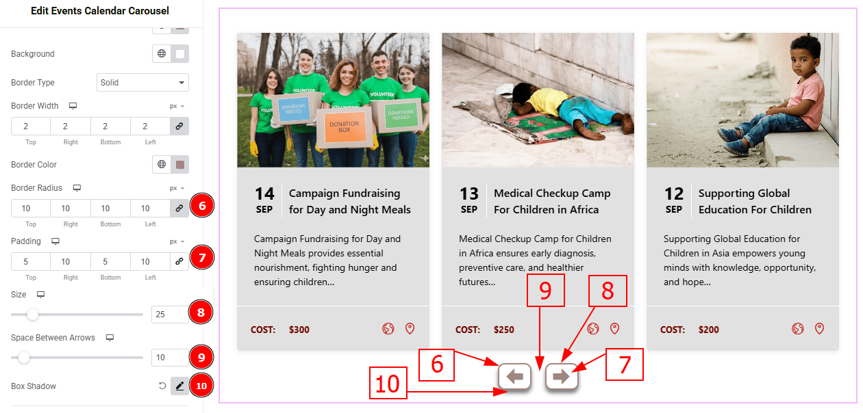
Border Radius: This option controls the roundness of the border.
Padding: You can adjust the inner space and gaps of the arrow field with this option.
Size: You can make changes to the arrows' size with this option.
Space Between Arrows: You can adjust the space between arrows with this option.
Box Shadow: You can add a shadow effect to the arrows with this option.
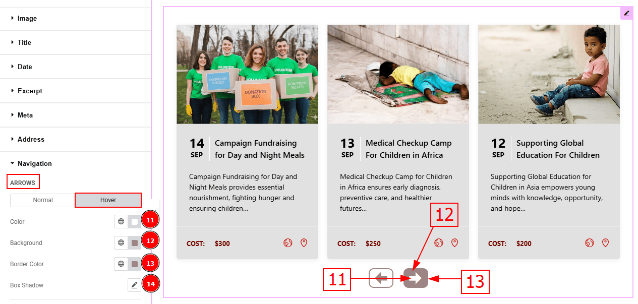
Now, let’s proceed to the Hover Tab -
Color: You can change the arrow’s hover color with this option.
Background: You can change the arrow’s background hover color with this option.
Border Color: You can change the border hover color with this option.
Box Shadow: You can add a hover shadow effect to the arrows with this option.
Offset Subsection
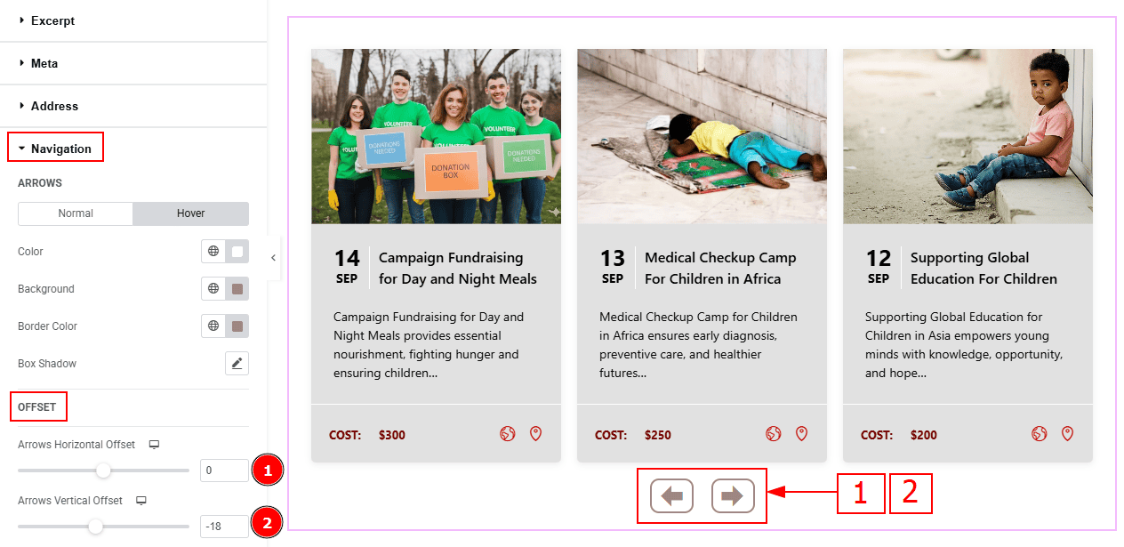
Arrows Horizontal Offset: This option allows you to move the arrows' position horizontally.
Arrows Vertical Offset: You can move the arrows' position vertically with this option.
All done! You have successfully customized the Events Calendar Carousel on your website.
Video Assist
You can also watch the video tutorial to learn more about the Events Calendar Carousel. Please visit the demo page for examples.
Thanks for being with us.