
In this documentation, we will discuss the customization of the Floating Knowledgebase widget, brought to you by the Element Pack Pro addon for Elementor.
Enable The Floating Knowledgebase Widget
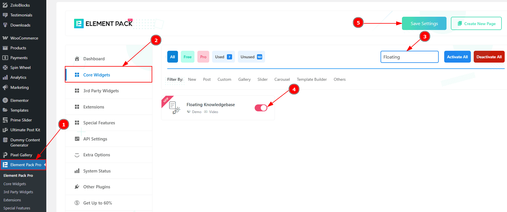
To use the Timeline widget from Element Pack Pro, first, you have to enable the widget.
Go to WordPress dashboard > Element Pack Pro Plugin dashboard.
Then, Click the Core Widgets Tab.
Search the Floating Knowledgebase Widget Name.
Enable the Floating Knowledgebase Widget.
Hit the Save Settings Button.
Inserting the Floating Knowledgebase widget

Go to the Elementor Editor Page and Hit the “+” icon Button.
Search the Floating Knowledgebase widget.
Drag the widget and Drop it on the editor page.
Work With The Content Tab
Layout Section
Go to Content > Layout
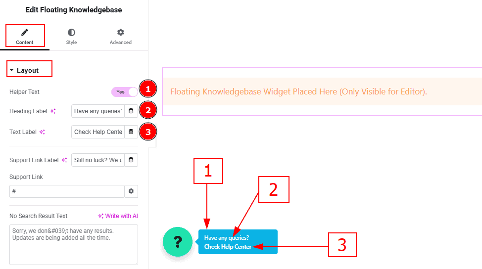
Helper Text: Enable the switcher to show the helper text to the audience.
Heading Label: You can add and make changes to the heading label with this option.
Text Label: You can add and make changes to the text label with this option.
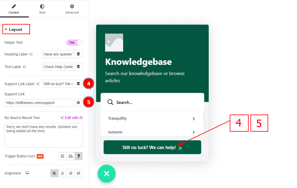
Support Link Label: This option allows you to change the support link label text.
Support Link: You can add a support link to the button with this option.
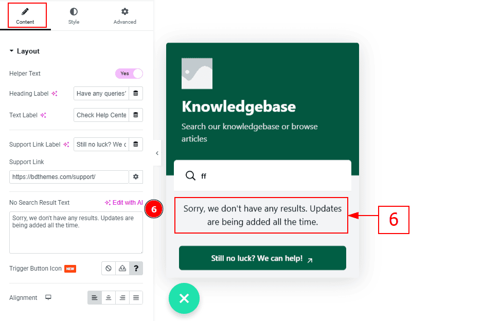
6. No Search Result Text: You can make changes to the no search result text with this option.
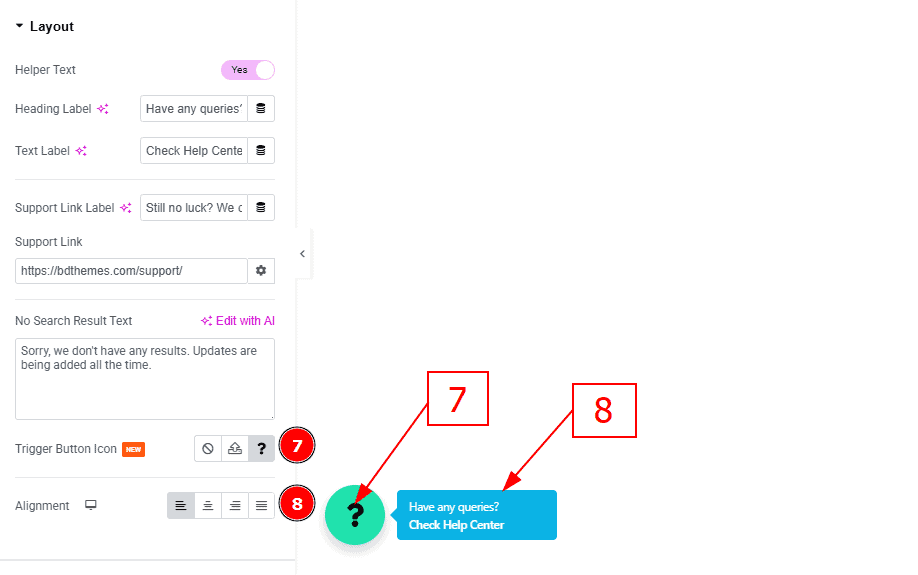
Trigger Button Icon: You can add a trigger button icon with this option.
Alignment: You can set the position of the text to left, center, right or justified with this option.
Header Section
Go to Content > Header
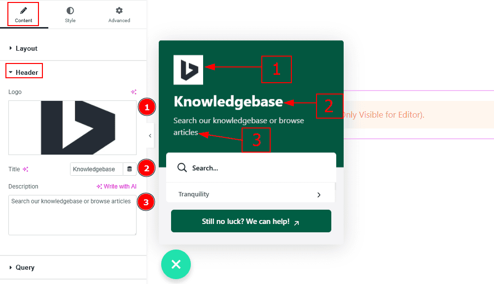
Logo: You can add a logo to the header with this option.
Title: You can add a title and make changes the text with this option.
Description: You can add description text with this option.
Query Section
Go to Content > Query
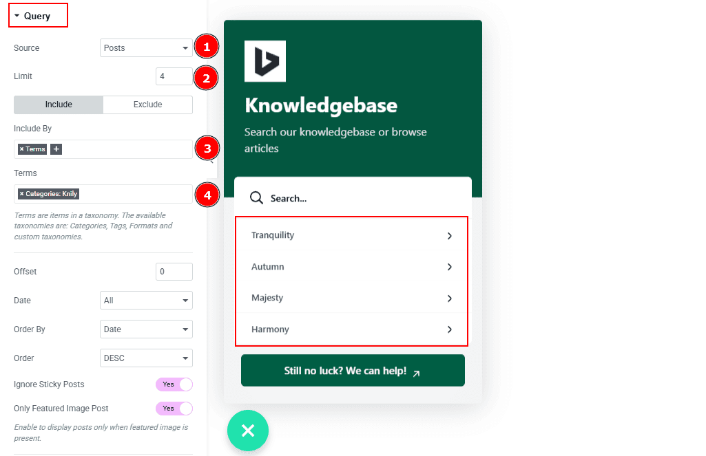
Source: Select the source for the timeline from here. The types of sources are - Posts, Pages, Floating Elements,Testimonials, Downloads, Products, Events, Mega Menu Items, Template Items, Manual Selection, Current Query, Related. Here we selected the type as posts.
Limit: You can adjust the limit here of how many posts you want to show in the timeline.
Include/Exclude Selection: Select the Include / Exclude filter to show/hide specific posts by Terms (Tags/Categories) or Authors. Here, we selected the include field as Terms.
Terms: You can select the categories with this option.
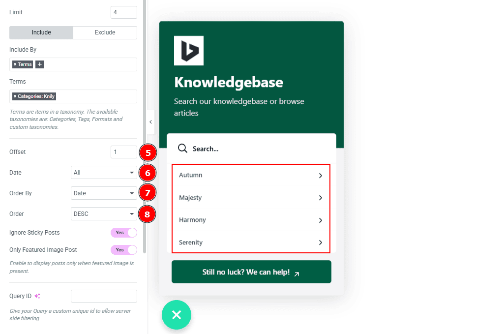
Offset: This option allows you to skips a set number of posts from the beginning before displaying the results.
Date: You can select the post as per the date of creation with this option.
Order By: It controls the data you want to display through title, id, date, author, comment count, menu order & random. Here we selected the order as date.
Order: This option controls the order by which data is arranged. There are two types of order. Ascending Order (Starts from the smallest or lowest value and goes to the largest or highest.) & Descending Order (Starts from the largest or highest value and goes to the smallest or lowest.)
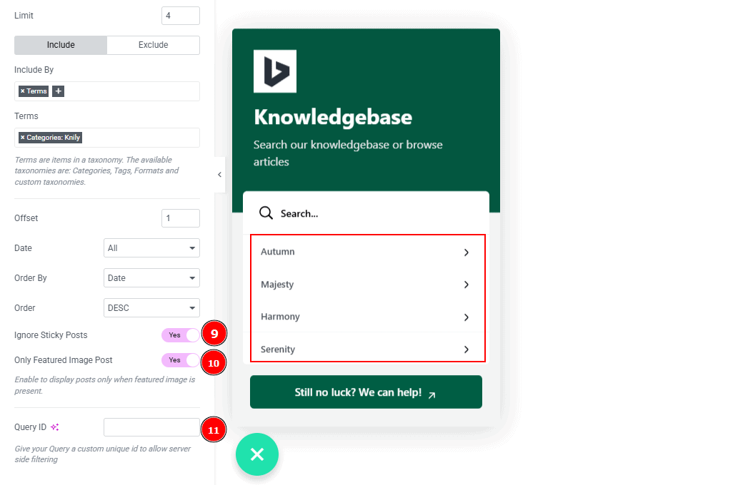
Ignore Sticky Posts: Enable or Disable the switcher to hide or show the sticky posts.
Only Featured Image Post: Enable or disable the switcher to show or hide the featured image post.
Query ID: Give your query a custom, unique ID to allow server-side filtering. Learn more about the Query.
Work with The Style Tab
Trigger Button Section
Go to Style > Trigger Button
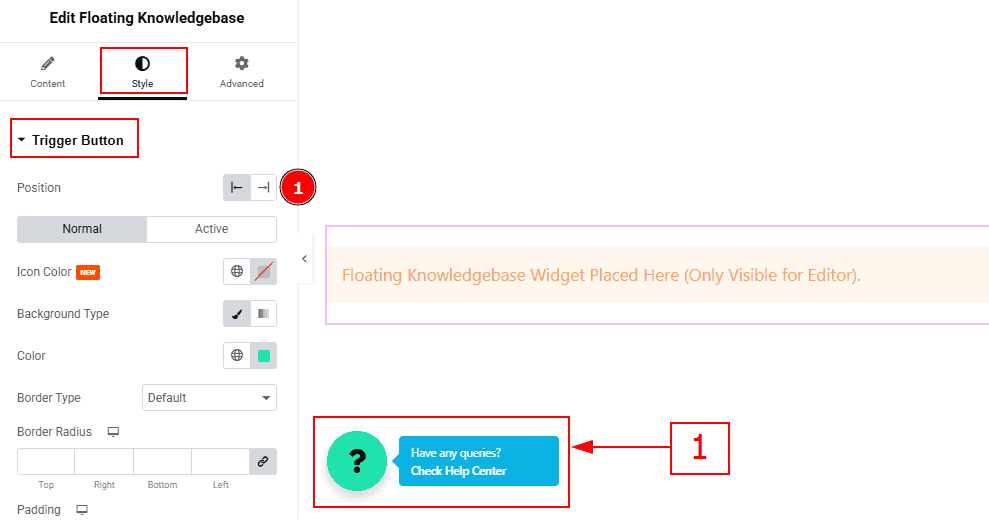
1. Position: You can set the position of the trigger button to left or right with this option.
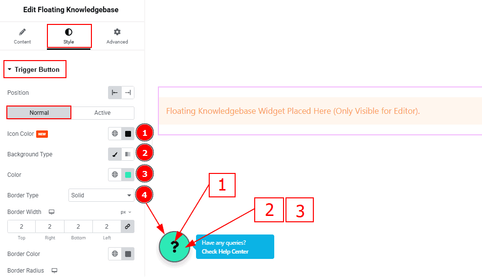
In this section, we have two more tabs. These are Normal & Active. Let’s start with the Normal Tab -
Icon Color: You can change the icon color with this option.
Background Type: You can change the background type to classic or gradient with this option. Here, we selected the background type as classic.
Color: You can change the background color with this option.
Border Type: You can add and change the border type with this option.
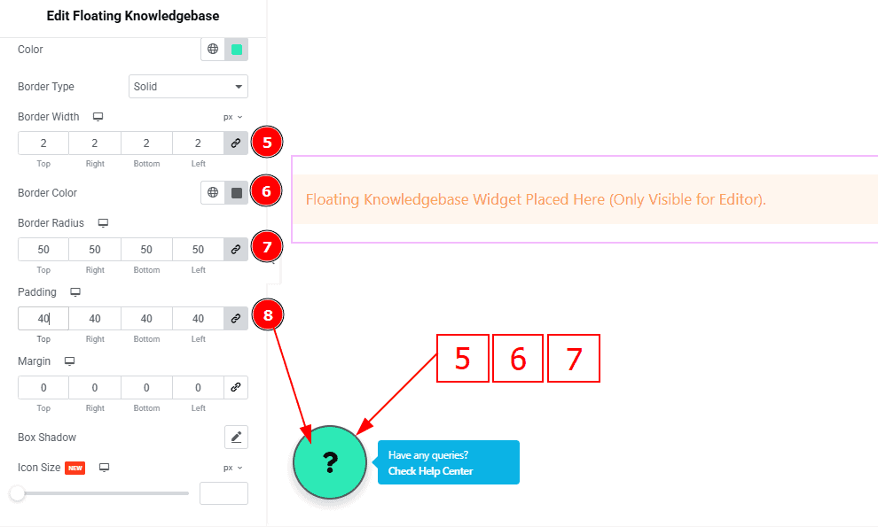
Border Width: Set the thickness of the border with this option.
Border Color: You can change the border color with this option.
Border Radius: This option controls the roundness of the border.
Padding: You can adjust the inner space of the trigger button with this option.
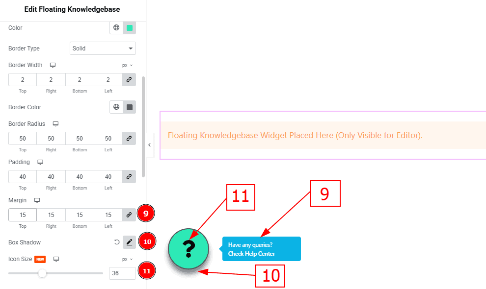
Margin: You can adjust the outer space of the trigger button with this option.
Box Shadow: You can add a shadow effect to the trigger button with this option.
Icon Size: You can make changes to the icon size with this option.
Now let’s proceed to the Active Tab -
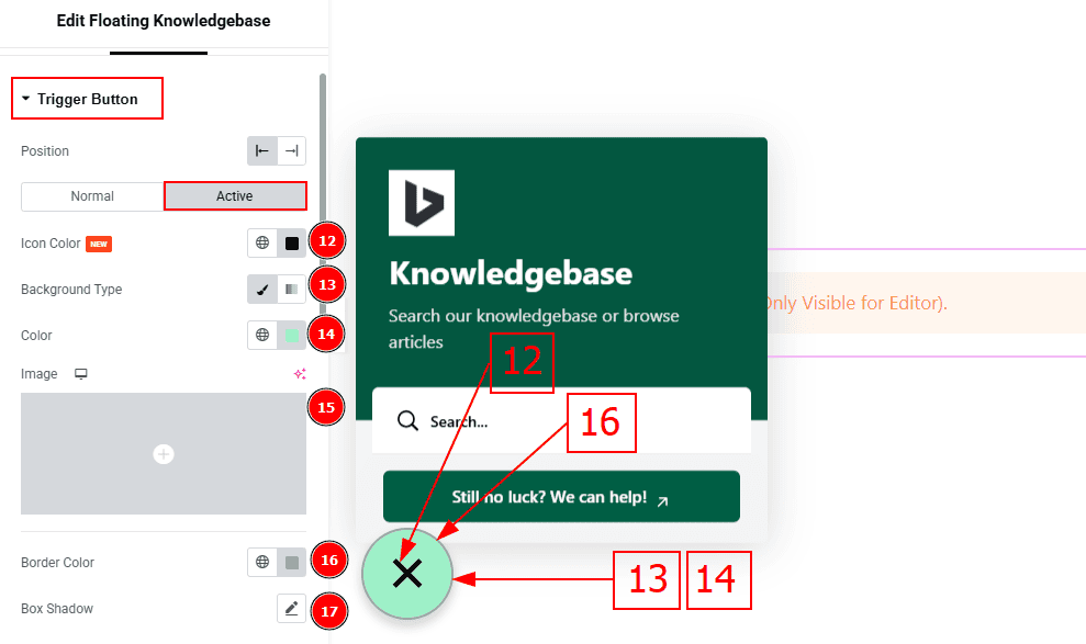
Active Color: You can change the trigger icon active color with this option.
Background Type: You can change the background type to classic or gradient with this option. Here, we selected the background type as classic.
Color: You can change the background color with this option.
Image: You can change the background image with this option.
Border Color: You can change the active border color with this option.
Box Shadow: You can add a shadow effect to the active trigger button with this option.
Helper Text Section
Go to Style > Helper Text
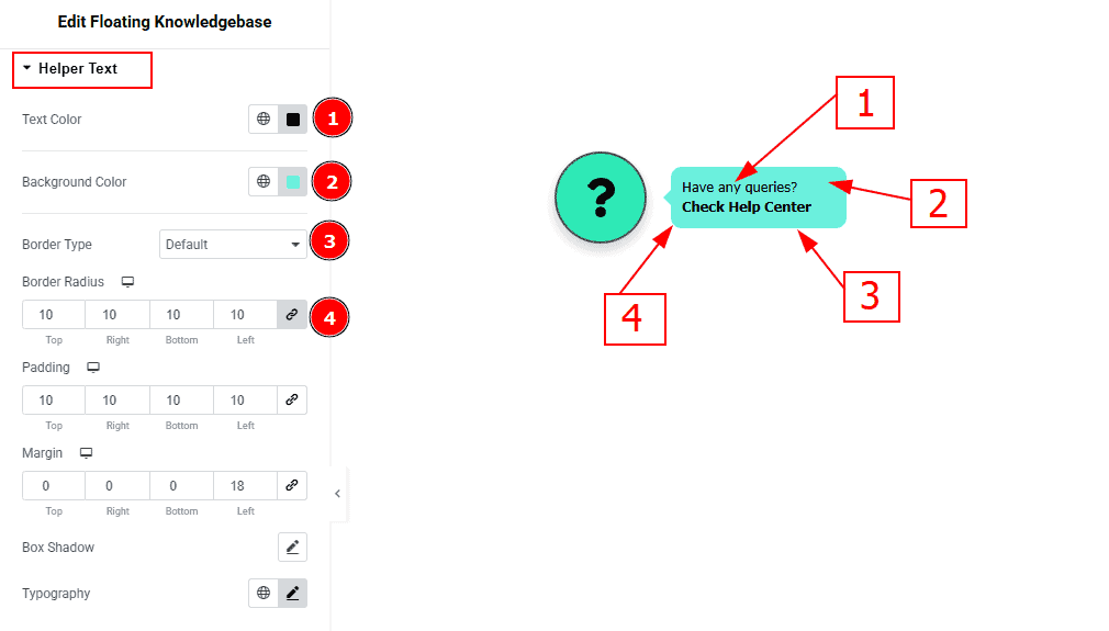
Text Color: You can change the text color with this option.
Background Color: You can change the background color with this option.
Border Type: You can add or change the border type with this option.
Border Radius: This option controls the roundness of the border.
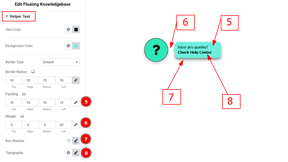
Padding: This option controls the inner space of the helper text field.
Margin: You can make changes to the outer space of the helper text field with this option.
Box Shadow: You can add a shadow effect with this option.
Typography: Change the font family, size, weight, transform, style, decoration, line height, letter spacing, and word spacing from here.
Header Section
Go to Style > Header
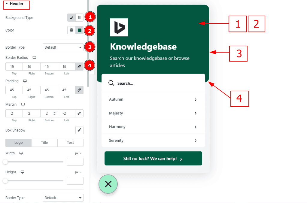
Background Type: You can select the background type classic or gradient with this option.
Color: You can change the background color with this option.
Border Type: You can add a border and change it’s type with this option.
Border Radius: This option controls the roundness of the border.
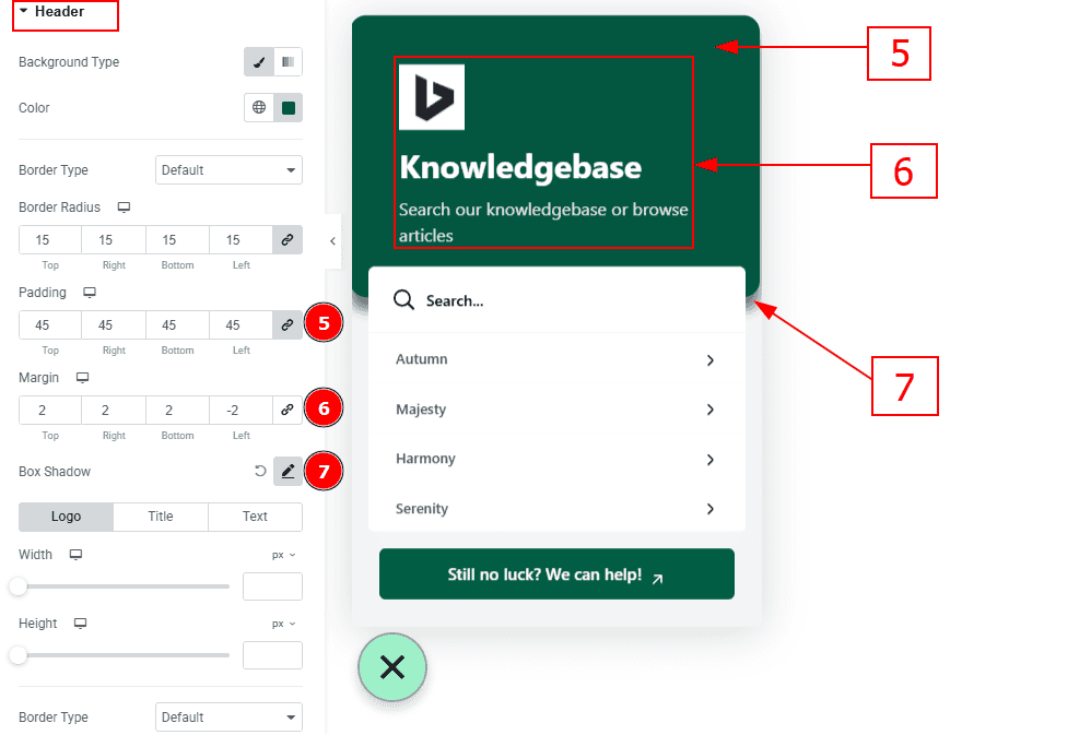
Padding: You can adjust the inner space of the header with this option.
Margin: You can adjust the outer space of the header with this option.
Box Shadow: You can add a shadow effect around the date with this option.
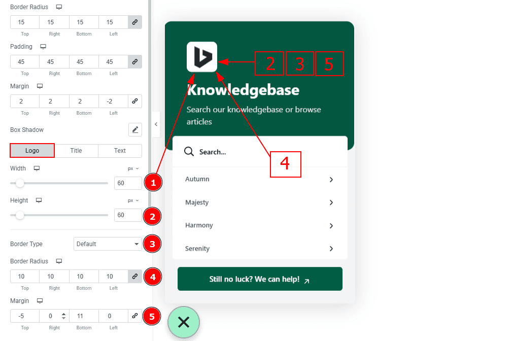
In this section, we have 3 more tabs. These are Logo, Title and Text. Let’s start with the Logo tab -
Width: You can make changes to the logo width with this option.
Height: You can make changes to the height of the logo with this option.
Border Type: You can add and change the border type with this option.
Border Radius: This option controls the roundness of the border.
Margin: You can adjust the outer space of the logo with this option.
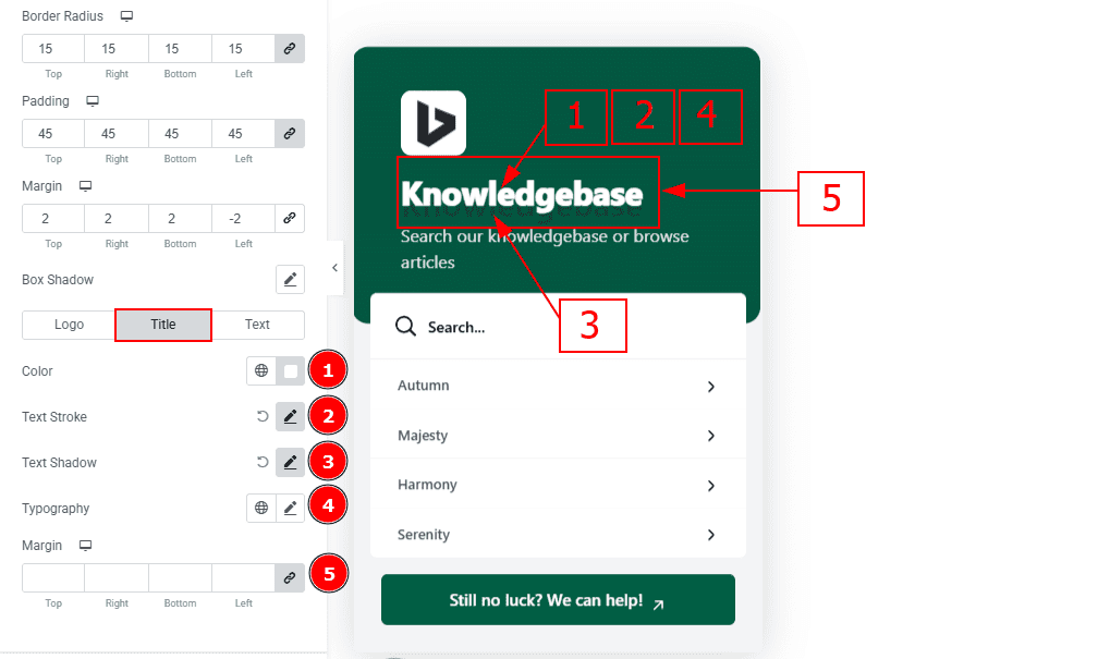
Now, let’s proceed to the Title Tab -
Color: You can make changes to the title color with this option.
Text Stroke: This option allows you to add an outline to characters by layering a stroke effect.
Text Shadow: You can add a shadow effect to the title with this option.
Typography: Change the font family, size, weight, transform, style, decoration, line height, letter spacing, and word spacing from here.
Margin: You can adjust the outer space of the title with this option.
Now, let’s proceed to the Text Tab -
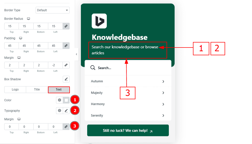
Color: You can change the text color with this option.
Typography: Change the font family, size, weight, transform, style, decoration, line height, letter spacing, and word spacing from here.
Margin: You can adjust the outer space of the text with this option.
Items Wrapper Section
Go to Style > Items Wrapper
Background Type: You can select the background type classic or gradient with this option.
Color: You can change the items wrapper color with this option.
Image: You can add or change image with this option.
Border Type: You can add a border and change it’s type with this option.
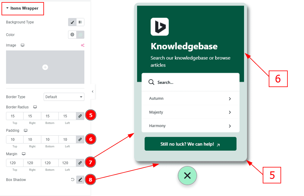
Border Radius: This Option Controls the roundness of the border.
Padding: You can adjust the inner space of the items field with this option.
Margin: You can make changes to the outer space of the items field with this option.
Box Shadow: You can add a shadow effect to the items wrapper with this option.
Search Section
Go to Style > Search
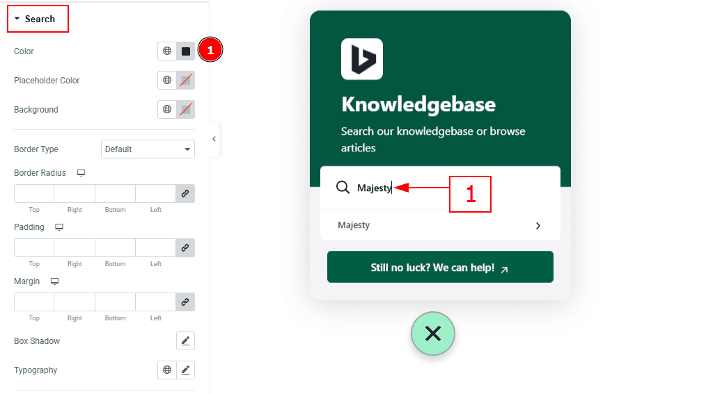
1. Color: You can change the search input text color with this option.
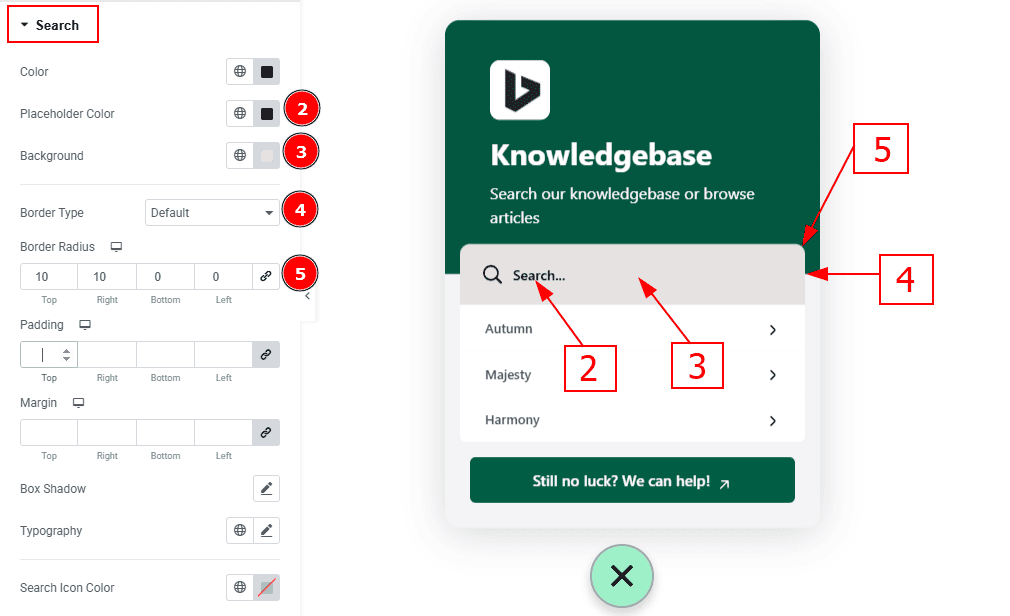
Placeholder Color: You can change the search placeholder text color with this option.
Background: You can change the search bar background color with this option.
Border Type: You can add and change the border type with this option.
Border Radius: This Option Controls the roundness of the border.
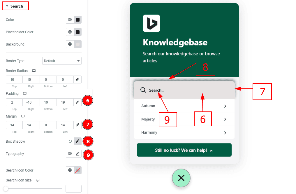
Padding: You can adjust the inner space of the search field with this option.
Margin: You can adjust the outer space of the search field with this option.
Box Shadow: You can add a shadow effect to the search bar with this option.
Typography: Change the font family, size, weight, transform, style, decoration, line height, letter spacing, and word spacing from here.
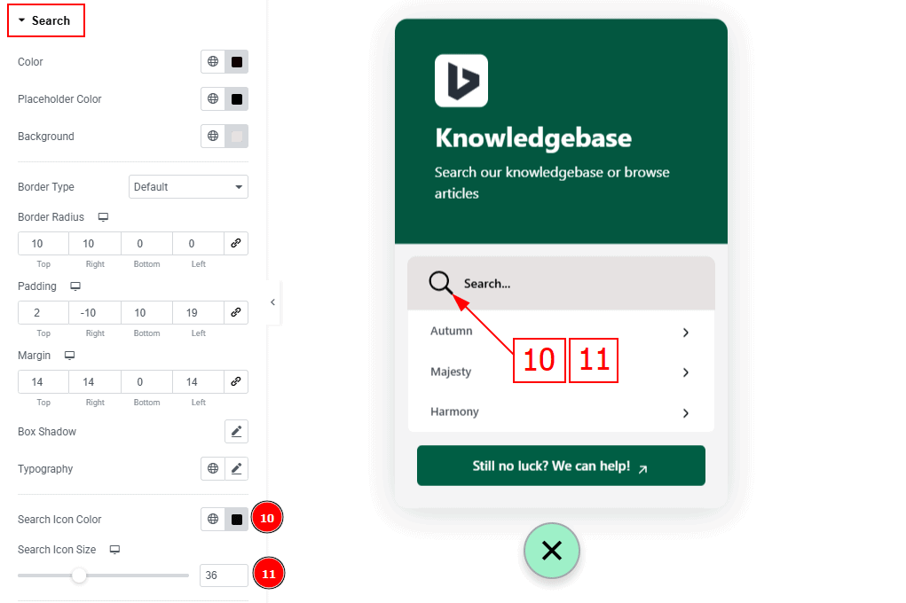
Search Icon Color: You can change the search icon color with this option.
Search Icon Size: You can make changes to the search icon with this option.
Items Section
Go to Style > Items Section
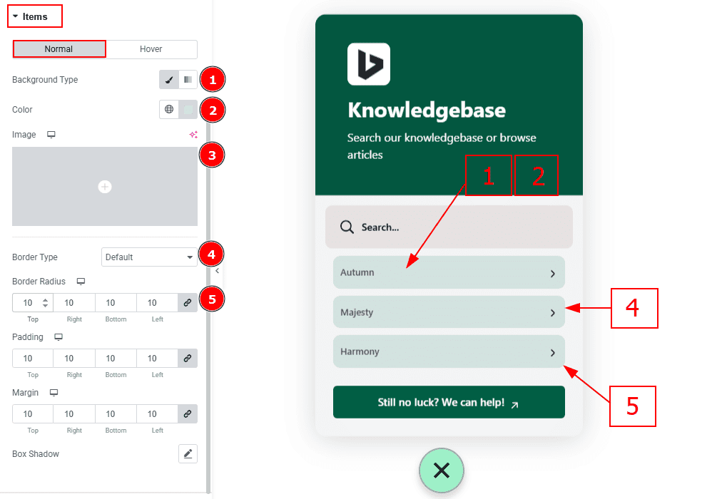
In this section, we have two more tabs. These are Normal and Hover. Let’s start with the Normal Tab -
Background Type: You can select the background type classic or gradient with this option.
Color: You can change the background color with this option.
Image: You can add or change image with this option.
Border Type: You can add and change the border type with this option.
Border Radius: This Option Controls the roundness of the border.
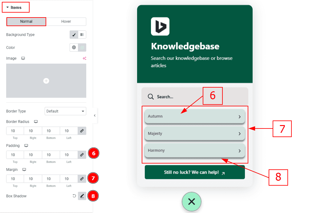
Padding: You can adjust the inner space of the items field with this option.
Margin: You can adjust the outer space of the items with this option.
Box Shadow: You can add a shadow effect to the items with this option.
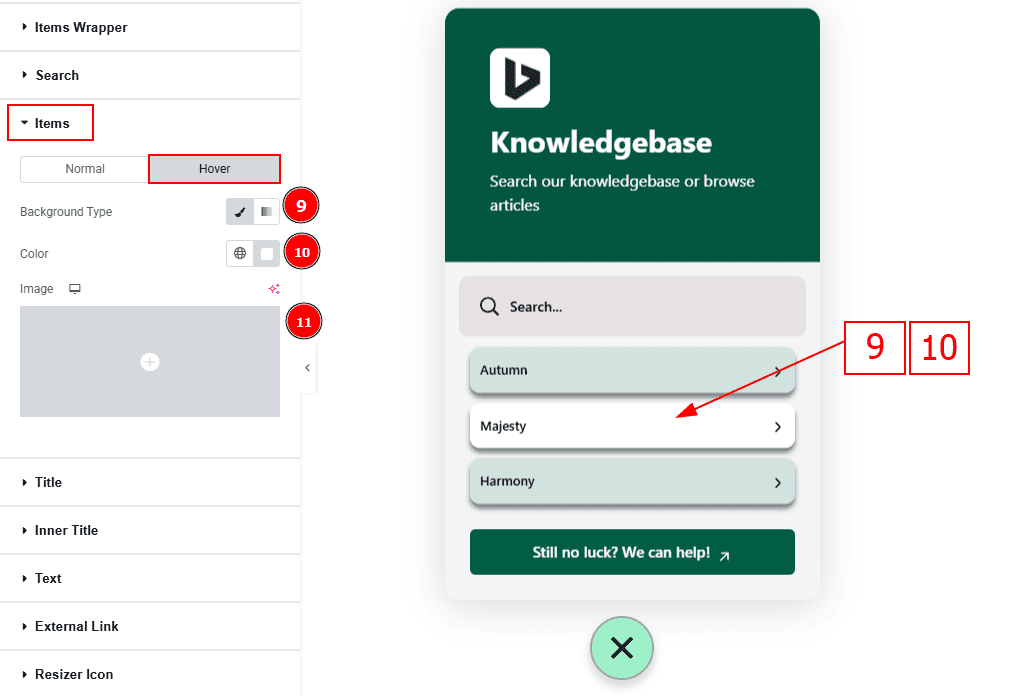
Now let’s proceed to the Hover Tab -
Background Type: You can change the background type to classic or gradient with this option.
Color: You can change the background color with this option.
Image: You can change the background image with this option.
Title Section
Go to Style > Title
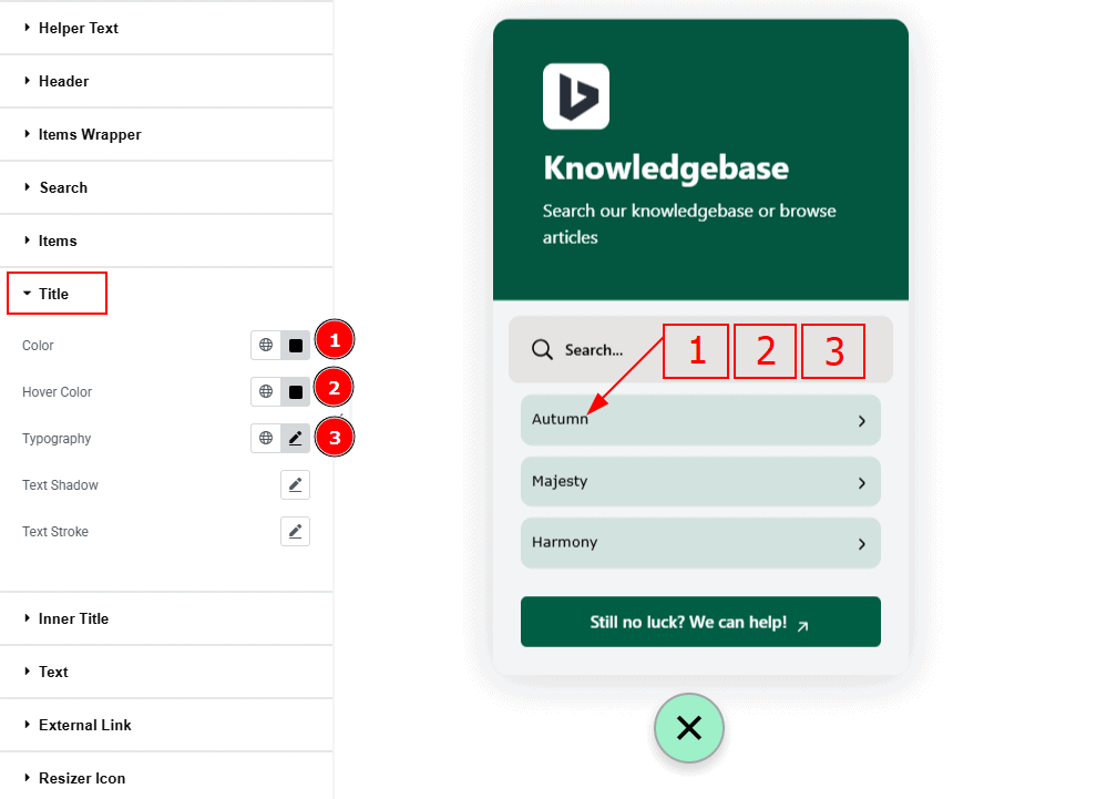
Color: You can change the title color with this option.
Hover Color: You can change the title hover color with this option.
Typography: Change the font family, size, weight, transform, style, decoration, line height, letter spacing, and word spacing from here.
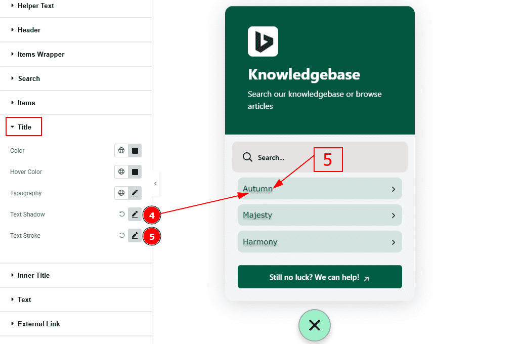
Text Shadow: You can add a shadow effect to the text with this option.
Text Stroke: This option allows you to add an outline to characters by layering a stroke effect.
Inner Title Section
Go to Style > Inner Title
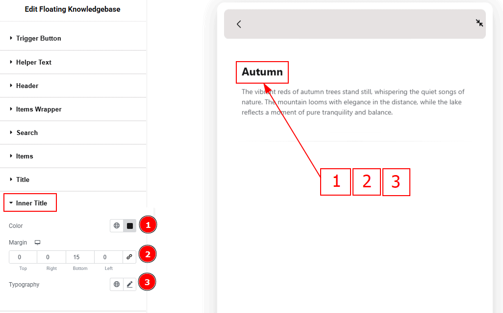
Color: You can change the inner title color with this option.
Margin: You can adjust the outer space of the inner title with this option.
Typography: Change the font family, size, weight, transform, style, decoration, line height, letter spacing, and word spacing from here.
Text Section
Go to Style > Text
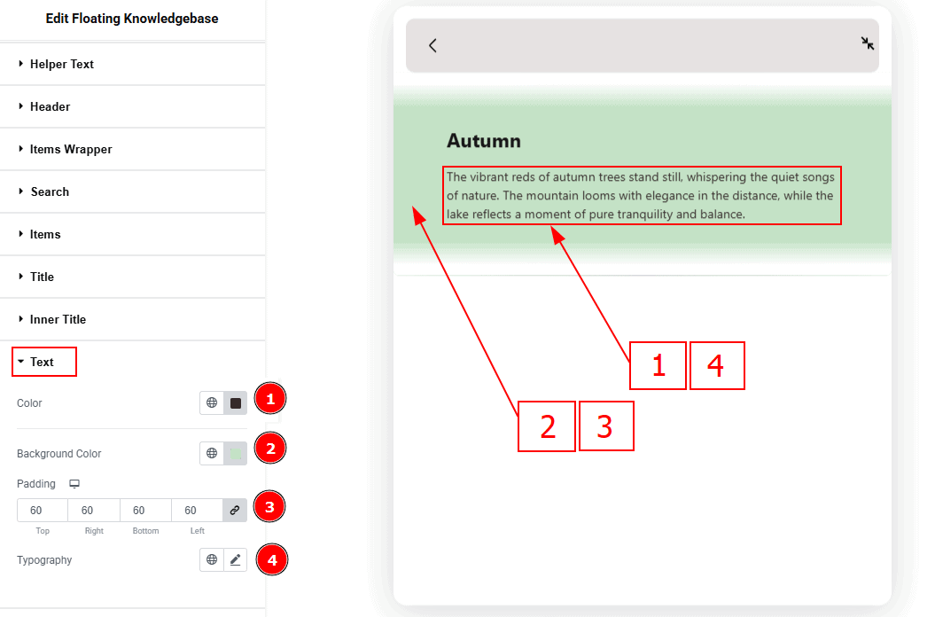
Color: You can change the text color with this option.
Background Color: You can change the background color with this option.
Padding: You can change the inner space of the text field with this option.
Typography: Change the font family, size, weight, transform, style, decoration, line height, letter spacing, and word spacing from here.
External Link Section
Go to Style > External Link
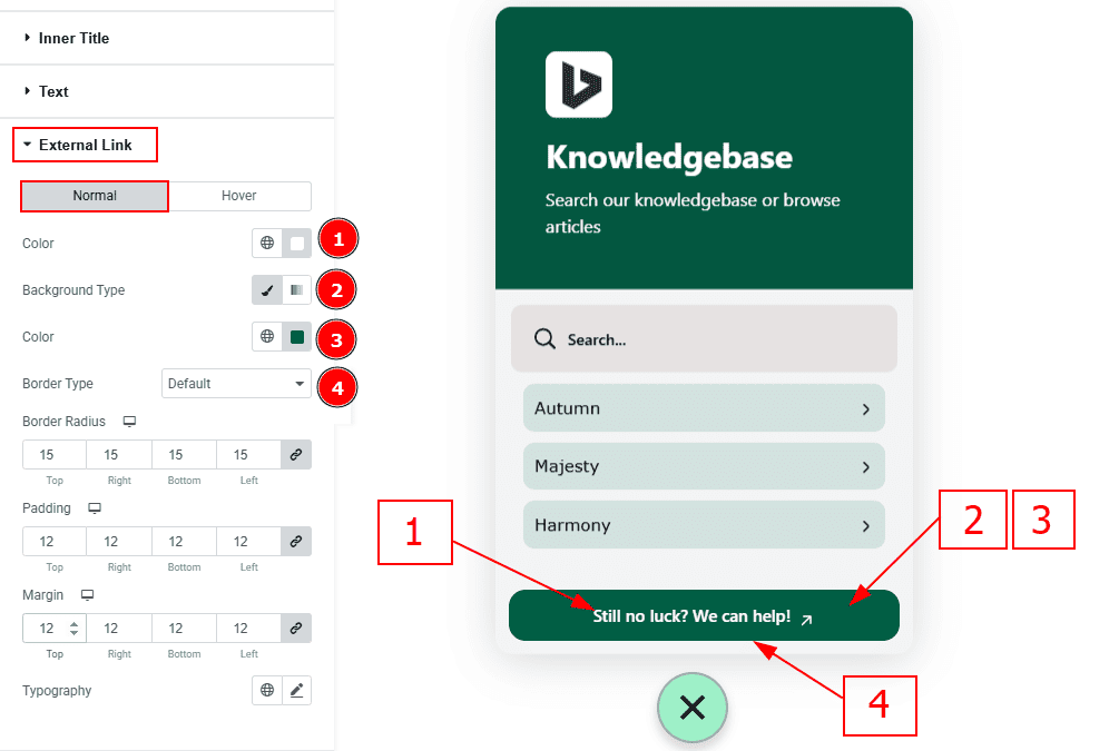
Color: You can change the external link text color with this option.
Background Type: You can select the background type classic or gradient with this option.
Color: You can change the background color with this option.
Border Type: You can add and change the border type with this option.
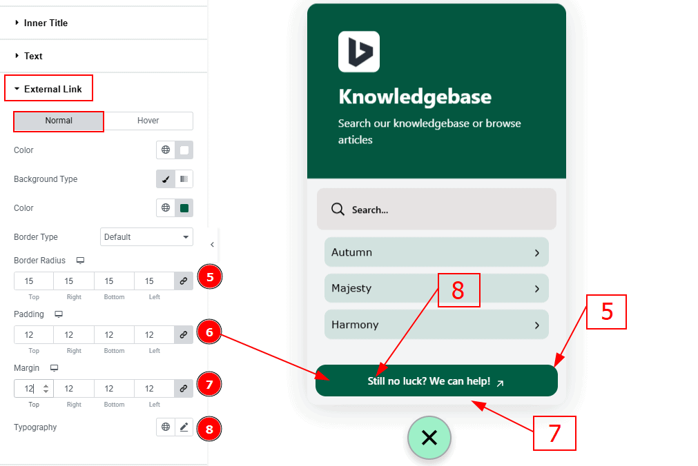
Border Radius: This option controls the roundness of the border.
Padding: You can adjust the inner space of the external link button with this option.
Margin: You can adjust the outer space of the external link button with this option.
Typography: Change the font family, size, weight, transform, style, decoration, line height, letter spacing, and word spacing from here.
Resizer Icom Section
Go to Style > Resizer Icon
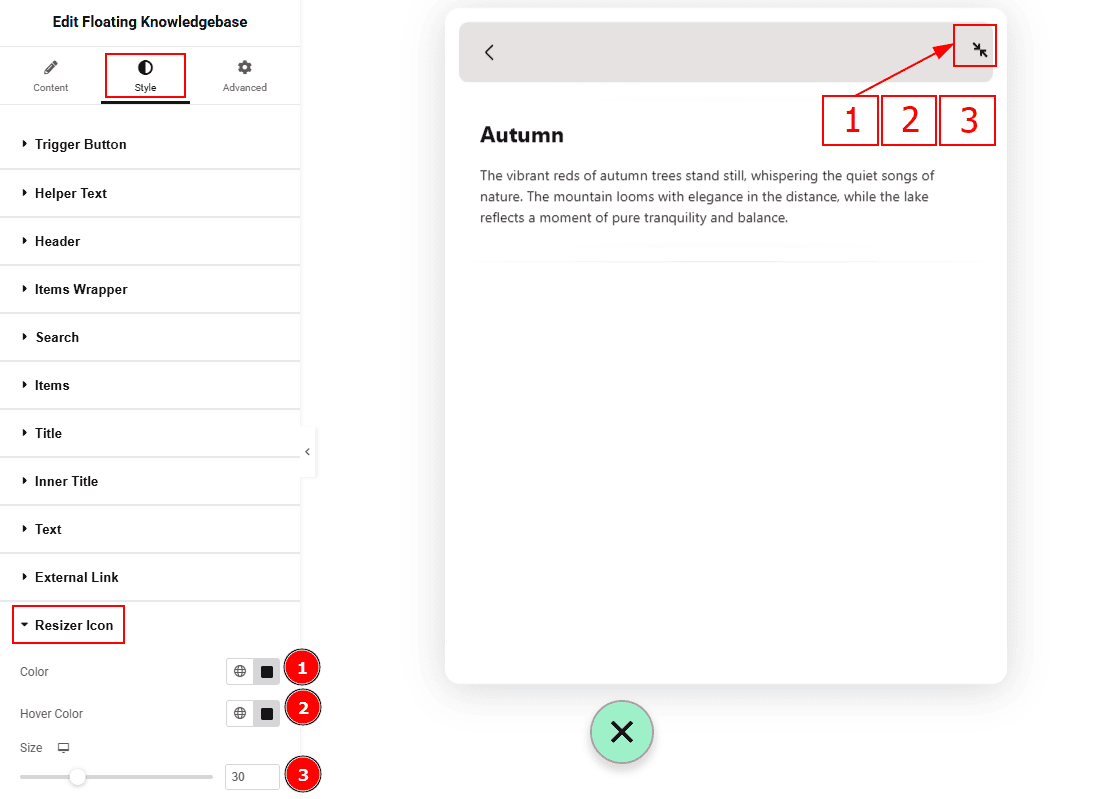
Color: You can change the resizer icon color with this option.
Hover Color: You can change the resizer icon hover color with this option.
Size: You can make changes to the resizer icon size with this option.
All done! You have successfully customized the Floating Knowledgebase widget in your website.
Video Assist
You can also watch the video tutorial. Learn more about the Floating Knowledgebase widget. Please visit the demo page for examples.
Thanks for being with us.